Crosstab
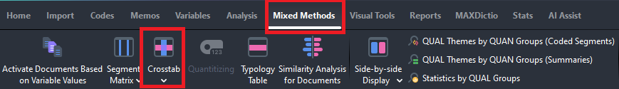
- We can also use document variables in our analysis tools. For example, let’s look at the Crosstab. Go to the Mixed Methods menu and select Crosstab.
Double click on Role Level from the list on the left (or highlight it and click on the right arrow key) to put it in the Conditions column.
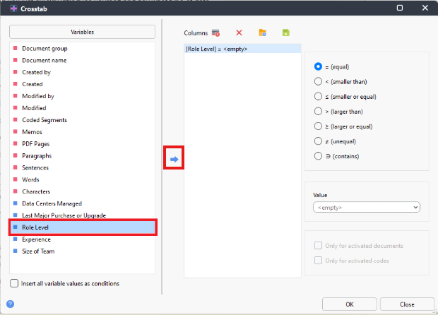
- From the Value drop-down menu, select Executive.
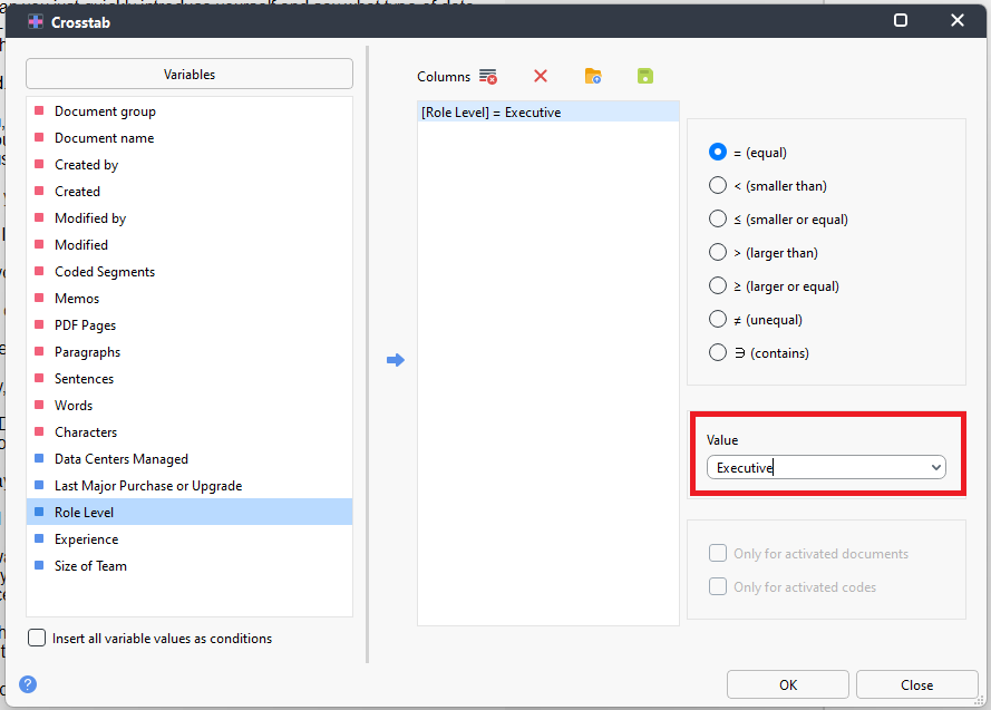
- Repeat this to add Role Level again to the Conditions column, but this time select Manager from the drop-down menu. Then click OK.
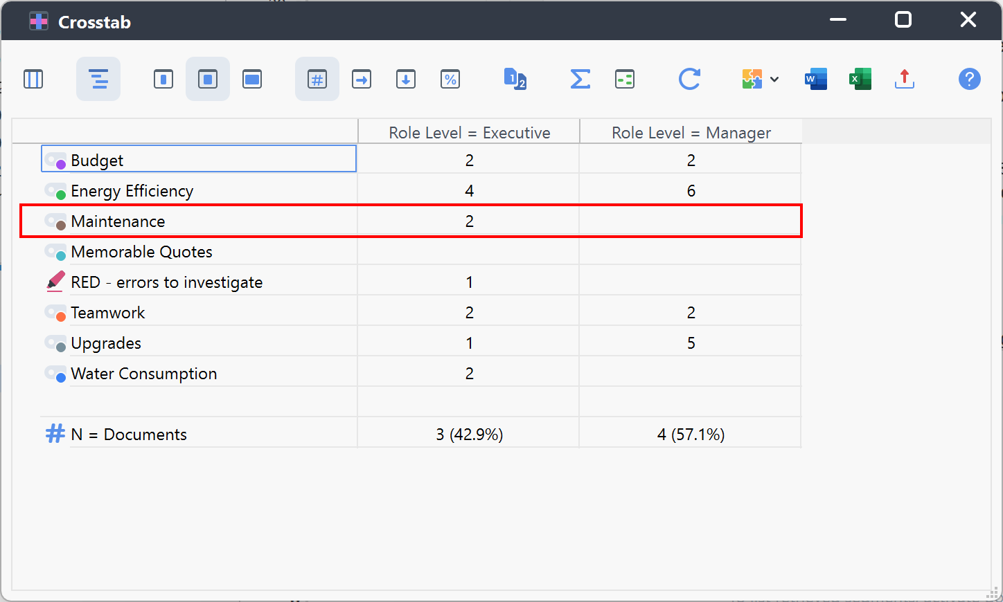
You will be presented with a table where the rows are your codes and the columns are your selected document variable values. The cell values are how many segments intersect between role and code – for example, you can see that according to our coding, only Executives mentioned anything to do with maintenance.
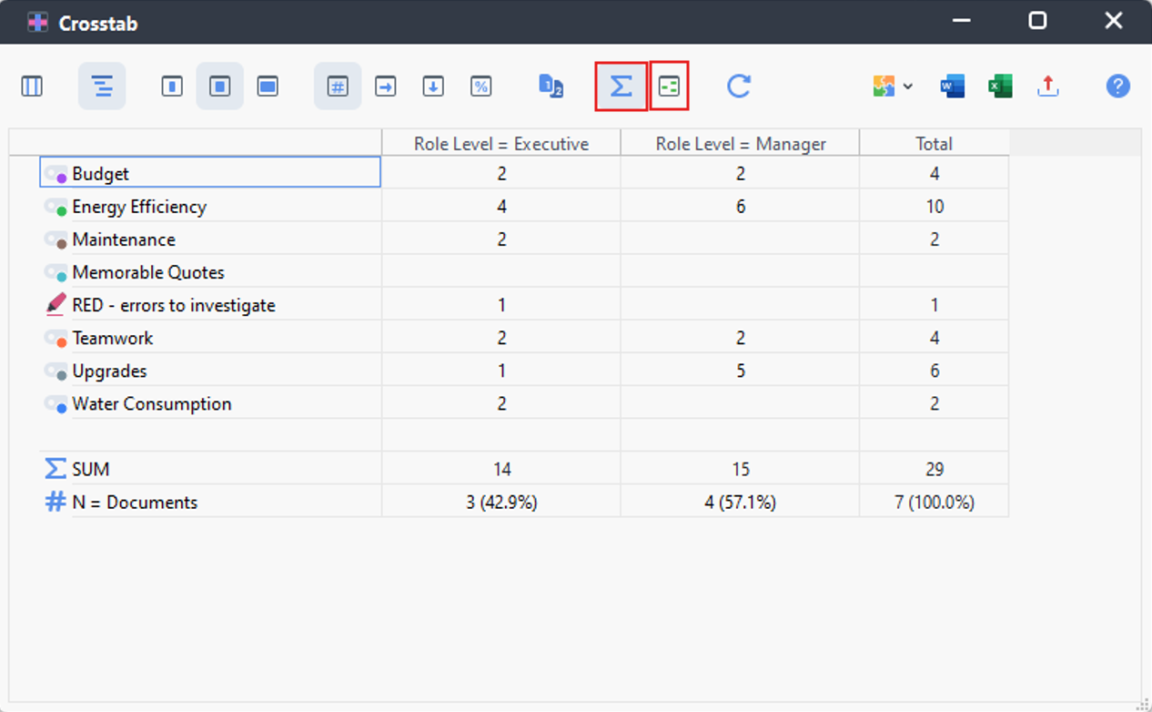
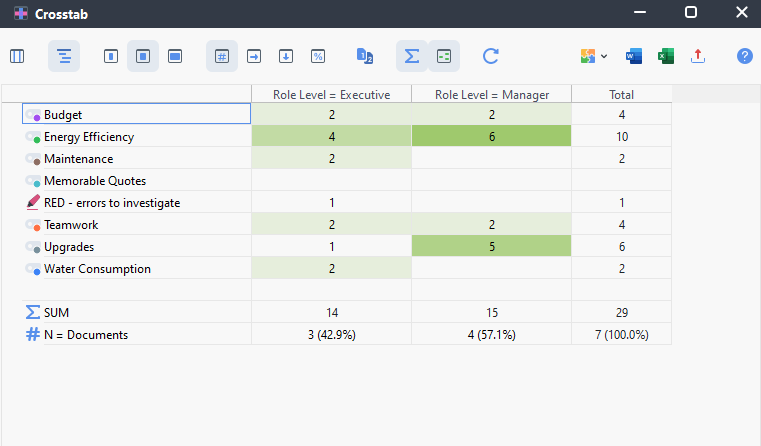
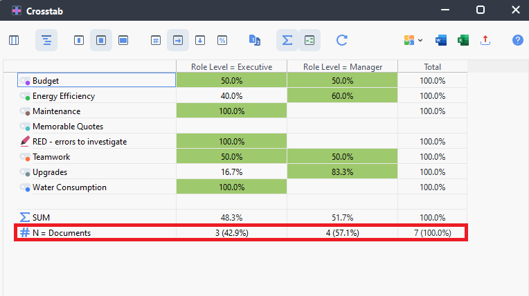
At the top are various icons you can use to customize the table. For example, click on the background colour icon (looks like 3 small green boxes in a square). The darker the shading, the larger the number. Also, click on the Sigma sign to add row and column totals.
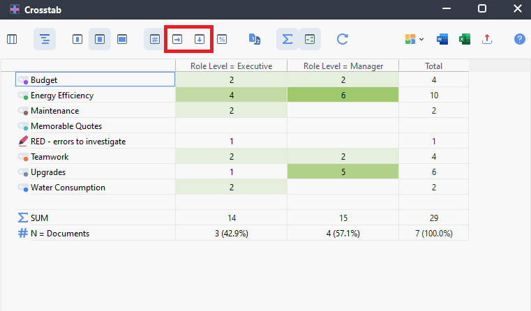
Currently it is displaying the number of segments, but we can change that to row percentages (to compare a code across Role Levels) or column percentages (to compare a Role Level across codes), by using the right arrow and down arrow icons found in the second drop-down menu. For example, using the row percentages, we can see that Managers spoke quite a bit more about Upgrades than Executives. You’ll notice that if you have row percentages selected, the percentages in a row will add up to 100% (and similar if you have columns selected).
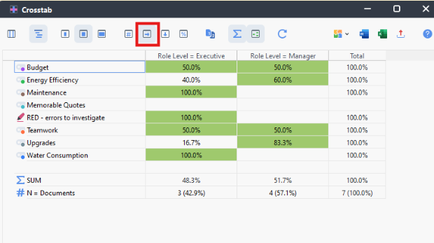
It shows you at the bottom of the table how many documents fall into each category. If we had a lot more data for one category than another, this could influence the numbers to be higher for that category, so you can’t always take these numbers as clear indicators. Often we aren’t reporting these numbers but use them to notice trends in our data that we might want to explore more.
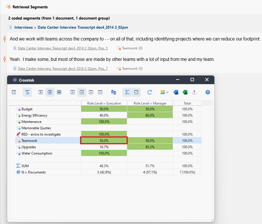
- If you double click on any cell, it will bring up those segments (at that intersection of code and variable) in the Retrieved Segments window.
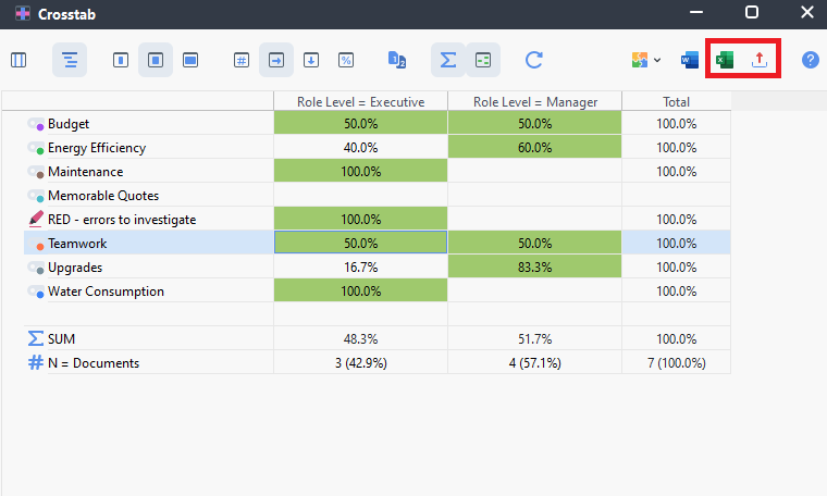
- For results of any analysis, we can export it. In this case, we could export this table as a spreadsheet by clicking on the export icon at the far right (looks like a red arrow pointing up) or the shortcut Excel icon. Choose where to save it. It creates a spreadsheet of this table and retains the cell shading.
Technique: Qualitative Data Analysis | Tools: MAXQDA