Introduction to GGPLOT2
This guide introduces users to the ggplot2 R package. Ggplot2 is a popular package that is used to make publication quality graphs in R. The official documentation for the ggplot2 package can be found here. It includes descriptions of functions and sample datasets.
This guide consists of 3 data visualization examples. You can download the code used in this guide here.
Once you have gone over these examples and you feel confident about them, you can test your understanding by trying this activity. If you have any questions, you can request for assistance by filling out our support request form here.
Install package
install.packages("ggplot2")
library(ggplot2)
Example 1: Histogram
data(diamonds)
ggplot(diamonds, aes(price)) + geom_histogram()
ggplot(diamonds, aes(price)) + geom_histogram() + theme_classic()
ggplot(diamonds, aes(price)) + geom_histogram(binwidth=100) + theme_classic()
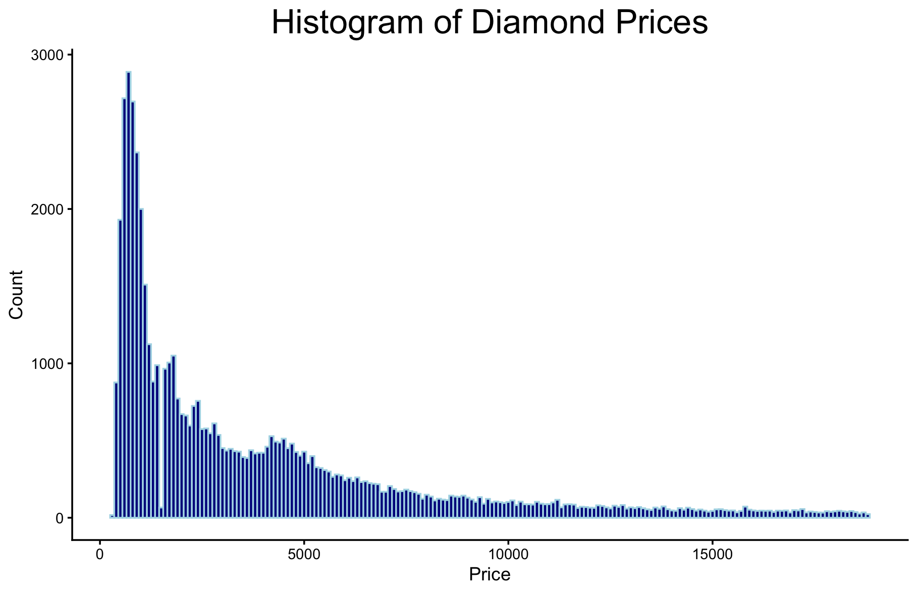
ggplot(diamonds, aes(price)) +
geom_histogram(binwidth=100, fill="darkblue", color="lightblue") +
theme_classic() +
ggtitle("Histogram of Diamond Prices") +
theme(plot.title=element_text(size=20, hjust=0.5)) +
xlab("Price") + ylab("Count")
ggsave("histogram1.png")
Example 2: Scatterplot
ggplot(diamonds, aes(carat, price)) + geom_point()
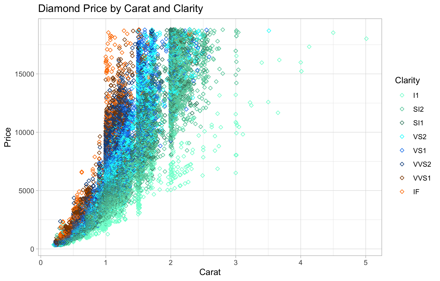
ggplot(diamonds, aes(carat, price, colour=clarity)) +
geom_point(shape="diamond filled") +
theme_light() +
ggtitle("Diamond Price by Carat and Clarity")
install.packages("colourpicker")
myscattercolours <- c("#7FFFD4", "#66CDAA", "#458B74", "#00FFFF", "#1C86EE", "#104E8B", "#8B4500", "#FF7F00")
ggplot(diamonds, aes(carat, price, colour=clarity)) +
  geom_point(shape="diamond filled") +
  theme_light() +
  ggtitle("Diamond Price by Carat and Clarity") +
  scale_colour_manual(values=myscattercolours) +
  xlab("Carat") + ylab("Price") +
  guides(colour=guide_legend("Clarity"))
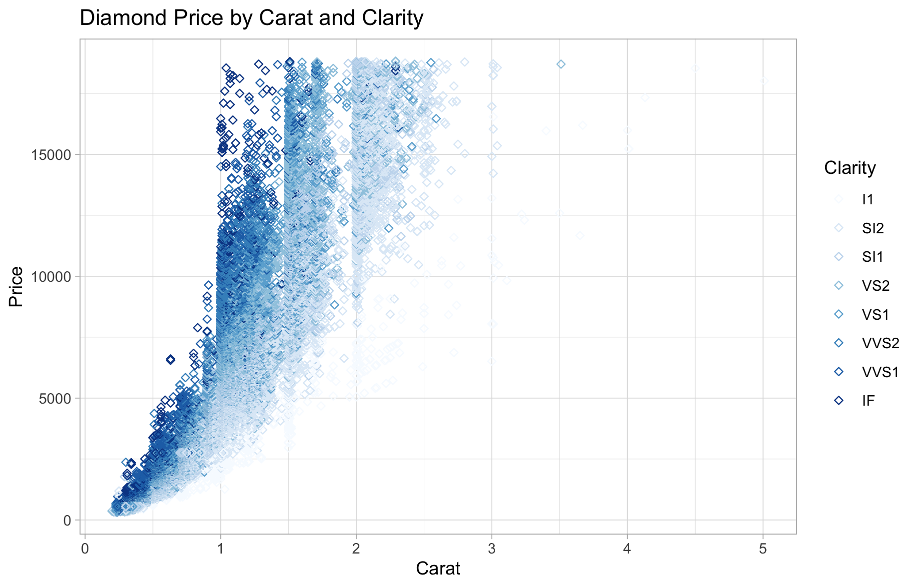
install.packages("RColorBrewer")
library(RColorBrewer)
ggplot(diamonds, aes(carat, price, colour=clarity)) +
  geom_point(shape="diamond filled") +
  theme_light() +
  ggtitle("Diamond Price by Carat and Clarity") +
  scale_colour_brewer(palette="Blues") +
  xlab("Carat") + ylab("Price") +
  guides(colour=guide_legend("Clarity"))
Example 3: Time Series Line Graph
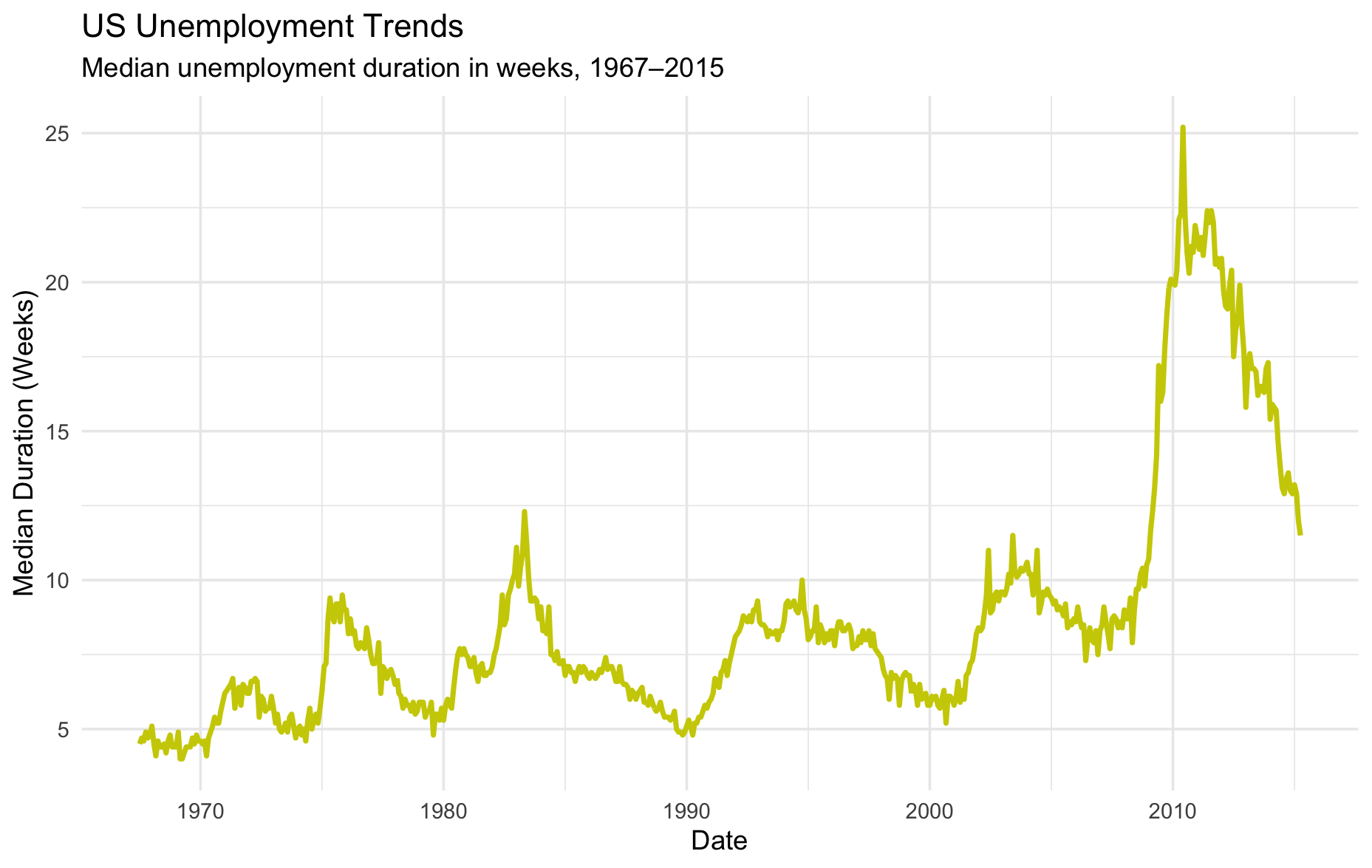
data(economics)
ggplot(economics, aes(x=date, y=uempmed)) +
  theme_minimal() +
  geom_line(colour="yellow3", linewidth=1) +
  labs(title="US Unemployment Trends",
       subtitle="Median unemployment duration in weeks, 1967–2015") +
  xlab("Date") +
  ylab("Median Duration (Weeks)")
Resources
1. GGPLOT2 Documentation: https://cran.r-project.org/web/packages/ggplot2/ggplot2.pdf
2. GGPLOT2 Tidyverse Reference: https://ggplot2.tidyverse.org/reference/
3. Additional code here.
Technique: Data Visualization | Tools: R