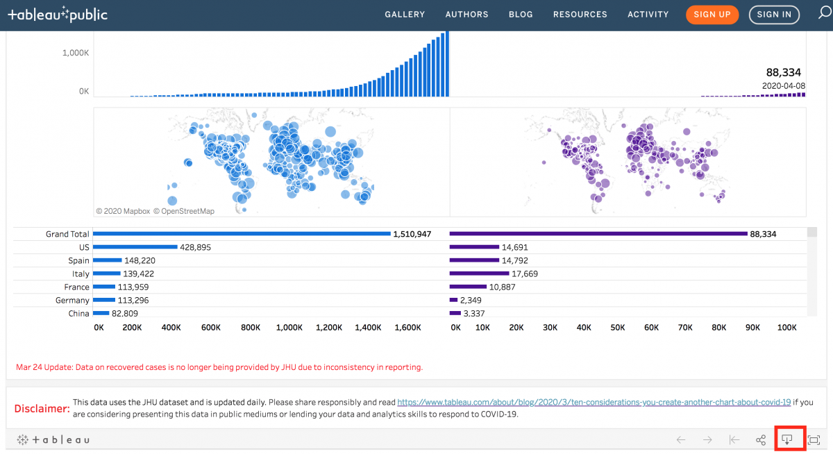
The Dashboard
This tutorial will be focused on learning how to recreate aspects of this old dashboard (seen as a screenshot) and this new dashboard using Tableau Desktop. Note: This dashboard used to have information on recoveries as well, which is best practice for COVID-19 visualizations, but unfortunately the dataset it was based on removed recovery information, as they concluded the data was too unreliable. Also, this dashboard (and so the tutorial) was designed using straight case counts, but for comparison purposes, it would make more sense to compare based on cases per # of people (e.g., cases per 100,000 people).
When working to emulate a Tableau dashboard found on the Tableau Public website, you can often click on the download icon (hover over the icons at the bottom right of the dashboard to find it) and download the underlying workbook (if the owner gave permission).
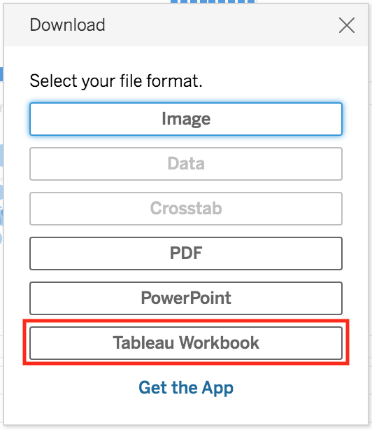
This is a great way to learn how to create dashboards in Tableau. However, in some situations, a workbook can be so complicated that it might take a while to unpick and understand what is going on. That is the situation here, and why this tutorial was created.
Technique: Data Visualization | Tools: Tableau