Creating Bar Graphs
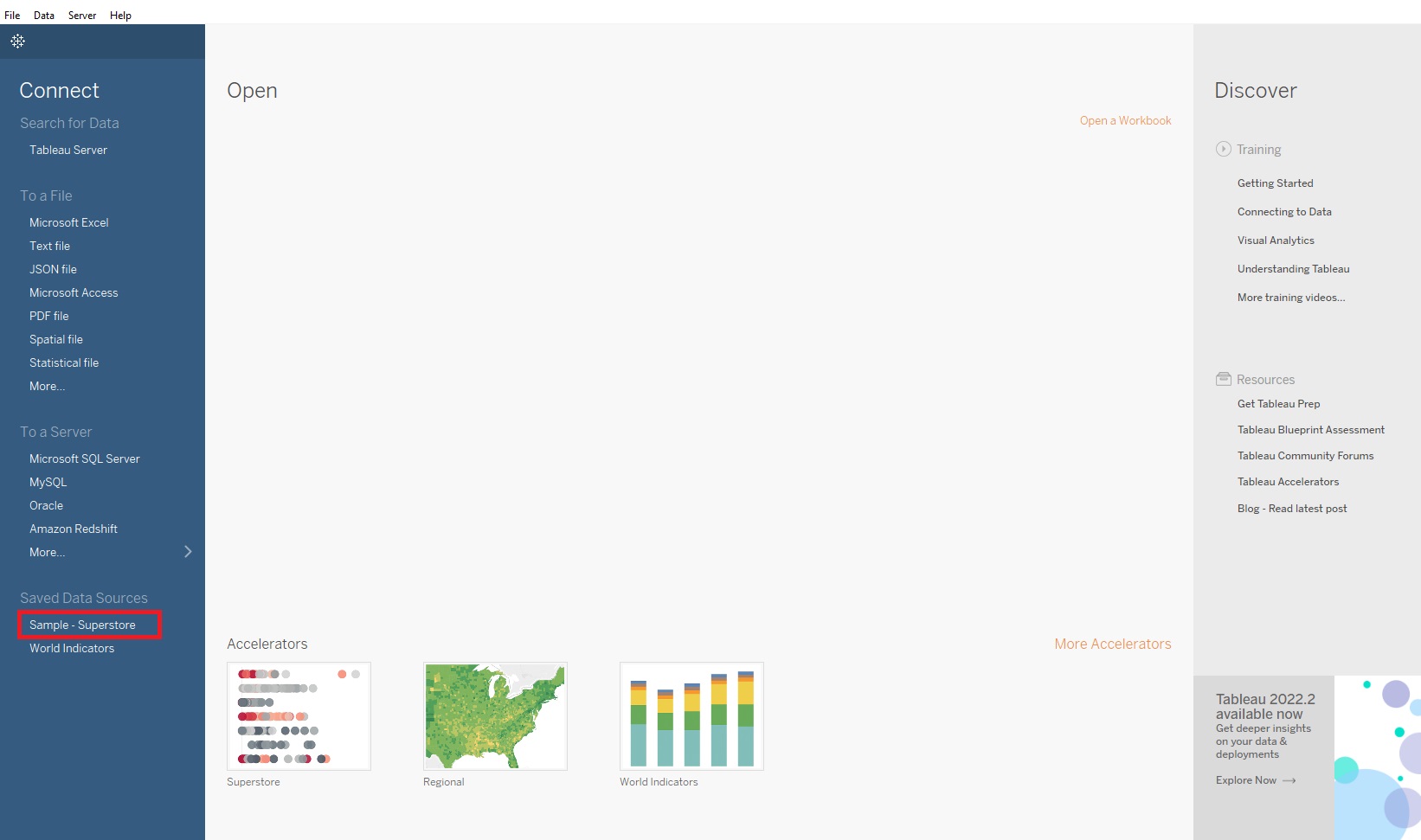
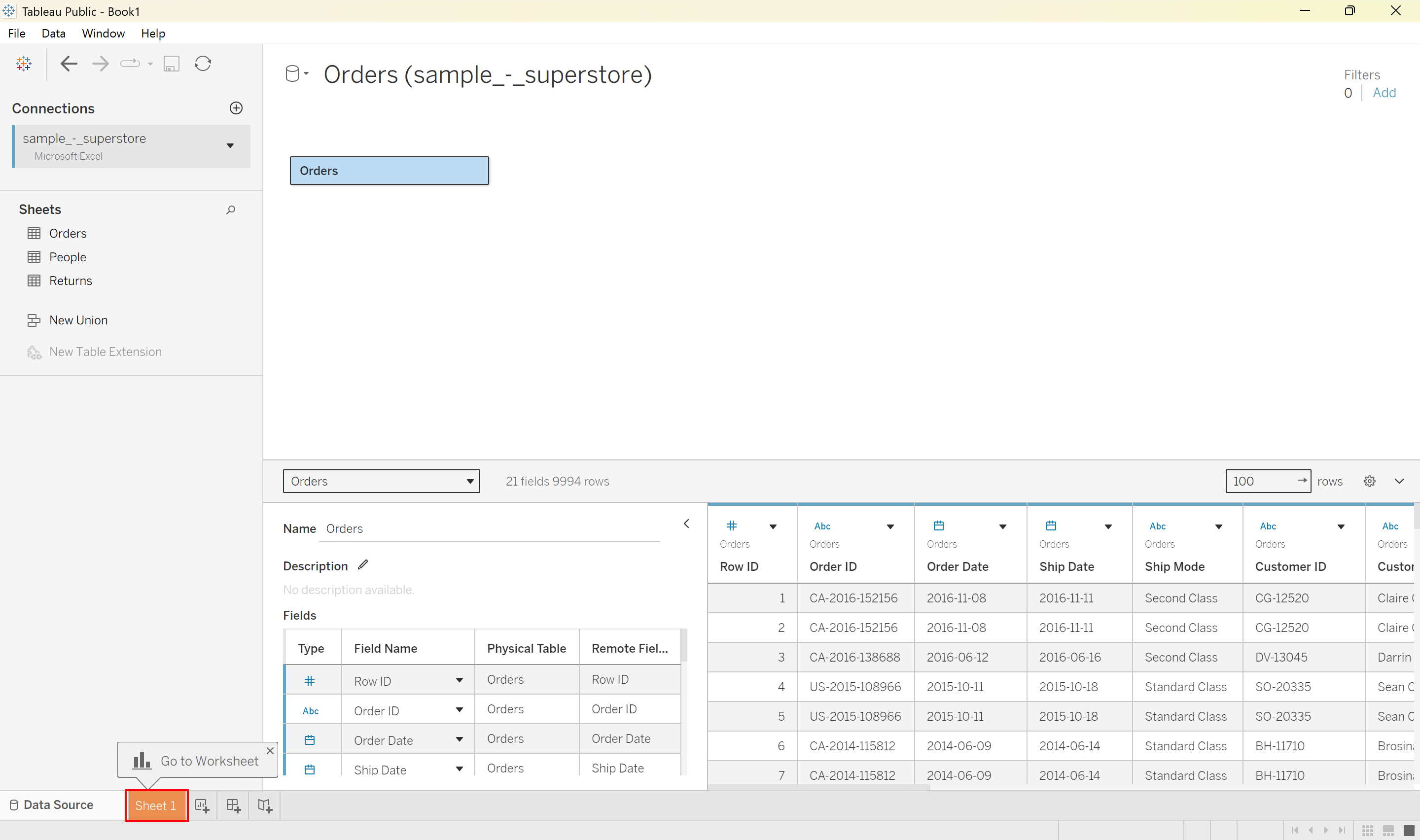
We are going to start with a dataset from Tableau. If you are using Tableau Desktop, the dataset is built in. Under Saved Data Sources, select Sample - Superstore.
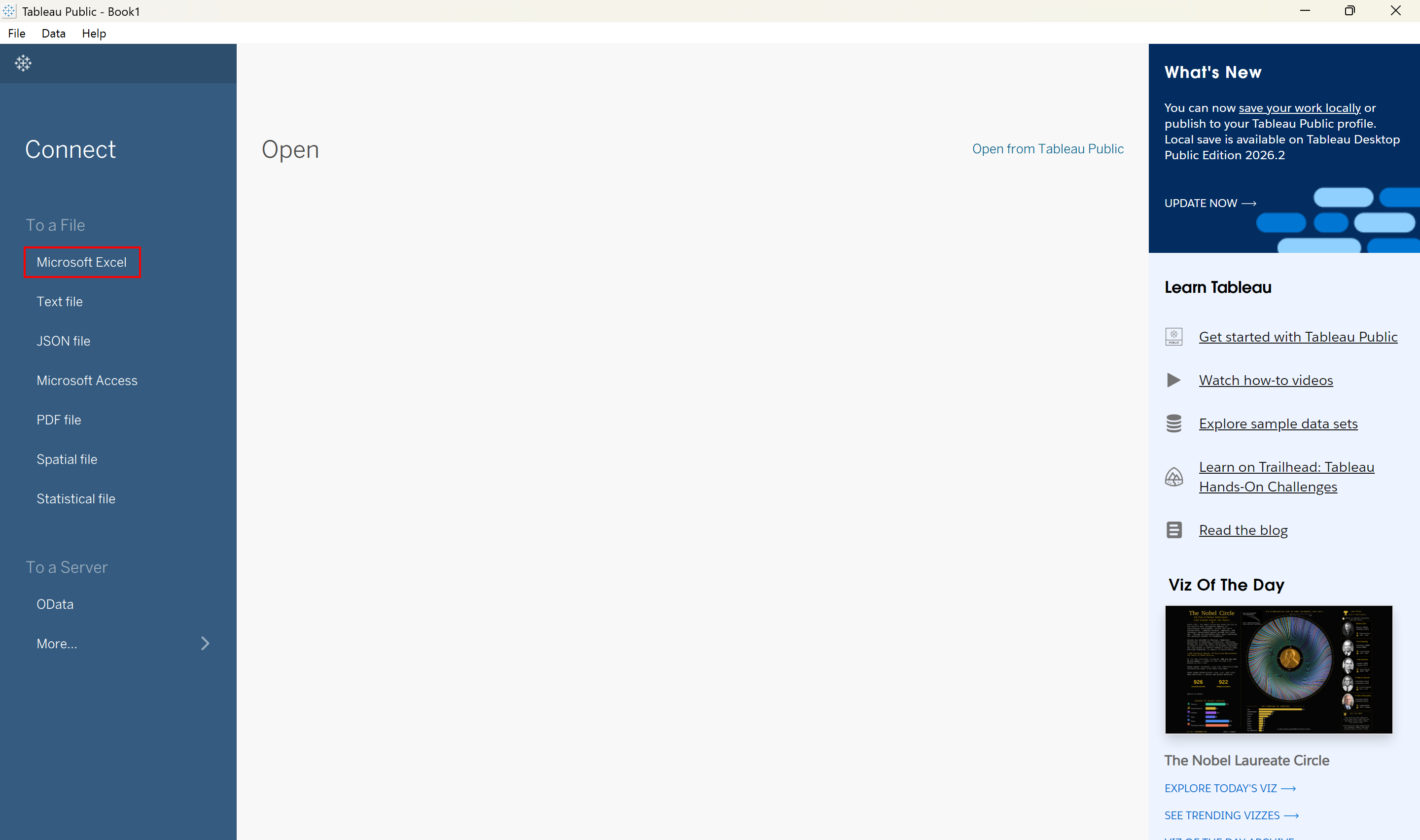
OR If you are using Tableau Public, you will need to first download the Superstore Sales dataset from Tableau. Then in Tableau, we need to load the data. Click on Microsoft Excel under Connect To a File.
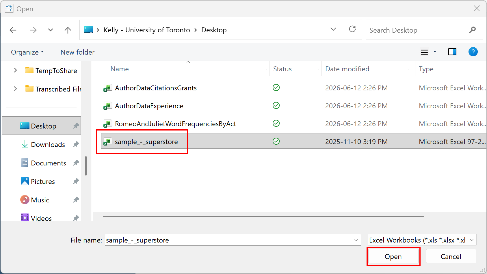
Select the superstore file.
Drag the Orders sheet into the blank space to the right of it to select that sheet from the Excel workbook.
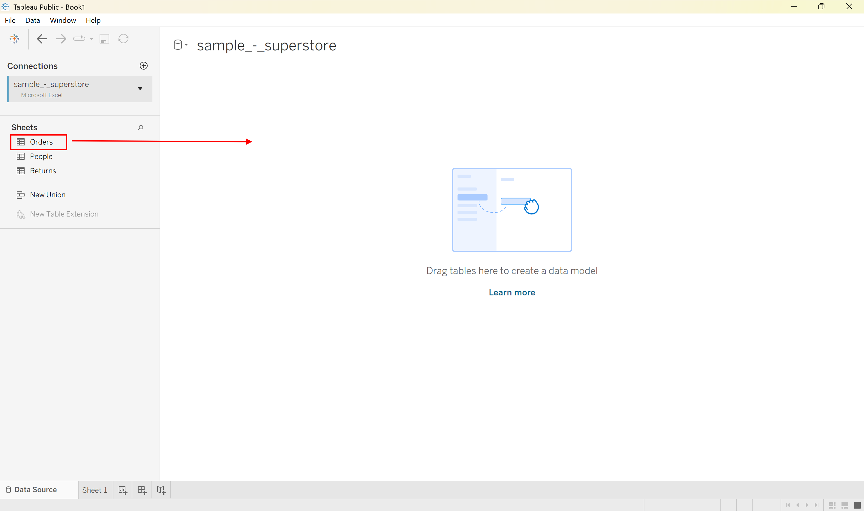
Finally, click on Sheet 1 at the bottom.
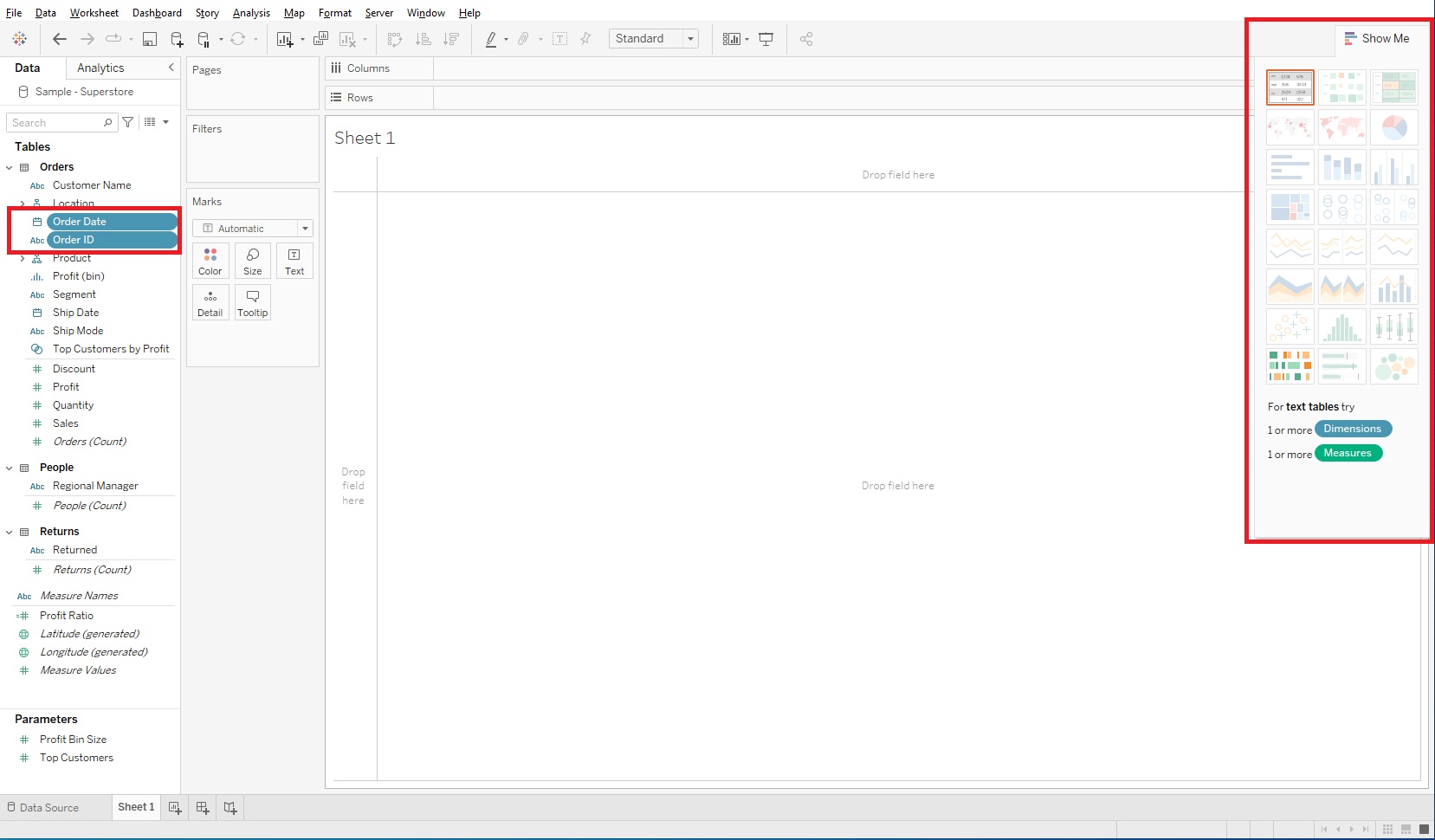
Let’s look around first before we dive in. On the left you can see Tables listed. Within a Table, the variables are listed, but divided by a thin grey line. Tableau categorizes variables as either Dimensions (above the line) or Measures (below the line). Dimensions are roughly qualitative data and Measures are roughly quantitative data.
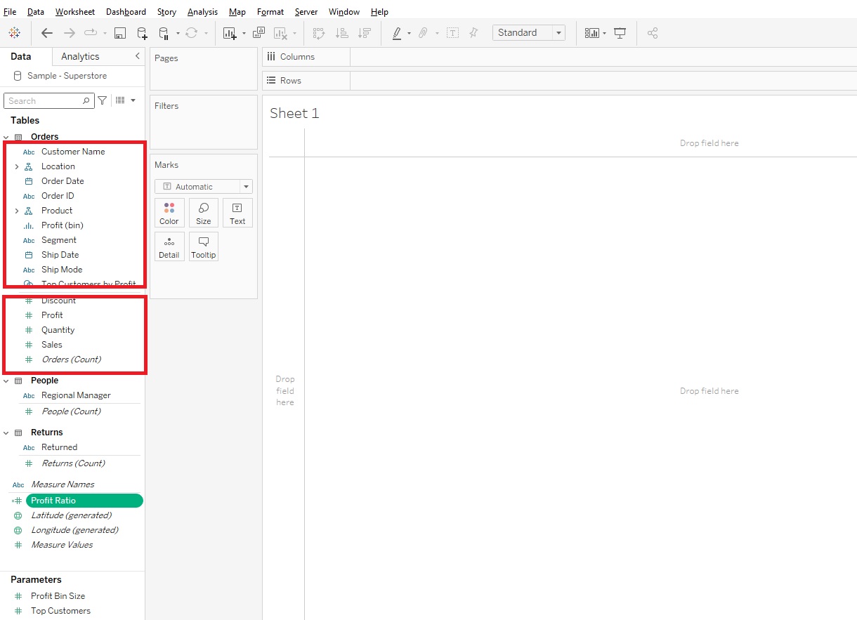
The centre area is where you’ll be dragging and dropping your variables on to different areas, such as Rows and Columns, or to vary Marks like Colour or Size by your variable, or filtering by a variable. Those areas that say Filters or Pages are called Shelves.
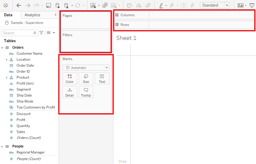
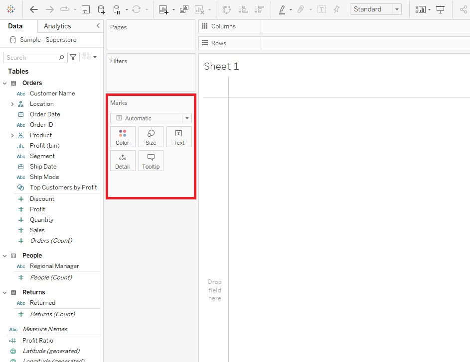
The Marks area have what are called cards, and when the variables are showing up in those areas, they are called pills, as they are shaped like a pill.
We’ll take a look at all these options as we go through the demo. One of the useful features of Tableau, to take a look at when you’re new to the tool and/or data visualization, is the Show Me feature. If you hold down Control and click on a couple of variables (hold down Command if on Mac), and then expand the Show Me tab, you’ll see that Tableau is giving you suggestions for what type of visualization to use by outlining the recommended visual.
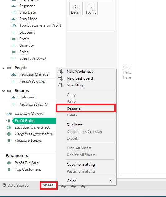
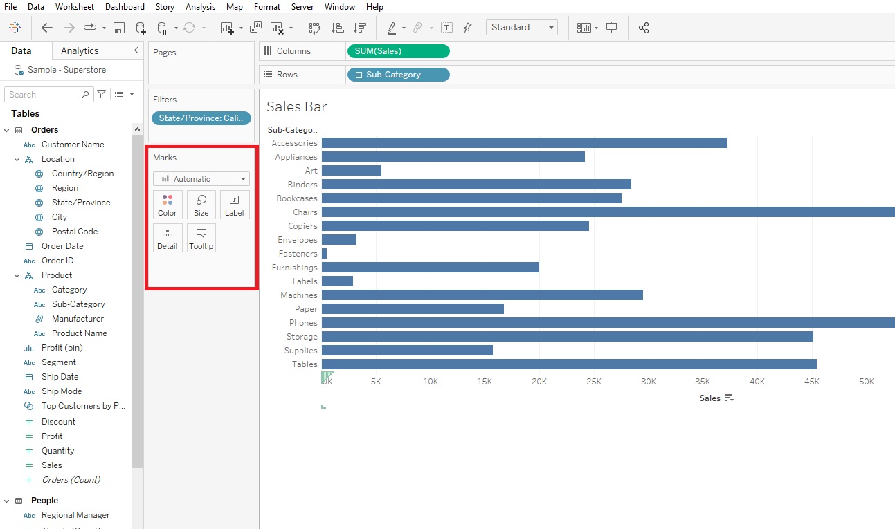
Okay, we’ve loaded in some data about a US fictional superstore, so let’s start by creating some visualizations that are used to make comparisons. Let’s start by making a simple bar graph. To keep track of all the visualizations we’re going to create, let’s rename our sheets as we go. Right-click on Sheet 1 at the bottom, select Rename, and give it the name “Sales Bar” and press Enter.
We’re going to create a horizontal bar graph to compare the amount of sales for different subcategories of products, with Sub-Category along the y-axis and Sales along the x-axis. Bar graphs are great for comparing categories. So drag the Sales variable (in the Measures section) next to Columns and Sub-Category (in the Dimensions section) next to Rows.
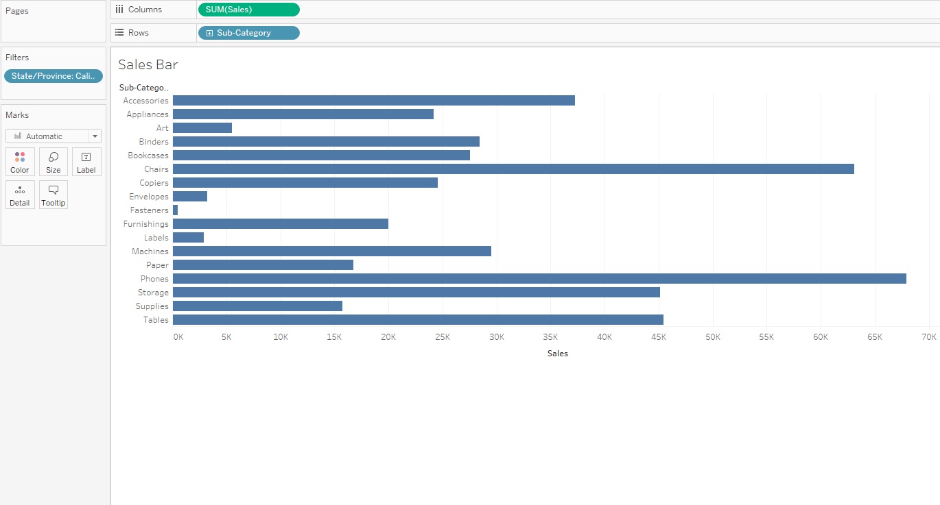
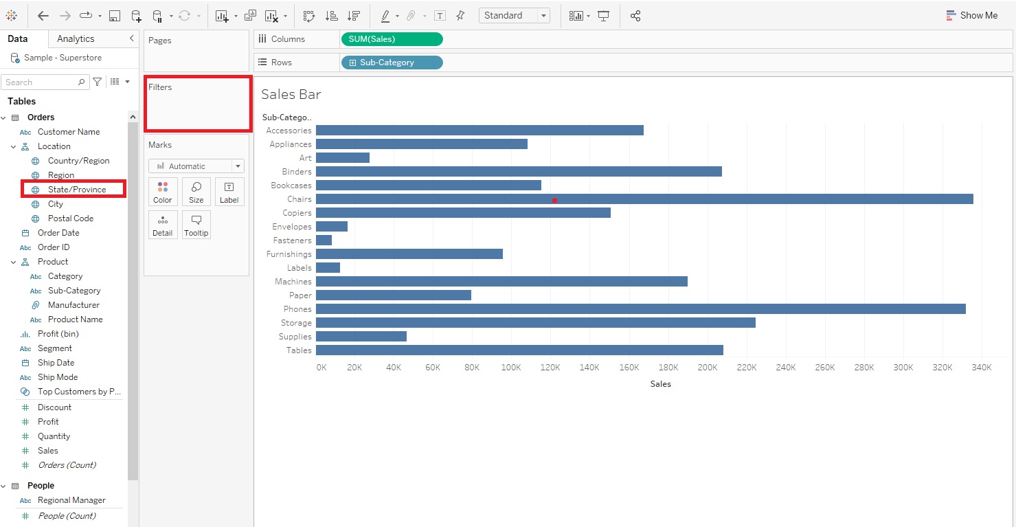
You can see that when we dragged Sales, Tableau automatically summarized it by adding up all the Sales values for each Sub-Category. Right now it is showing data combined for all of the States (this is a US example), but let’s say we just want it to show one of them. We can filter by State by dragging the State variable (in the Dimensions section) over to the Filters shelf and selecting one State from the list.
Let’s pick California in the pop-up window and click OK.
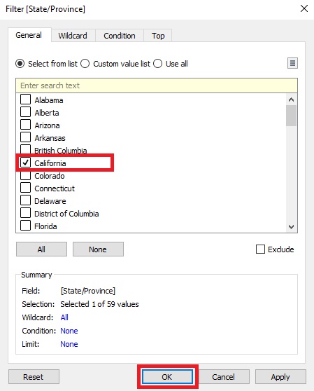
Now we have a bar graph showing the Sales by Sub-Category for California.
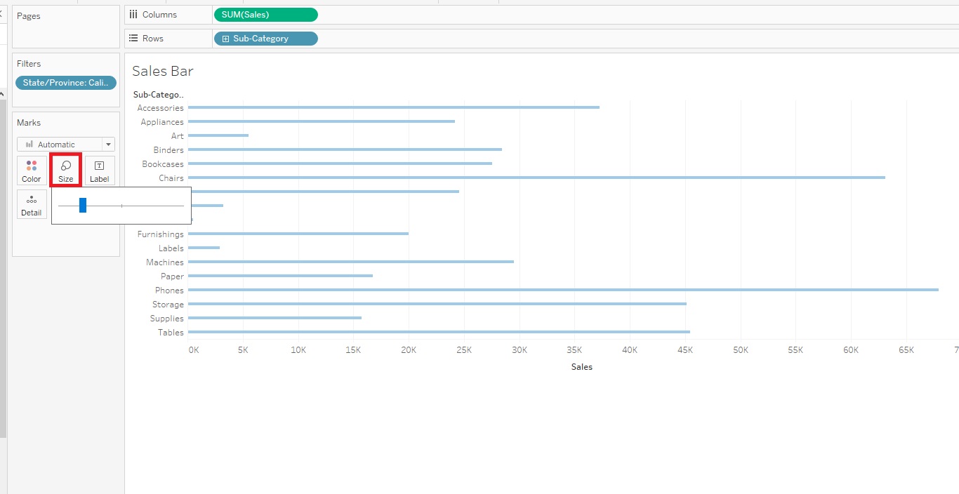
Next let’s look at the Marks card. You can also see 5 smaller boxes labelled Colour, Size, Label, Detail, and Tooltip.
If you click on Colour, you you can change the colour of the bars in the bar graph. Let’s pick a different shade of blue.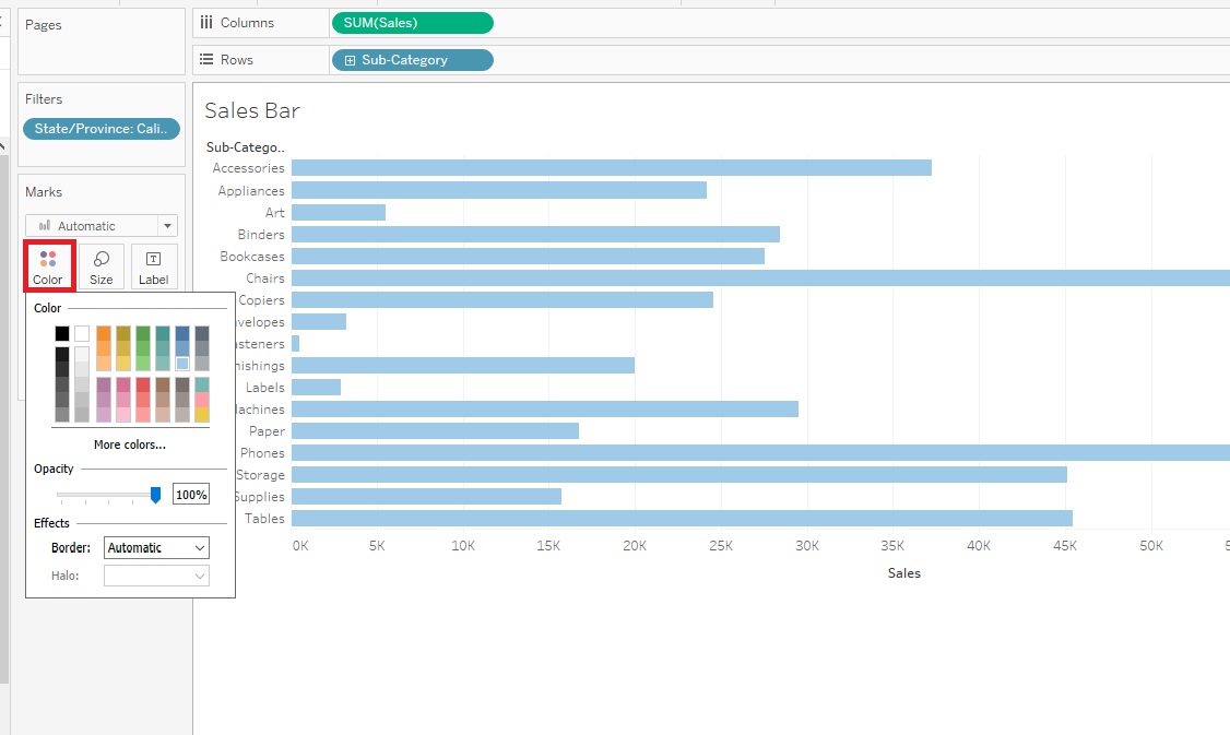
We can also adjust the size/width of the bars using the Size slider.
The Label section allows to create and customize labels. We can click on Show mark labels to see the values for each bar.
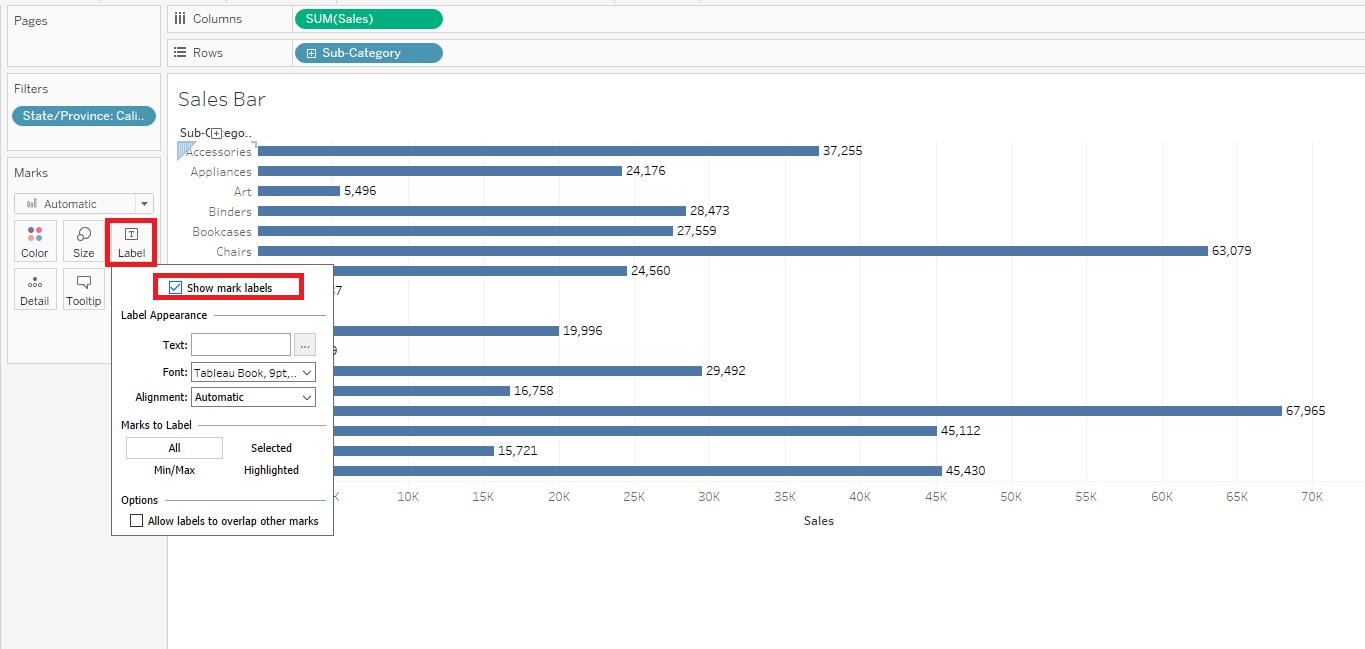
But you can see this makes our bar graph look cluttered, so let’s keep Show mark labels unchecked.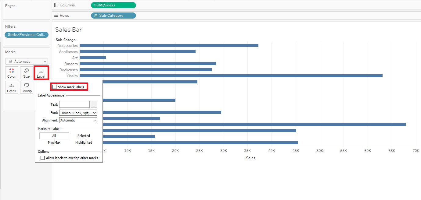
- You normally drag a variable on to the Detail section to clarify to what level of detail are marks on the page displayed at. We’ll look an example of this later.
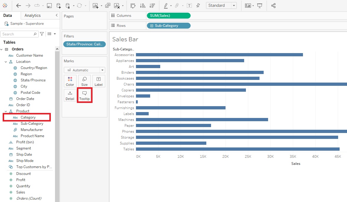
Finally, the Tooltip section allows you to customize the text and format in the pop-up that shows up when you hover or click on a particular bar. For example, let’s add the broader Category that the product falls under in the Tooltip. To do this, drag the Category variable (in the Dimensions section) to the Tooltip box.
Then click on Tooltip. In the edit box, you’ll see that Category has been added underneath Sub-Category to the Tooltip. However, if you want to change the order, perhaps to have the broader category go first, you can click on Tooltip and edit the box. Let’s switch the order and click on OK.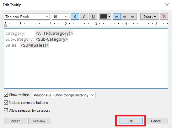
As you can see there are options to customize a lot of parts of the visualization. You can also customize the axes. For example, right-click on your x-axis title, select Edit Axis…
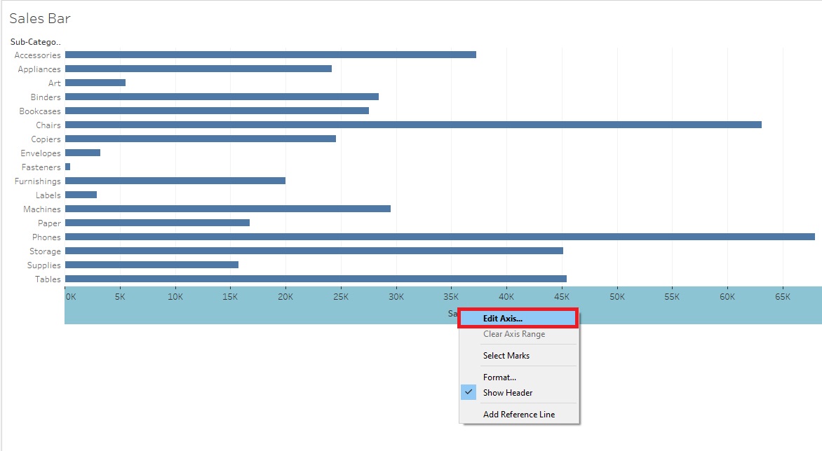
Let’s edit the x-axis Title next to Custom to say ‘Sales in US Dollars’. Once we are done there’s no OK button to click, just close the window, as the changes have already been applied.
![The Sales in US Dollars Custom Axis Title at the bottom is outlined with a red box in the Edit Axis [Sales] pop-up window](/tableau-workshop-demonstration-tutorial/assets/images/ReTableauWorkshop1-12.2.png)
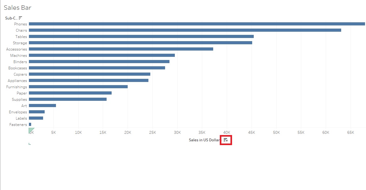
Right now the bars are sorted in alphabetical order by Sub-Category, but if you hover over the x-axis label, Sales in US Dollars, a small sort icon appears. Click on it to sort your bars by Sales instead. Every time you click the icon, it cycles through different sort orders. Let’s have it sort descending with the Sub-Category with the largest sales at the top. You can now easily see the top and bottom sub-categories in terms of sales.
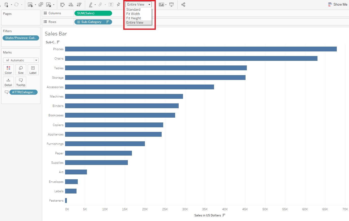
If we wanted to, we could also spread this visualization out a bit, so it isn’t squished up at the top. From the top ribbon where it says Standard, use the drop-down to select Entire View.
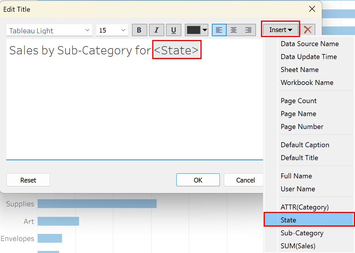
Finally, we can give our visualization a more meaningful title by double clicking where it says “Sales Bar” at the top. You’ll see the default title is the sheet name, but we can change that. Let’s put “Sales by Sub-Category for “ then instead of typing in “California”, we can make the title dynamic by click on Insert and selecting State. Then if we change the filter, the title will automatically change.
Now we’re done our first visualization!
Technique: Data Visualization | Tools: Tableau