Creating Line Graphs
Okay, let’s create a new visualization. We need a new worksheet. Click on the New Worksheet icon at the bottom of the screen. Rename this one to “Line”.
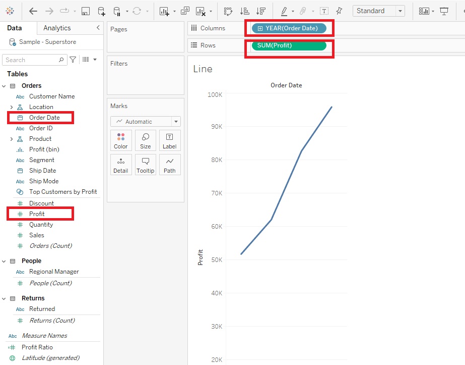
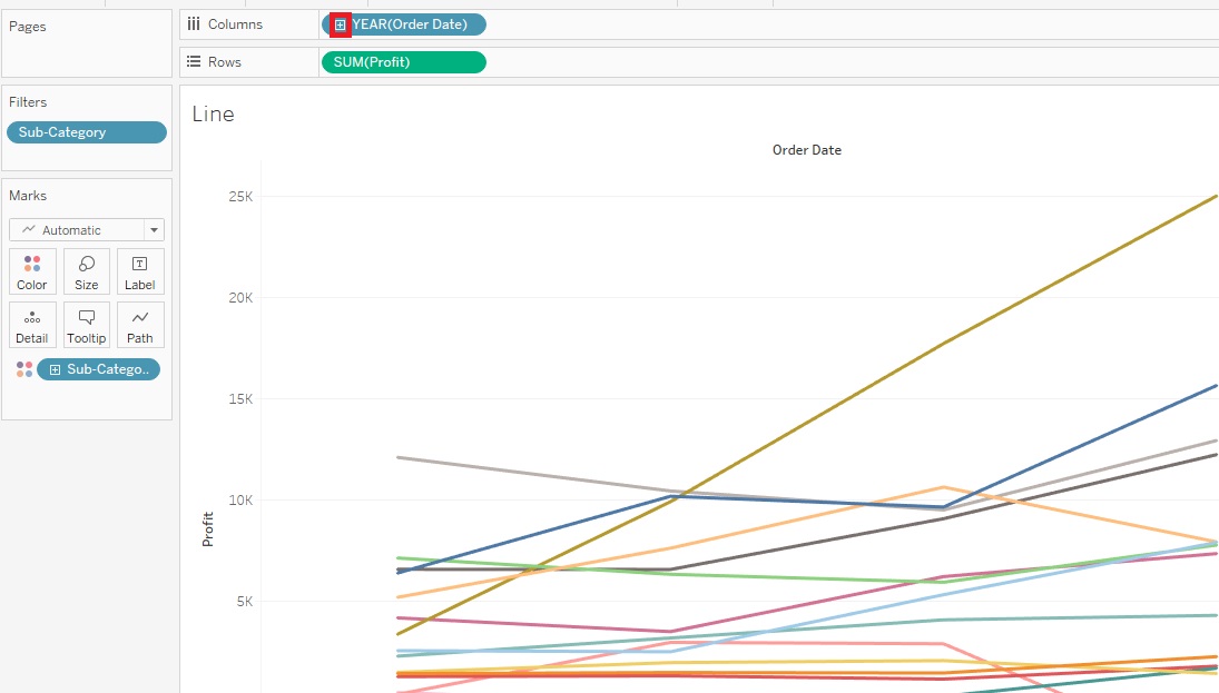
We’re going to create a line graph now, which is great to show trends over time. We’re going to create a line graph of change in total profit over time. Let’s drag Order Date variable (in the Dimensions section) next to Columns. Next drag the Profit variable (in the Measures section) next to Rows. You’ll notice that our graph is summing Profit automatically.
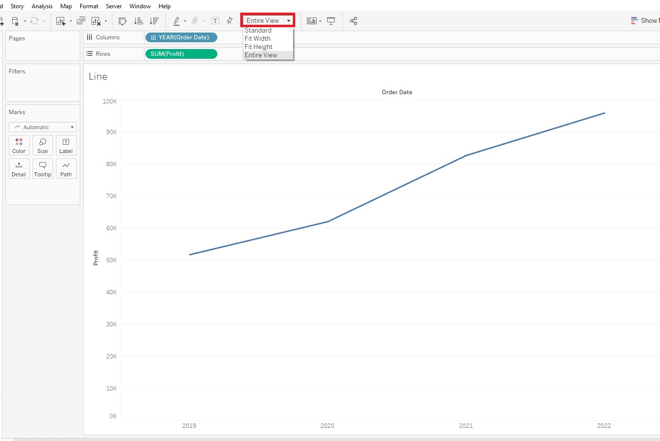
As we did before, from the drop-down at the top change it from Standard to Entire View.
It might be useful to see this graph broken down by Sub-Category – so basically adding a 3rd variable. The Sub-Category variable is just what it sounds like – a categorical variable, so we can assign different coloured lines for each category to display this information on the graph. To do this in Tableau, you drag Sub-Category (in the Dimensions section, under Product) on to Colour.
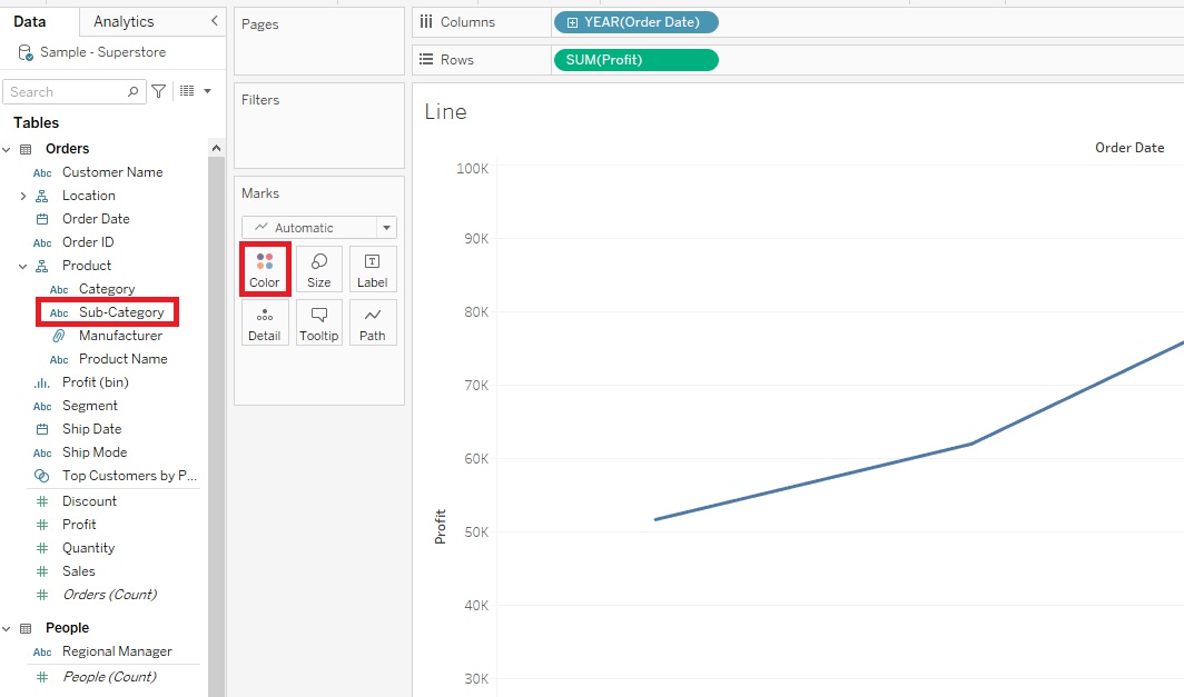
Tableau has assigned a qualitative colour palette scheme, assigning different colours to represent our Sub-Category, but we do have a lot of them, so it is a bit overwhelming.
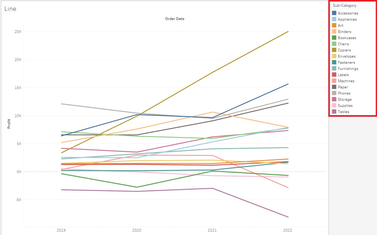
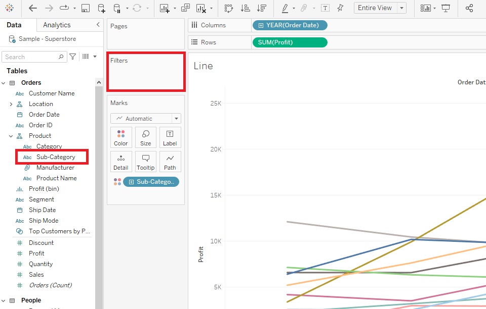
When creating visualizations, you always need to figure out what your main message is. What is the story you are trying to tell. One way to simplify this would be to show a comparison between 2 particular sub-categories of interest. We can do this by dragging Sub-Category over to the Filters shelf.
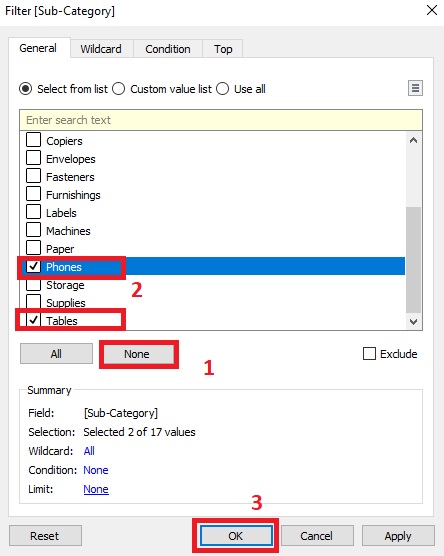
Select two sub-categories. Let’s pick Phones and Tables. (Select None first to clear the selections).
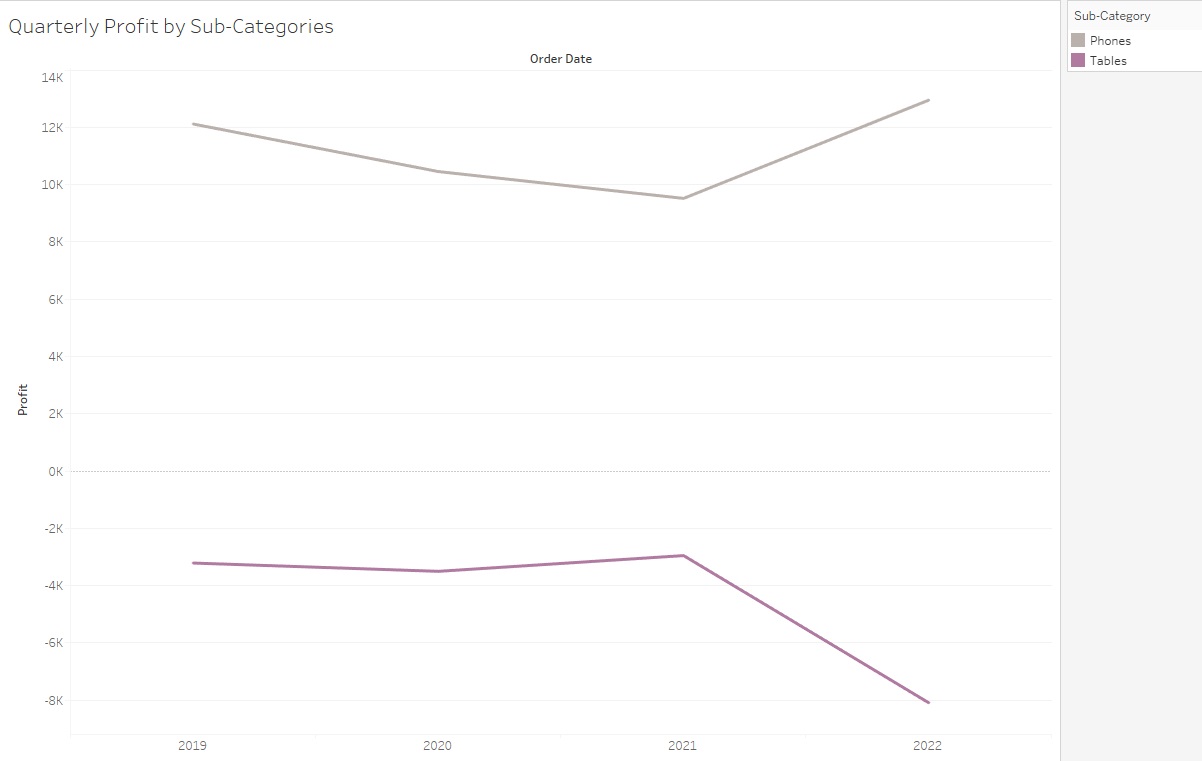
This tells a story that Phones are increasing in profit, while Tables are decreasing.
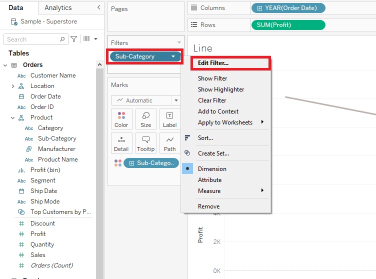
Another way we could tell a story would be to allow the user to filter it themselves based on what sub-categories they are interested in – so adding an interactive element. To do that, go back to Filters shelf, right click on Sub-Category and pick Edit Filter.
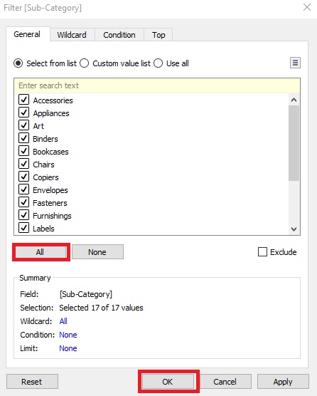
Select All and click on OK.
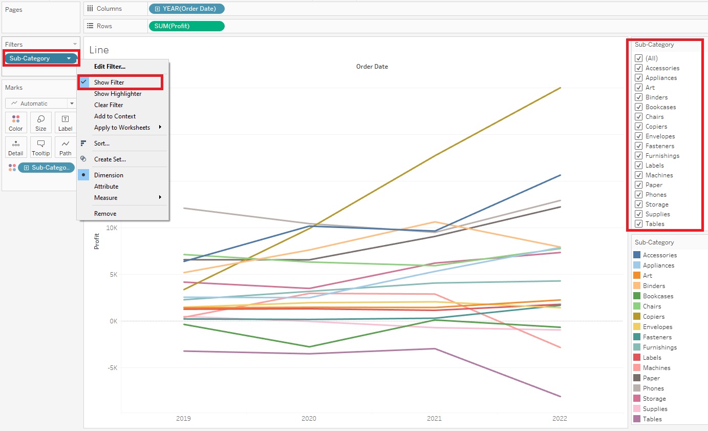
Then right click Sub-Category in the Filters shelf again, but this time select Show Filter. Now you can see the Sub-Category filters show up on the right. We can select or deselect as we like and the graph changes. Or select (All) to have them all come back. (if you don’t see the filters, click on Show Me to close its options panel that is blocking the view)
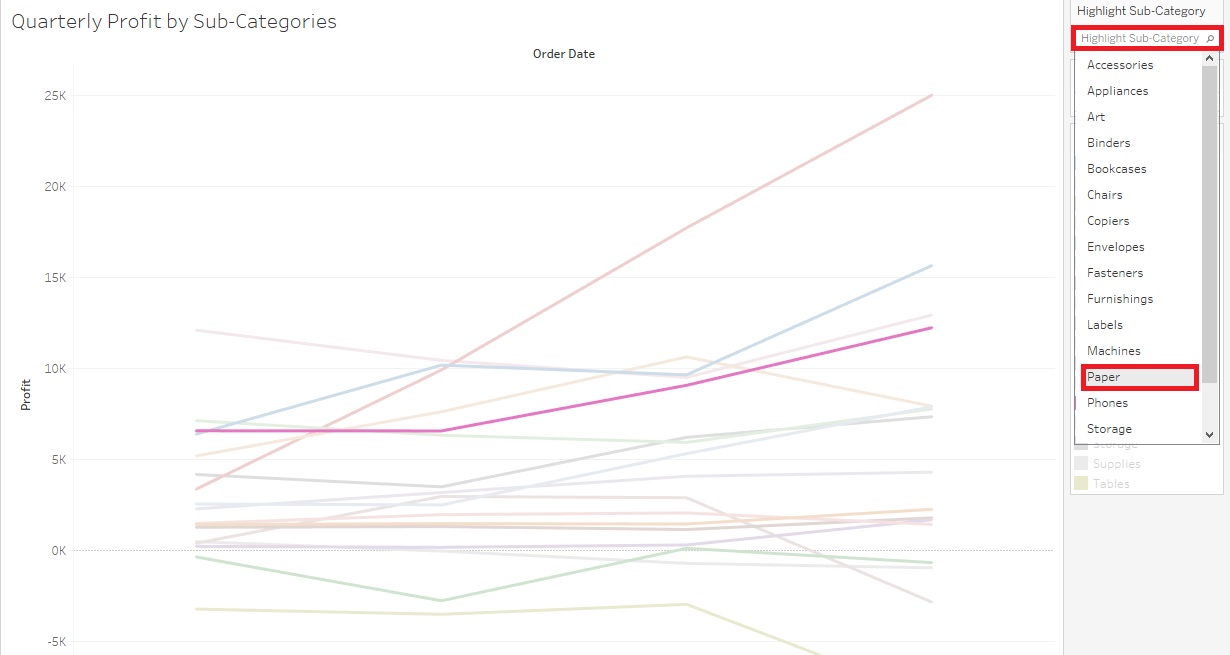
To further help the user read your graph, you could also add a Highlighter. Go back to the Filters shelf, right click on Sub-Category, but this time pick Show Highlighter.
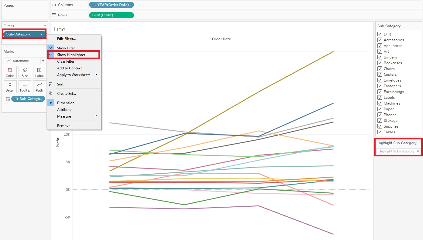
Now Highlight Sub-Category box shows up on the right. The user can pick a sub-category and the graph emphasizes that Sub-Category – try it out. You should see it emphasized on the graph.
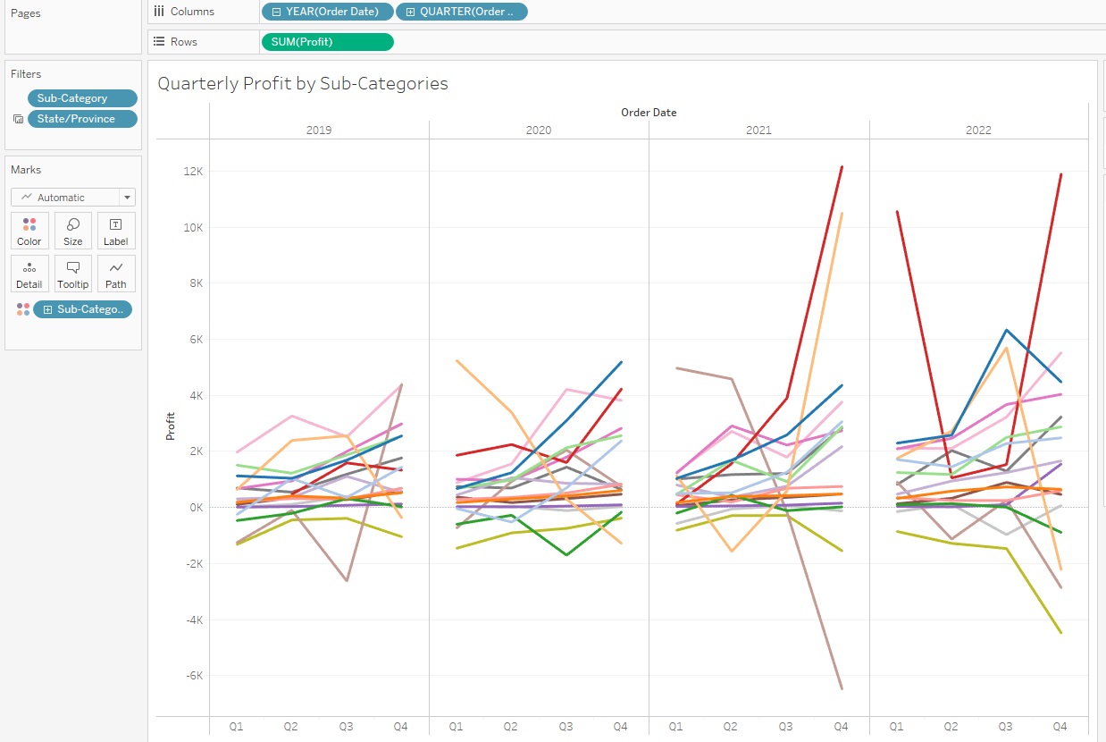
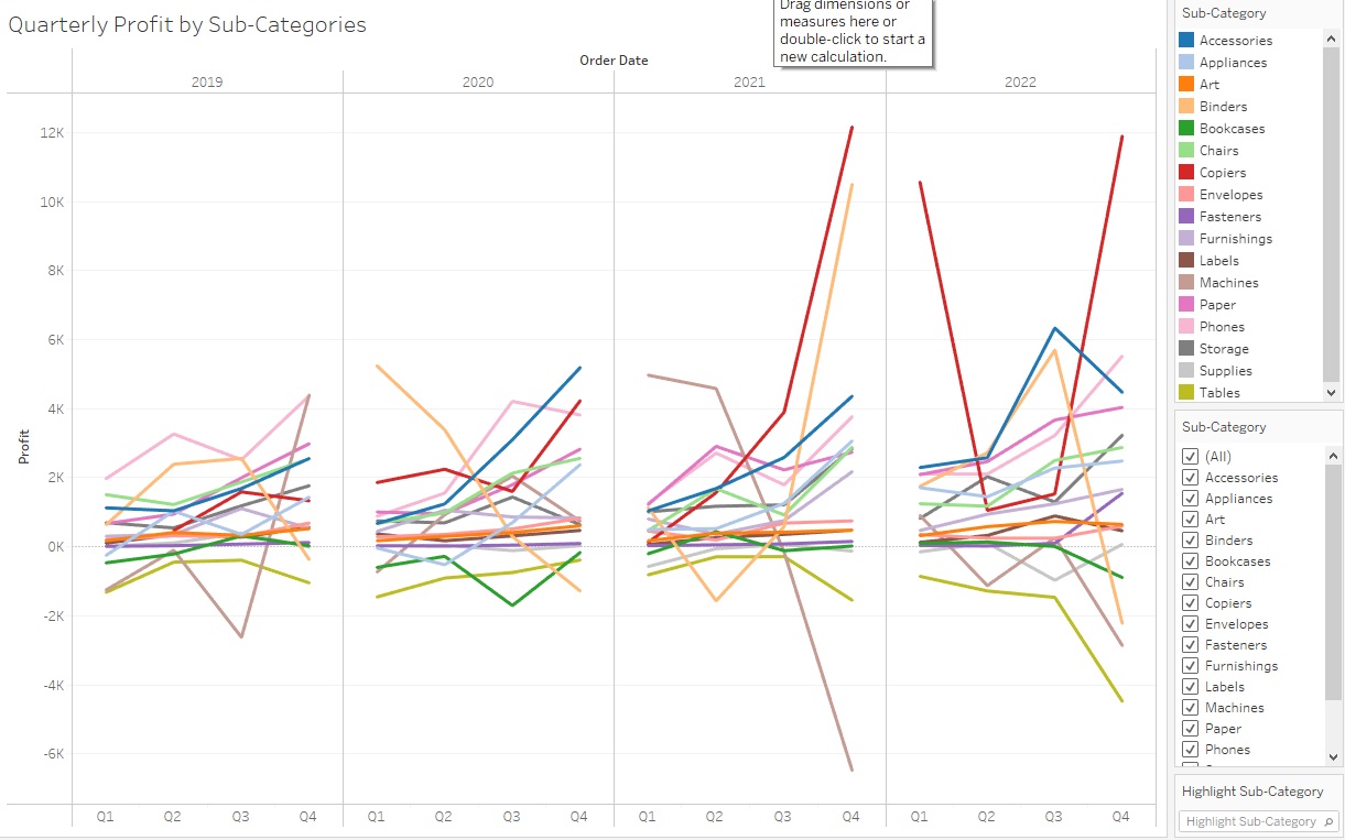
Right now it is showing the change in profit over time by years, but we can also change it to display more detail, such as by quarters. One way to do this is to click on the plus sign next to the Year (Order Date) pill next to Columns. This subdivides each year by its quarters.
You might see a pattern of end of year growth, cycling over each year, depending on what sub-categories you have selected.
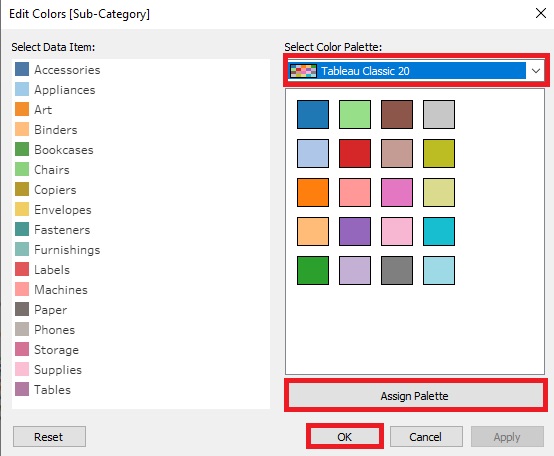
Finally, let’s say you didn’t like these colours. Click on the Colour Box and select Edit Colours.
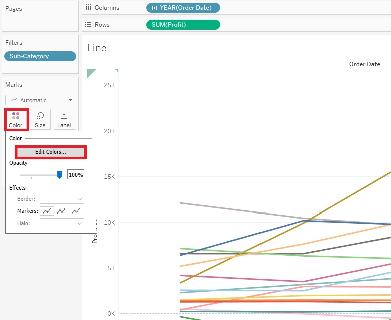
Here you can pick from a drop-down menu of various colour palettes. Select one you like and click on Assign Palette. Then click on OK.
Again, give your graph the title “Quarterly Profit by Sub-Categories”. Lovely!
Technique: Data Visualization | Tools: Tableau