Creating Scatter Plots
- Sometimes you have to pull data from multiple sources instead of having it all in one file. Let’s add a couple more datasets, but this time we’re going to match them up or join them together to create one large dataset to work from.
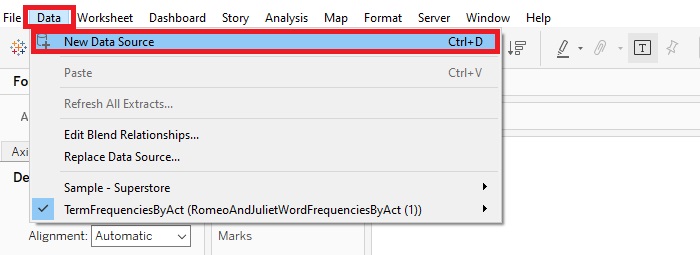
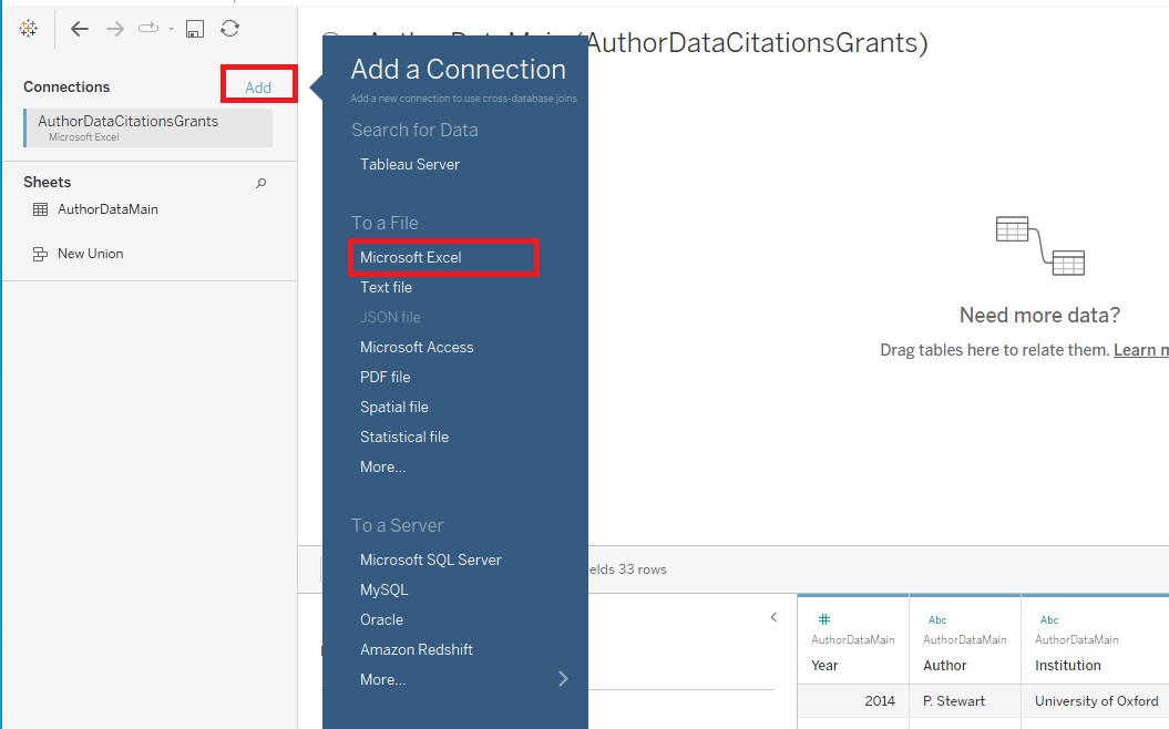
Go to the top Data Menu and select New Data Source.
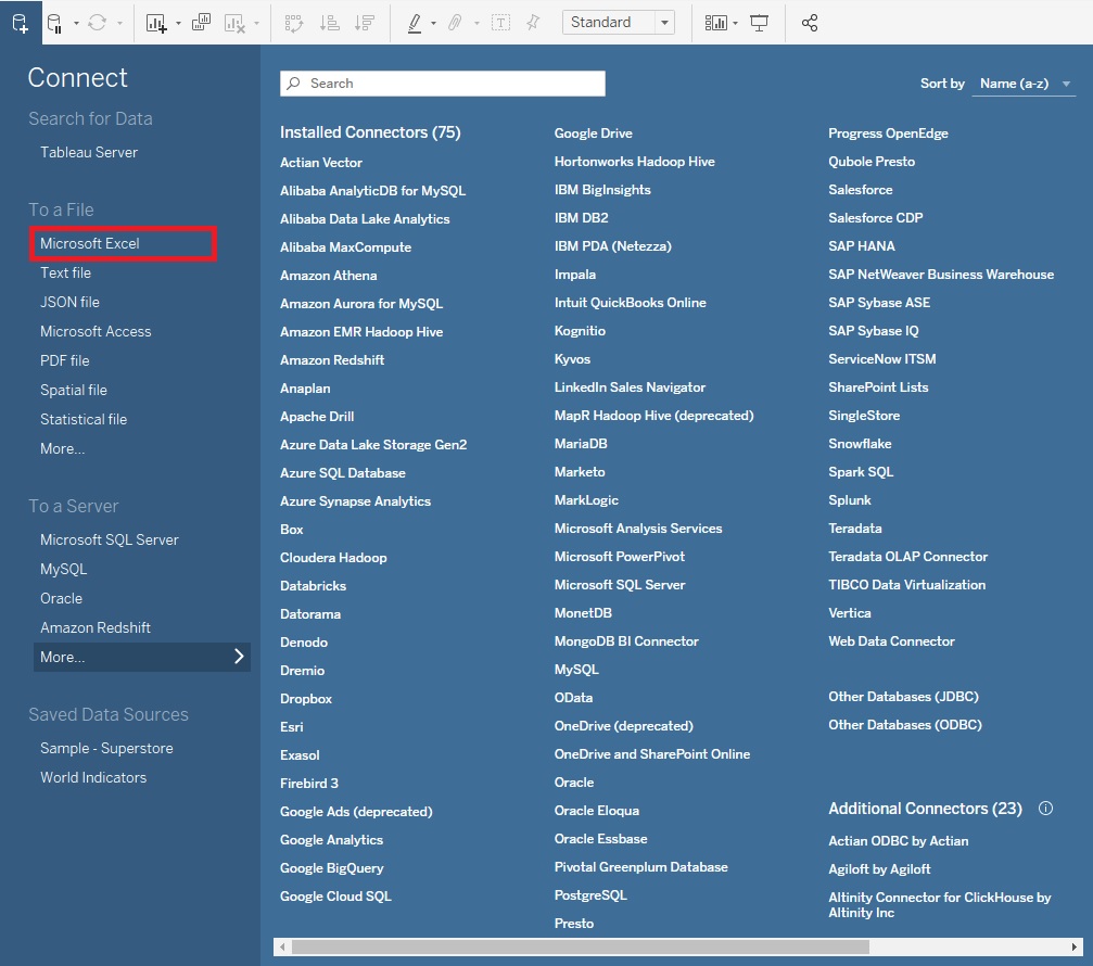
Select Microsoft Excel.
Choose AuthorDataCitationsGrants.xls.
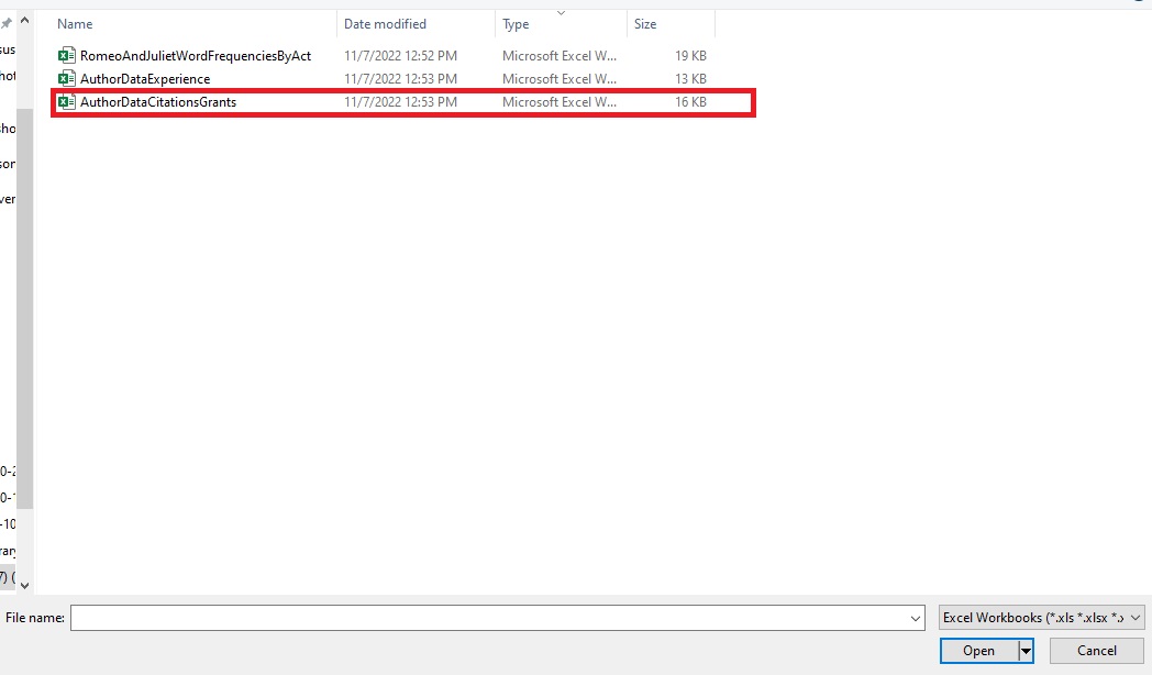
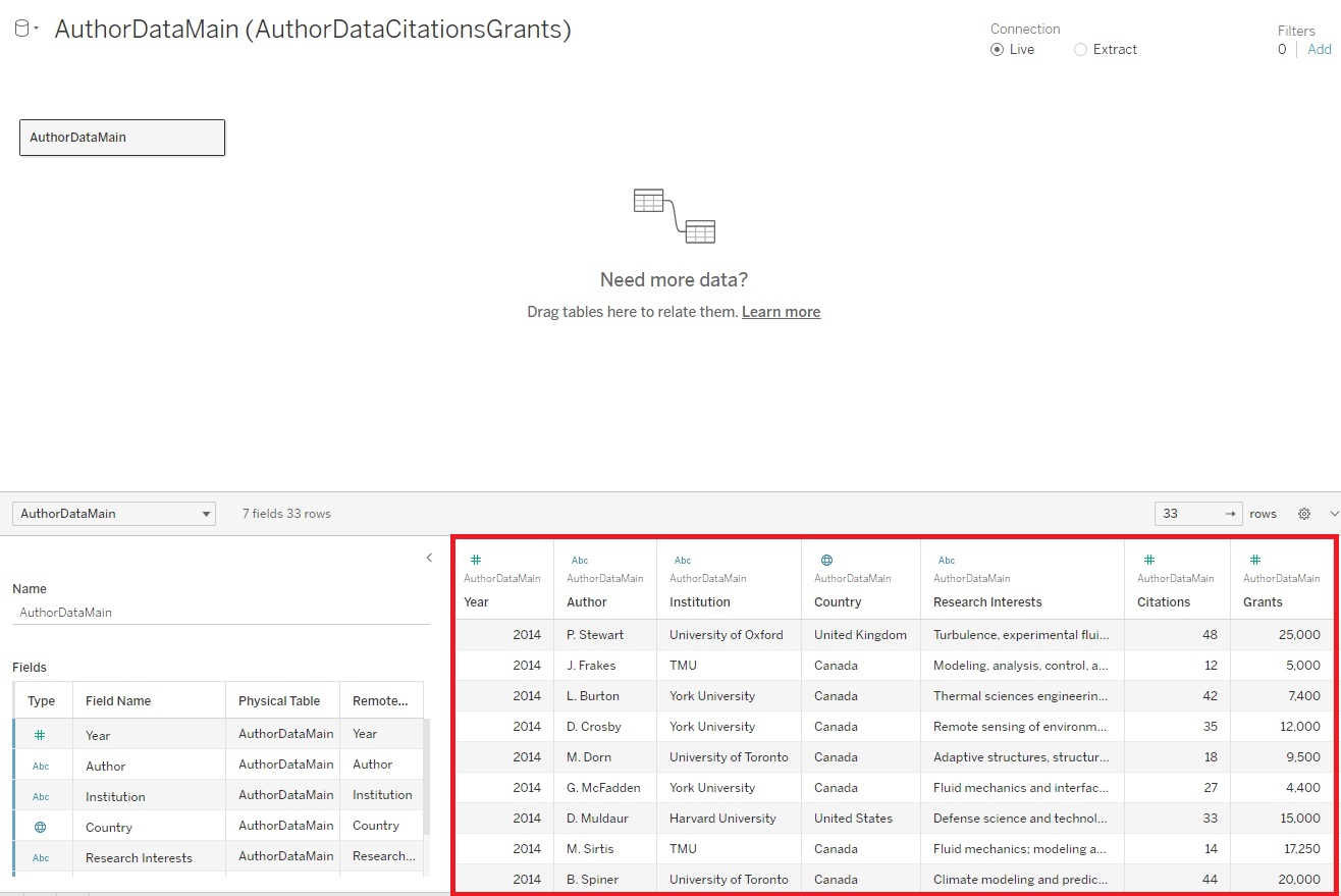
This is the dataset containing names of authors, their countries and institutions, research interests, how many citations they’ve received over a few years, and how much grant money they’ve received over a few years.
Now click on “Add” next to Connections on the top left to add a second dataset, select Microsoft Excel.
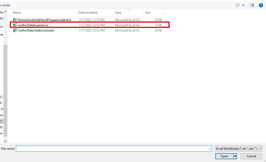
Then pick the AuthorDataExperience.xls file. This dataset has just author names along with how many years of experience they have as a researcher.
To relate or connect the two datasets, drag AuthorDataExperience under Sheets over to the section where it says, “Need more data?” (if you don’t see AuthorDataExperience under Sheets, make sure that AuthorDataExperience is selected under Connections).
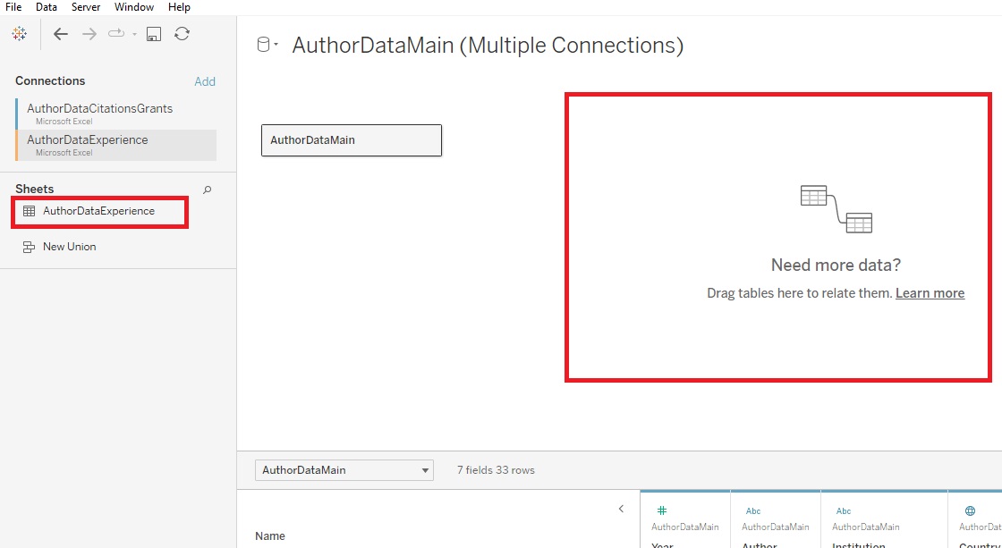
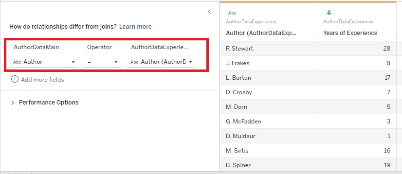
The bottom window shows us that the data has been related together based on a common column, Author. Now the years of experience data will also be associated with the appropriate authors additional data found in the first table. Tableau performs relates and joins on the fly, as needed. If these terms are new to you, see these articles on relationships and joins in the slides.
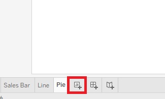
Then we can click on the New Worksheet icon at the bottom. Let’s rename this one to “Scatter Plot”.
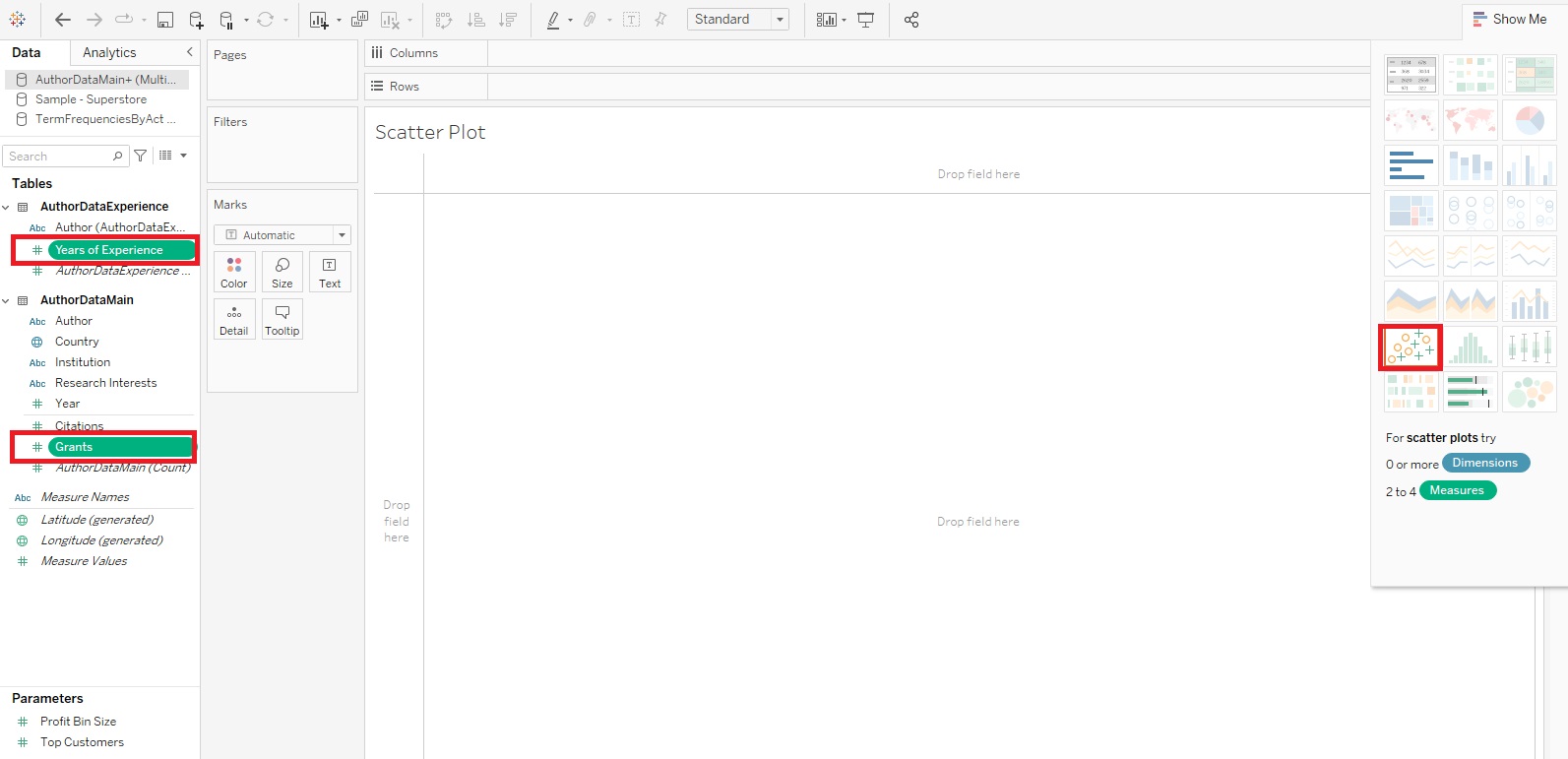
- Scatter Plots are great to use to identify if there is any relationship between numeric variables. Let’s see if there is a relationship between grants and years of experience.
Again, let’s create this scatterplot using the Show Me feature. This time, hold down the Control Key and click on Grants and Years of Experience (hold down the Command Key if on Mac), and then expand the Show Me tab. I see that Scatter Plot is one of the recommendations. Let’s pick it.
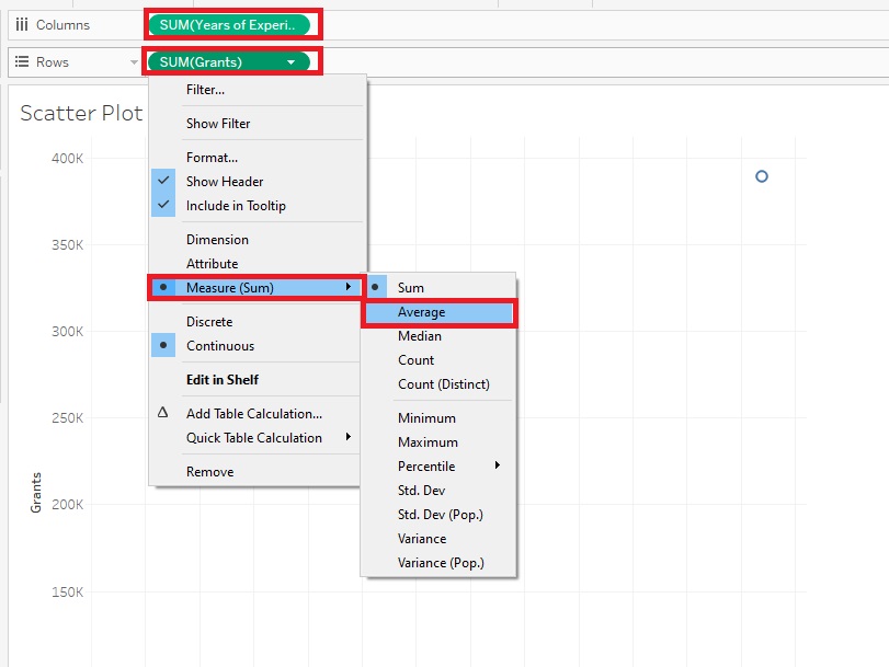
Doesn’t look like much yet, but let’s make some adjustments. First, instead of summing these variables, let’s take the averages. So right click on the Grants Pill next to Rows, select Measures (Sum) and then change it to Average. Do the same for the Years of Experience Pill next to Columns.
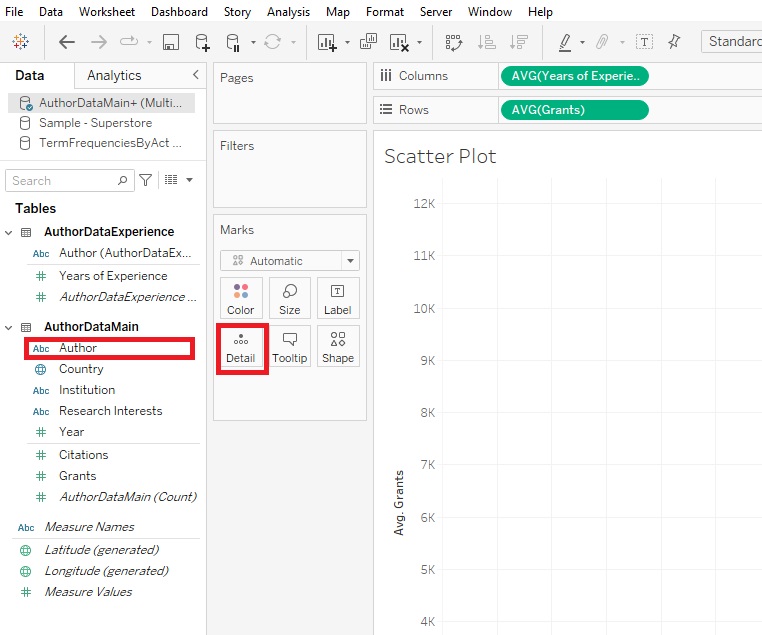
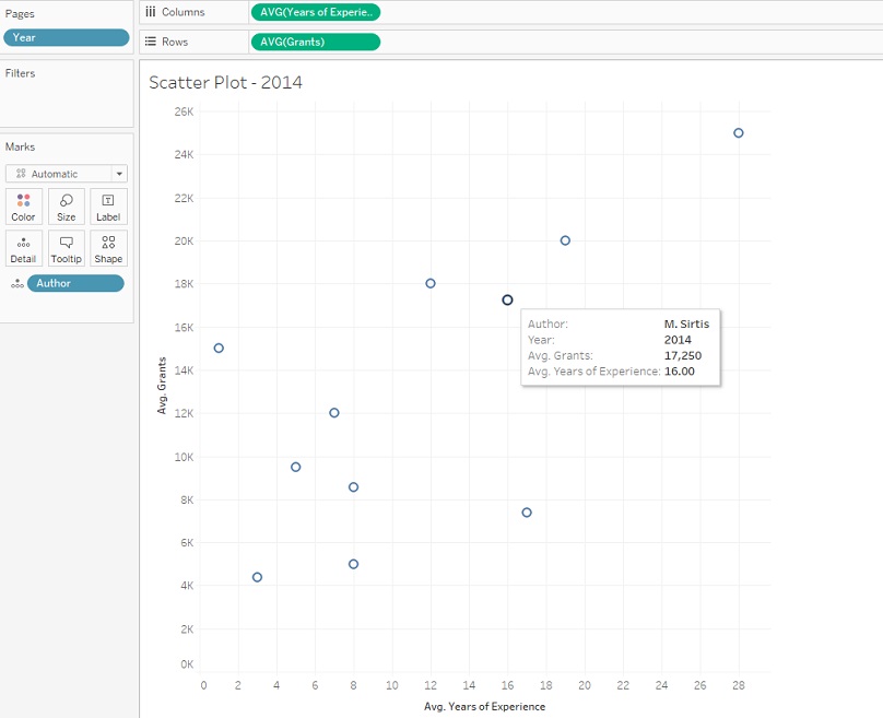
Our next problem is that it is plotting just one x/y pair – the averages of the whole dataset. We need to plot the points either for each Author, Country, or Institution. Let’s do it by Author. This is where that Details box comes up. If you drag Author over it, it explodes out the aggregation to plot it by Author.
When you hover over a point, you can see the details.
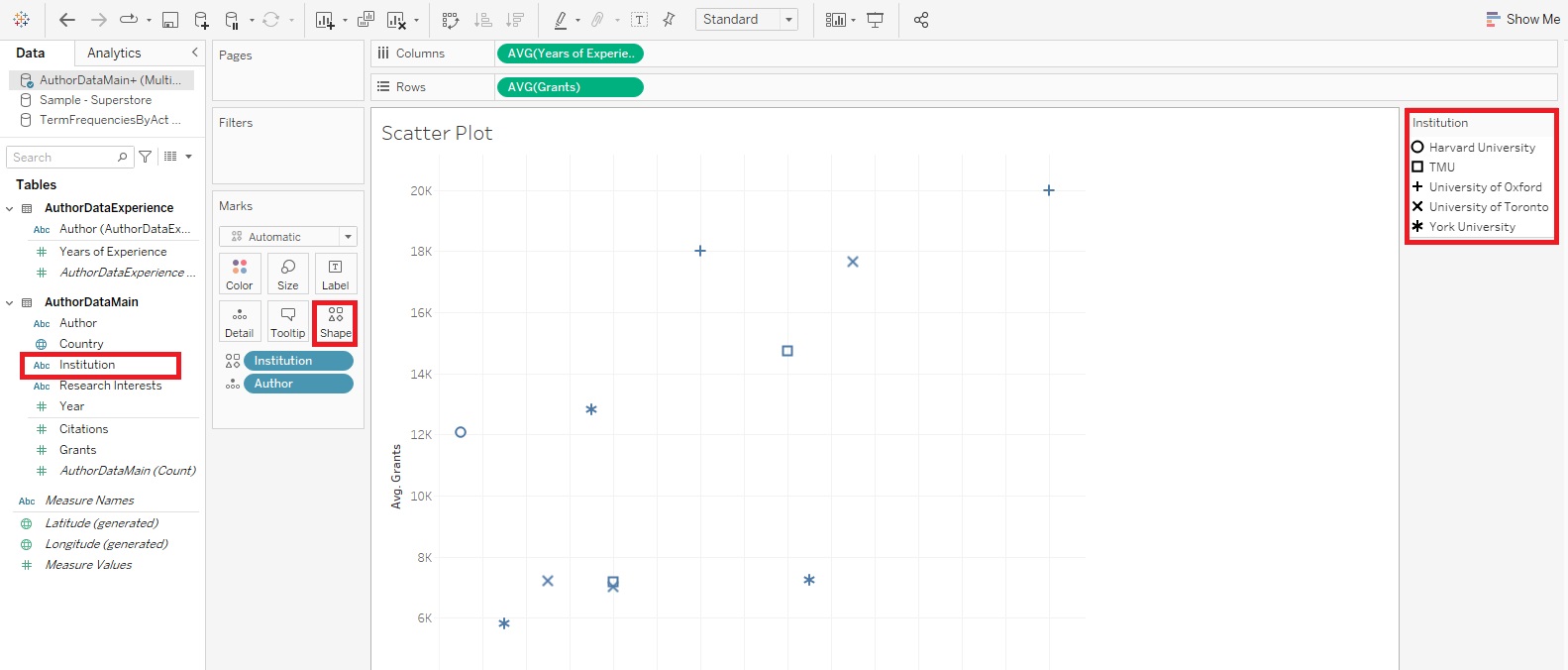
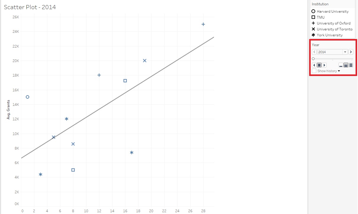
You may notice there is now also another box on the Marks card called Shape. If you want to add another categorical variable to your Scatter Plot, you could do so by using different shapes to represent different categories. Drag Institution on to the Shape box. Now you should see that there is a legend on the right, using different shapes for different institutions.
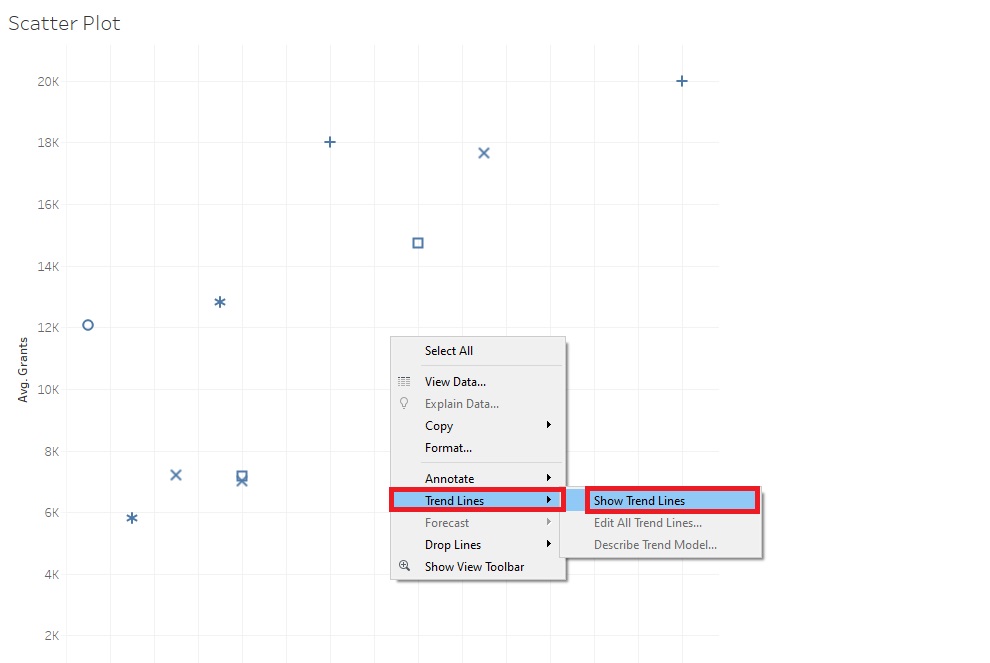
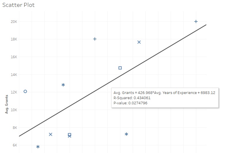
If you want to add trend lines in Tableau, right-click in the centre and select Trend Lines -> Show Trend Lines.
Hovering over the lines also gives you statistical information, such as P-values.
Finally, one interesting feature of Tableau is to create not just one visualization, but a series of them, using the Pages shelf. Drag Year on to the Pages shelf.
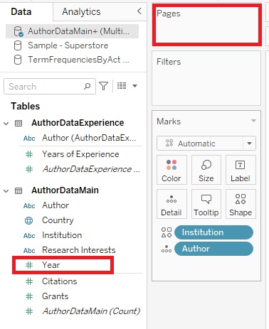
Now you should see some controls on the right. The user can scroll through three different Scatter Plots, one for each year, or they can click on the Play button to have it animate through the years.
Technique: Data Visualization | Tools: Tableau