Creating Dashboards
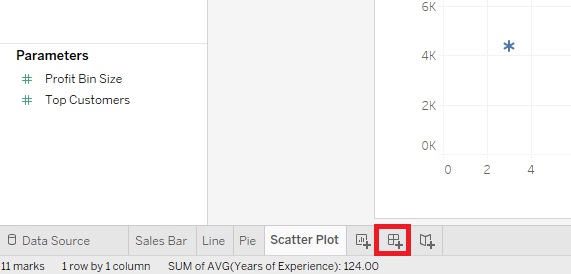
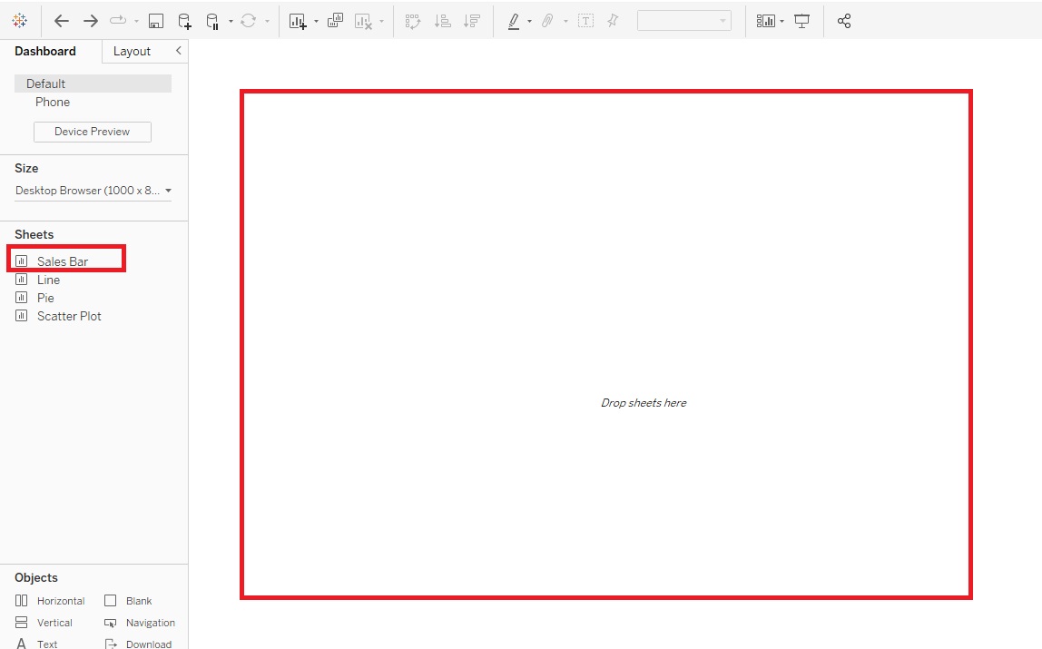
Now so far we’ve been creating visualizations within worksheets. But you can also create Dashboards that combine a number of visualizations together to present a more complex story than a single visualization can show. So for example, let us click on the Create New Dashboard icon at the bottom, next to the New Worksheet icon.
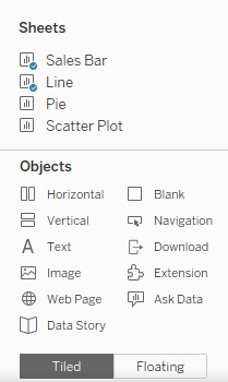
You then can drag and drop various sheets to layout a dashboard. You can see it really helps to label your sheets. You can also drag other Objects (bottom left), such as text or images to create your dashboard. So let’s create a Dashboard showing Sales and Profit by Sub-Category and being able to filter by State/Province.
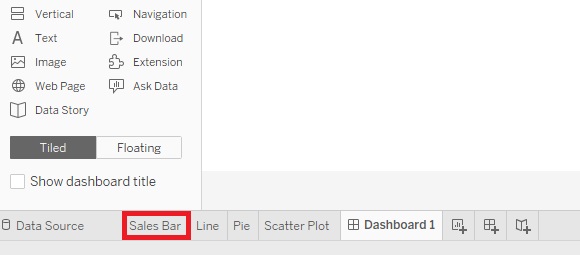
Before we start building our dashboard, I just want to adjust the Sales Bar sheet slightly. Go to it by clicking on its tab at the bottom.
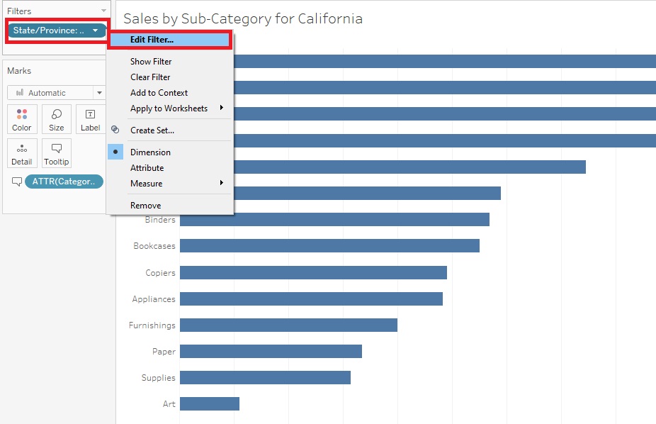
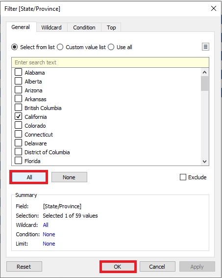
Right click on the State/Province filter, and select Edit Filter…
Select All and click on OK.
Then right click the State/Province filter again, but this time select Show Filter.
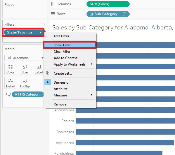
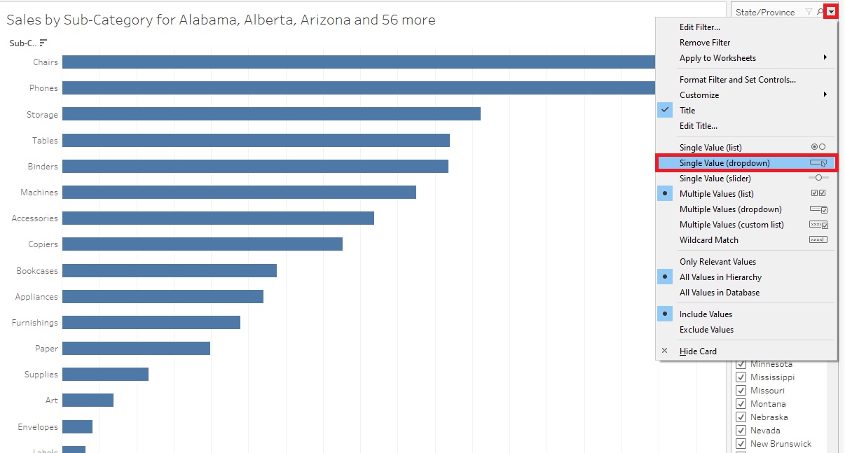
Now you can see the filters show up on the right. Hover over the legend until you see a small arrow. Click on it to get the drop-down menu, then select Single Value (dropdown). Now we have a State/Province filter that the reader can use to filter the graph. We’re going to take this filter and use it in our Dashboard to apply to all the graphs we add into the Dashboard.
So let’s go back to our Dashboard by clicking on the Dashboard 1 tab at the bottom.
First, let’s drag the Sales Bar sheet into the Dashboard.
Then drag the Line sheet underneath and select a few categories of interest.
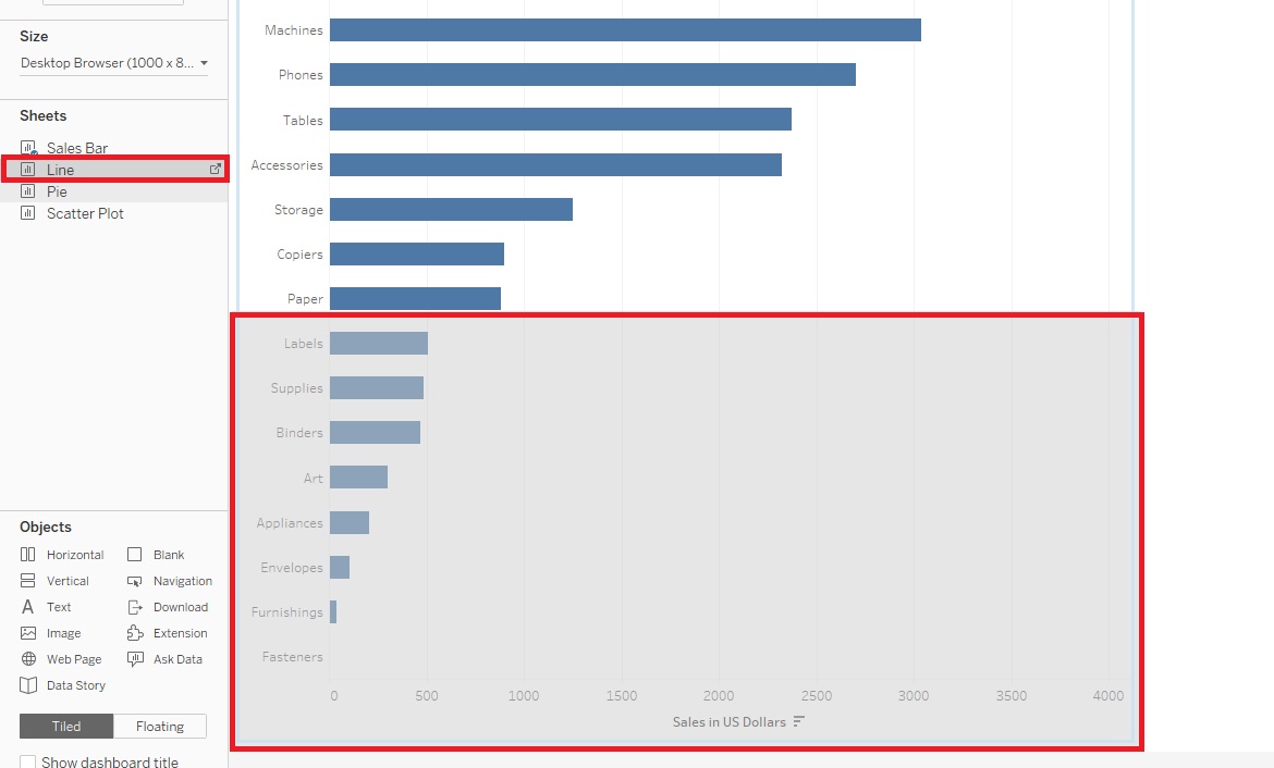
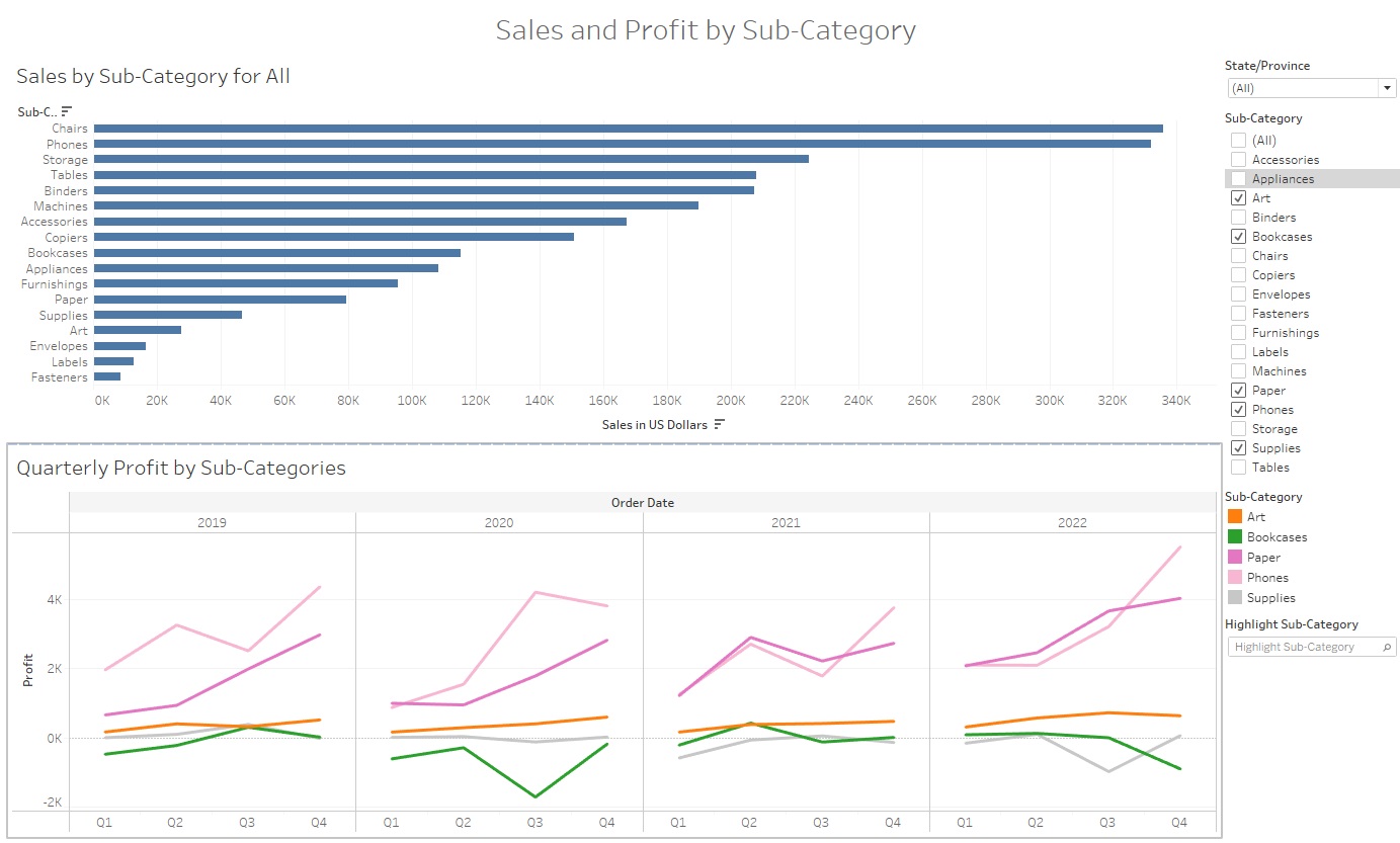
Your Dashboard should now look like this.
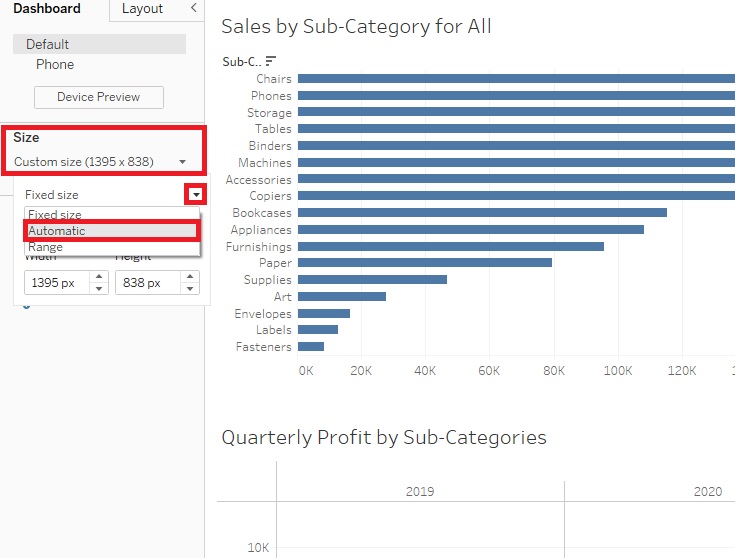
Our Dashboard seems a bit squished, so to improve how it displays, under Size on the left, change Fixed size to Automatic.
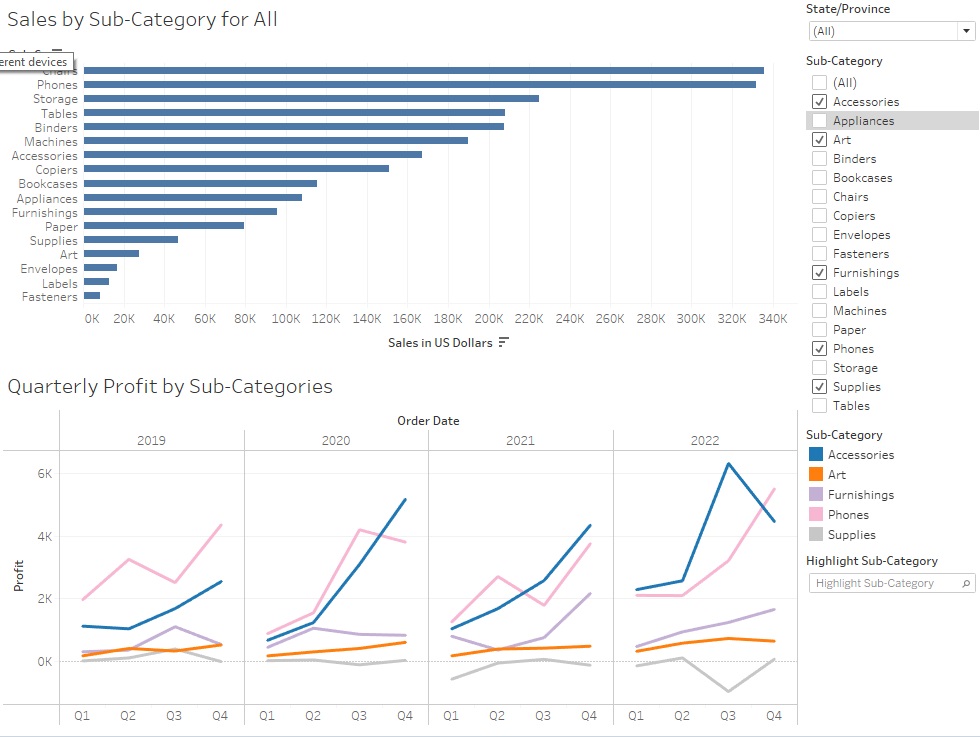
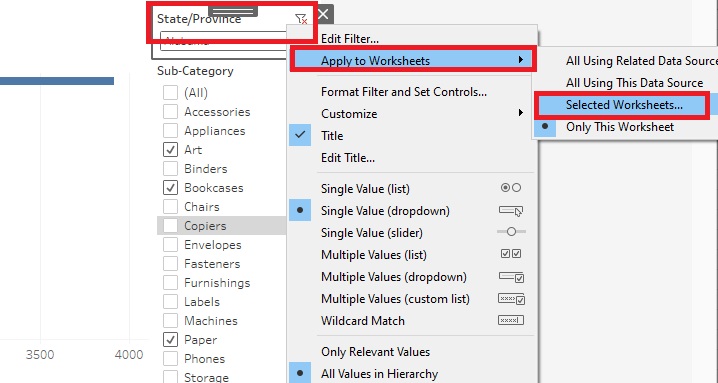
To make the filter for the Sales sheet apply to both, right click on the title of the filter, State/Province, select Apply to Worksheets, and then pick Selected Worksheets…
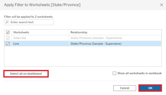
Click on Select all on dashboard in the pop-up window, and then click on OK. Now you’ll see that when you select one State/Province, both graphs refer to that State/Province. End up picking all States/Provinces.
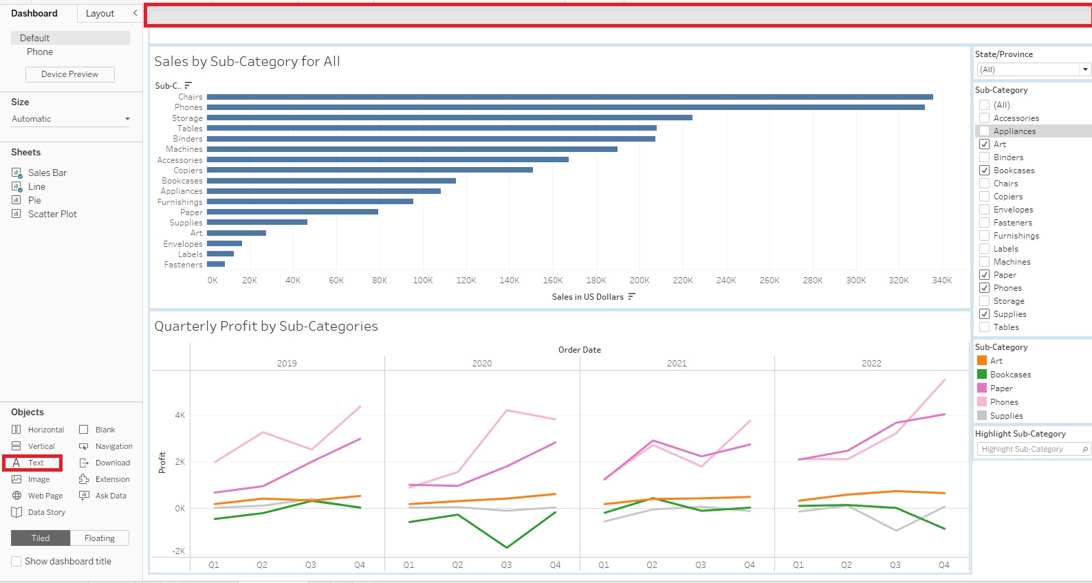
Let’s add a title to our Dashboard. Drag Text from under Objects to the top of the Dashboard. As you drag, make sure the grey rectangle is narrow, spanning the top of the whole Dashboard.
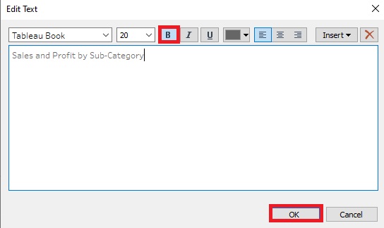
Make the title “Sales and Profit by Sub-Category”, set the font size to 20 and make it bold. Resize the height of the title to finish it off.
Your Dashboard should now look like this.
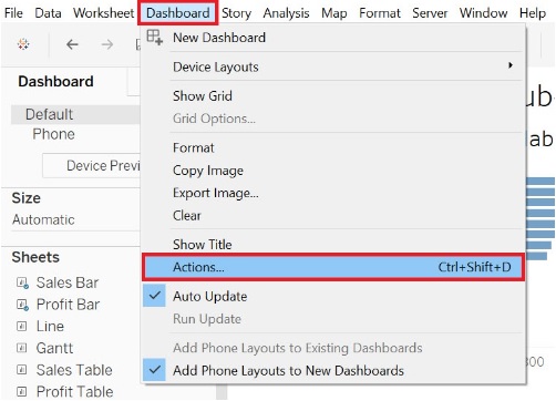
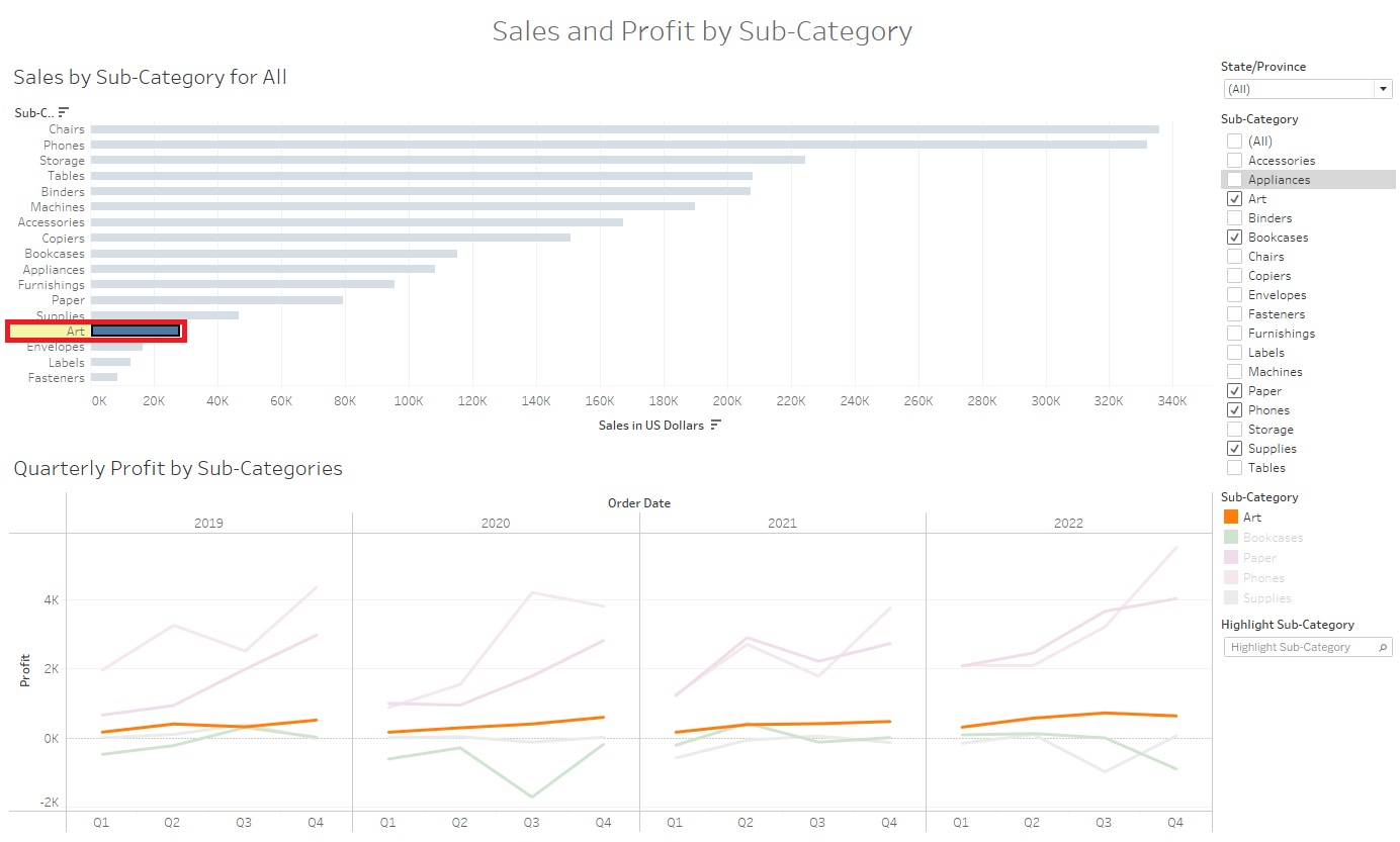
Finally, let’s add a Dashboard Action, where if you click on a Sub-Category in one of the graphs, it’ll highlight it in both to help the reader link the data together visually. From the Dashboard menu at the top, select Actions…
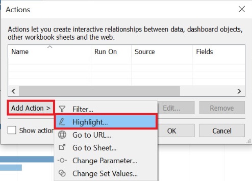
Click on Add Action and select Highlight… From this window, you could customize the settings if you wish to specify which sheets would be affected, and when the action will occur, for example.
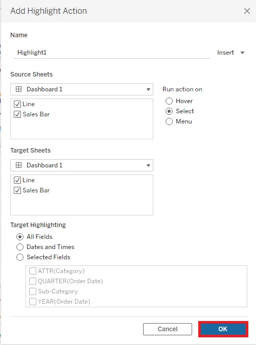
Let’s keep the defaults and click on OK. Then click OK again.
Now if you select a Sub-Category in one graph, such as the Arts Sub-Category in the Bar Graph, it should highlight it in the second graph (highlighting the line). Click it again to deselect it.
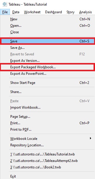
Once you’ve created some visualizations and Dashboards, your last steps are to save and publish them. If you’re working on some visualizations, like we have here, you can save work-in-progress as a Tableau Workbook file. Go to the File menu and click on Save. Give it a name and select where you want to save the file. (Note: If you do this, it doesn’t save the underlying data, so you have keep the data file(s) and workbook together). Or you can select Export Packaged Workbook… (also from the File menu). Then you could share that file with others who have Tableau (and this time it includes the data). In both cases, you can then come back to revisit your work later by reopening it in Tableau Desktop.
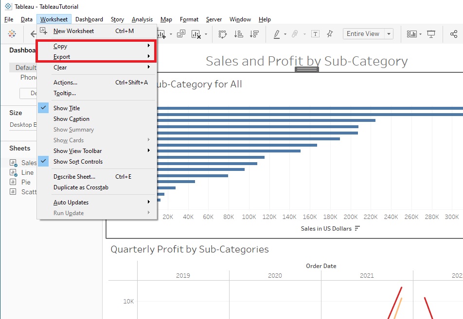
If you want to export one of your worksheets to an image you can use in a report or article, you can do so from the Worksheet menu. There are options to either Export it as an image or Copy it and paste it into a document or image editing software to work with it further. You can do the same thing for your whole Dashboard or Story from the Dashboard or Story menu respectively.
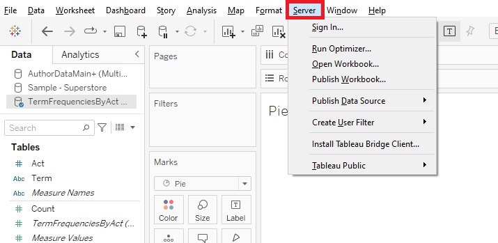
As our Dashboard and visualizations can also be interactive, there may be times when you want to publish them to the web so that your users can view them. Your free option is to create a Tableau Public account and publish it there using that option in the Server menu (but note it is public; however, you can adjust the settings, if you don’t want readers to download the underlying data and/or workbook). There are also pay options (Tableau Cloud and Tableau Server), if you want to be able to limit permissions on who can view your visualizations or to publish to your own server; use the Publish Workbook option from the Server menu to access these options.
If you also go to Tableau Public Viz of the Day, you’ll see Tableau visualizations to provide inspiration. If there’s something you’re interested in, you can click on the Download icon (a small box with an arrow pointing down) at the bottom to see if you can download the workbook. You can also click on the Share icon (three staggered dots connected by lines) to share the visualization.
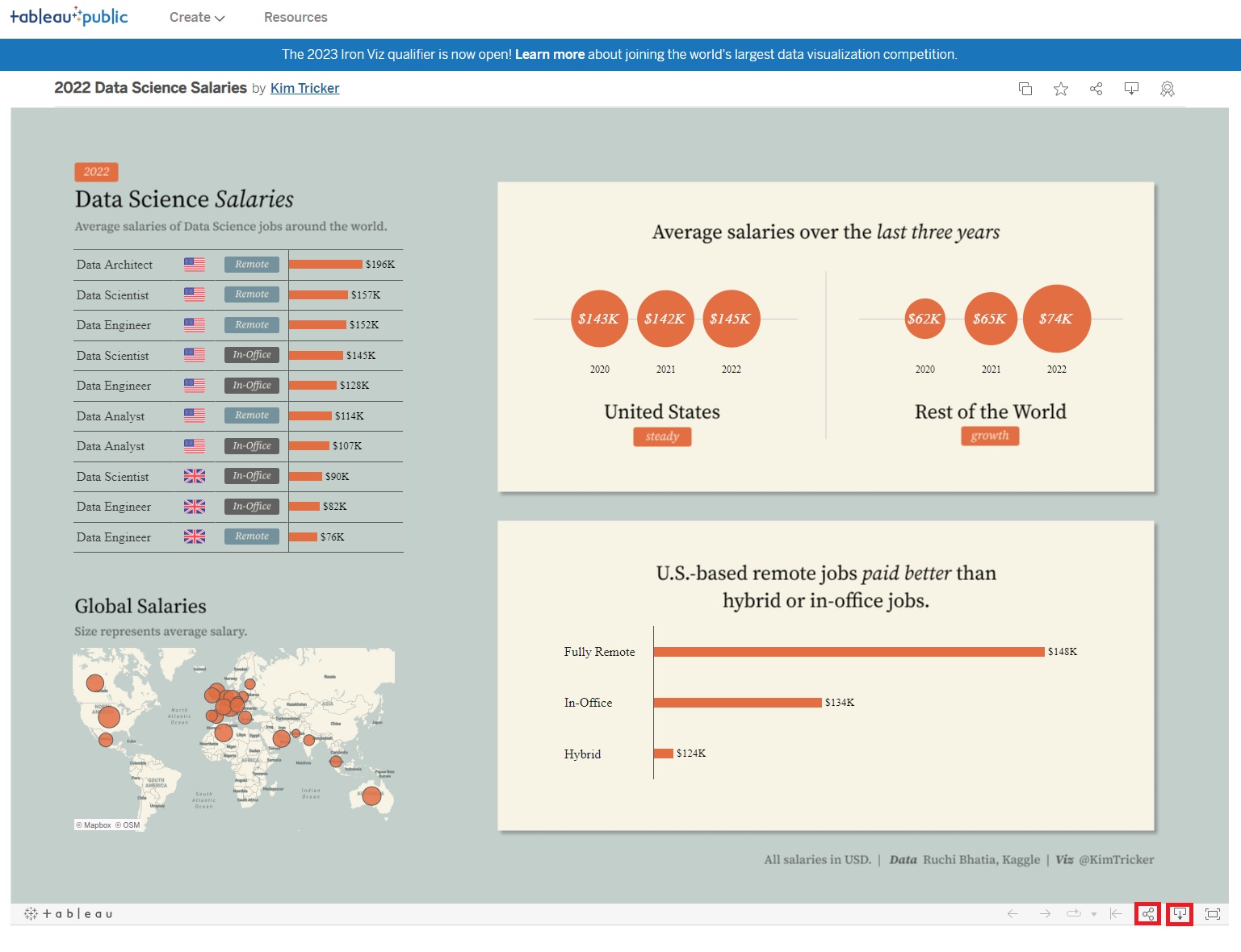
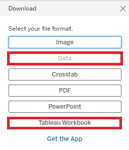
When downloading the visualization, you can click Data to download the workbook used for this visualization (if the Data button is not greyed out). You can then open the workbook to see how the author created this visualization.
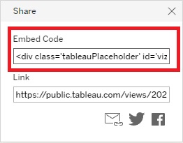
When sharing the visualization, you can access its Embed Code. If you want to embed your own visualizations into your own website, you have to first upload them to Tableau Public, then click on the share icon to get the embed code to add to your website’s HTML code.
And that’s it!
Technique: Data Visualization | Tools: Tableau