Creating Bar Graphs
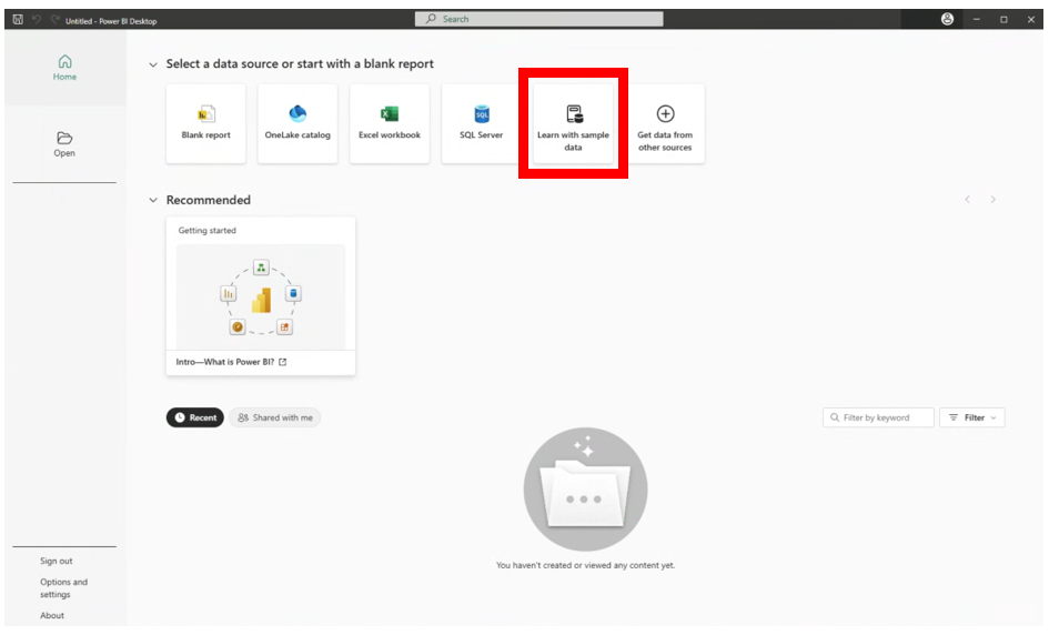
This first screen gives you an opportunity to load your data from many different file types/formats. But we are going to start with a sample dataset from Power BI first. Click on the Learn with sample data tab.
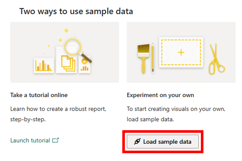
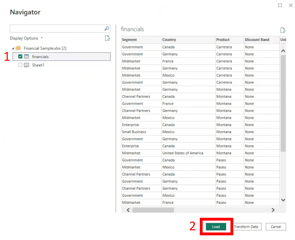
In the pop-up, select Load sample data (Power BI may take a few seconds to connect). Select financials on the left (to select that sheet of the data) and then click on the Load button at the bottom. It is just some standard business data about sales of different products. We’ll talk more about loading in our own data later.
Let’s look around first before we dive in. On the far right you can see the Data panel. If you expand financials, you can see all the columns or variables from the dataset we just loaded in. There are symbols next to the variables to help signal if Power BI understands their data type. For example, it often understands the variable to be numeric if there’s a little Sigma (Σ) sign to the left of it (saying it will sum this variable as a default), or for text there’s no symbol, or for a date field there’s a little calendar to the left of it.
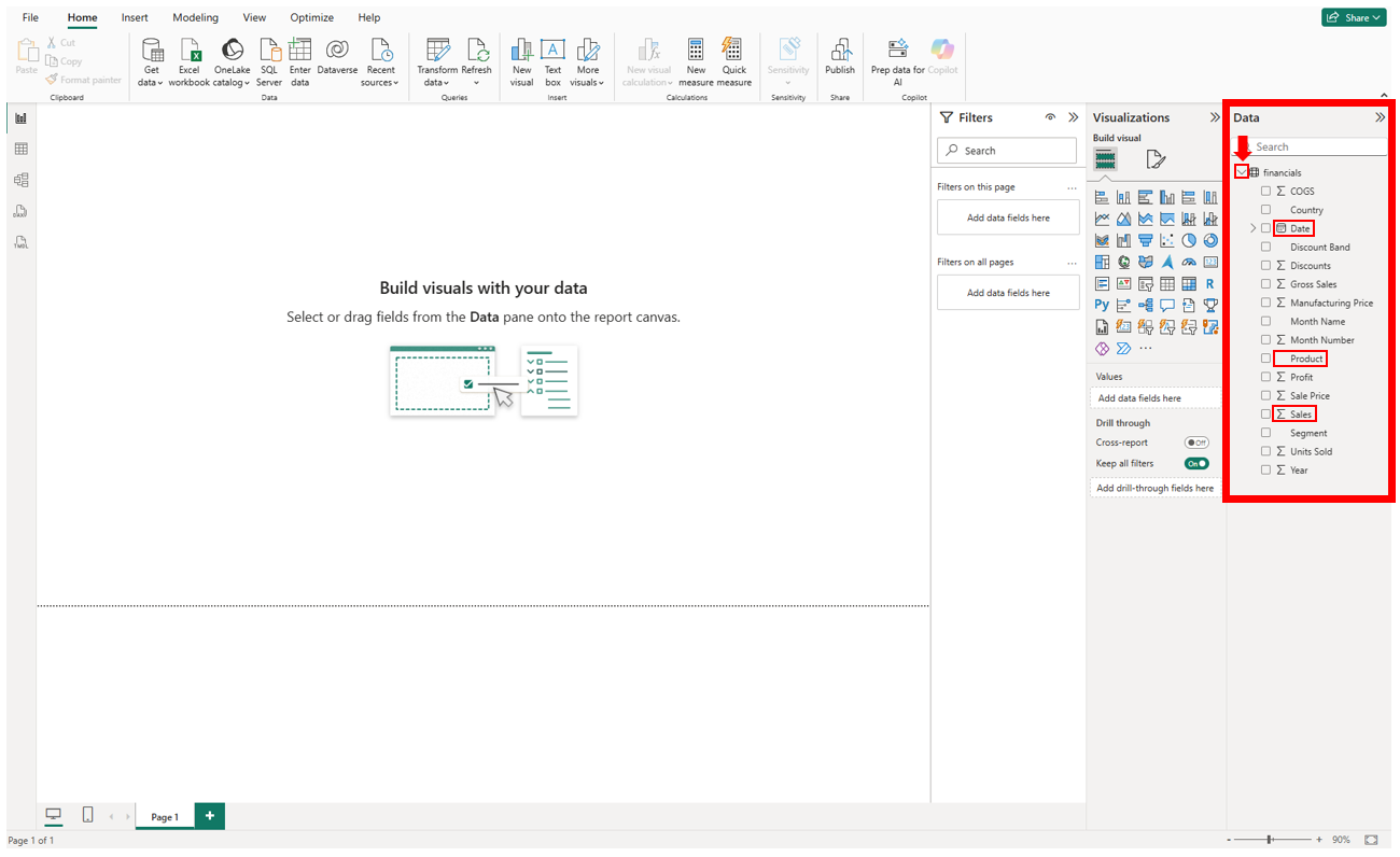
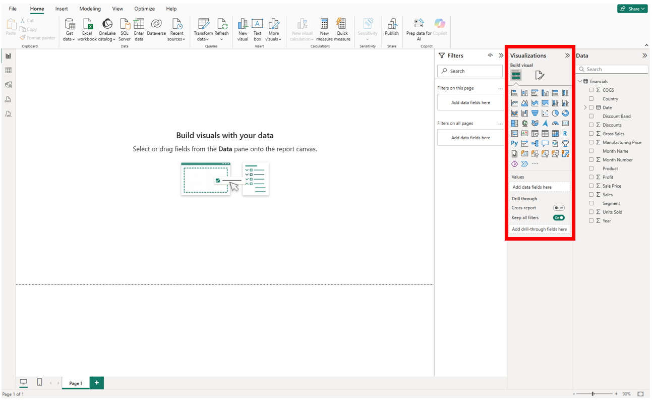
To the left of the Data panel is the Visualizations panel, which we will use to build our visualizations, and adjust the formatting of them.
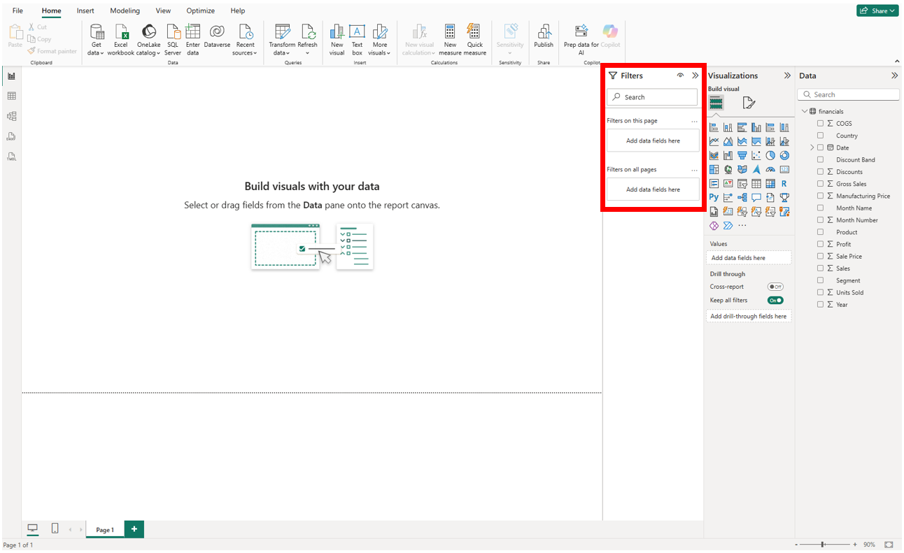
To the left of that is a Filters panel, which we can use to filter our data. We will look at all of these panels as we work with the tool.
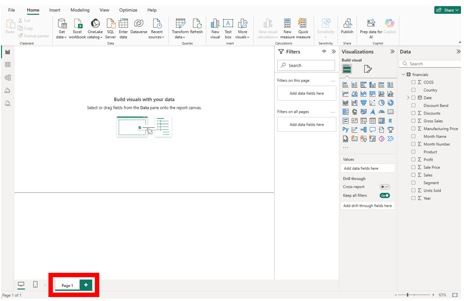
At the bottom, you’ll see a tab that says Page 1. In Power BI, you create ‘report’ pages that can have one or more visualizations displayed. These are similar to Excel sheets.
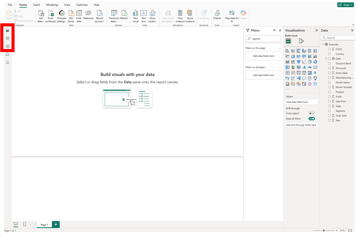
On the far left, there are a few icons that change the view. The default view is the Report view where you build your visuals. The icon looks like a bar graph. If you click on the icon below that, we switch to the Table view, where you can see the data in a spreadsheet format. If you click on the icon below that, we switch to the Model view. If we had loaded in multiple datasets, we could tell Power BI how they were connected to each other through common columns, etc. We will take a look at this view a bit later, when discussing database relationships. For now, let’s go back to the Report view, by clicking on its bar graph icon on the left.
Okay, we’ve loaded in some data about a fictional company’s sales, so let’s start by creating some visualizations that are used to make comparisons. Let’s start by making a simple bar graph. To keep track of all the visualizations we’re going to create, let’s rename our pages as we go. Right-click on Page 1 at the bottom, select Rename, and give it the name “Sales Bar” and press Enter. You don’t need to only have one visualization per page, and normally, you don’t – you normally lay out a page with a few visualizations to tell a story. But for now, to simplify things, we will keep it to one visualization per page.

We’re going to create a horizontal bar graph to compare the sales for different products, with products along the y-axis and sales along the x-axis. Bar graphs are great for comparing categories, such as products. So, select the horizontal stacked bar chart icon from the Visualizations panel (the top left icon). (Note: If you hover over a visual, it tells you its name). Expand the box by dragging the bottom right corner to make it fit the page.
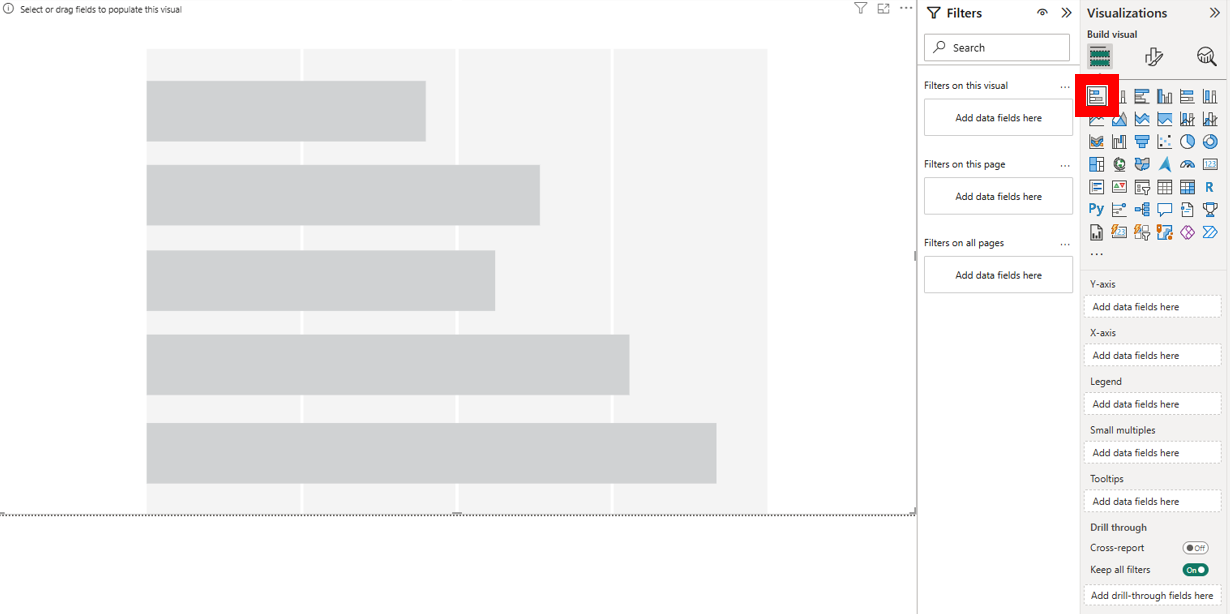
Next, drag the Sales variable from the Data panel to the X-axis, Add data fields here box on the Visualizations panel. Then drag the Product variable from the Data panel to the Y-axis, Add data fields here box on the Visualizations panel.
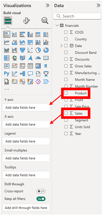
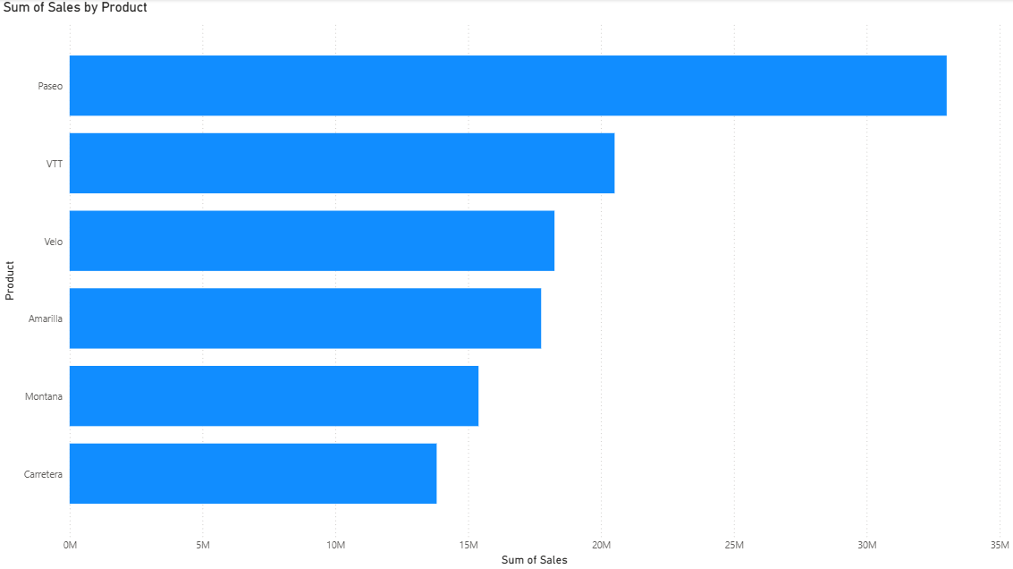
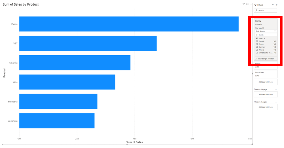
You can see that when we dragged Sales, it automatically summarized it by adding up all the sales values for each product. Right now, it is showing data combined for all of the countries for this global company, but let’s say we just want it to show one of them. We can use the Filters panel to filter just this visual, all visuals on this page, or all visuals on all pages, by dragging our variable into the appropriate box that says Add data fields here. For example, let’s filter by country for this visual by dragging the Country variable from the Data panel over to the Filters panel, to the Add data fields here under the Filters on this visual heading. You should now see a list of countries we can choose from to filter. Let’s select Canada.
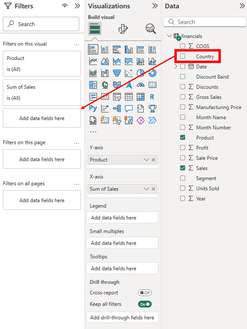
Now we have a bar graph showing the Sales by Product for Canada.
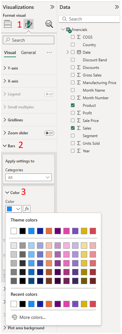
Next let’s look at how we can start formatting our visual. On the Visualizations panel, you will see 3 icons at the top, just above the available visuals. We’ve been looking at the Add data to your visual section (left icon), with the different visualizations to choose from. If we click on the next icon to the right, we are in the Format your visual section. Here, for example, we can change the colour of the bars. Click on the Format your visual tab and expand Bars and choose a colour you like.
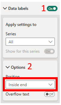
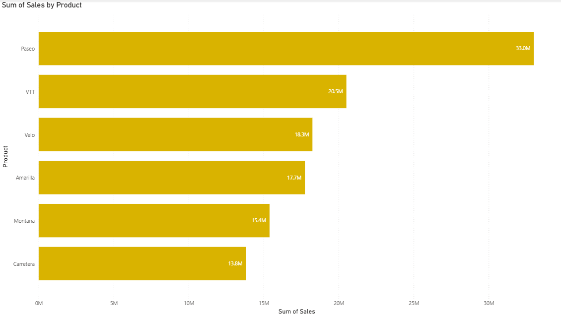
The Data labels option allows to create and customize labels. We can, for example, turn on Data labels using the toggle switch. Expand Data labels, and then expand Options underneath. We can also adjust the position. For example, using the dropdown menu for Position, which currently says Auto, change it to Inside end, so that the values are labeled within the bar, instead of next to the bar. This provides a cleaner look. But in this case, we have an axis to help users read the bar values, so let’s keep the show Data labels toggled off for now for a simpler design.
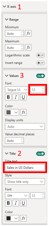
As you can see, there are options to customize a lot of parts of the visualization. You can also customize the axes. For example, expand the X-axis. Here you can make changes to your axis, such as the range of values. In our case, we’re fine to keep it as Auto. But we can change the X-axis label, though. Let’s change it to say “Sales in US Dollars”. In the X-axis section, expand the Title section underneath and change the title text from Auto to “Sales in US Dollars”. You should see your changes applied to the x-axis. Also expand Values and make the axis labels larger, by changing the font to 12pt.
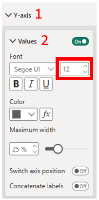
We can also make the Product name labels larger. Expand the Y-axis, and then expand Values. Change the font to 12 pt.
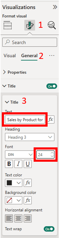
We can give our visualization a more meaningful title. So far, we’ve been making adjustments in the Visual tab. But if you go to the General tab, we can expand Title. For the Text, we can put “Sales by Product for Canada“. We can also change the font to make it a bit larger – say 24 pt. Be careful when making this change, as the Title was originally dynamic based on what data was selected. If you adjust the data in the visual later, the title won’t change automatically.
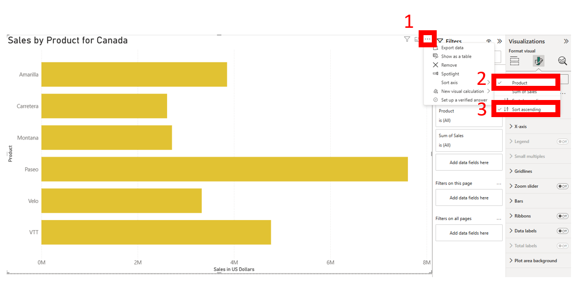
Finally, right now the bars are sorted by sales. This is good so that you can easily see the top and bottom products in terms of sales. But you can change the sort order. For example, perhaps you want to sort it alphabetically by product name, to make it easier to find a product in the list. Click on the three dots at the top right of the visual. Then select Sort Axis and select Product. Go back to the Sort Axis option and change it to Sort Ascending. Now it is in alphabetical order by Product name. Now we’re done our first visualization!
Technique: Data Visualization | Tools: Power BI | Data Format: Statistics