Creating Line Graphs
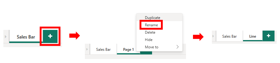
Okay, let’s create a new visualization. We need a new page. Click on the New page (+)icon at the bottom of the screen. Rename this one to “Line”.
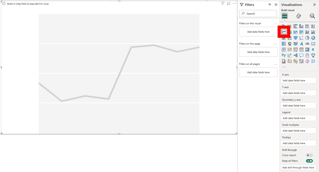
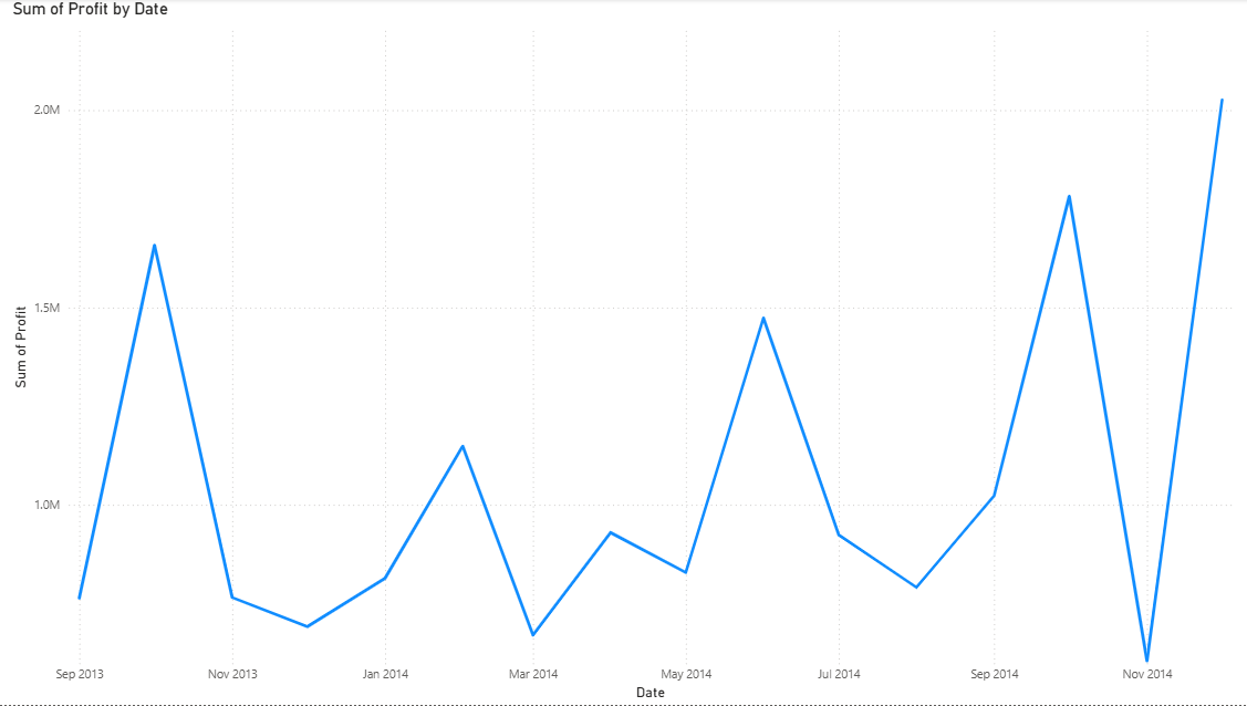
We’re going to create a line graph now, which is great to show trends over time. We’re going to create a line graph of change in total profit over time. Select the Line chart visual from the Visualizations pane. Drag the corner to make it fit the page.
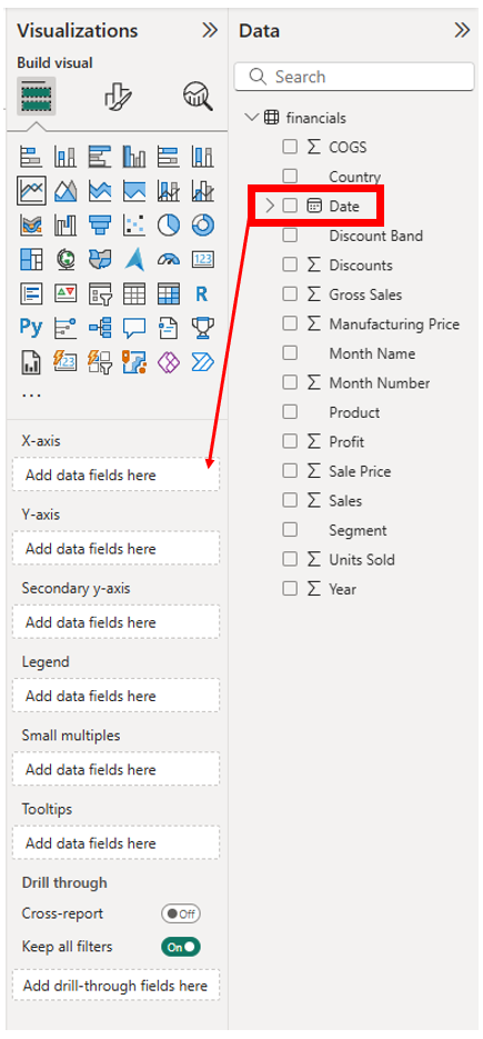
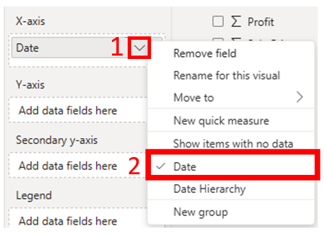
Next, drag the Date variable from the Data panel to the X-axis, Add data fields here box on the Visualizations panel. Click on the drop-down arrow next to Date, and select Date, instead of Date Hierarchy. The Date Hierarchy features allows the user to drill-down to different levels, like quarters or months, but the way the data is then grouped can be very misleading. I don’t think this is a good feature, so I would suggest you disable it by having Power BI not use hierarchies.
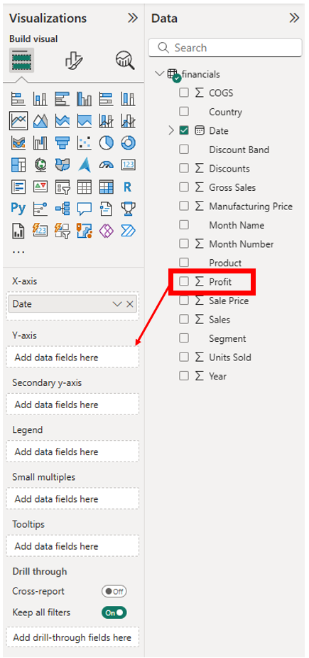
Next drag the Profit variable from the Data panel to the Y-axis, Add data fields here box on the Visualizations panel.
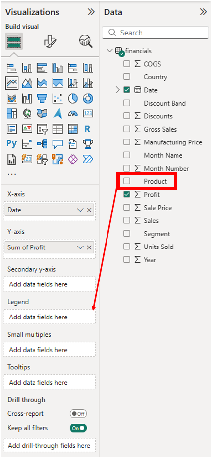
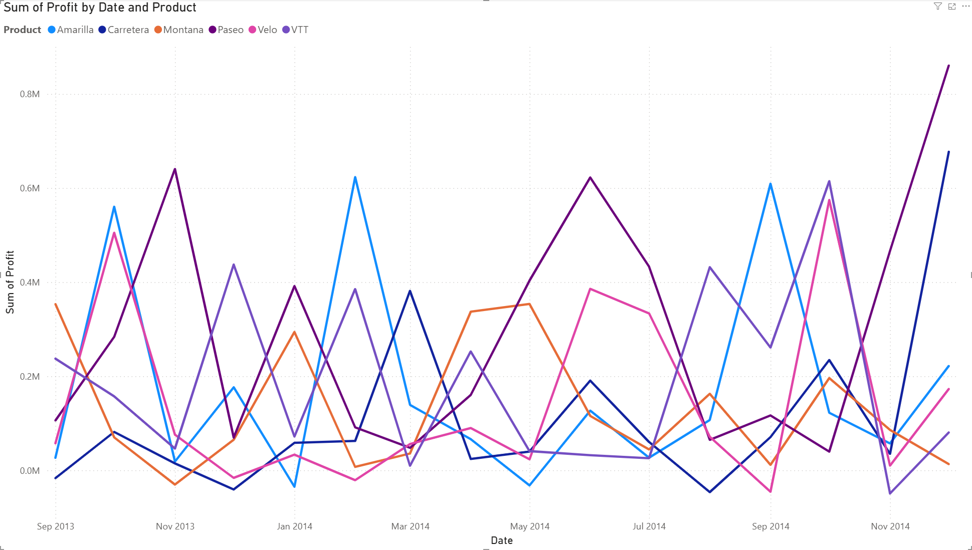
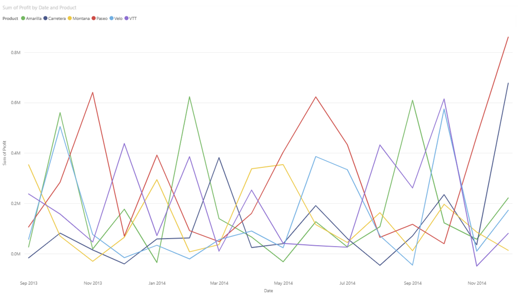
It might be useful to see this graph broken down by Products – so basically adding a 3rd variable. The Product variable is a categorical variable, so we can assign different coloured lines for each category to display this information on the graph. To do this in Power BI, you drag Product from the Data panel to the Legend, Add data fields here box on the Visualization panel. Power BI has assigned a qualitative colour palette scheme, assigning different colours to represent our products, but this could make our graph a bit overwhelming as there are a fair few number of products.
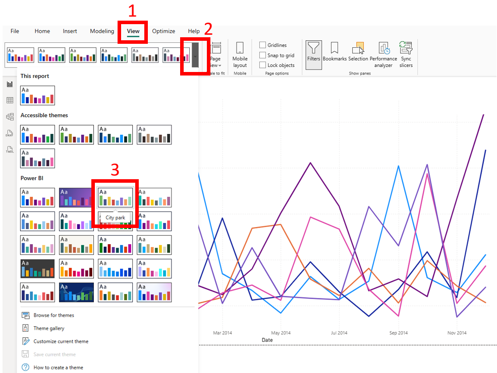
Let’s say you didn’t like these colours for the lines. Go to the View menu at the top (Ribbon: File, Home, Insert, etc.). On the left, you should see various colour themes you can apply to your visual. If you hover over the theme, some have “Accessible” in the title, so in theory they should be good colour choices to use if you might have colour blindness in your audience. However, in practice, some of these accessible themes seem to have colours that are hard to distinguish between, even for those without colour blindness. Using a colour blind simulator, such as Coblis, can more reliably help you with these decisions. Pick a theme to apply it.
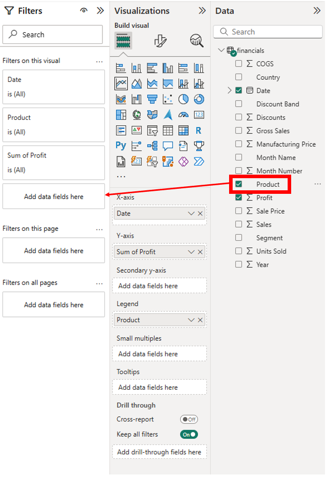
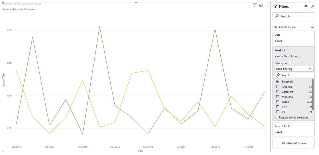
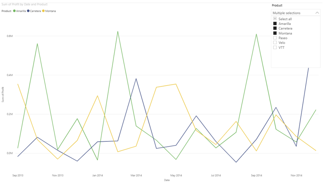
Now, when creating visualizations, you always need to figure out what your main message is. What is the story you are trying to tell. So one way to simplify this would be to show a comparison between two particular products of interest. We can do this by dragging Products over to the Filters panel and selecting two products – let’s pick Amarilla and Montana. This could tell a story, such as that profit in a few cases seems to run opposite for the two products – one is making a large profit when the other one isn’t. Or that Amarilla has some larger profit spikes than Montana.
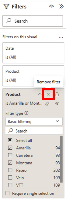
Another way we could tell a story, would be to allow the user to filter it themselves based on what products they are interested in – so adding an interactive element. To do that, go back to Filters panel, and click on the X next to the Product filter to remove it.
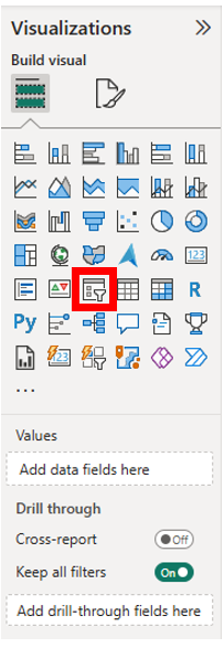
Instead let’s use something called a slicer to allow the user to select what products they want to see. First, make sure that you don’t have the line graph selected by clicking on the space below the graph. Then select the Slicer icon from the Visualizations panel (icon has a small funnel in front of a visual). Drag it to the top right of the visual and make the height much smaller as we’re going to turn it into a drop-down list.
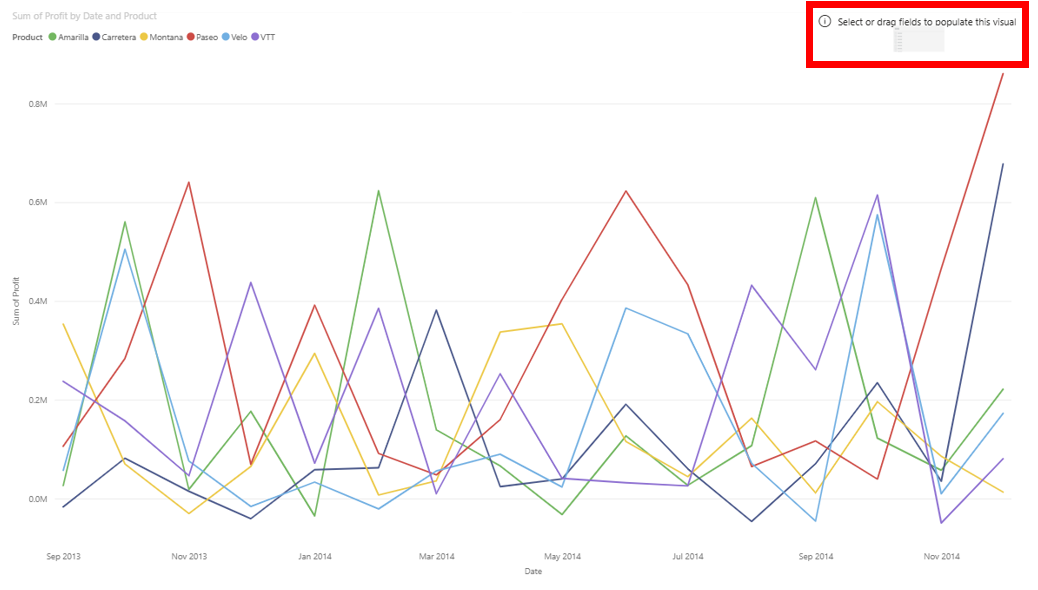
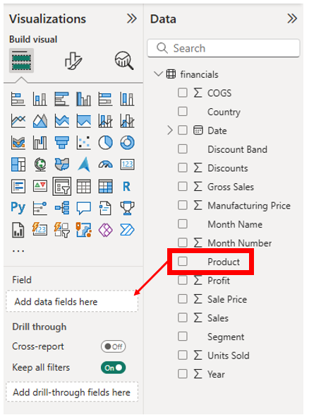
Next, drag the Product variable from the Data panel to the Field, Add data fields here box on the Visualizations panel.
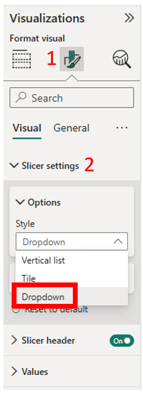
Go to the Format your visual section of the Visualizations panel. Expand Slicer settings and then expand Options. Under Style, select Dropdown.
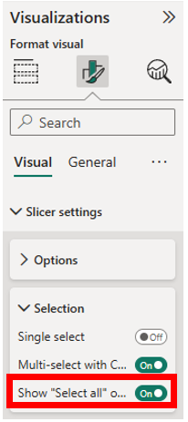
Next, expand Selection. Toggle on Show “Select all” option. Now use the slicer to filter your graph. Hold down the Ctrl key if you want to select more than one option.
If you can’t see the Slicer options, it might be that you have the line graph selected. Just click in the blank space below the group to see everything again. And that’s it, we have our second visual!
Technique: Data Visualization | Tools: Power BI | Data Format: Statistics