Creating Scatter Plots
- Sometimes you have to pull data from multiple sources instead of having it all in one file. Let’s add a couple more datasets, but this time we’re going to match them up or join them together to create one large dataset to work from, using the Model view of Power BI.
Go to the Home menu and select Get data. Select Excel workbook and choose the AuthorDataCitationsGrants.xls. Select the worksheet AuthorDataMain. The preview shows you that this dataset contains names of authors, their institutions their countries, and their research interests. And how many citations they’ve received over a few years, and how much grant money they’ve received over a few years. Click on Load.
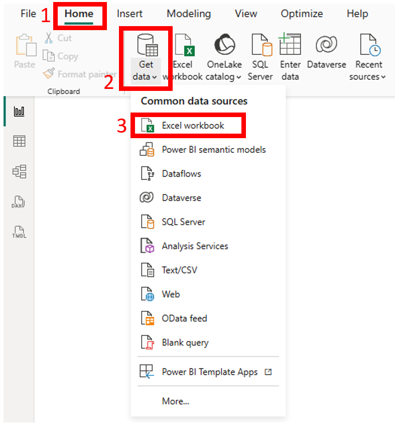
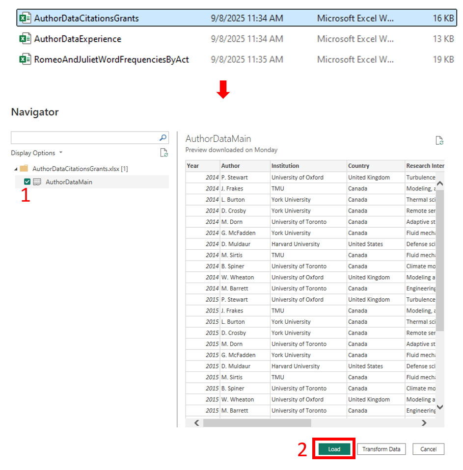
Go to the Home menu and select Get data again. Select Excel workbook and choose the AuthorDataExperience.xls. Select the worksheet AuthorDataExperience. The preview shows you that this dataset has just author names along with how many years of experience they have as a researcher. Click on Load.
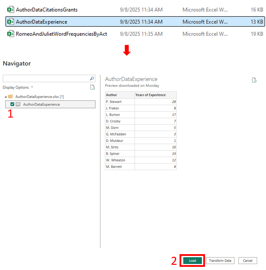
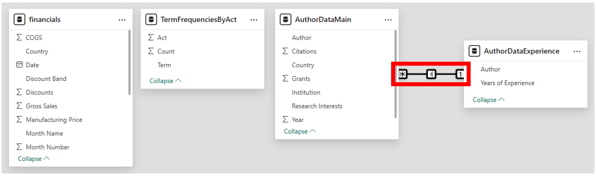
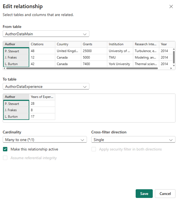
Next, go to the Model view by selecting the third icon down on the far left. The window shows us all the datasets we have loaded. For the last two datasets, you will see that the data has been related together based on a common column, Author. Power BI detected it automatically and has connected them with an arrow. You can click on the arrow to see the details of the relationship. Now the years of experience data will also be associated with the appropriate authors additional data found in the first table. Sometimes you might have to go to this view and manually connect your tables together, but in this case we don’t need to. If database joins and relationships are new to you, see this article on relationships and joins.
Go back to the Report view by clicking on the top icon in the far left. Then click on the new page icon at the bottom. Let’s rename this one to “Scatter Plot”.

- Scatter Plots are great to use to identify if there is any relationship between numeric variables. Let’s see if there is a relationship between Grants and Years of Experience.
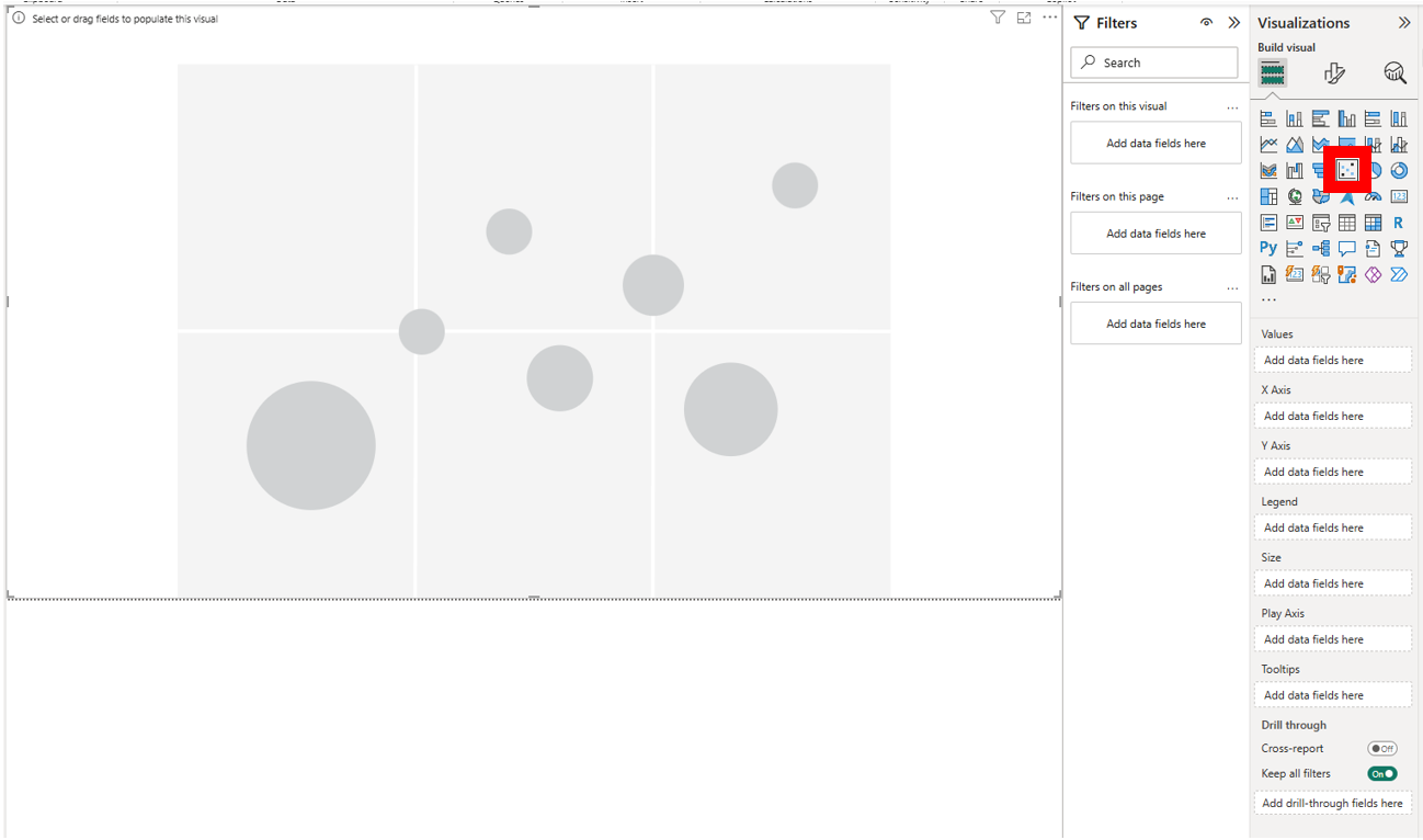
Select the Scatter chart icon from the Visualizations panel and drag the corner to fill the page.
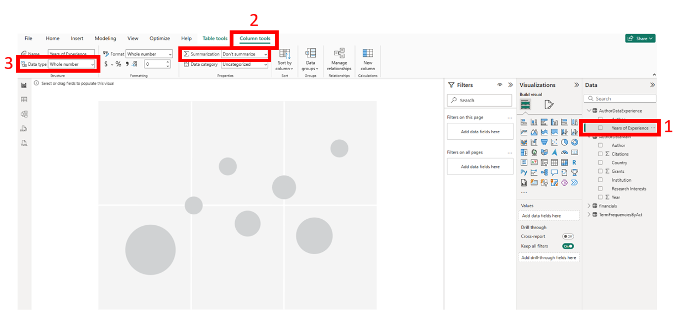
Expand the two new datasets listed on the Data panel to check your variables, as we did before. Even though there’s no Sigma symbol next to Years of Experience, if you click on it to bring up the Column tools menu, you will see that the Data type is Whole number, so it is fine as is. It has just been set not to summarize, as it isn’t needed in this case.
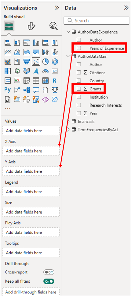
Drag the Years of Experience variable from the Data panel, AuthorDataExperience to the X-axis, Add data fields here box on the Visualizations panel. Next, drag the Grants variable from the Data panel, AuthorDataMain to the Y-axis, Add data fields here box on the Visualizations panel.
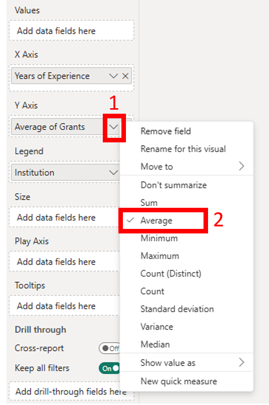
First, instead of summing up the Grant variable, let’s take the average in this case. Click on the arrow next to Grants (in the Visualizations panel for Y-Axis) and select Average from the list. You can see other options you can choose when working with numeric variables.
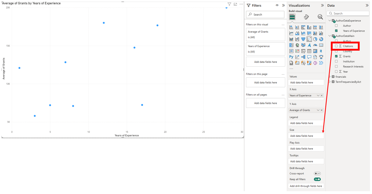
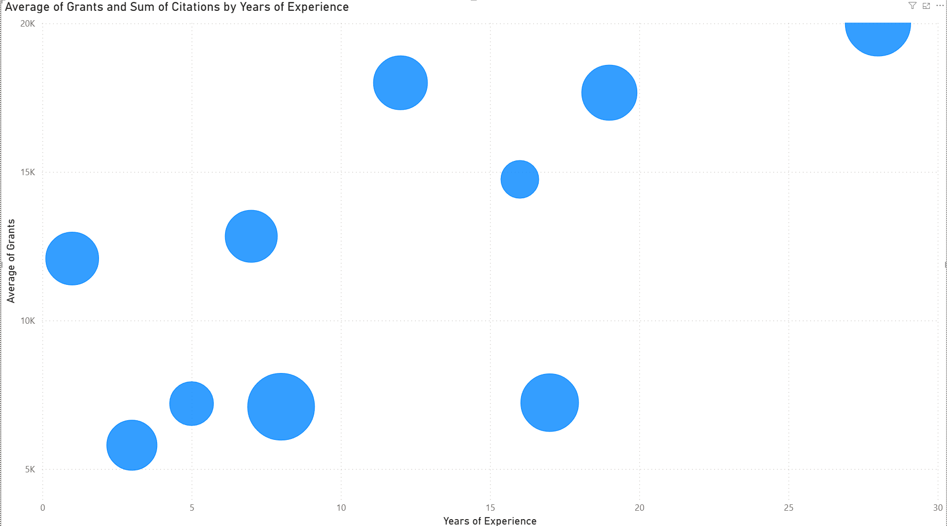
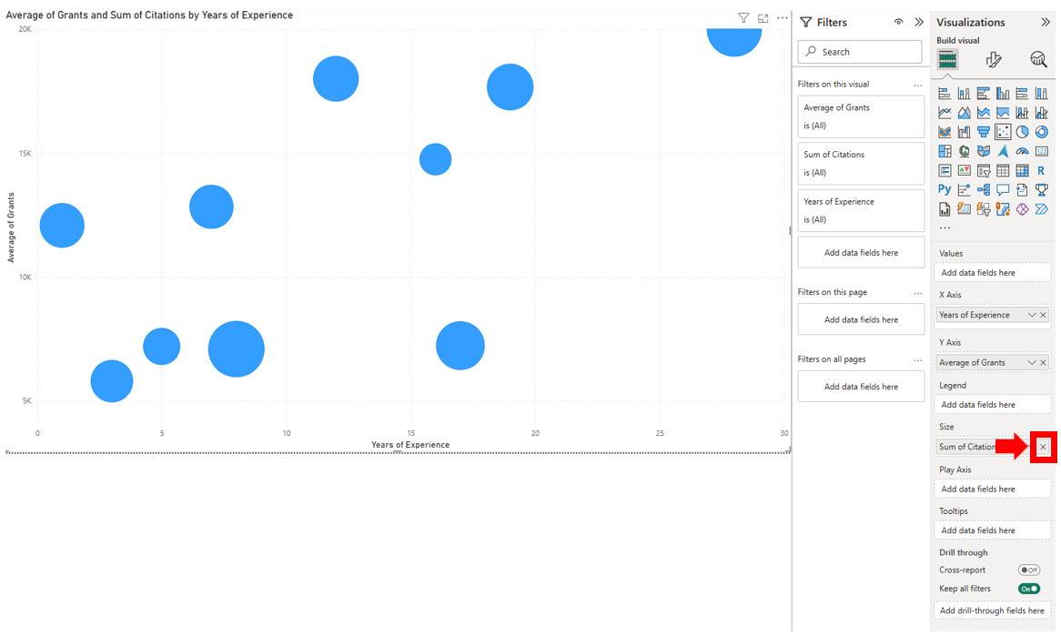
If you wanted to add another numeric variable to your scatterplot to turn it into a bubbleplot, you could drag the Citations variable from the Data panel, AuthorDataMain to the Size, Add data fields here box on the Visualizations panel. Now the bubbles are sized based on the Sum of Citations. If we want to remove this, or any variable we drag into a visual, we can click on the X next to that variable name on the Visualizations panel. Let’s remove Sum of Citations and go back to a scatterplot.
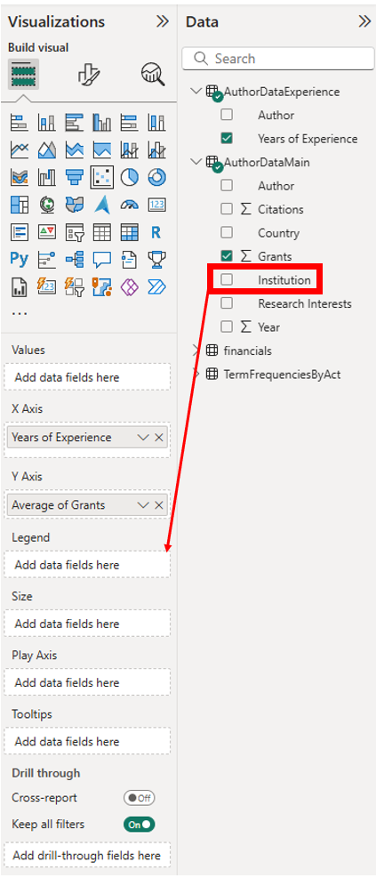
If you want to add another categorical variable to your scatterplot, you could do so by using different shapes to represent different categories. Drag the Institution variable from the Data panel, AuthorDataMain to the Legend, Add data fields here box on the Visualization panel. Now you should see that there is a legend, using different colours for different institutions.
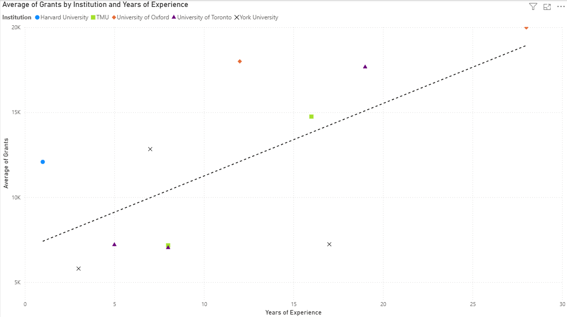
But when the marks are small, such as the dots in this case, it is helpful to also use different symbols to represent the points. Go to the Format your visual section of the Visualizations panel. Expand Markers, and then expand the Shape and Color sections. Right now it is one shape for all the categories in the series. But you can use the dropdown menu to select each category, in this case, each institution, and then select a shape and colour to go with it. Do this for each institution. You don’t need to click on Okay or Apply; as soon as you pick that category and those shapes and colours for it, it is applied. You should now see these changes in the scatterplot.

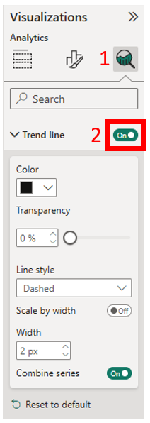
Finally, if you want to add trend lines in Power BI, that is when you would use the icon to the right of the Format your visual, which provides analytical options. Click on that icon and then toggle Trend line on. You should now see a dashed line showing the trend in the scatterplot.
Technique: Data Visualization | Tools: Power BI | Data Format: Statistics