Creating Pie Charts
- Okay let’s try loading our own data – this time based on some qualitative humanities data. Power BI is not meant to work directly with text data files, but you can use other better-suited textual analysis tools to create datasets that you can then visualize in Power BI. What I did was take the freely available text for Shakespeare’s play Romeo and Juliet. I ran it through a free online tool called Voyant Tools and it generated a word frequency table that we are now going to use as our dataset. If you want to learn more about textual analysis and visualization tools, such as Voyant, you can take a look at the Tools & Tutorials page in the Data Visualization guide.
Let’s load this word frequency data into Power BI. From the Home menu (top ribbon), select Get Data, Excel Workbook.
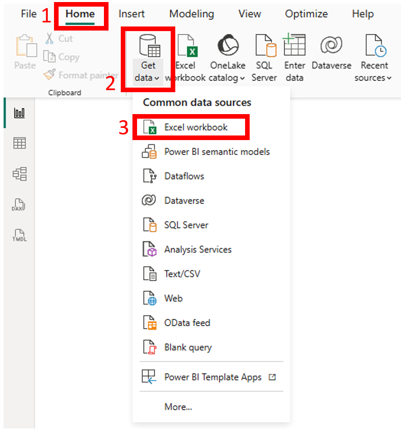
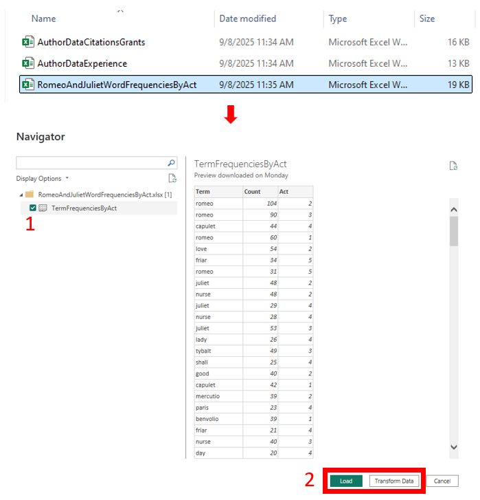
Pick RomeoAndJulietWordFrequenciesByAct.xls (navigate to where you saved the data). From the data preview window, select the only sheet in the file, TermFrequenciesByAct.
You can see that it is a simple spreadsheet that counts how many times a term/word came up in each act. At the bottom, you’ll see a button that says Transform Data. This opens up the Power Query Editor tool where you can do data cleaning tasks, such as cleaning up blank rows or columns, changing a column type to date, and highlighting columns and selecting unpivot to convert from wide format to long format. We don’t need to do those tasks on this dataset, so we’ll leave it as is for now and just click on Load Data.
Let’s click on new page to get started. Let’s rename this one to “Pie”.

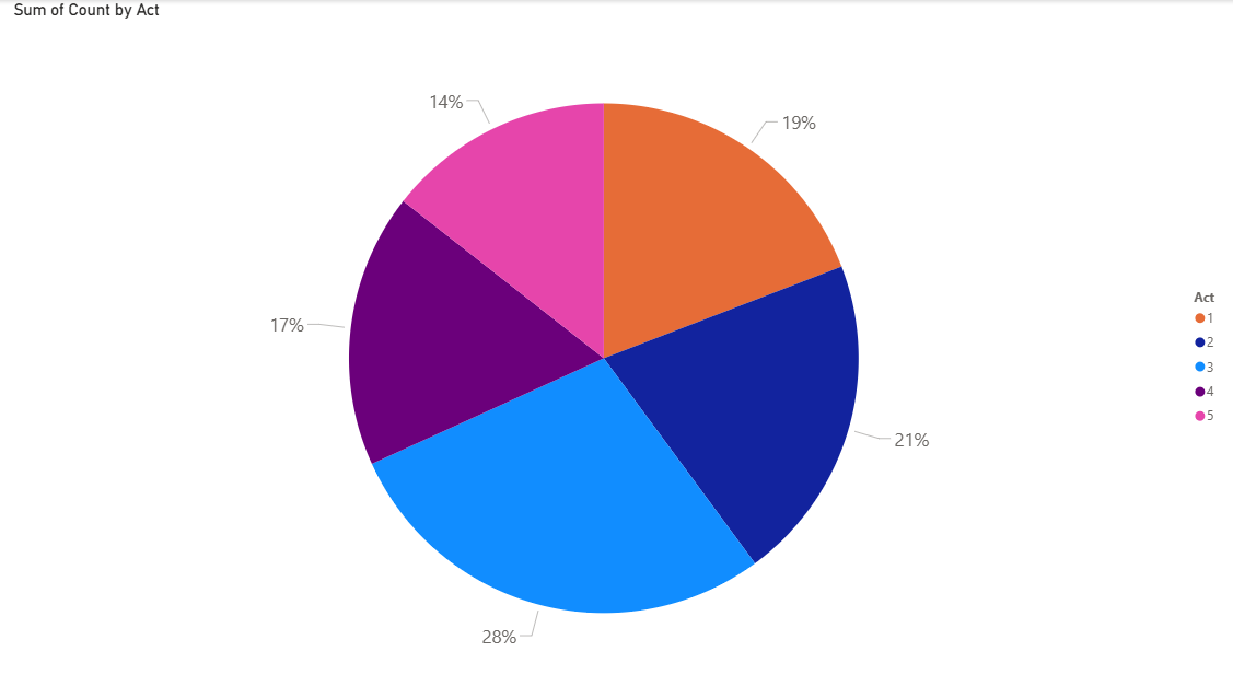
- Let’s first make a simple pie chart to show how many words are in each Act of the play, to see which Act is the longest and shortest and how they contribute to the whole.
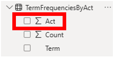
Before we begin building our visualization, let’s make sure our variables are correct. If we expand our dataset on the Data panel and look at what the variable types Power BI has identified in our dataset, you’ll notice that it thinks Act is a numeric variable that you can sum, when really it is text in this case (the sections of the play are divided into numbered acts, but you wouldn’t do math with these numbers). So let’s change it. If you click on Act, you’ll see at the top a new menu has appeared called Column tools. For the Data Type, it says Whole number, but you can fix it. Click on the dropdown menu arrow and select Text.

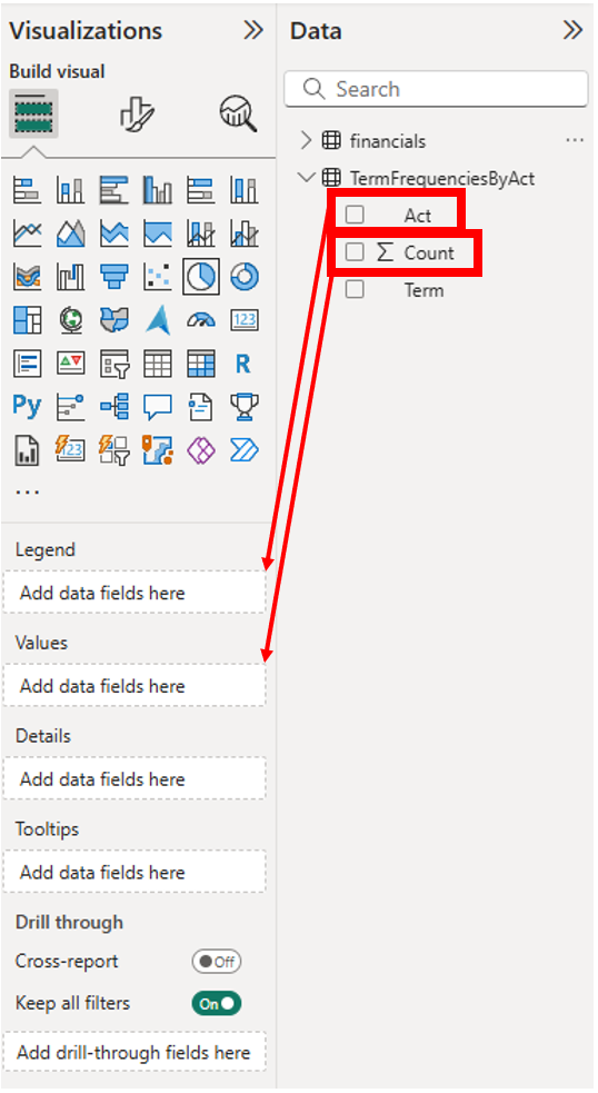
Now we are ready to create a pie chart. Select the Pie chart icon from the Visualizations panel, and drag the corner so it fills the page.
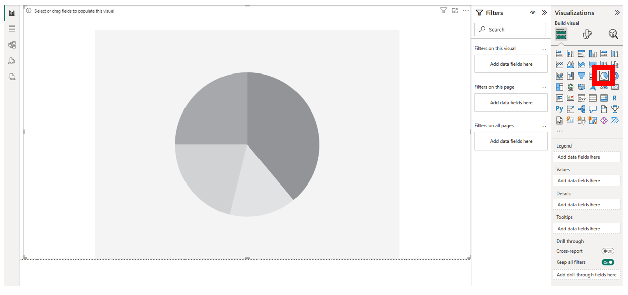
Drag the Act variable from the Data panel to the Legend, Add data fields here box on the Visualizations panel (nothing will display at this point). Next, drag the Count variable from the Data panel to the Values, Add data fields here box on the Visualizations panel.
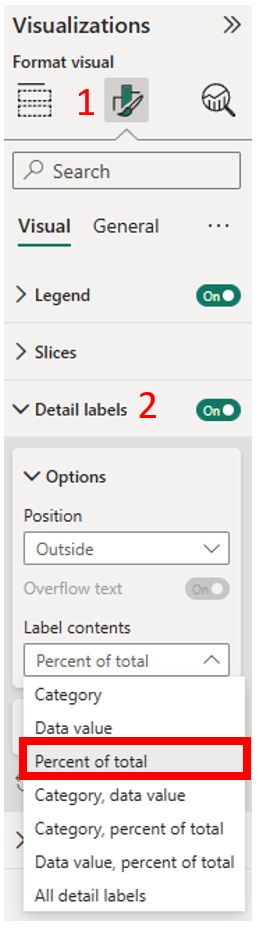
Next, let’s work with the formatting. It is automatically showing the percentages, which is great, but also showing other information. Let’s have it just display percentages. Go to the Format your visual section of the Visualizations panel. Expand Detail labels, and for Label contents, select Percent of total.
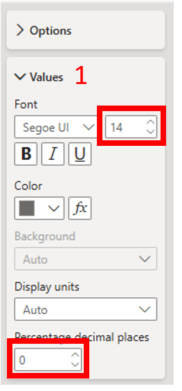
Expand Values and change the font size to 14pt to make the labels more legible. We could also format the percentages to round to whole numbers. Further down under Values, change the Percentage decimal places to 0.
You will notice we also have an issue with the legend not being in order. We can fix this with sorting. Click on the three dots at the top right of the visual. Select Sort Axis, Act. Go back to Sort Axis and select Sort ascending. Now the legend and the slices are in the order the Acts are in the play.
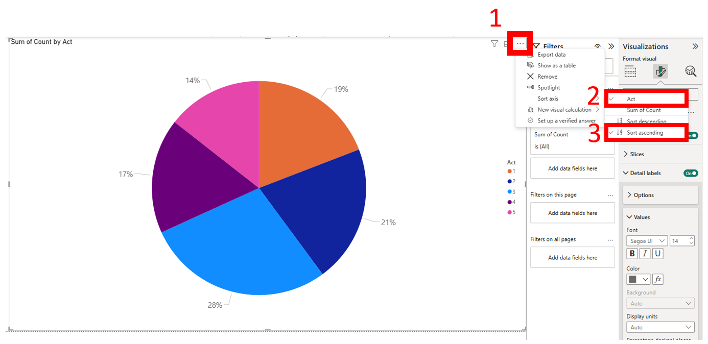
We can see the number of words used is quite evenly distributed throughout the acts, but Act 3 uses the most and Act 5 uses the least.
| Technique: Data Visualization | Tools: Power BI | Data Format: Statistics |