4. Mapping using ggplot2
In this section, we will cover how to make maps using ggplot2. We will use the neighbourhoods, subway lines, subway stations and museums spatial datasets.
We have covered how to make basic maps in the previous sections. To make a map that includes polygons, lines and point features, you can add each layer individually using the geom_sf() function. We use the order of polygons, lines and point features to have the layer of point features on top of the line features on top of the polygons.
# 4. Mapping using ggplot2
# Mapping multiple spatial data layers
ggplot() +
  geom_sf(data=neighbourhoods_sf) +
  geom_sf(data=subway_lines_sf) +
  geom_sf(data=subway_stations_sf) +
  geom_sf(data=museums_sf)
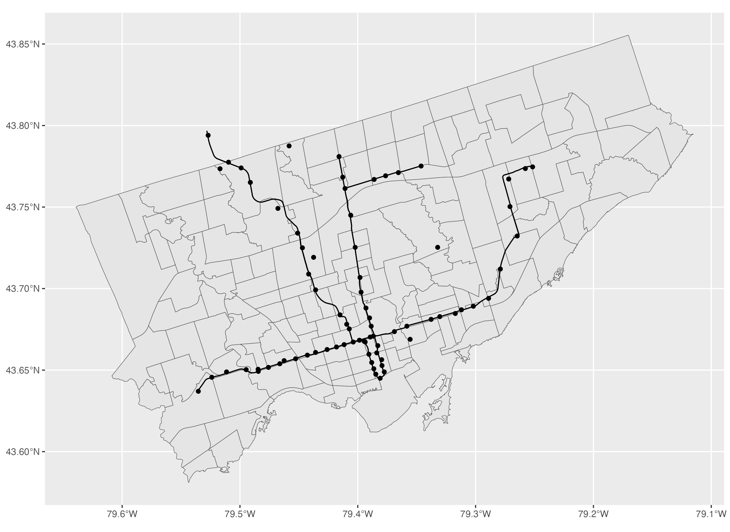
To modify the colour inside the polygon, you can use the colour argument and to modify the colour of the polygon boundaries, you can use the fill argument.
# Polygon features: to modify colours within the polygon and the border
ggplot() +
  geom_sf(data=neighbourhoods_sf, colour="darkgrey", fill="#354f52") +
  geom_sf(data=subway_lines_sf) +
  geom_sf(data=subway_stations_sf) +
  geom_sf(data=museums_sf)
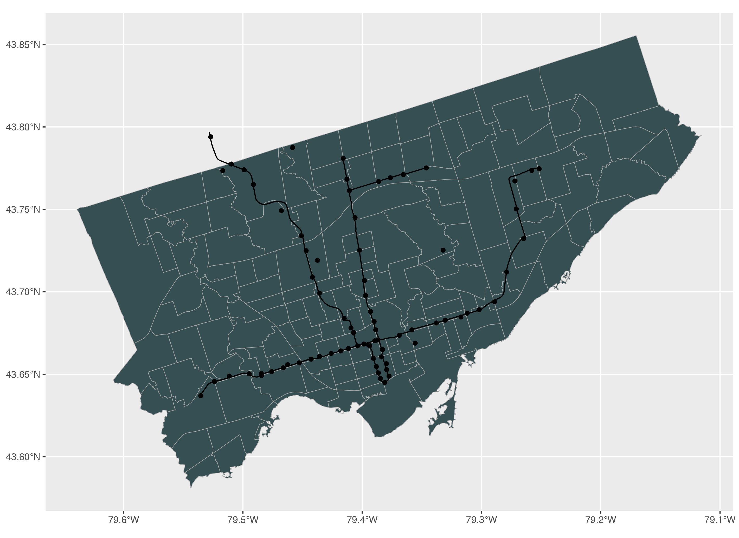
For line features, to modify the colour of the line, we use the colour argument and to modify the line width, we use the linewidth argument.
# Line features: to modify the colour and line width
ggplot() +
  geom_sf(data=neighbourhoods_sf, colour="darkgrey", fill="#354f52") +
  geom_sf(data=subway_lines_sf, colour="lightgrey", linewidth=1) +
  geom_sf(data=subway_stations_sf) +
  geom_sf(data=museums_sf)
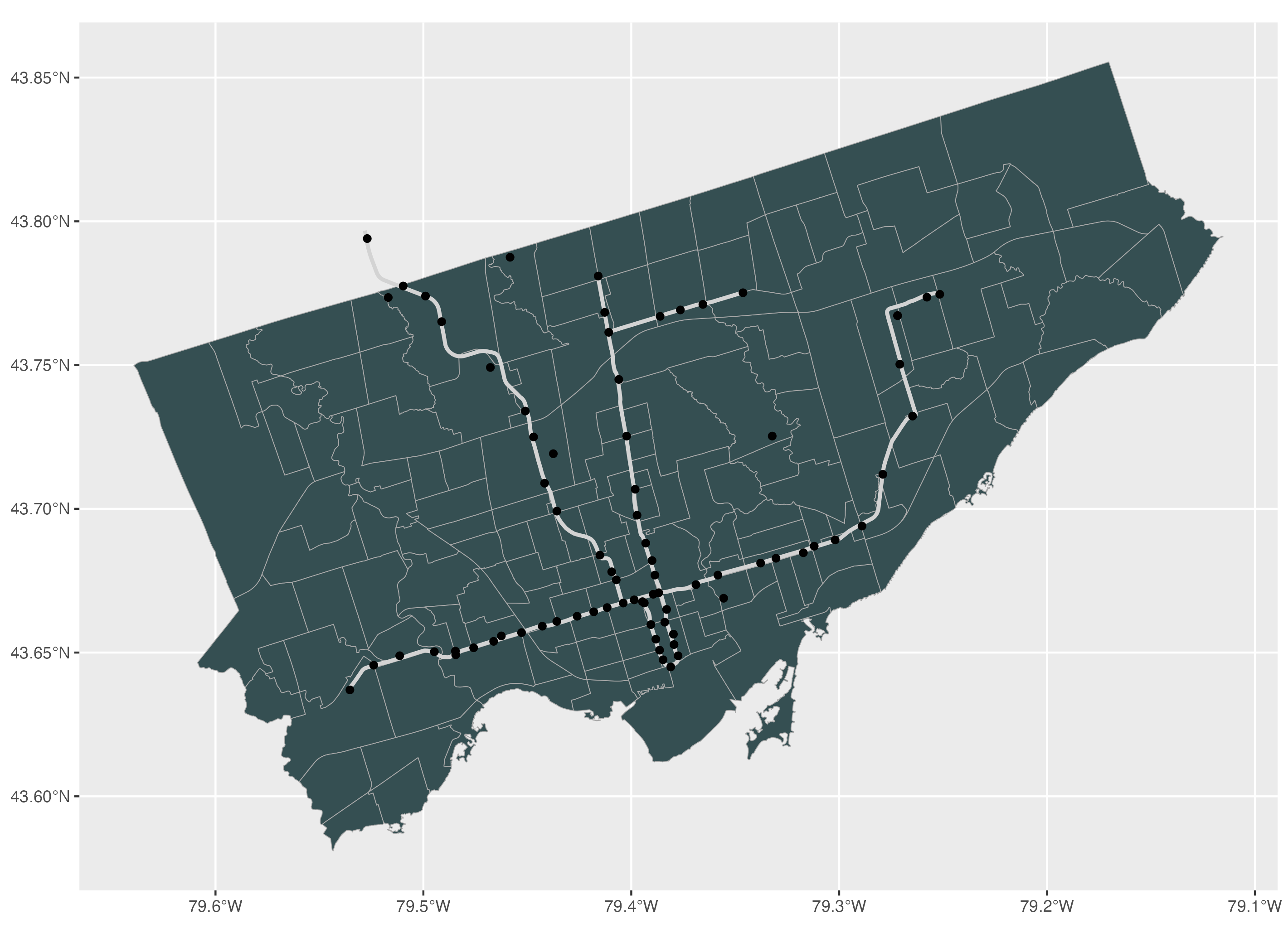
For point features, to modify the colour, size and shape of point features, we can use the colour, size and shape arguments respectively. You can find the full selection of possible shapes and their values in the help window by using the R code help(points) and going to the pch section.
# Point features: to modify the colour, size, and shape
ggplot() +
  geom_sf(data=neighbourhoods_sf, colour="darkgrey", fill="#354f52") +
  geom_sf(data=subway_lines_sf, linewidth=1, colour="lightgrey") +
  geom_sf(data=subway_stations_sf, colour="lightgrey", size=1.5) +
  geom_sf(data=museums_sf, colour="maroon2", size=3, shape=17)
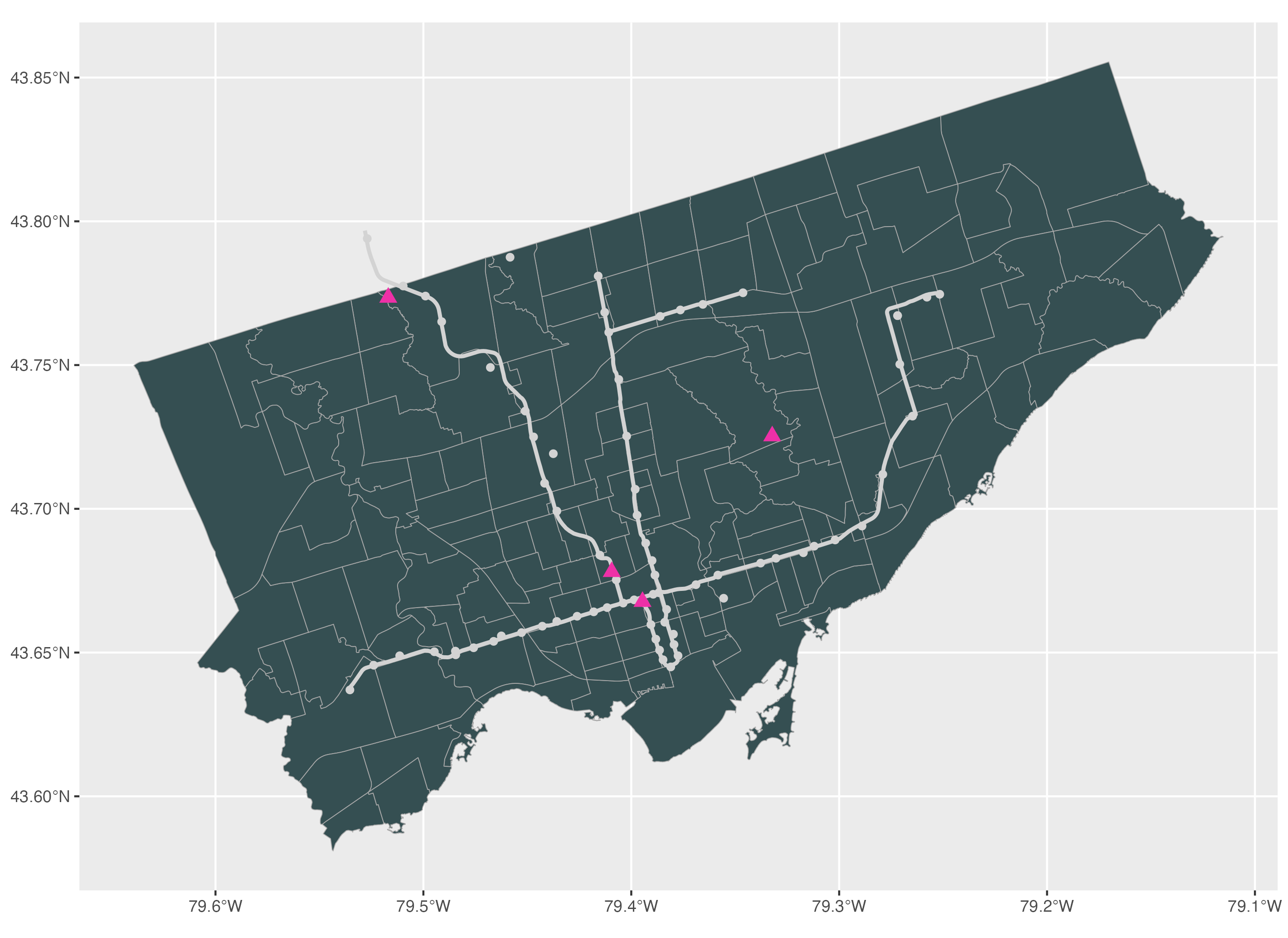
To apply a theme to the map, we can use one of the ggplot2 theme functions. If you type theme, you should see a dropdown menu with the list of themes that you can use. In this tutorial, we apply the classic theme to this map.
# To apply a theme to the map
ggplot() +
  geom_sf(data=neighbourhoods_sf, colour="darkgrey", fill="#354f52") +
  geom_sf(data=subway_lines_sf, linewidth=1, colour="lightgrey") +
  geom_sf(data=subway_stations_sf, colour="lightgrey", size=1.5) +
  geom_sf(data=museums_sf, colour="maroon2", size=3, shape=17) +
  theme_classic()
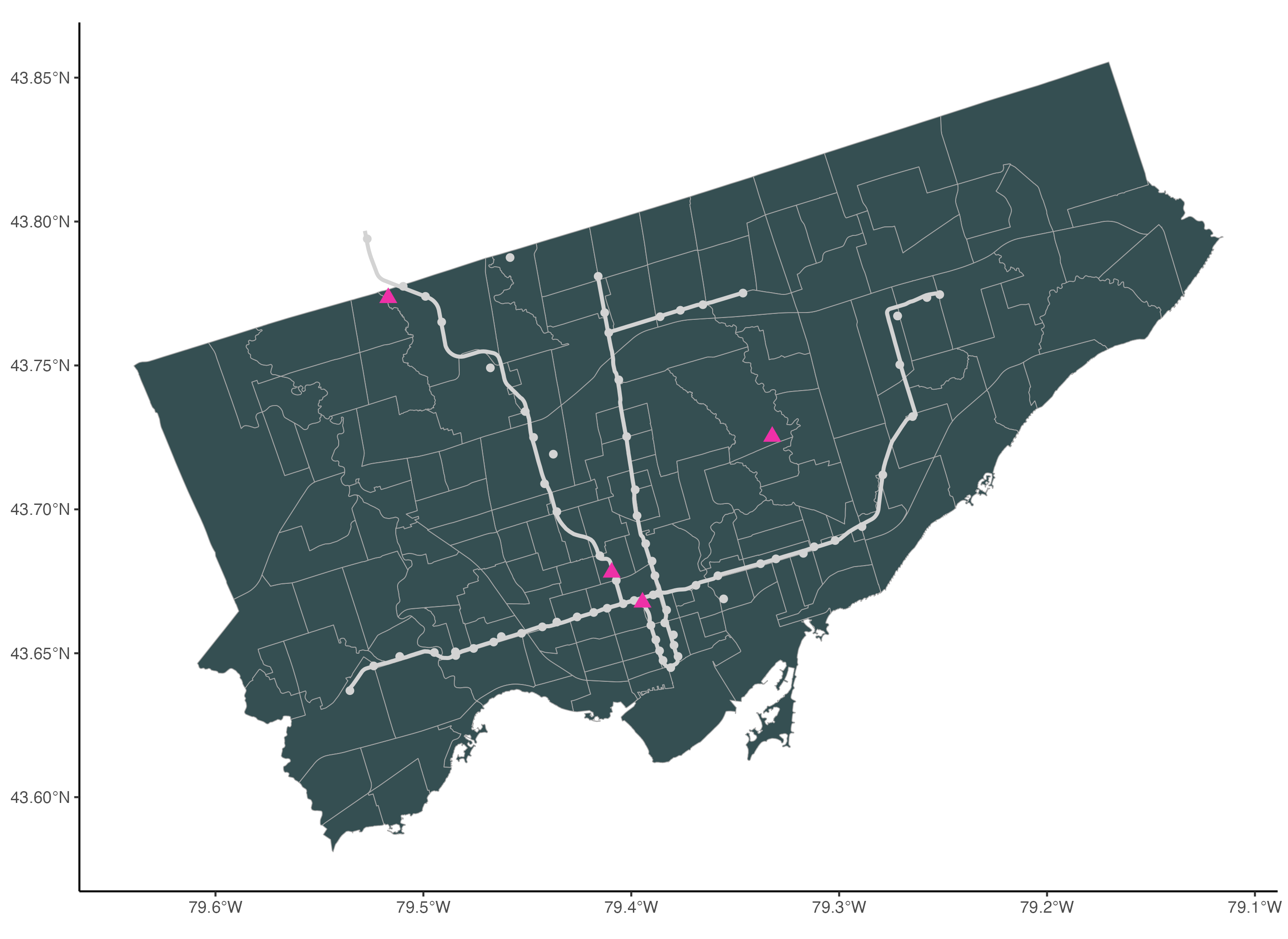
To add a title, we use the ggtitle() function. We also add a subtitle using the subtitle argument.
# To add a title
ggplot() +
  geom_sf(data=neighbourhoods_sf, colour="darkgrey", fill="#354f52") +
  geom_sf(data=subway_lines_sf, linewidth=1, colour="lightgrey") +
  geom_sf(data=subway_stations_sf, colour="lightgrey", size=1.5) +
  geom_sf(data=museums_sf, colour="maroon2", size=3, shape=17) +
  theme_classic() +
  ggtitle("Museums and Subway Lines",
          subtitle="Toronto, Canada")
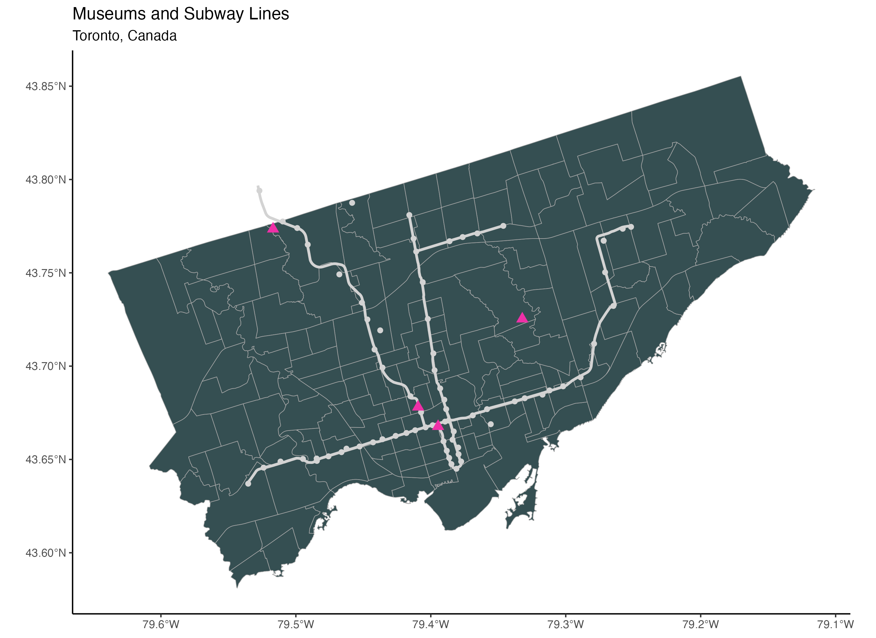
To add a scale, we use the annotation_scale() function from the ggspatial package. To place the scale in the bottom right corner of the map, we assign the location argument the value “br”. Then we use the bar_cols argument to select the two alternating colours of the scale. We use the R colours grey20 (a dark grey) and white.
# To add a scale bar (package: ggspatial)
ggplot() +
  geom_sf(data=neighbourhoods_sf, colour="darkgrey", fill="#354f52") +
  geom_sf(data=subway_lines_sf, linewidth=1, colour="lightgrey") +
  geom_sf(data=subway_stations_sf, colour="lightgrey", size=1.5) +
  geom_sf(data=museums_sf, colour="maroon2", size=3, shape=17) +
  theme_classic() +
  ggtitle("Museums and Subway Lines",
          subtitle="Toronto, Canada") +
  annotation_scale(location = "br", bar_cols = c("grey20", "white"))
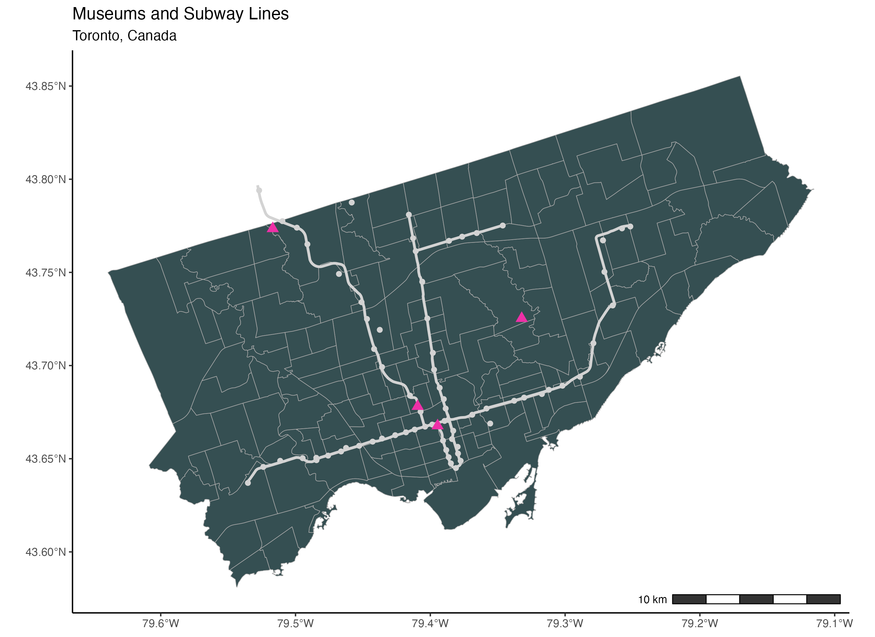
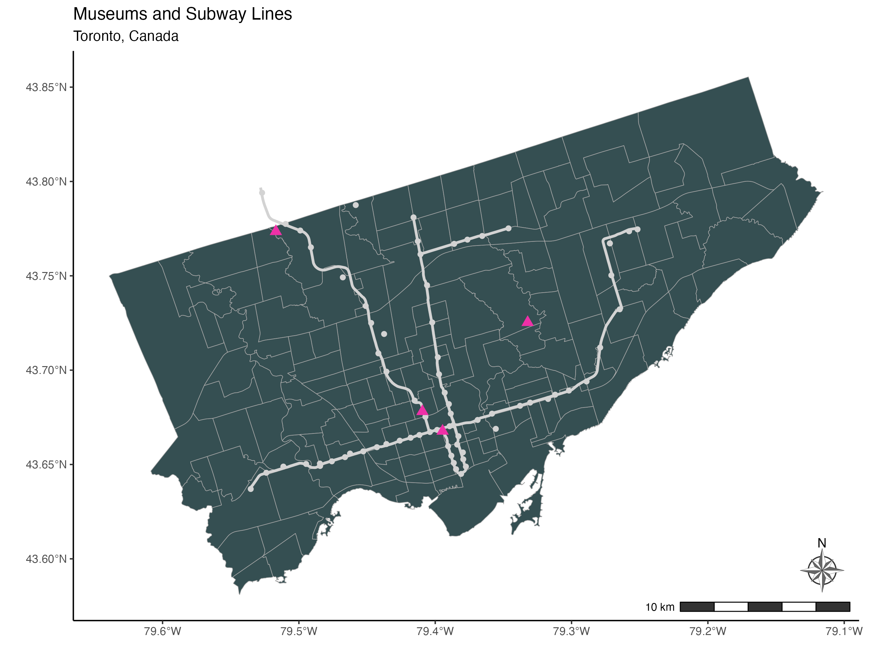
To add a north arrow, we use the annotation_north_arrow() function from the ggspatial package. Using the location argument, we place the north arrow in the bottom right corner of the map. To point the arrow to the true north, we set the argument which_north to “true”.
The pad_x and the pad_y arguments are used to specify the distance of the arrow from the edge of the frame. We specify the distances from the edge in units of inches here but you can also use centimetres for example.
Finally, the style argument is used to specify the drawing style of the arrow. You will find the full selection of north arrow drawings here. We are using the north_arrow_nautical() style here. For this specific style, we select the two alternating colours used to fill the arrow using the fill argument and the colour of the border of the arrow using the line_col argument.
# To add the north arrow (package: ggspatial)
ggplot() +
  geom_sf(data=neighbourhoods_sf, colour="darkgrey", fill="#354f52") +
  geom_sf(data=subway_lines_sf, linewidth=1, colour="lightgrey") +
  geom_sf(data=subway_stations_sf, colour="lightgrey", size=1.5) +
  geom_sf(data=museums_sf, colour="maroon2", size=3, shape=17) +
  theme_classic() +
  ggtitle("Museums and Subway Lines",
          subtitle="Toronto, Canada") +
  annotation_scale(location = "br", bar_cols = c("grey20", "white")) +
  annotation_north_arrow(location = "br", which_north = "true",
                         pad_x = unit(0.1, "in"), pad_y = unit(0.3, "in"),
                         style = north_arrow_nautical(fill = c("grey40", "white"),
 line_col = "grey20"))
Technique: Quantitative Data Analysis, Mapping, Spatial Analysis | Tools: R | Data Format: Microdata