D. Adjust the appearance of nodes and edges
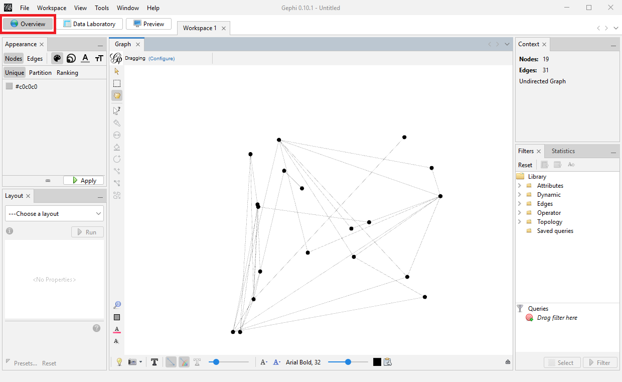
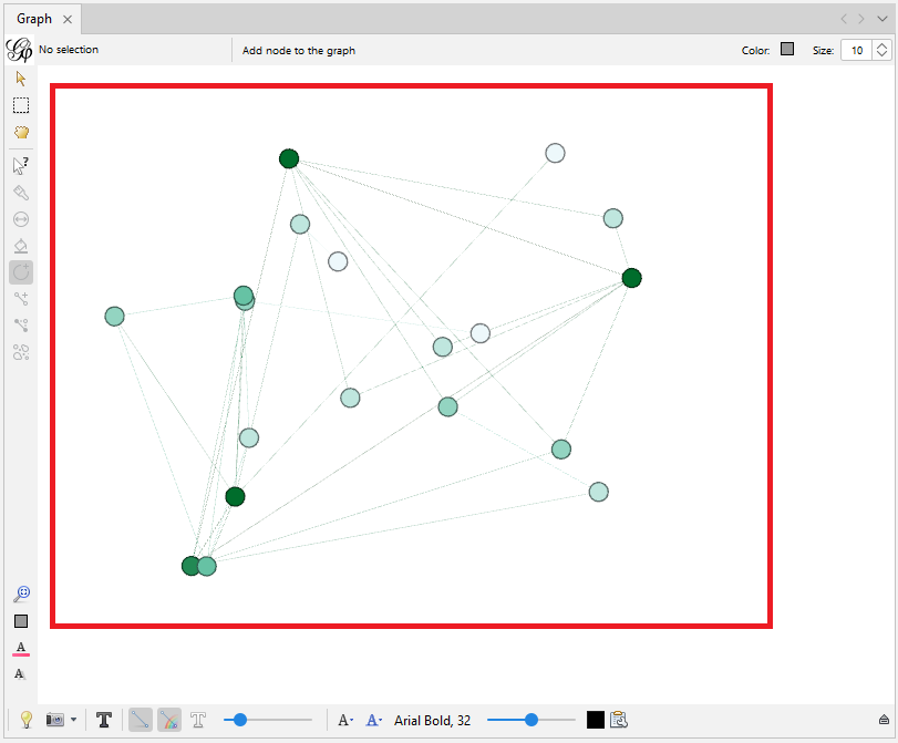
Next, let’s move to the Overview tab. This tab is where we do our network analysis, layout and visualizations.
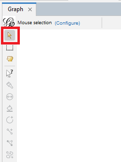
Let’s look at some of the tools along the edge of the graph pane, starting from the top left. The arrow icon is a direct selection tool and the rectangle allows you to draw a rectangle around the items you want selected. Once nodes are selected, then you can adjust their sizes and colours.
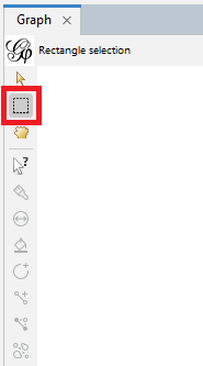
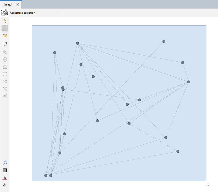
For example, use the rectangle tool to draw a rectangle around all the nodes to select the whole graph.
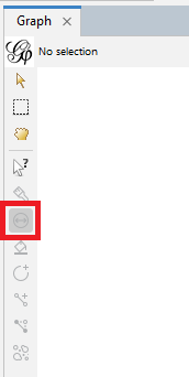
Next, click on the icon that looks like a two sided arrow in a circle. This tool is called sizer and it can be used to adjust the sizes of nodes.
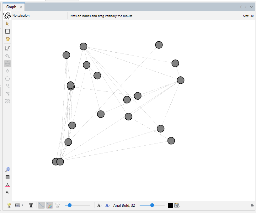
Select the sizer tool. Notice that the tool gives us a hint on how to operate it at the top of the pane.
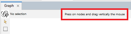
Click on the white space next to the graph and drag the mouse vertically. All the nodes should be changing size.
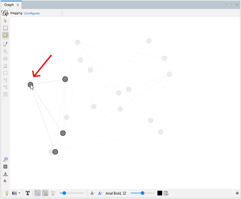
Another tool is a dragging hand icon. You can use it to move nodes around.
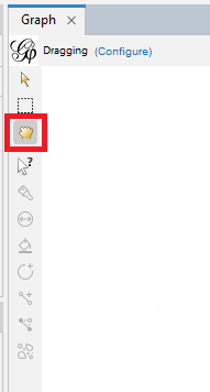
Select it and then use this tool to manually drag and reposition a node in your graph.
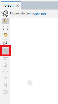
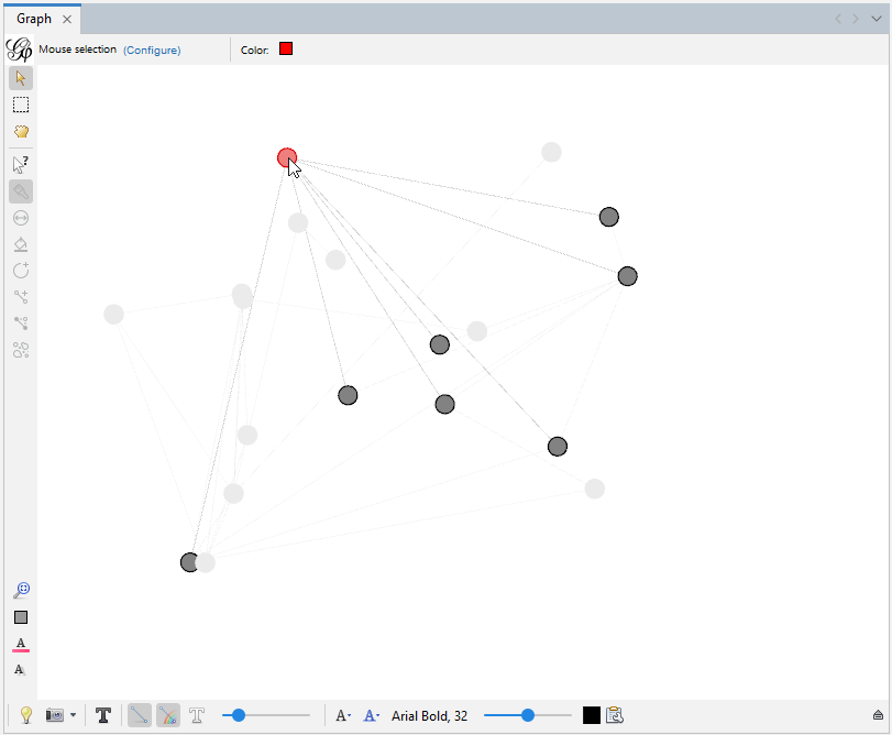
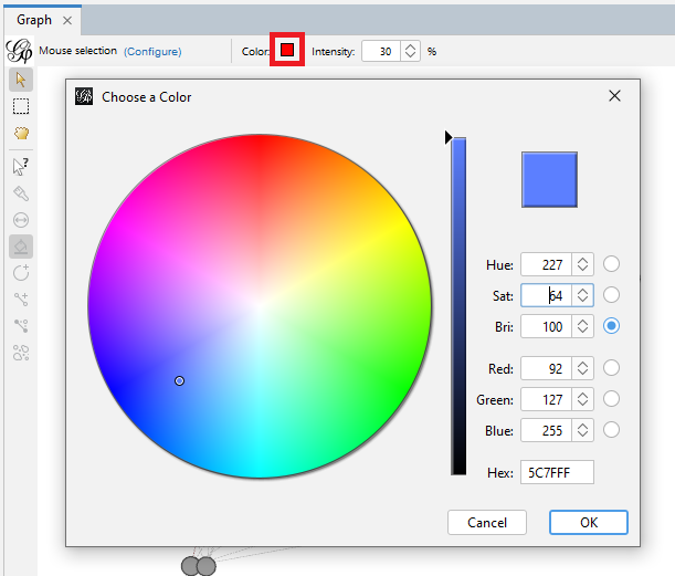
We can colour certain nodes manually by using the icon that looks like a paint brush – we can use this to highlight a specific node of interest.
Try selecting a node and colouring it red. Every time you click on a node, it gets more vibrant.
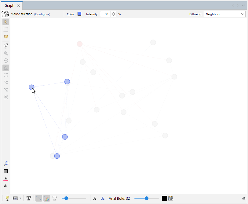
The next icon after the sizer icon is called brush. Note that when we hover over a tool, it describes how the tools works in a pop-up.
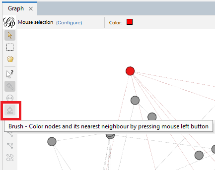
In this case, it colours nodes and their nearest neighbour (i.e., directly connected) the same colour. Select the tool, change the colour at the top to blue, and then select a node.
Click multiple times as before to make the colour brighter.
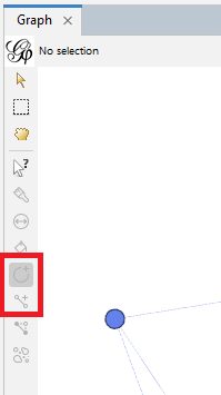
The next two icons allow us to manually create a new node or a new edge. So, in theory we could draw out our network manually, instead of preparing node and edge spreadsheets. Unless your network is very small, this would be a labour-intensive process that could be prone to error.
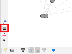
We can reset colours on our graph using the grey rectangle icon near the bottom left of the graph pane. Click on that now.
To colour nodes and edges in a graph based on specific attributes, use the appearance pane.
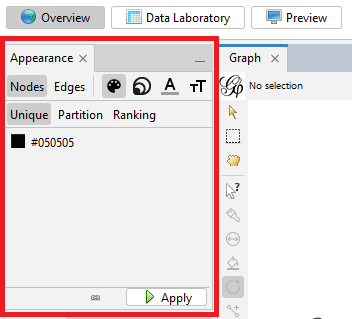
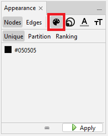
We can toggle between visualizing nodes and edges – let’s start with nodes. There are four ways you can affect the appearance of nodes: we can colour-code the nodes based on an attribute, such as alliance in our case, we can size the nodes based on an attribute, such as degree, and we can also affect the colour and size of labels on our nodes. Let’s first take a look at colour. Select the painter’s palette icon. Here, the default is the Unique option, which will colour all the nodes a unique colour, in this case grey.
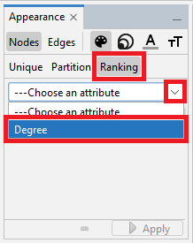
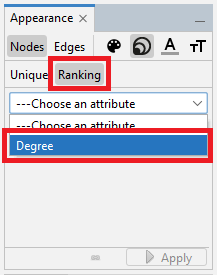
Let’s try the Ranking option, where it will select a sequential colour palette (so one colour changing from light to dark) to show the range of a numeric variable. Select Ranking and choose Degree from the drop-down menu.
Then click on Apply.
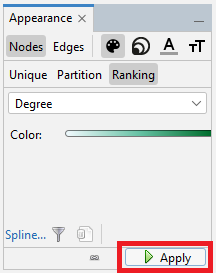
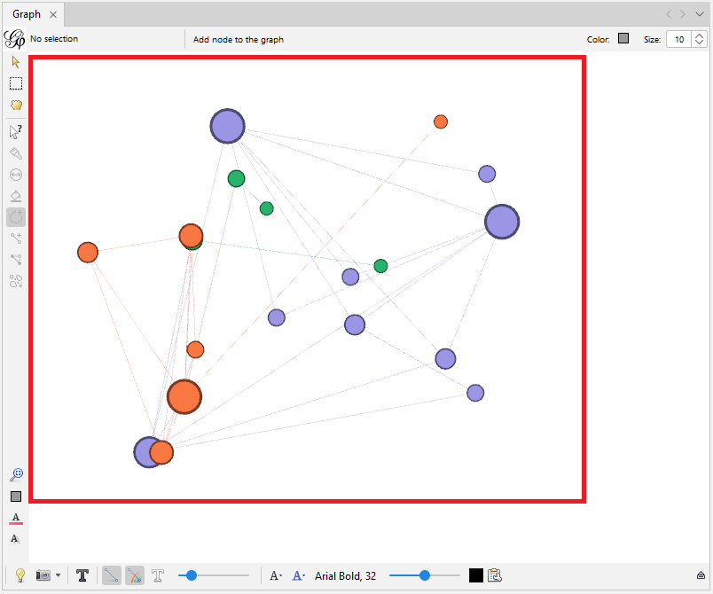
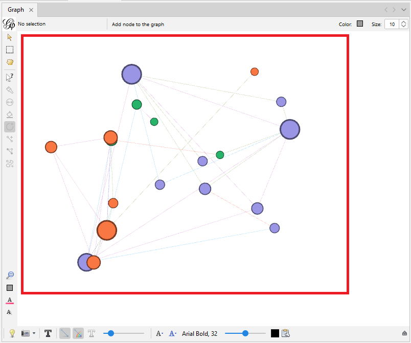
You can see that the darker coloured nodes have more connections.
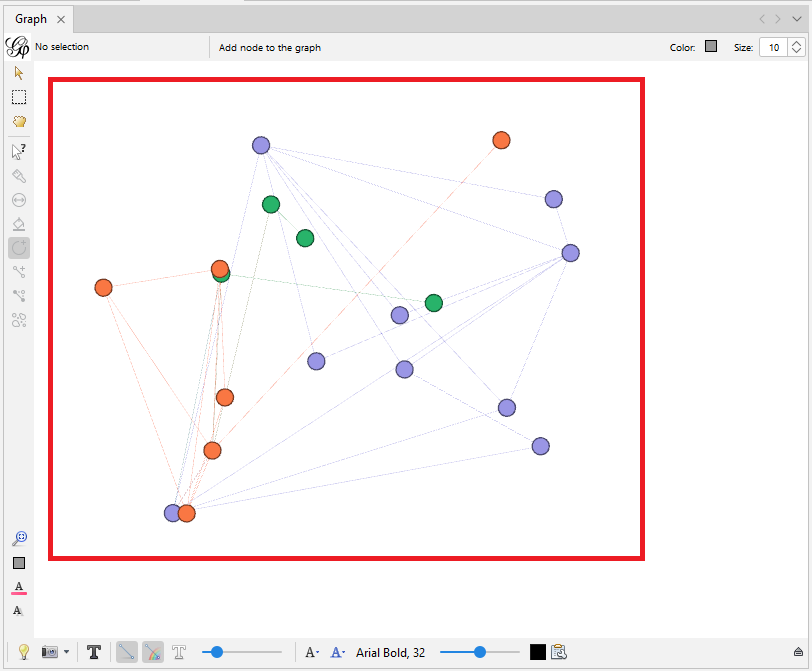
However, colours are more effective when used for categorical data. For our example, we want to use partition and assign a qualitative colour palette where different colours match different categories. Let’s click on Partition and select the attribute alliance.
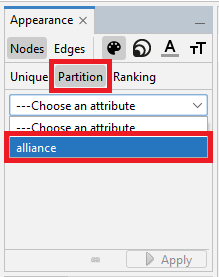
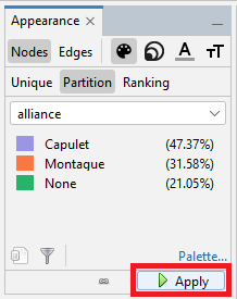
We will see different colours assigned to correspond to different alliances. You can click on an individual colour to change it, or click on the palette link to select from predefined palettes. Let’s keep the default. Click on Apply.
Now the nodes on your graph have been colour-coded correspond to different alliances.
Using sizes in visualizations is an effective way of displaying numerical variables, so let’s size the nodes by a numeric attribute that we have: Degree. Click on the icon with multiple circles for node size.
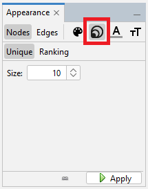
The unique option is where you specify a set size for all nodes, but we want ranking where the node sizes will vary by degree. Click on Ranking, select Degree from the drop-down menu.
Set the Min size to 20 and the Max size to 50, and then click on Apply.
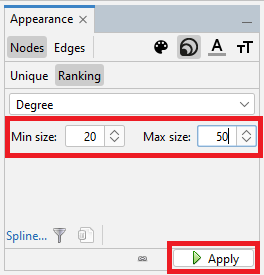
You can see that the nodes on your graph have been sized according to their different degrees.
So far we’ve been playing with node appearance. We could also adjust the edge appearance by selecting Edges in the appearance pane.
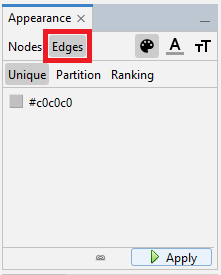
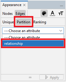
There are several options to change colours and adjust labels. We could for example just colour all our edges grey by selecting Unique for colour and keeping the default grey colour specified and then clicking on Apply. However, we have an attribute for our edges, so for our graph let’s use partition to colour them by relationship type. Click on Partition for colour, and then select relationship.
Finally, click on Apply.
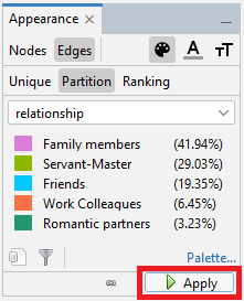
Now the edges on your graph have been colour-coded correspond to their different relationships.
Technique: Data Visualization | Tools: Gephi