E. Use layout algorithms
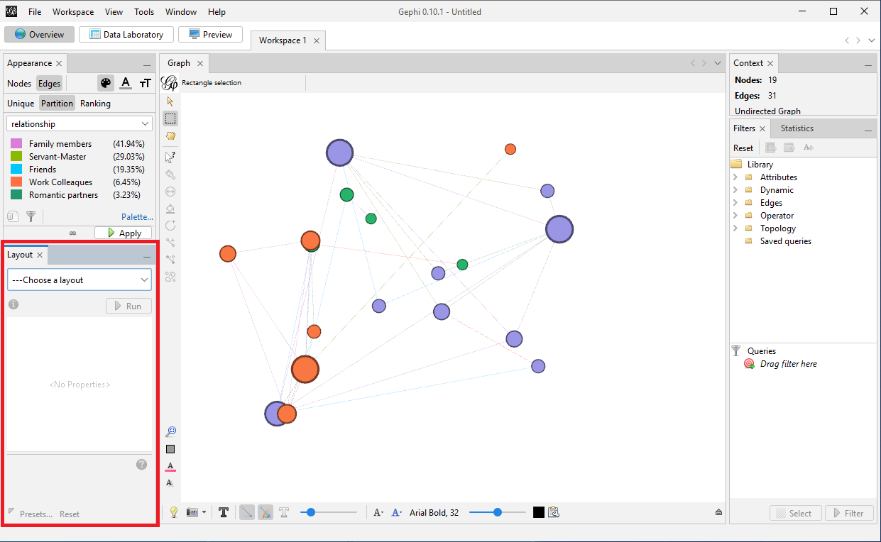
When you first loaded the data, Gephi displayed the nodes and edges at random to start. You may find often that you need to adjust the layout of the nodes and edges of your graph so that you can start to make sense of the data visually and set the shape of your graph. Let’s navigate to the layout pane.
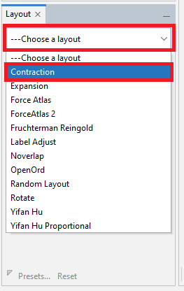
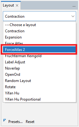
Select the drop down menu that says Choose a layout. Select an example, such as Contraction
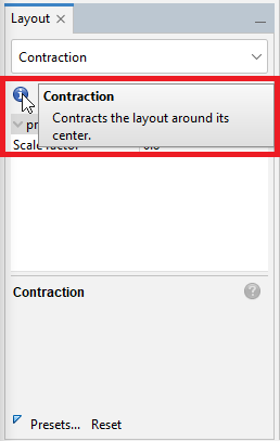
To get more information about the layout, hover over the blue circle with the “i”.
From the layout list, we see two similarly named options: Force Atlas and ForceAtlas 2. Force-based algorithms follow a simple principle: linked nodes attract each other and non-linked nodes push apart. The Force Atlas layout is from Gephi – it works best for small networks (up to 10,000 nodes) and can be slow.
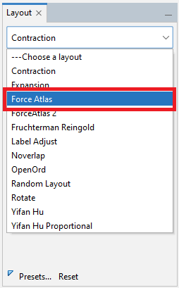
ForceAtlas 2 is an improved version that can handle larger networks, for up to a million nodes. For our graph, select ForceAtlas 2.
Note: Different algorithms are appropriate in different situations and for different types of data. Learn more about layouts from Gephi’s website.
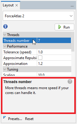
With any of these layout algorithms, there are settings we can play with to adjust how the algorithm works, such as settings that affect the attraction and repulsion of the nodes to each other and to the centre of the graph. The documentation will specify all the parameters – we can see short help snippets show up at the bottom of the pane when you click on a parameter.
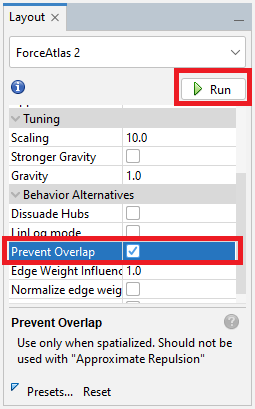
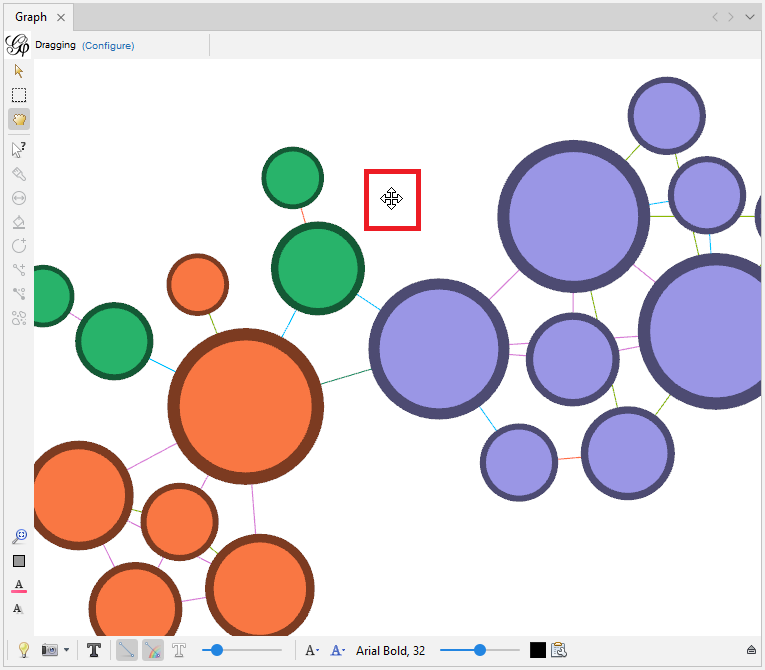
Let’s select one of these parameters as an example, Prevent Overlap, so that none of our nodes overlap each other in the layout. Keep the rest of the defaults, and then click on Run.
We should see the graph change right before our eyes. The algorithm will continue to run and adjust the graph in small ways until we click on stop – so however long you run an algorithm can also have an effect on the layout. Let it run for 15 seconds or so, and then click on Stop.
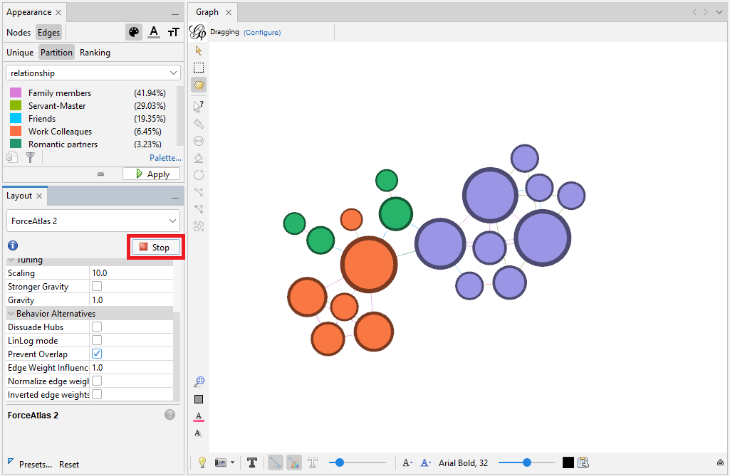
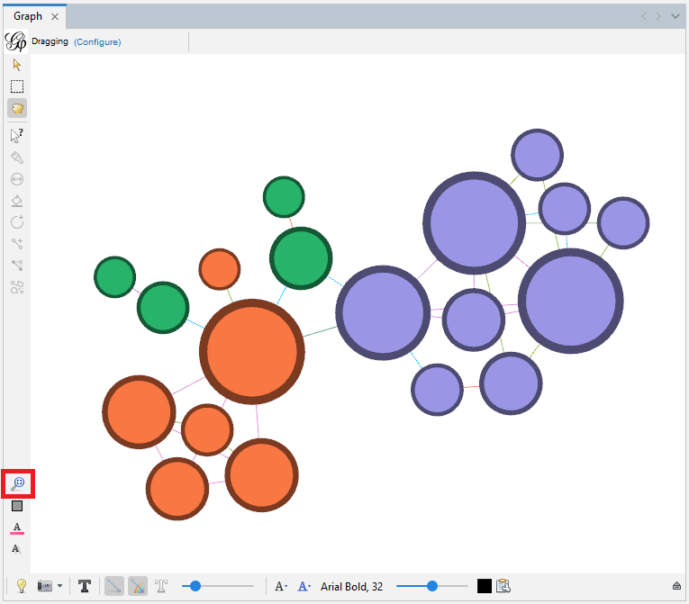
In our situation, our graph shrinks towards its centre. Click on the graph, and use the mouse wheel to quickly zoom in and out. If the graph is going off the edge of our screen, we can right click on the blank area and then drag to reposition our graph.
We can click on the magnifying glass near the bottom left of the edge of the graph pane, to centre our graph on the screen – but watch out as it does sometimes zoom out again when you do that. Let’s zoom in and centre our graph.
Technique: Data Visualization | Tools: Gephi