F. Add labels and make final layout adjustments
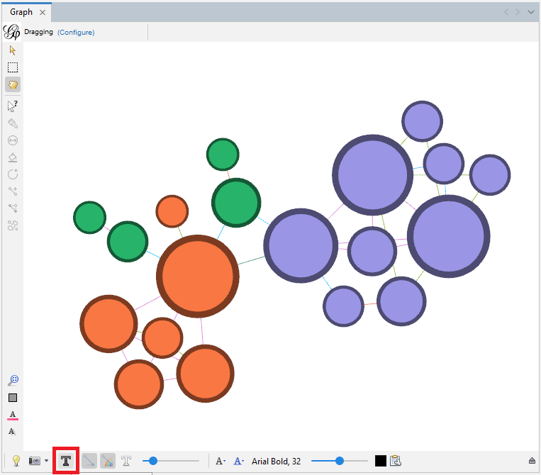
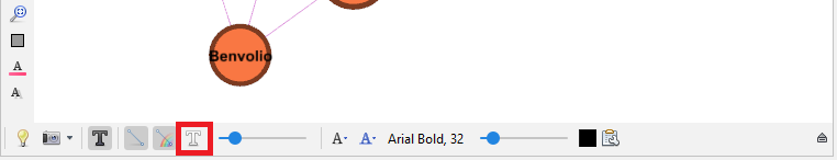
Now, let’s look at node labels and the icons on the bottom of the graph pane edge. Click on the black ‘T’ icon to show node labels.
Gephi will take the text from the label column we created in our nodes spreadsheet.
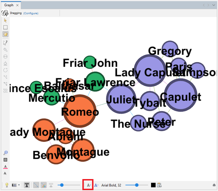
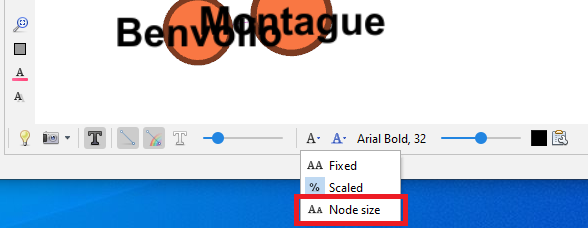
Then click on the black ‘A’ icon and select Node size – so they will be proportional to the node sizes.
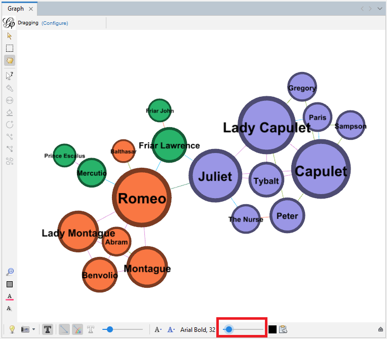
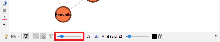
Then use the slider on the right of that icon to make the node labels smaller and more readable.
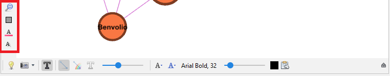
We can also change the font, its size, and colour from here.
Layouts can help us make your labels more legible. Go back to the Layout pane and run Label Adjust.
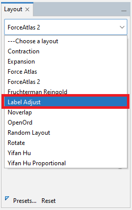
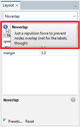
Then run Noverlap. Use the blue “i” icon to learn more about these and other layouts.
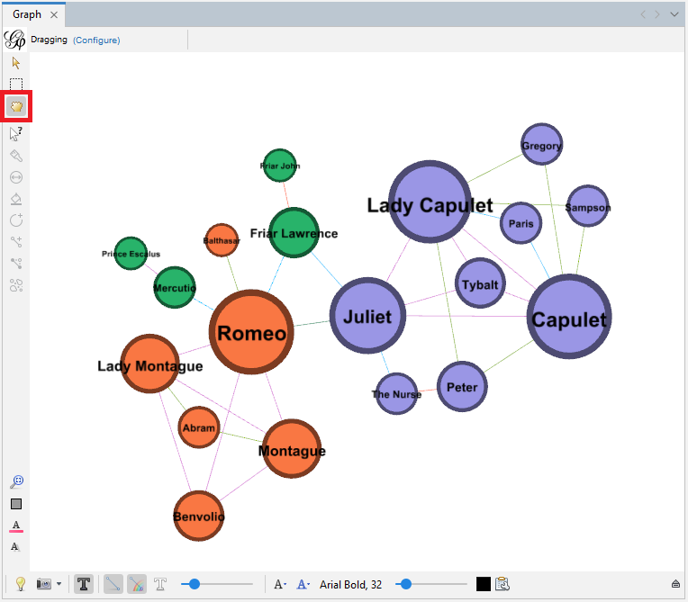
After we run those layouts, we might need to zoom out a bit. At this point, we can also use the grabbing hand icon near the top left edge of the graph pane to make some final tweaks to the layout by moving individual nodes.
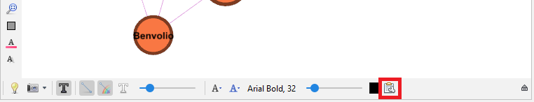
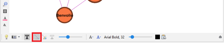
Let’s go back to the graph pane icons. The little clipboard next to the node label colour selector allows you to specify which attribute to display as a label – the default is the label column.
The white T turns on edge labels, but we are not going to label our edges in this situation.
The sliders adjusts the thickness of our edges – we can make them a bit thicker to see the colours better.
We already coloured all our edges by their relationship type, but if we had wanted, we could have coloured our edges by the source node (which is more helpful in directed graphs), by selecting the rainbow icon.
The icon to the left allows us to toggle the edges off and on in our graph – helpful for working with and viewing very complicated graphs.
The lightbulb icon toggles the background between white and black.
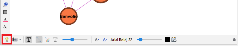
Click it to try it out. You can see the background of your graph has toggled to black, and the label text has toggled to white to keep it readable.
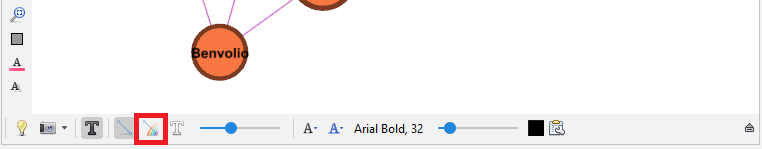
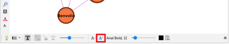
The blue ‘A’ icon allows us to link node label colours to node colours, but in this case let’s leave the default as the black labels are more legible.
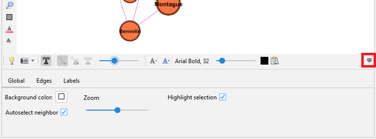
If you click on the little arrow icon on the far right, we can reveal even more options to play with, such as the ability to change how edges and nodes are coloured when they are selected.
Additionally, there are a few icons to reset colours (which we saw before), along with icons to reset label colours and visibility, all near the bottom left edge of the graph pane.
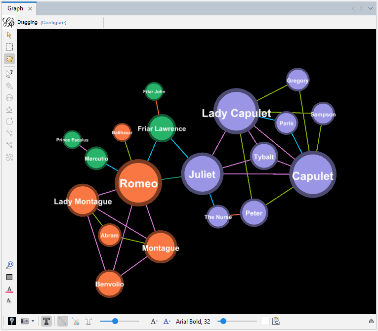
We can see that we can use Gephi to visualize our network data to display the characters in a network and their relationships. Sizes and colours can be adjusted to illustrate attributes and then use the network diagrams to spot any spatial patterns. For example, the largest nodes (if node is sized by degree) could show us key entities in the network that have many connections. We could also see if the largest nodes are always the same colour (if we have colour-coded our nodes by a particular attribute) to see if there’s a relationship between that attribute and degree. Some limited analysis can be done visually and and convey interesting characteristics through our network diagrams.
Technique: Data Visualization | Tools: Gephi