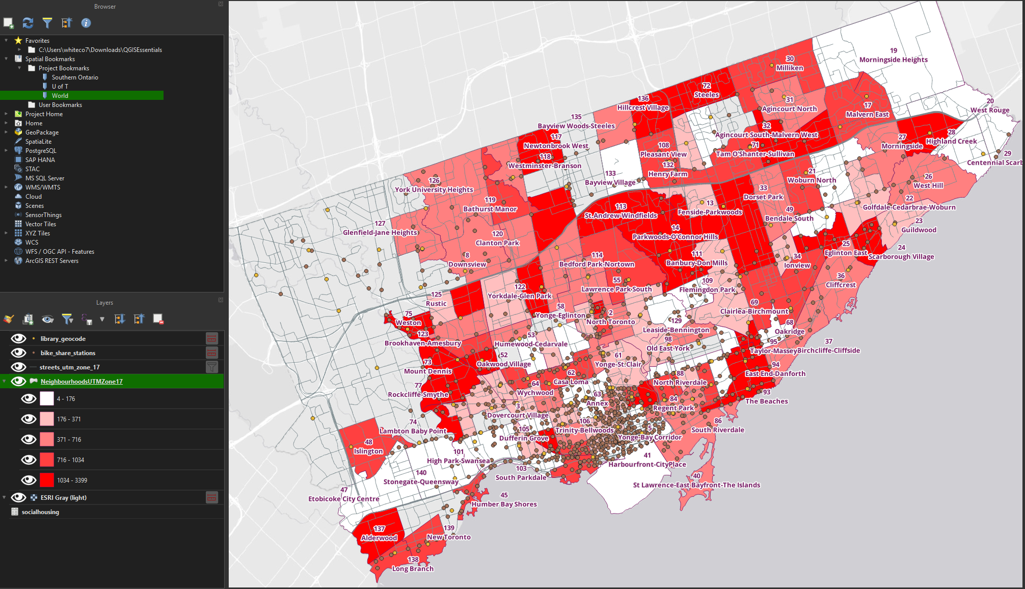
Symbology
Symbology refers to the graphic design of a layer. It’s useful for visualizing data in a clear, aesthetically pleasing way.
We can also create data-driven symbology that reflects information stored in a layer’s attributes.
Categorical symbology
• Right-click the neighbourhoods layer and choose Properties. 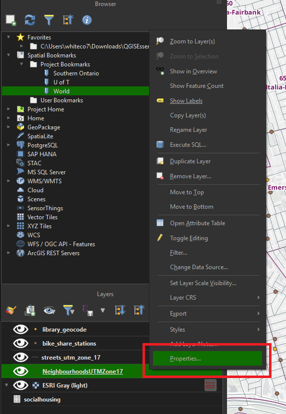
• Click the Symbology tab. Currently, the layer is using Single symbol - all neighbourhoods are drawn in the same way (the purple outline).
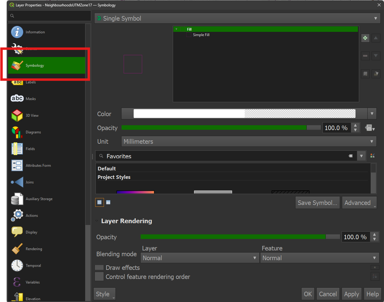
• Click the dropdown and change the symbology type from Single Symbol to Categorized.
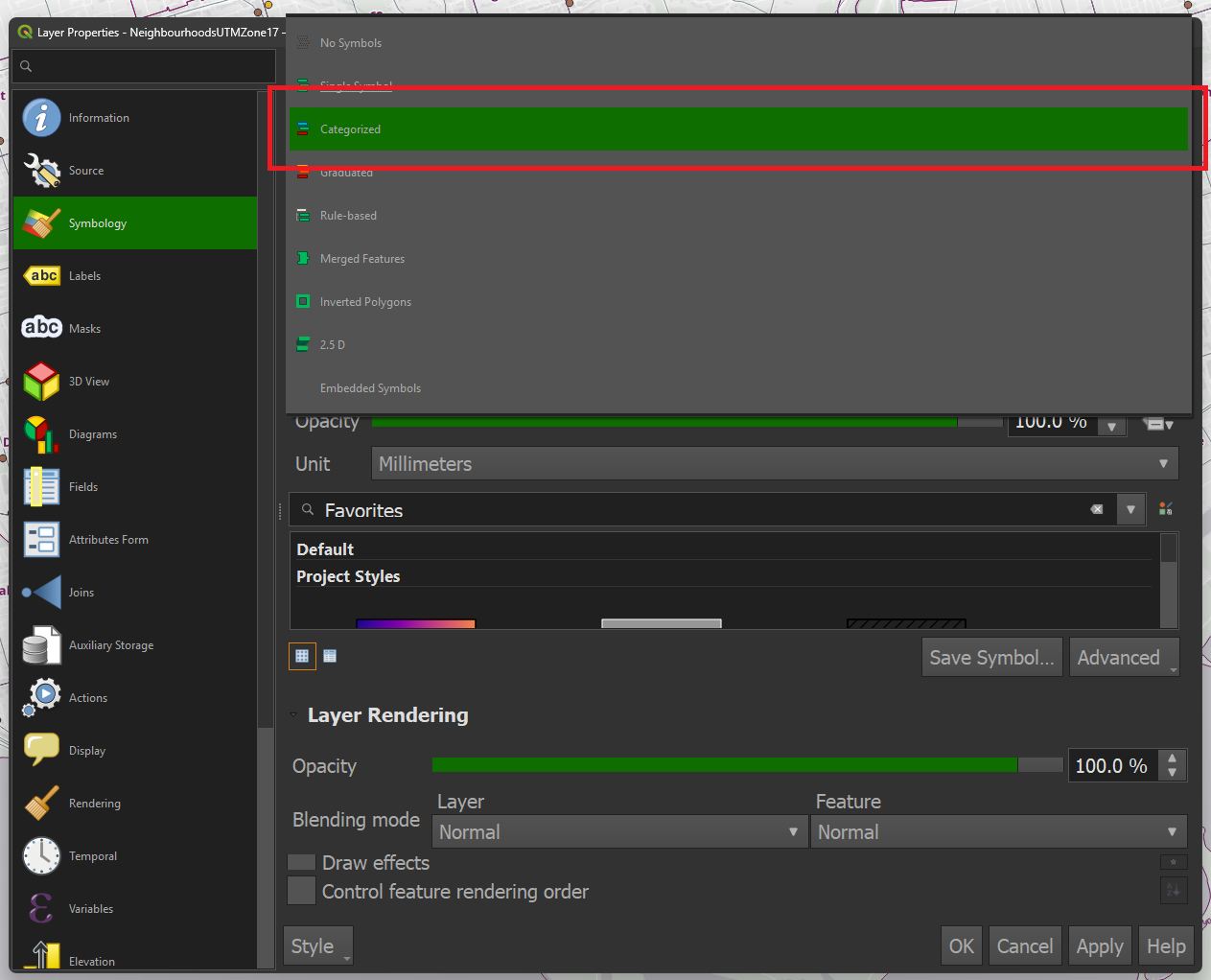
• Click the dropdown and choose Category from the list of available fields.
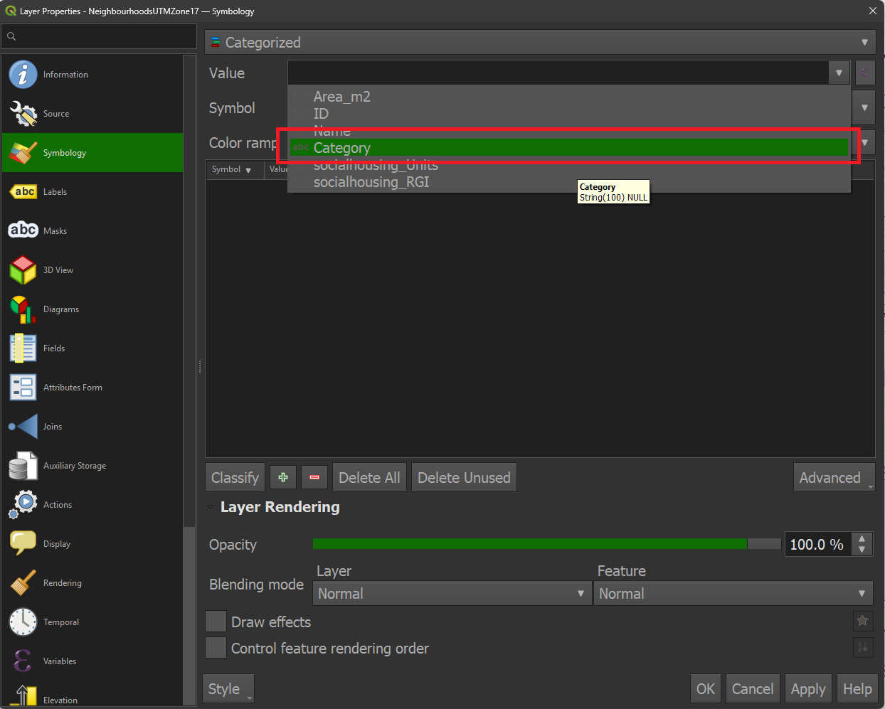
• Click the Classify button. Each unique category found within the layer’s attribute table is assigned a different coloured fill. Fill colours can be adjusted manually, or you can choose a colour ramp from the dropdown. Click OK.
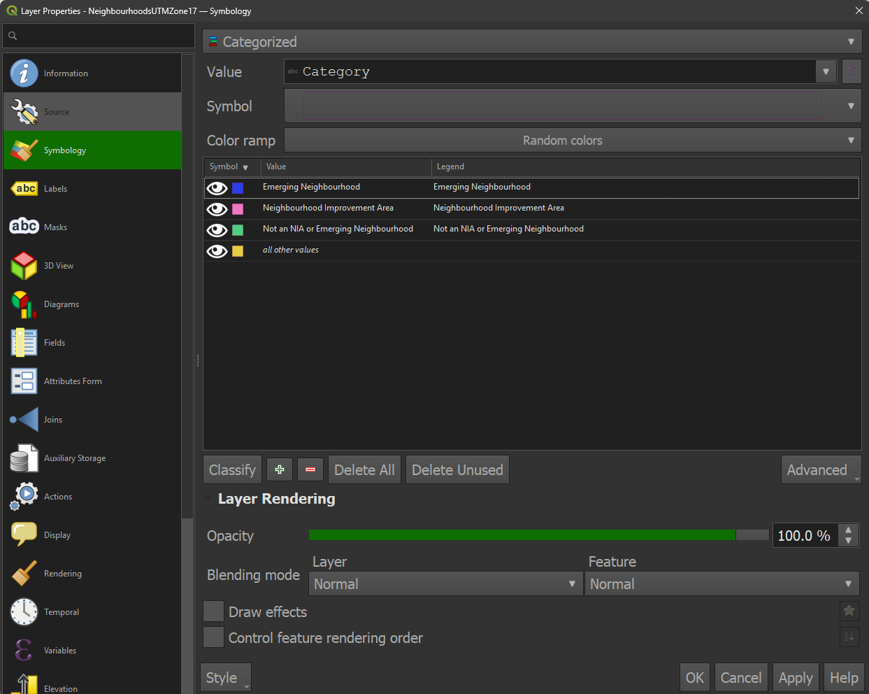
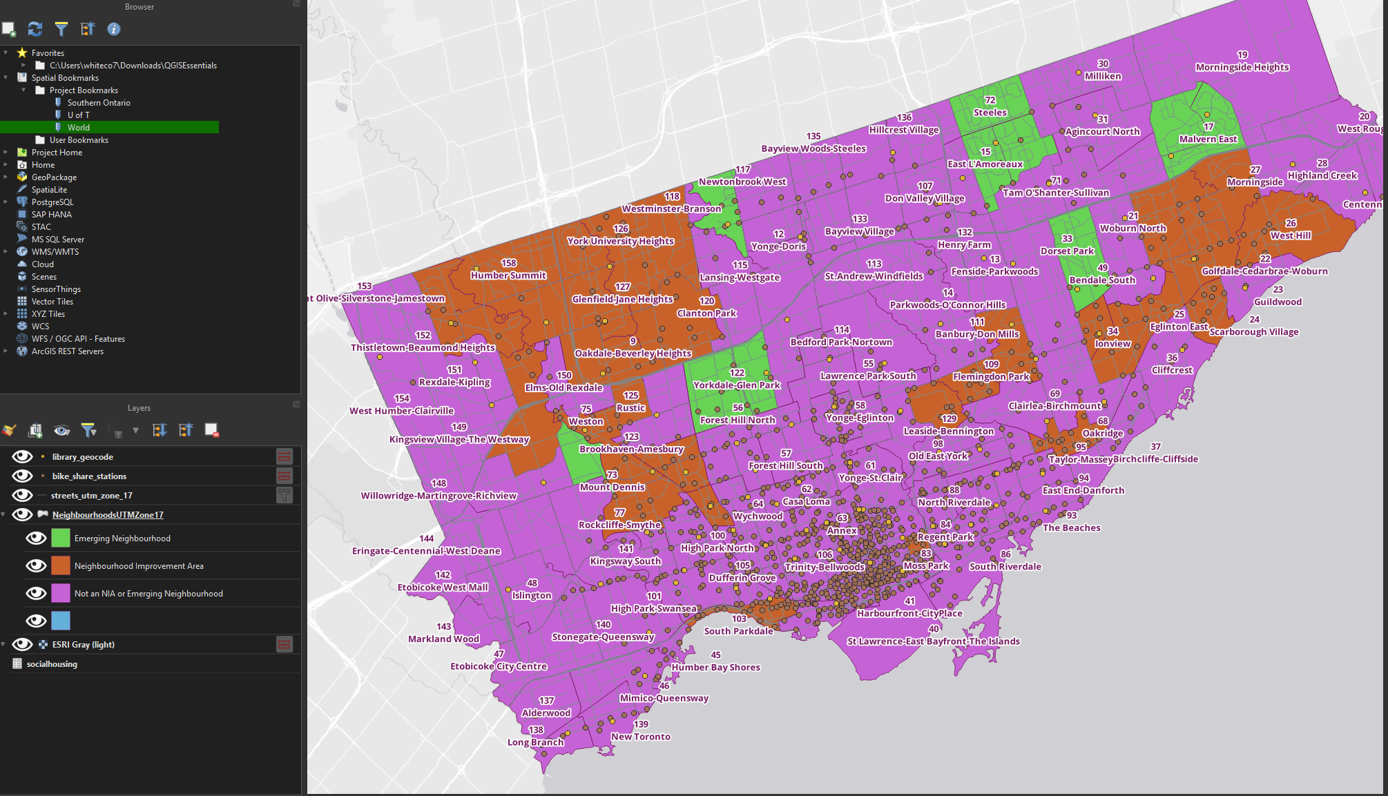
• Result: Neighbourhood polygons have been styled according to their designation as neighbourhood improvement areas or emerging neighbourhoods.
Graduated symbology
• Go back to the symbology settings for the neighbourhoods layer. Change the symbology type from Categorized to Graduated.
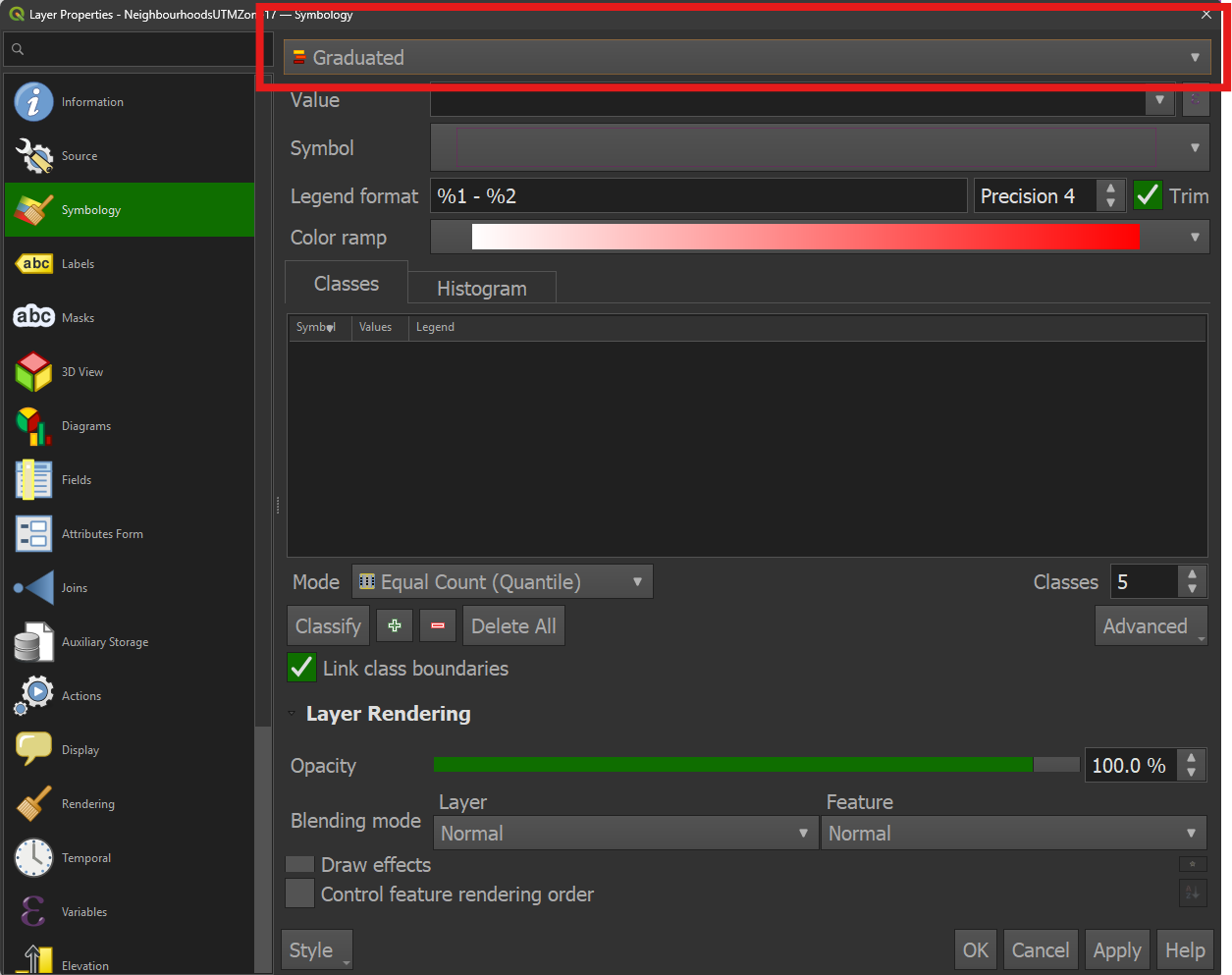
• Choose the socialhousing_units field for the Value.
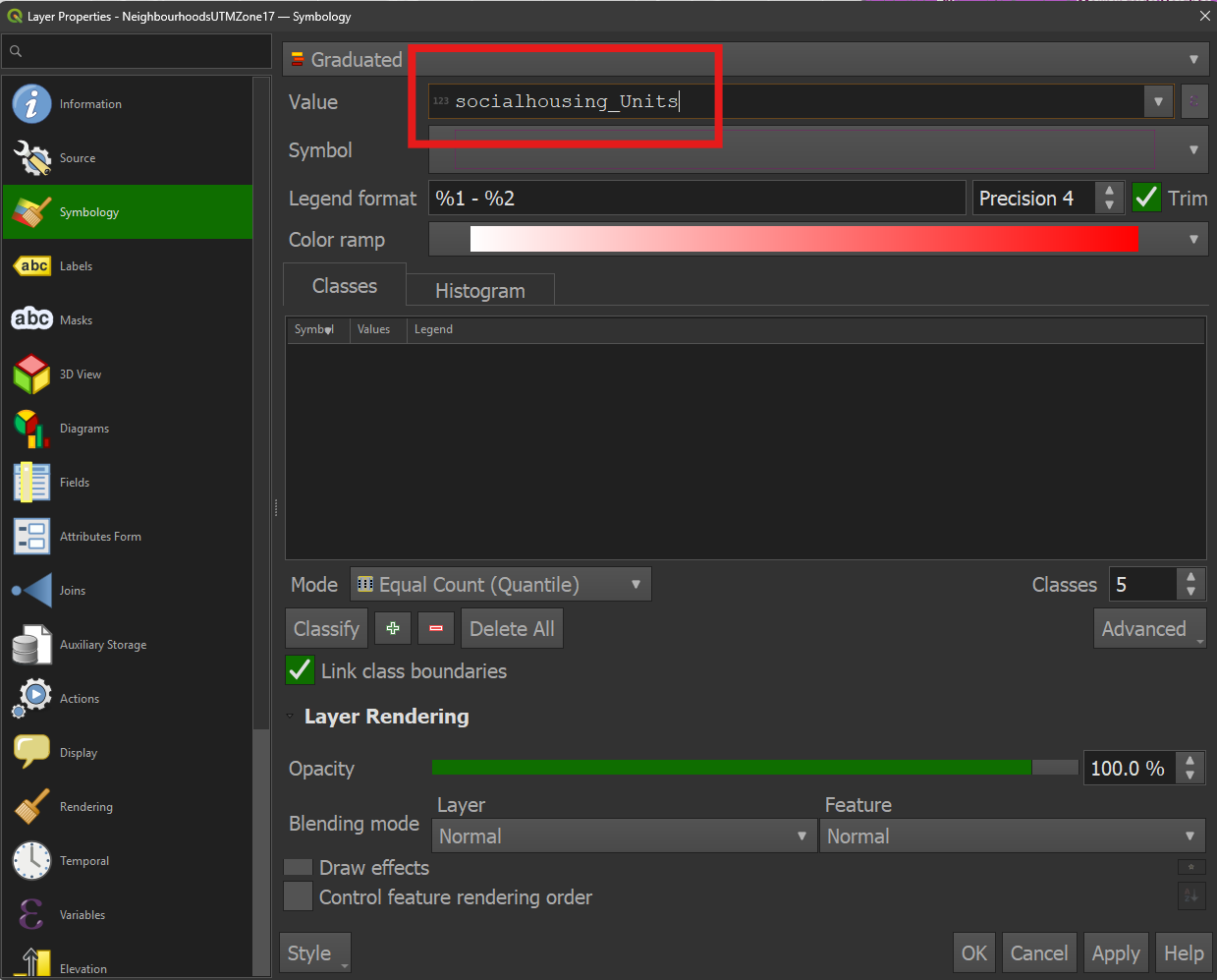
• Click Classify
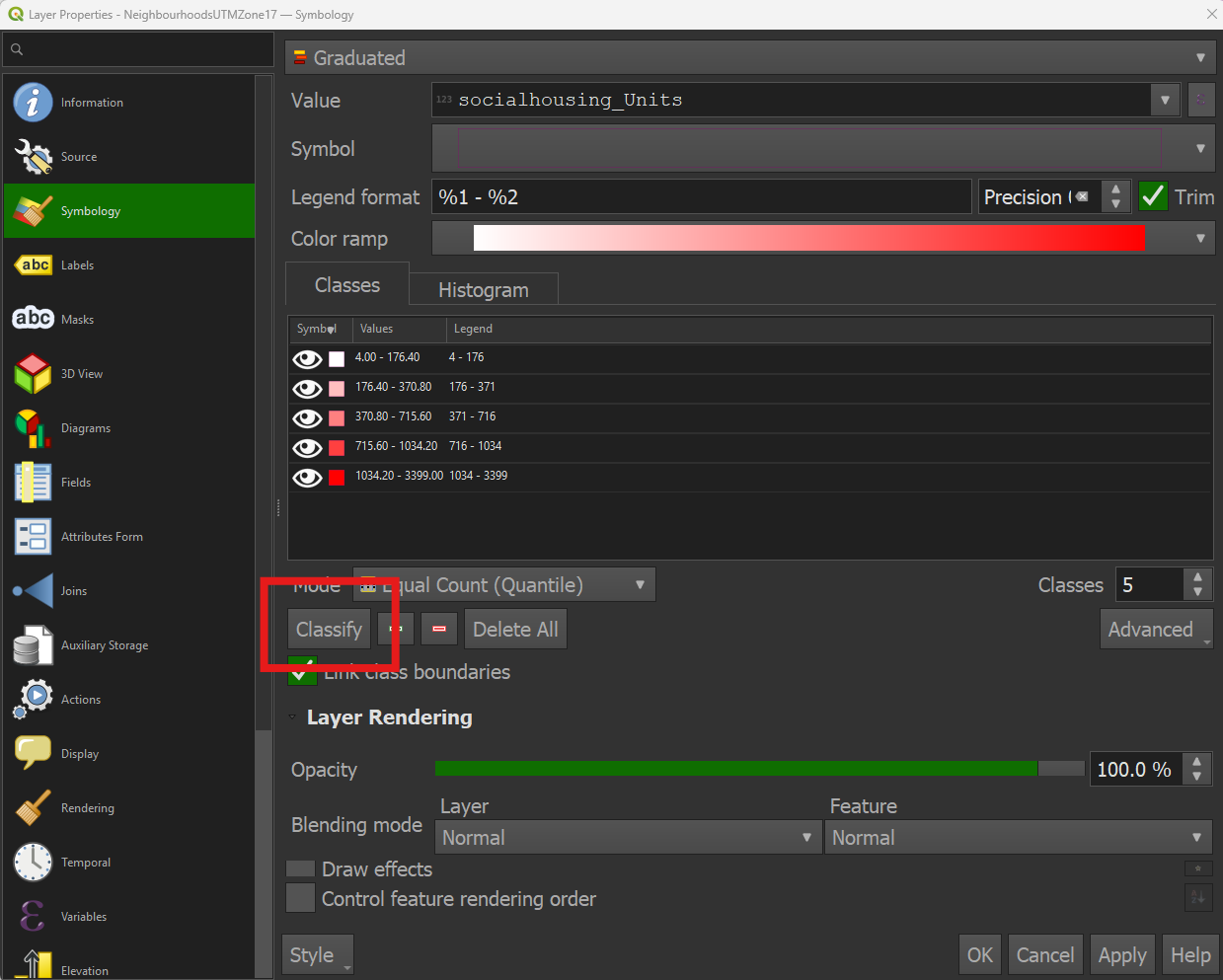
• Click OK. Neighbourhood polygons have now been symbolized to show quantity (number of social housing units per neighbourhood).