4. Creating a Simple Line Graph
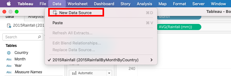
Okay, let’s create a new visualization: A line graph of average monthly temperature data by country (looking again at the same range of years, 1901-2015). First, we need to load some more data. Go to the top Data Menu and select New Data Source. Select Excel and choose the 2015TemperaturesByMonthByCountry.xls file.
From this screen, you can see what types of variables Tableau has detected (based on small icons above the variables names). 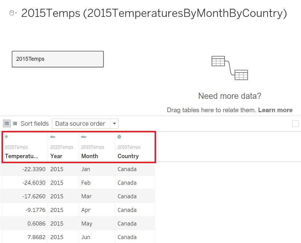
These variables can be changed if you’d like. For example, based on the small “Abc” above them, you can see that Year and Month columns have been identified as a string. If I want to plot data over time using a line graph, it would be best to change Month to date format. To do that, I just click on the Abc icon above the Month column and select Date instead. 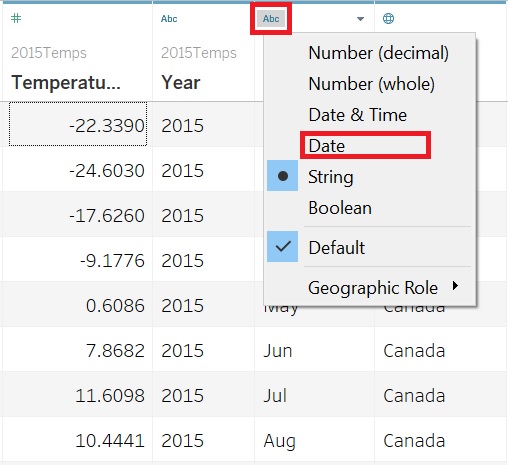
You’ll see below that the data has changed format and the icon now looks like a calendar. 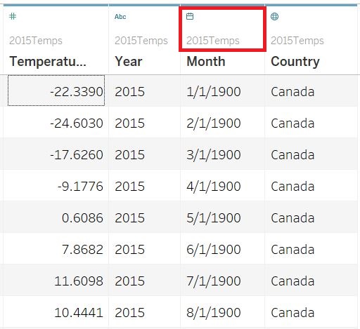
Once happy with your data, you can create a new worksheet to start building a new visualization by clicking on the tab next to where it says Sheet 1. This is a new worksheet icon. 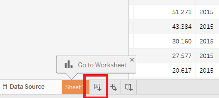
Let’s drag the Month variable to the Columns section again. This time it is a date variable, so we have more options in our drop-down menu. We want is to make sure we’re displaying months, not years, so right click on the Month pill and select the first option for Month. 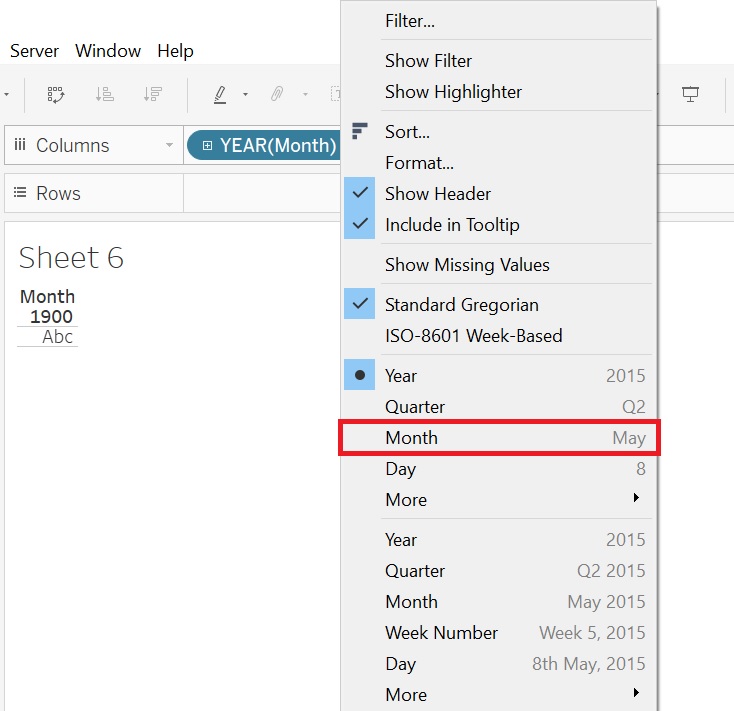
Next, drag the Temperature variable to the Rows section. You’ll notice that our graph is summing the temperatures for all the countries. We can again right-click on the Temperature pill, and select Measure (Sum), then pick Average. Your “pills” and graph should look like the image below. 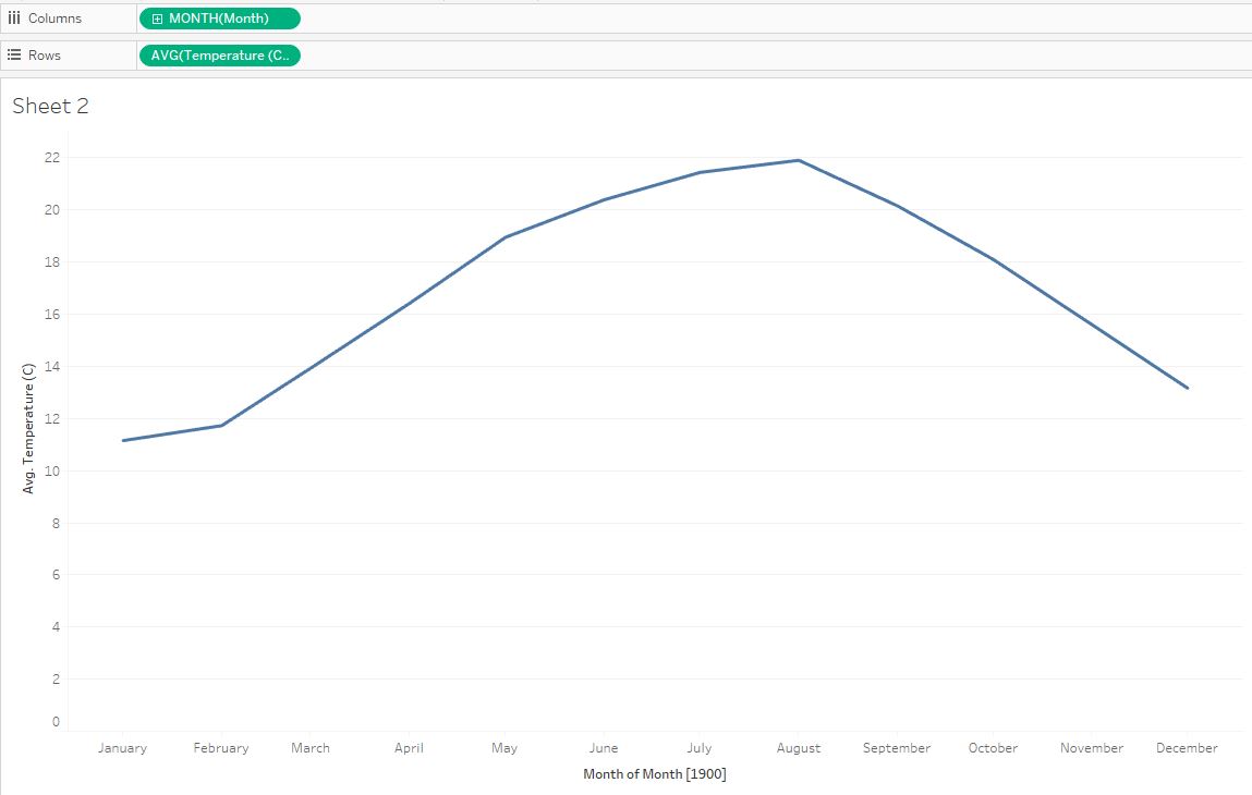
We would like to see each country’s data separately, so let’s drag the Country variable onto the Color box in the Marks card. You can see that Tableau has assigned a qualitative colour palette scheme to represent our countries, but we do have a lot of them, so it is a bit overwhelming. 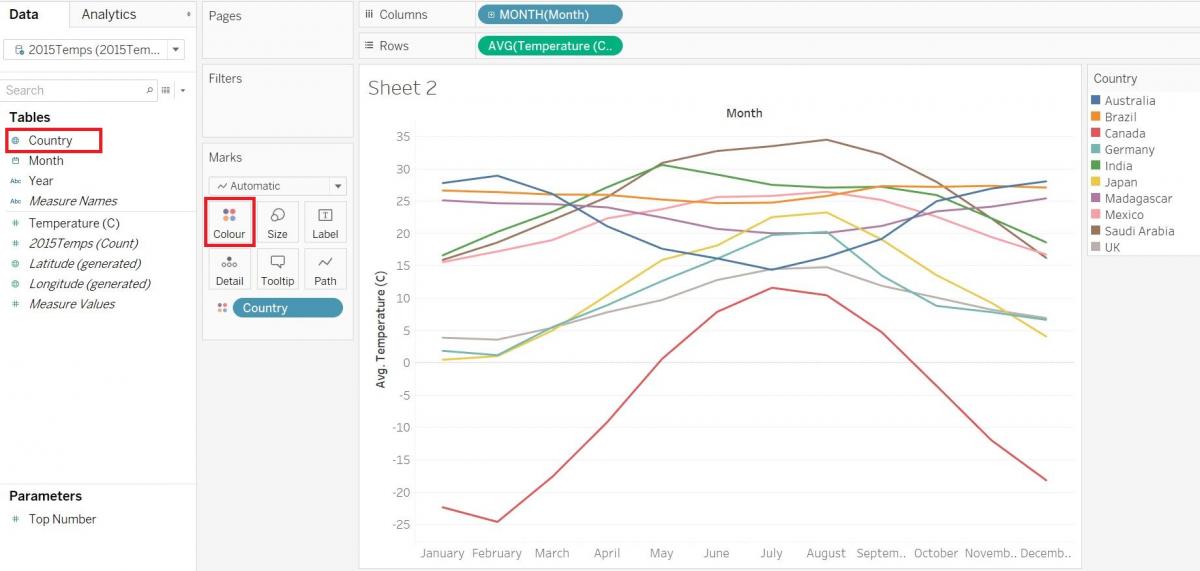
One way to simplify this would be to show 2 countries to compare their temperature distributions. Drag the Country variable over to the Filters shelf. Click on the None button to first clear the selections. Then select two countries only – let’s pick Canada and Brazil. Now we are just filtering the data to show only Canada and Brazil.
Note: that if you can’t see this Country legend, then you need to move or close the “Show Me” window, which could be concealing the legend. Go ahead and move or close the window so that you can see the legend. 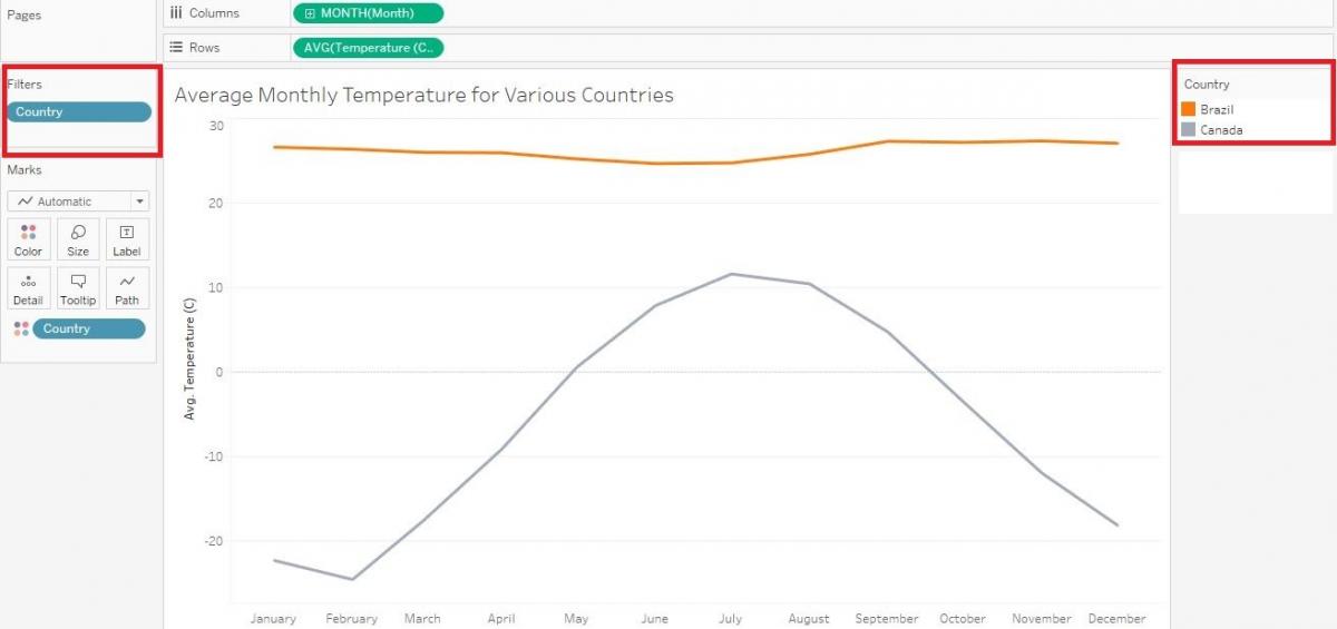
Another way we could do this would be to allow the user to filter it themselves based on what countries they are interested in. To do that, go back to the Filters shelf, right-click on the Country pill and pick Edit Filter… Select the All button to re-select all the countries and then click OK. Then right-click on the Country pill again, but this time select Show Filter. Now you can see the filters show up on the right. We can select or deselect as we like and the graph changes. 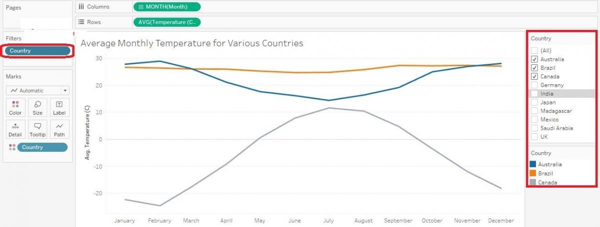
To further help the user read your graph, you could also add a highlighter. Go back to the Filters shelf, right click on the Country pill, but this time pick Show Highlighter. Now the Highlight Country box shows up on the right. 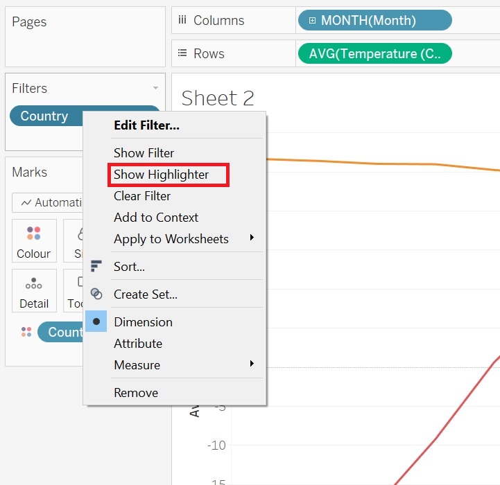
The user can pick a country and the graph emphasizes that country. To try it out, make sure you aren’t filtering any of the countries first, then click on the Highlight County search box to see the list of countries, and then hover over one – try Canada. You should see it emphasized in the graph.
Let’s adjust a bit more of the formatting on this graph. For one thing, I don’t like how the months are displayed at the bottom. We can fix that. Right-click on one of the months and select Format… 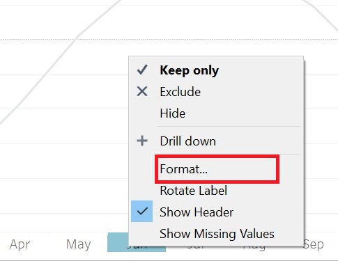
The Format pane should show up on the left. From the Header tab, under Default, where it says Dates, select from the drop-down menu, Abbreviation.* Then click anywhere on the graph to save it.
If you are encountering a problem where the “Dates” option is not showing up under the Default section, you might have the wrong data type selected for your “MONTH(Month)” variable. You can rectify this issue by right-clicking the “MONTH(Month)” pill (selected as your column) and selecting the other “Month” option. Then try the previous step again. 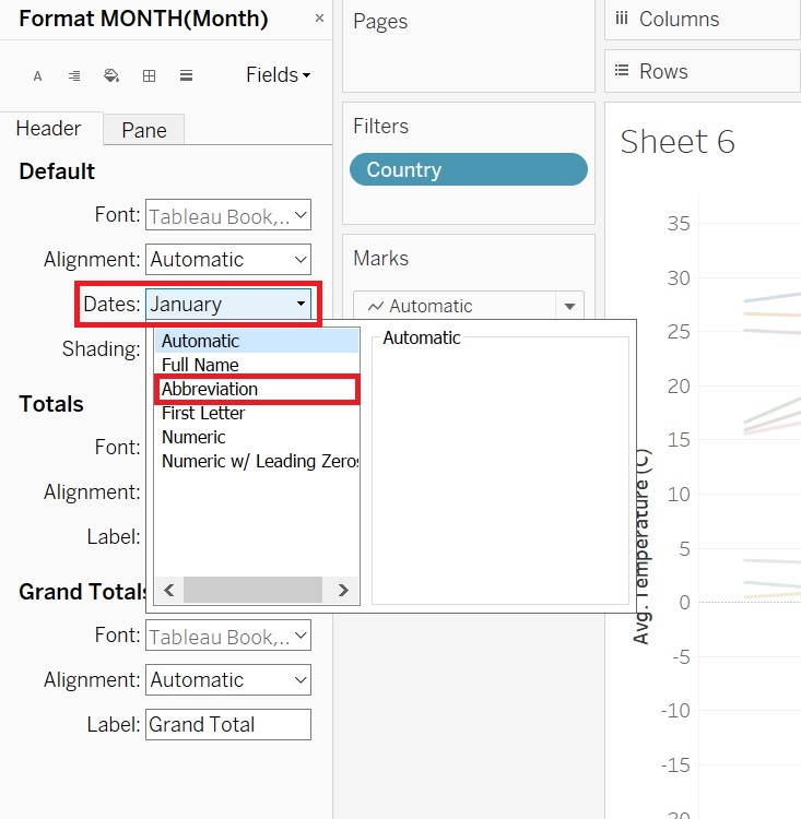 Finally, let’s say you didn’t like these colours. Click on the Color box under Marks and select Edit Colors…
 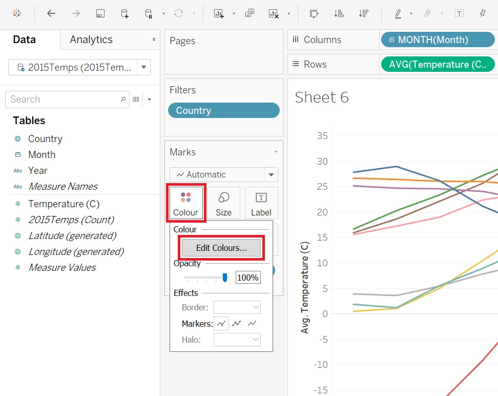 Here you can pick from a drop-down menu of various qualitative palettes, including a colour blind safe palette. Select one you like and click on Assign Palette (you must click this option to activate the new colour palette). Then click on OK.
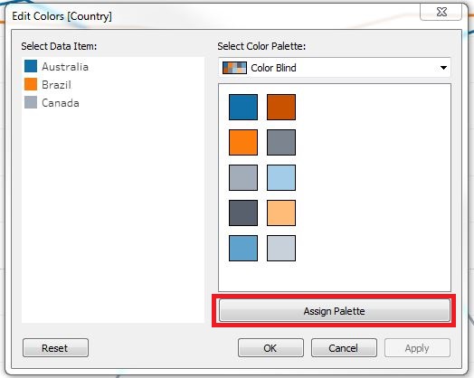
Again, we can give our visualization a more meaningful title by double clicking on Sheet 2 at the top and replacing the text with our title “Average Monthly Temperature for Various Countries” and click OK. You have completed a simple line graph in Tableau Desktop!
Technique: Data Visualization | Tools: Excel, Tableau