5. Creating a Series of Simple Scatter Plots and Merging Datasets
Sometimes you have to pull data from multiple sources instead of having it all in one Excel file. So, let’s add a couple more datasets, but this time we’re going to match them up, or have Tableau join them together so we will have one large dataset to work from.
Go to the top Data Menu and select New Data Source. Select Excel and choose the AuthorDataCitationsGrants.xls file, then click Open.
Now click on Add next to Connections on the top left to add a second dataset to ultimately create a database join. Select Excel and then pick the AuthorDataExperience.xls file. This dataset has just author names, along with how many years of experience they have as a researcher. 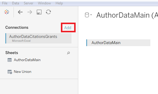
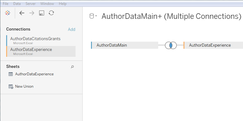
You can now see the two datasets listed under connections. In order to relate the two datasets together, double click on AuthorDataMain above the table.
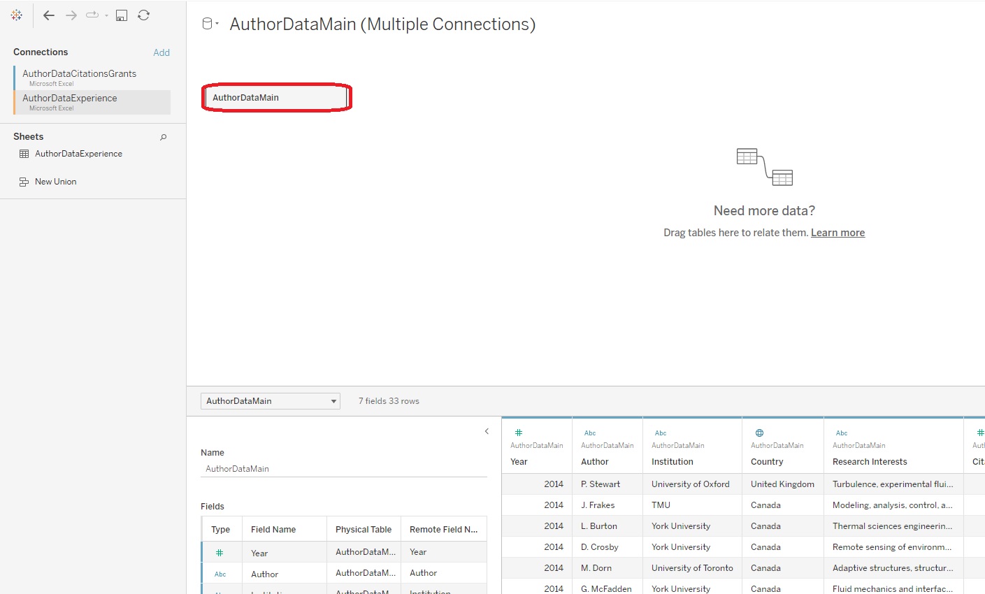
Ensure the dataset AuthorDataExperience is selected and drag its sheet, also named AuthorDataExperience beside AuthorDataMain.
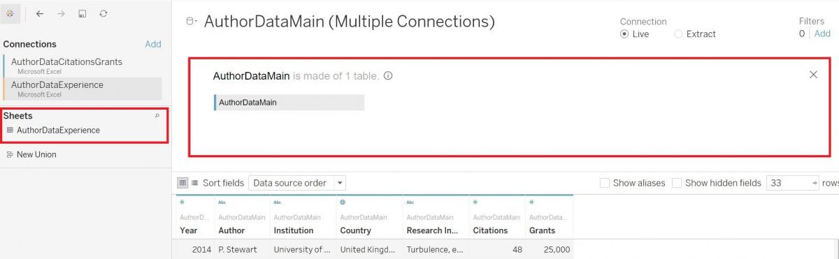
At the top you can now see the two datasets listed, and below you’ll see that Tableau has joined the two together, matching based on the author name. If you want to double check this, click on the circles between the two dataset names at the top; this will also provide you with more information about how the join was completed by Tableau. You can see from the icons that Tableau has done an inner join, matching the column Author in one dataset with the Author column in the second dataset. It has copied pasted that information about the author’s years of experience next to that author wherever the author shows up in the first table. The inner join means that it only keeps data on an author if that author shows up in both tables. (Note: If database joins are new to you, see this resource for a detailed explanation.)
Again, once you’re happy with your data, you can create a new worksheet to start building a new visualization by clicking on the new worksheet icon (at the bottom left of your screen to the right of the Data Source).
This time, let’s take a look at creating a scatter plot using the Show Me feature. To do so, first hold down the CTRL button (on your keyboard) and click on Grants and Years of Experience. Secondly, click on the Show Me tab to expand it. We see that a Scatterplot is one of the recommendations (i.e., not greyed out) – select it. If you’re not sure which one it is, hover over the images and then read the description below to find out which one is the scatter plot. Thirdly, observe how Tableau automatically populated your column and row fields once the scatter plot option was selected.
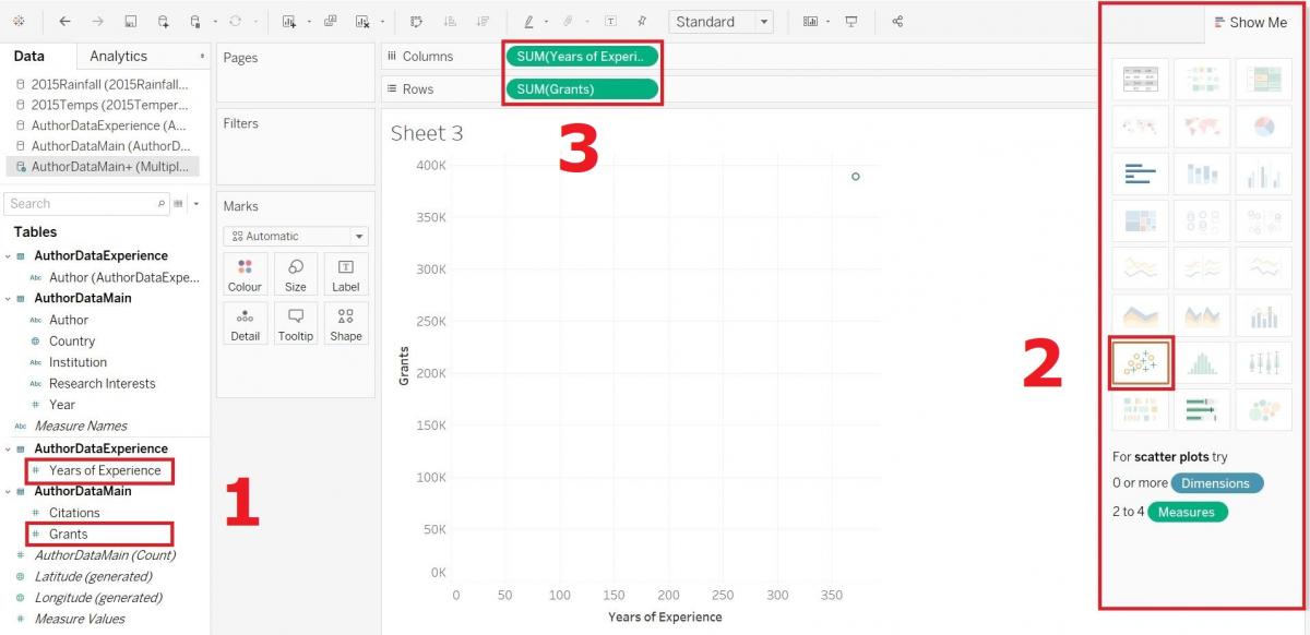
Click on Show Me again to hide its options panel.
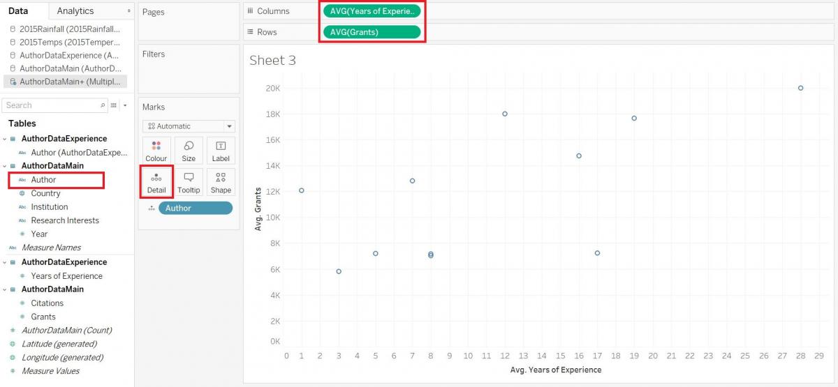
First, instead of summing these variables, let’s take the averages, as we’ve done before. So right click on each pill in the Rows and Columns sections, and select Average from the Measure (Sum) menu.
Our next problem is that it is plotting just one x/y pair – the averages of the whole dataset. We need to plot the points either for each author, country, or institution. Let’s do it by author. Drag the Author variable over the Details box; it explodes out the aggregation to plot it by author. When you hover over each point, you can see the details.
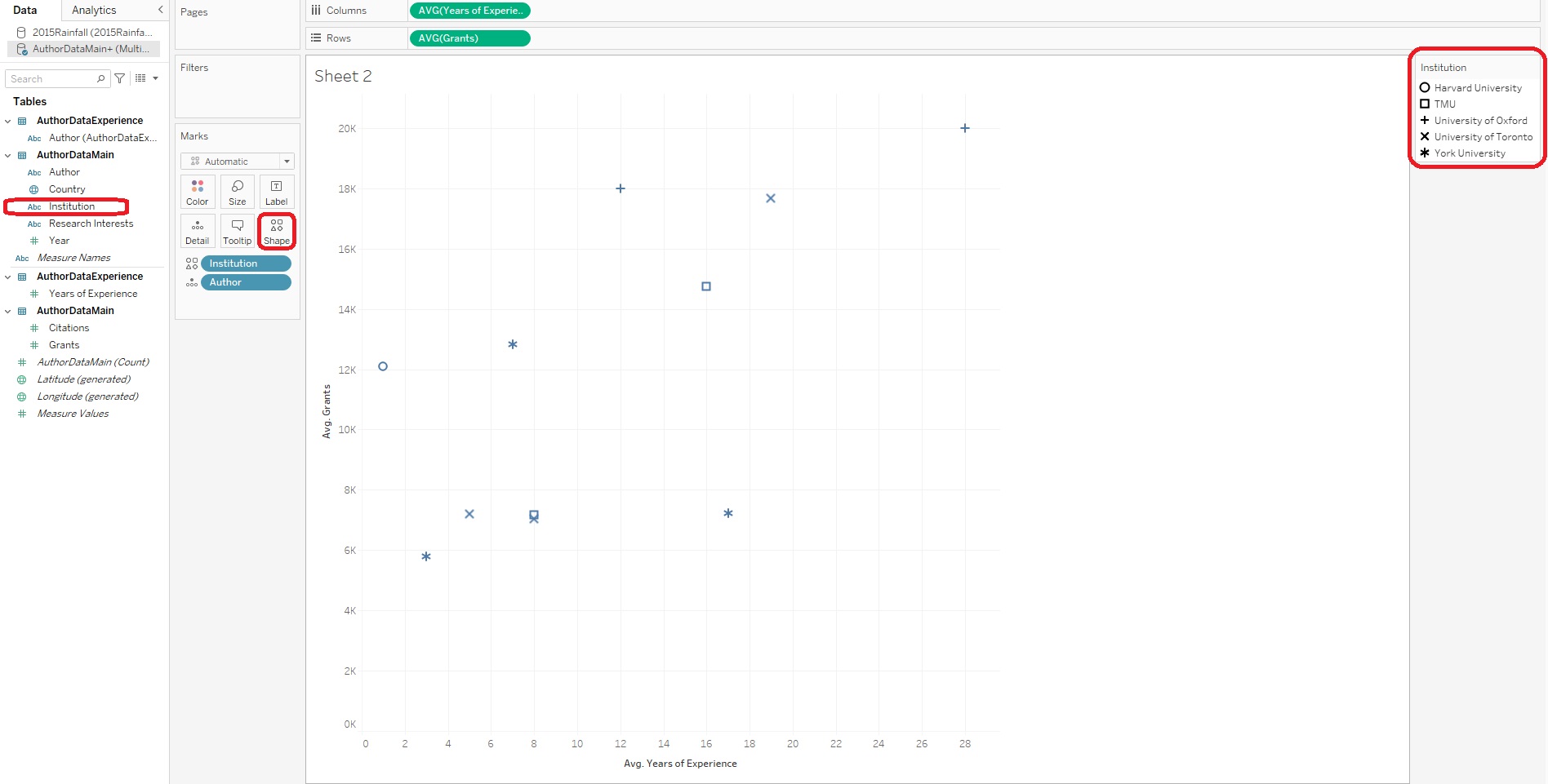
You may notice there is now also another box on the Marks card called Shapes. If you want to add another categorical variable to your scatter plot, you could do so by using different shapes to represent different categories. Drag Institution on to the Shapes box. Now you should see that there is a legend on the right, using different shapes for different institutions.
If you want to add a trend line, right click in the centre of the graph and select Trend Lines, and then Show Trend Lines. 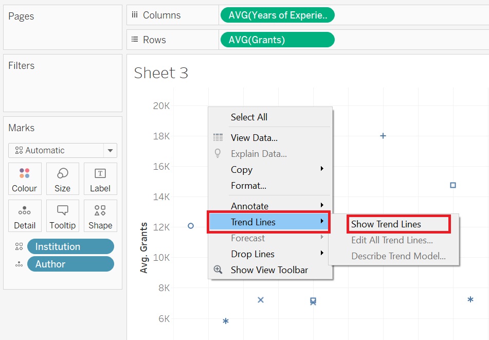
Hovering over the lines gives you statistical information, such as a regression and p-values.
Finally, one interesting feature of Tableau is that you can create not just one visualization, but a series of them, using the Pages shelf. Drag Year onto the Pages shelf. 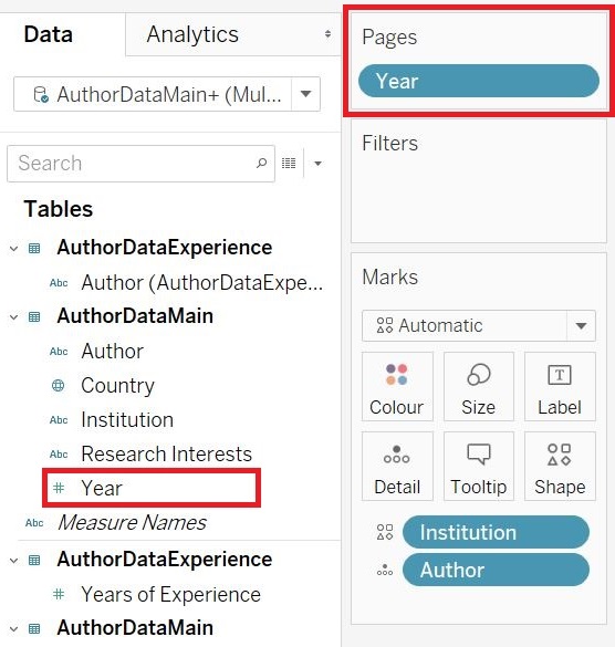
Now you should see some “Year” controls on the right. The user can scroll through three different scatter plots, one for each year, or they can click on the play button to have it animate through the years. Your final graph should resemble the image below (depending on which “page” is currently visualized in Tableau). 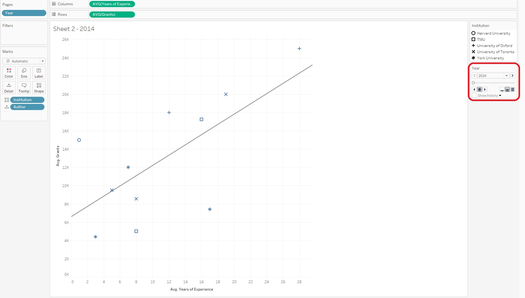
Again, you may be interested in giving your visualization a name, which you can click and change at the top left of your scatter plot.
Technique: Data Visualization | Tools: Excel, Tableau