8. Creating a Dashboard
Now so far we’ve been creating visualizations within worksheets. But you can also create dashboards that combine a number of worksheets together. We are now going to create a dashboard capable of displaying the average monthly rainfall and temperature for one country at a time. Let’s click on the create new dashboard icon at the bottom, next to the new worksheet icon. 
You then can drag and drop various sheets to layout a dashboard. You can also drag other objects, such as text or images to create your dashboard. From the left side of your screen, drag Sheet 1 to the dashboard area. 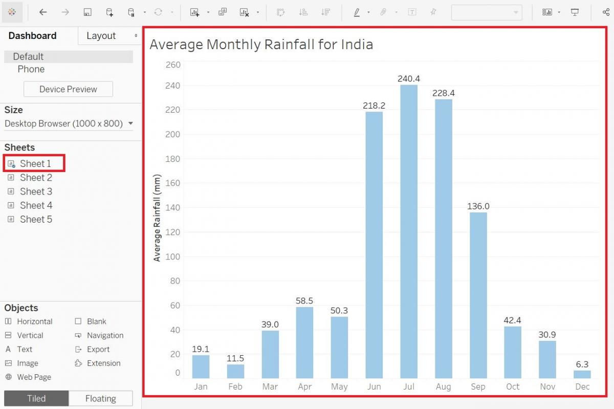
Next drag Sheet 2 to the bottom of the dashboard area. As you are dragging each sheet, Tableau will shade in the section of the page the sheet will occupy once you release it, so use this as your guide to the placement of your sheets in the dashboard. 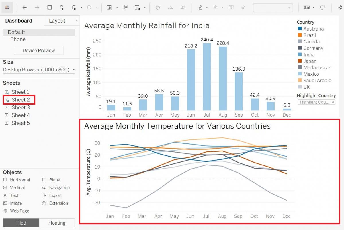
We can also take the filters we had for one worksheet, in this case the temperature graph, and then apply it to the all the sheets on the dashboard. We can do that in this case, with just a few adjustments to our Sheet 1. Go back to Sheet 1 by clicking on its tab at the bottom. Select the annotation (your “monsoon season” text) and press the Delete key on your keyboard to remove it. Adjust the title removing the mention of a particular country. Drag the Country filter, set to India, back towards the Dimensions and Measures section to remove it (which you can do with any variables you want to remove from your visualization).
Go back to the dashboard by selecting its tab at the bottom. Right-click on the title of the filter, Country, select Apply to Worksheets, and then pick All Using Related Data Sources. 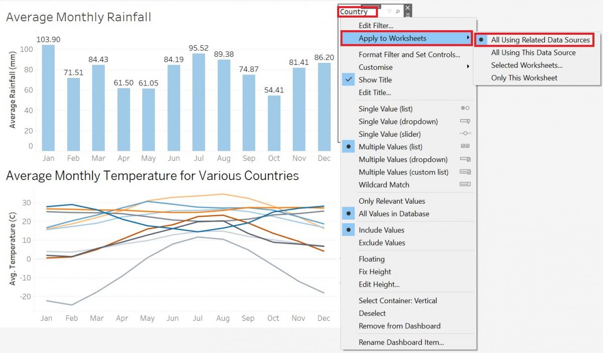
Right-click again on the Country filter title, but this time select Single Value (list). This will make sure that your audience can only view one country at the time. Now you’ll see that when you select one country, both graphs refer to that country. 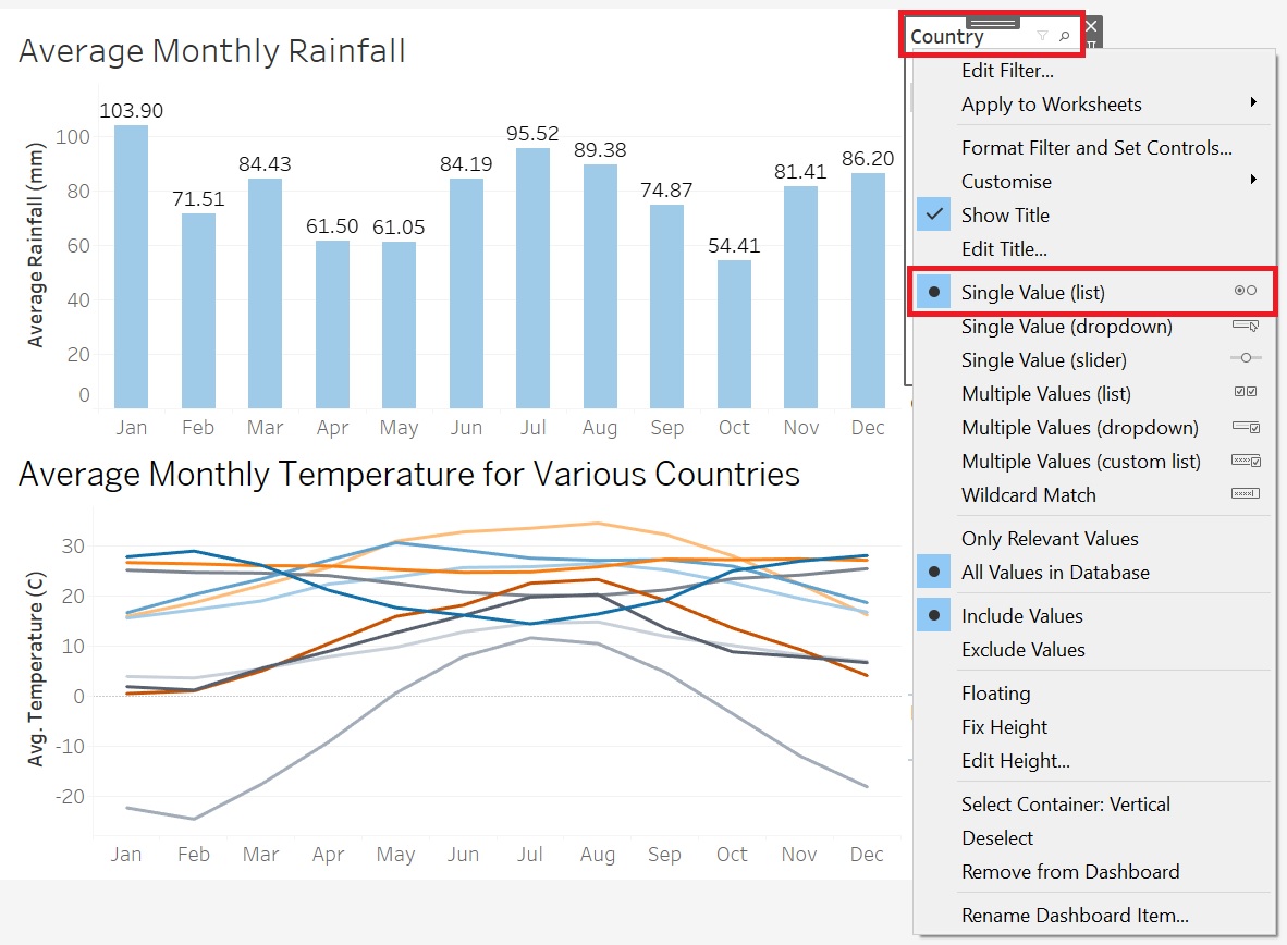
Technique: Data Visualization | Tools: Excel, Tableau