Creating Bar Graphs
Start by opening up Tableau Desktop.
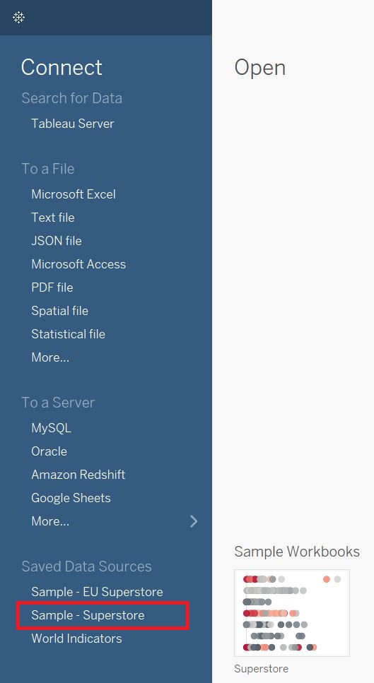
We are going to start with a built-in dataset. Under Saved Data Sources, select Sample - Superstore.
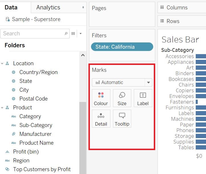
On the left you can see our variables listed, categorized by Dimensions and Measures. Dimensions are roughly qualitative data and measures are roughly quantitative data.
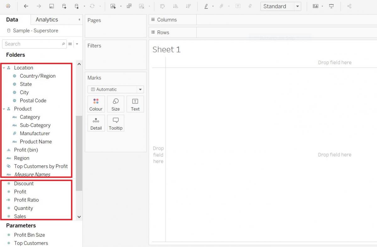
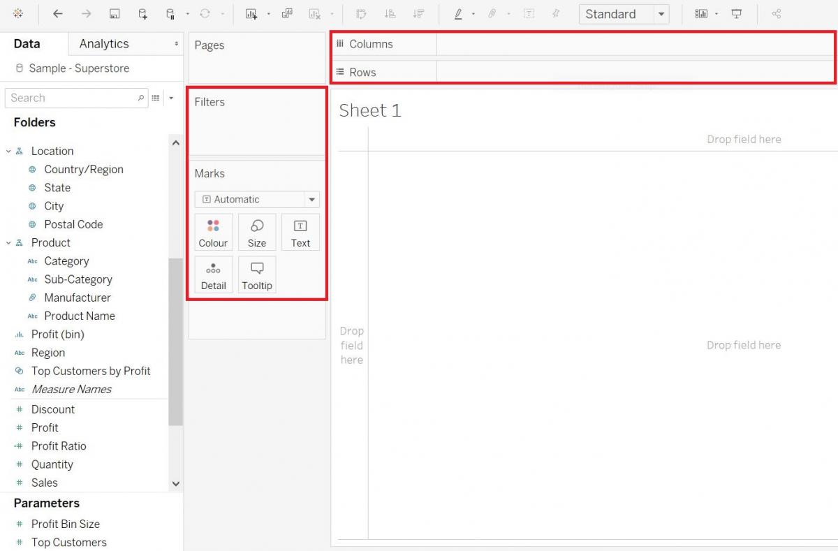
The centre area is where you’ll be dragging and dropping your variables on to different sections, such as rows and columns, or to vary mark characteristics such as colour or size by your variable, or filtering by a variable. In terms of Tableau terminology, those areas that say filters or pages are called shelves, the marks area is called a card and when the variables are showing up in those areas, they are called pills, as they are shaped like a pill.
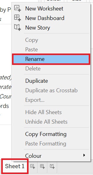
Okay, we have loaded in some data about a fictional superstore, so let’s start by creating some visualizations that are used to make comparisons. Let’s start by making a simple bar graph. To keep track of all the visualizations we are going to create, let’s rename our sheets as we go. Right-click on Sheet 1 at the bottom, select rename.
Give it the name “Sales Bar” and press Enter.
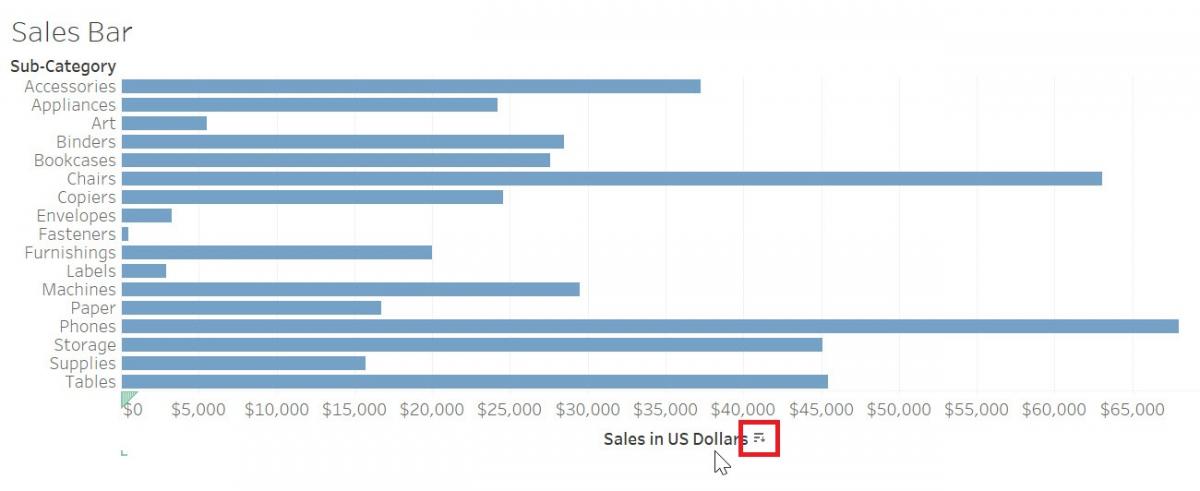
We are going to create a horizontal bar graph to compare the amount of sales for different sub-categories of products, with sub-categories along the y-axis and sales along the x-axis. Bar graphs are great for comparing categories. So drag the Sales variable (in the Measures section) next to columns and the Sub-category variable (in the Dimensions section, under Product) next to rows.
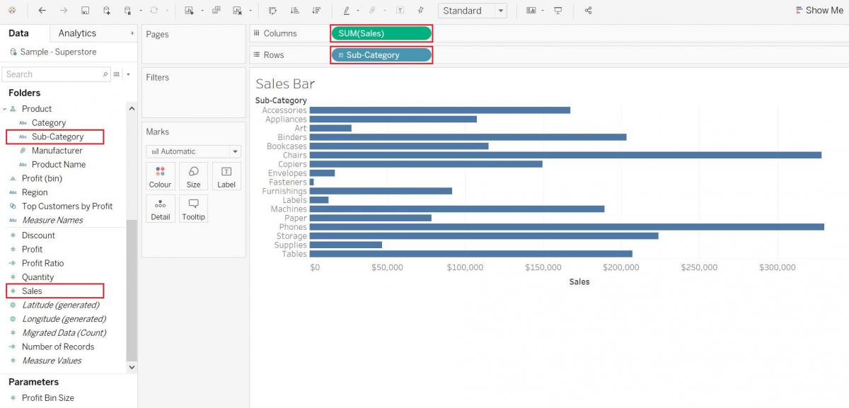
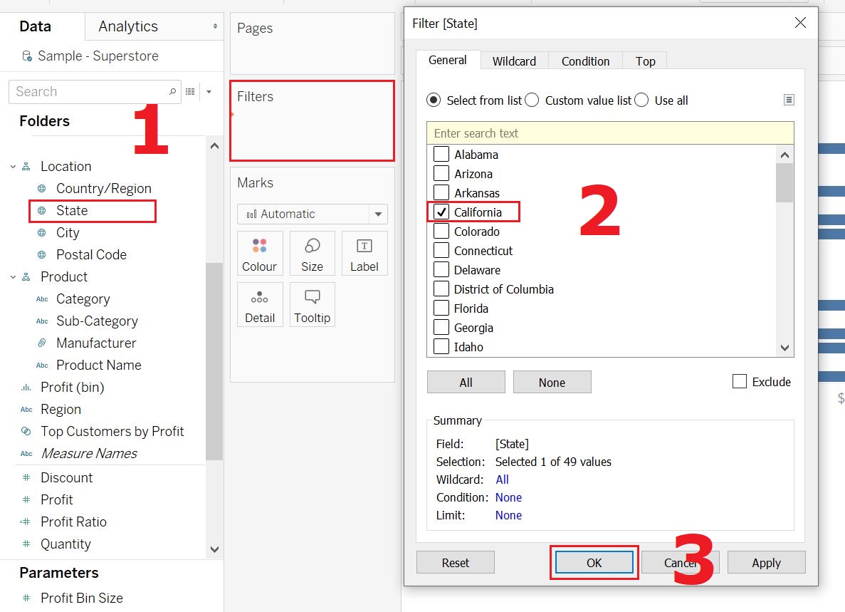
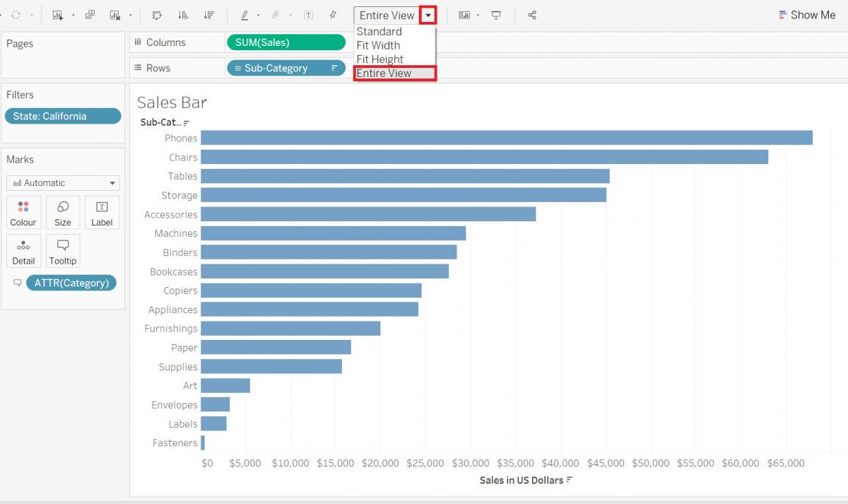
You can see that when we dragged Sales, it automatically summarized it by adding up all the sales values for each sub-category. Right now it is showing data combined for all of our states, but let’s say we just want it to show one of them. We can filter by state by dragging the State variable (Dimensions, under Location) over to the filters shelf and selecting one state from the list – let’s pick California and click OK.
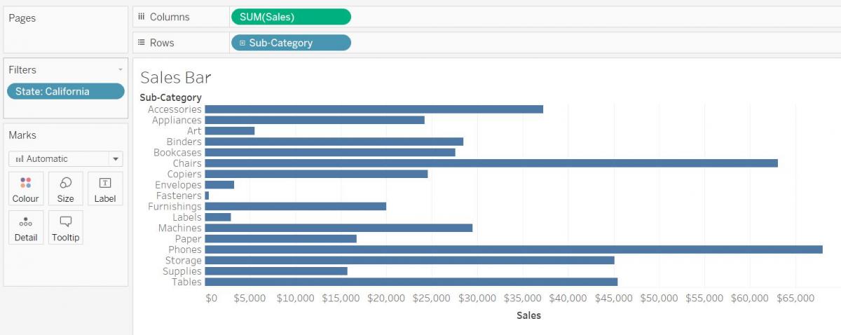
Now we have a bar graph showing the Sales by Sub-Category for California.
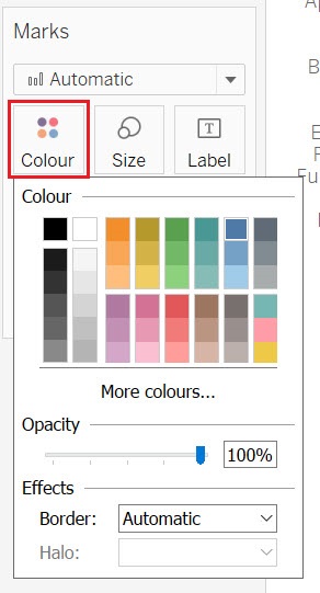
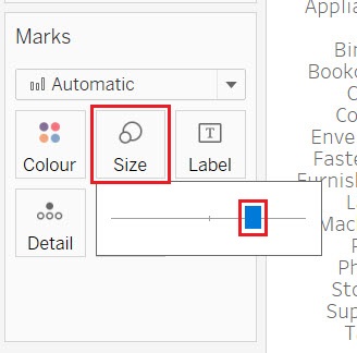
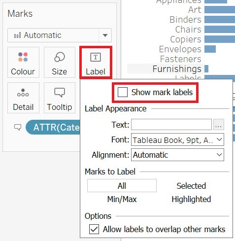
Next let’s look at the Marks card. You should see 5 boxes labelled Colour, Size, Label, Detail, and Tooltip. You can use these to customize your visualization.
Click on colour, and change the colour of the bars to a different shade of blue.
Click on Size, and use the slider to make the bars wider or narrower.
Click on Label. The Label section allows you to create and customize labels. We can click on show mark labels to see the values for each bar (under options, make sure to allow overlap as well), but you can see this makes our bar graph look cluttered, so let’s keep the show mark labels unchecked.
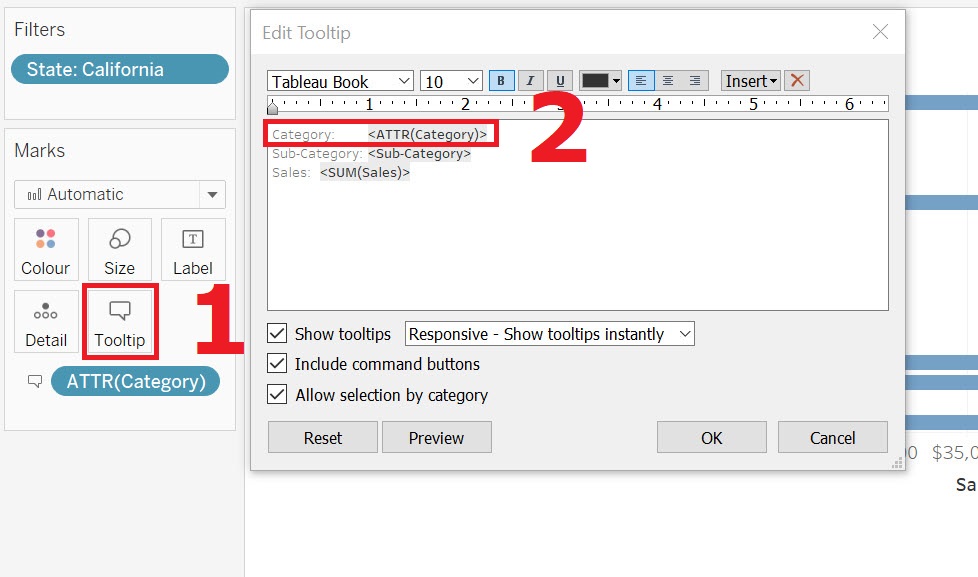
Let’s add the broader category that the product falls under in the tool tip. To do this, drag the Category variable (Dimensions, under Product) to the tooltip box.
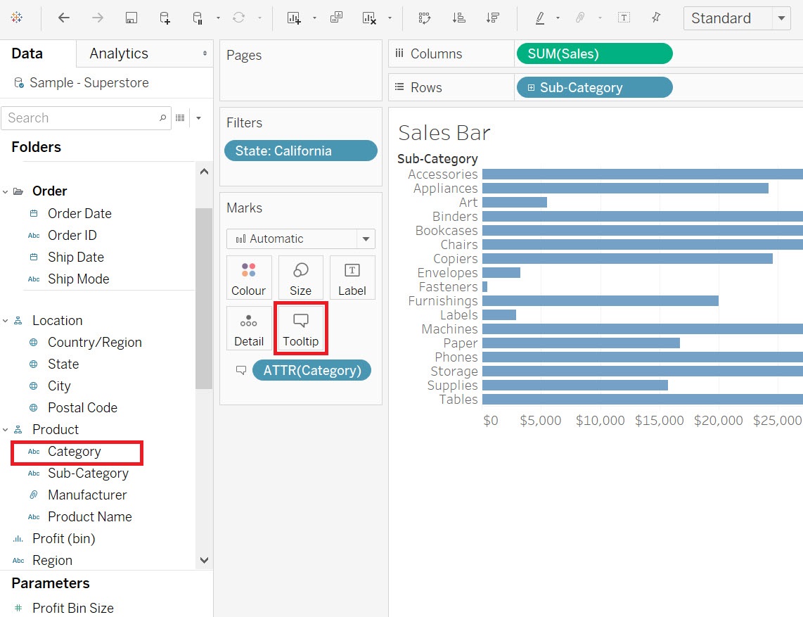
click on Tooltip. In the edit box, you will see “Category:” has been added underneath Sub-Category to the tooltip. However, if you want to change the order, perhaps to have the broader category go first, you can click on tooltip and edit the box. Switch the order, making Category come before Sub-Category and click on OK.
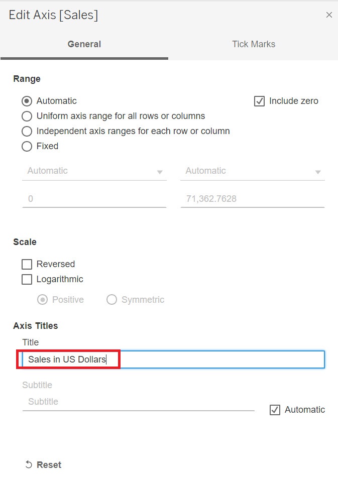
You can also customize the axes. For example, right click on your x-axis title, select edit axis. Here you can make changes to your axis, such as the range of values or tick marks.
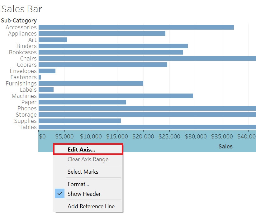
Change the title (under Axis Titles in the General tab) to say “Sales in US Dollars”. Then close the window. The change will be applied automatically.
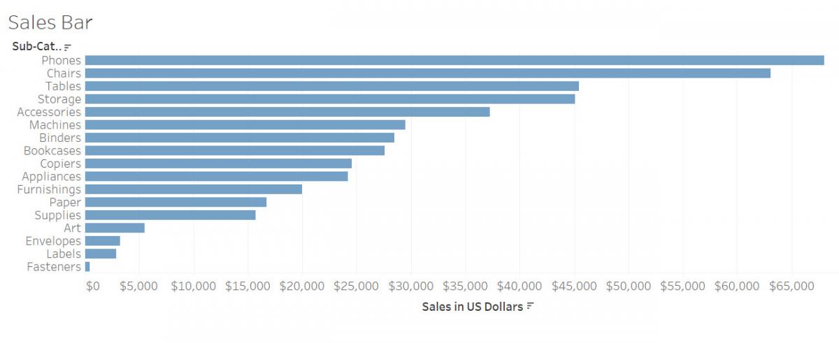
Right now the bars are sorted in alphabetical order by Sub-Category, but if you hover over the x-axis label, Sales in US Dollars, a small sort icon appears. Click on it to sort your bars by sales instead.
Every time you click the icon, it cycles through different sort orders. Let’s have it sort descending with the sub-category with the largest sales at the top. You can now easily see the top and bottom sub-categories in terms of sales.
If we wanted to, we could also spread this visualization out a bit, so it is not squished up at the top. From the top ribbon where it says Standard, use the drop-down to select Entire View.
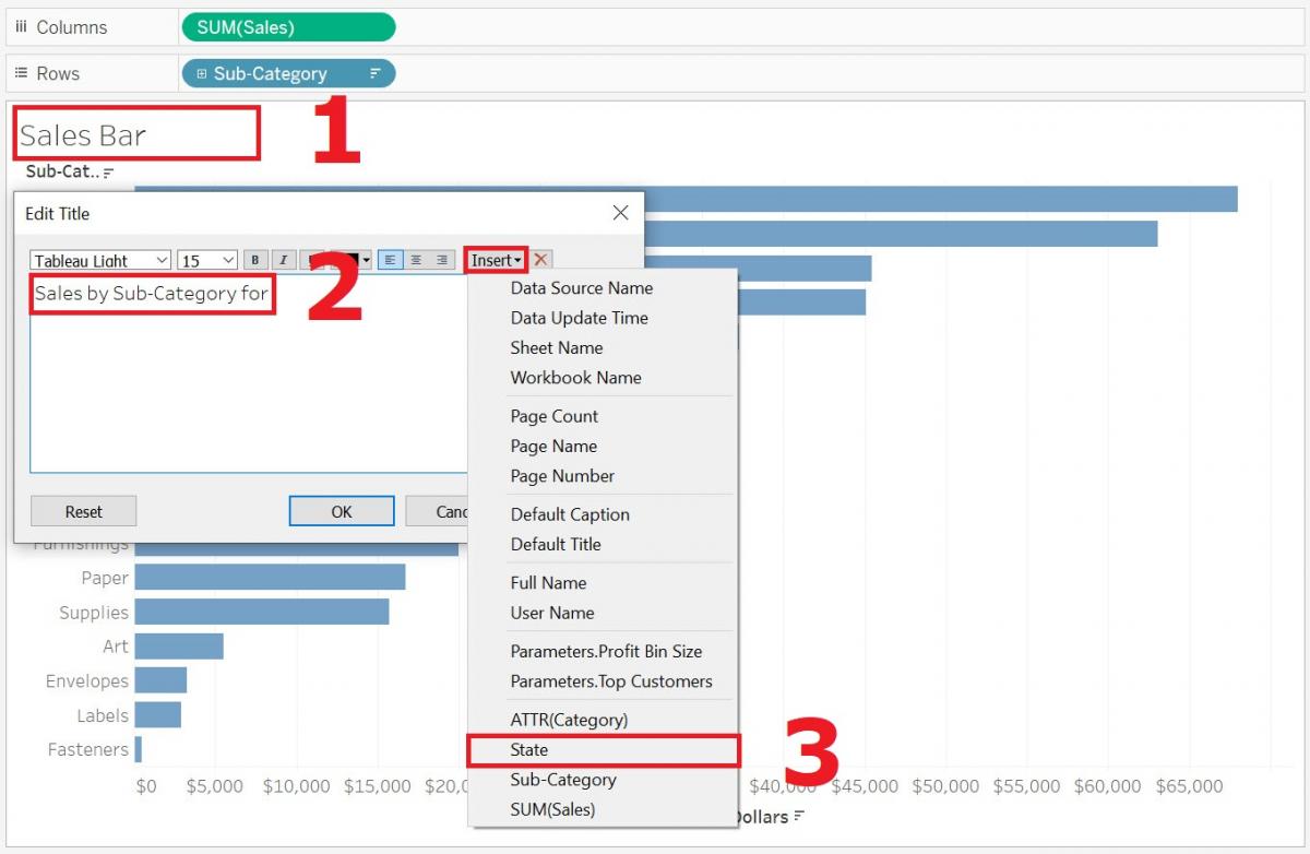
Finally, we can give our visualization a more meaningful title by double clicking where it says “Sales Bar” at the top. You will see the default title is the sheet name, but we can change that. Let’s put “Sales by Sub-Category for “ then instead of typing in “California”, we can make the title dynamic by clicking on Insert and selecting State. Then if we change the filter, the title will automatically change.
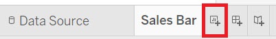
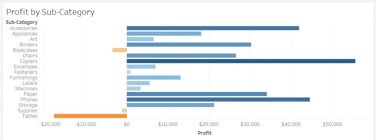
Let’s create one more bar graph, as we are going to use it later in the activities. Let’s create a similar bar graph but showing profit by sub-category. First, we need a new worksheet. Click on the icon with “a plus sign in front of a bar graph” to the right of “Sales Bar” at the bottom of the screen. That is the new worksheet icon.
Let’s rename this one to “Profit Bar”.
Drag the Profit variable (Measures) next to columns and Sub-category (Dimensions, under Product) next to rows.
Let’s colour the bars this time based on their profit (showing gains in shades of blue and losses in orange – a diverging colour palette). Drag the Profit variable (Measures) on to the Colour box in the Marks card.
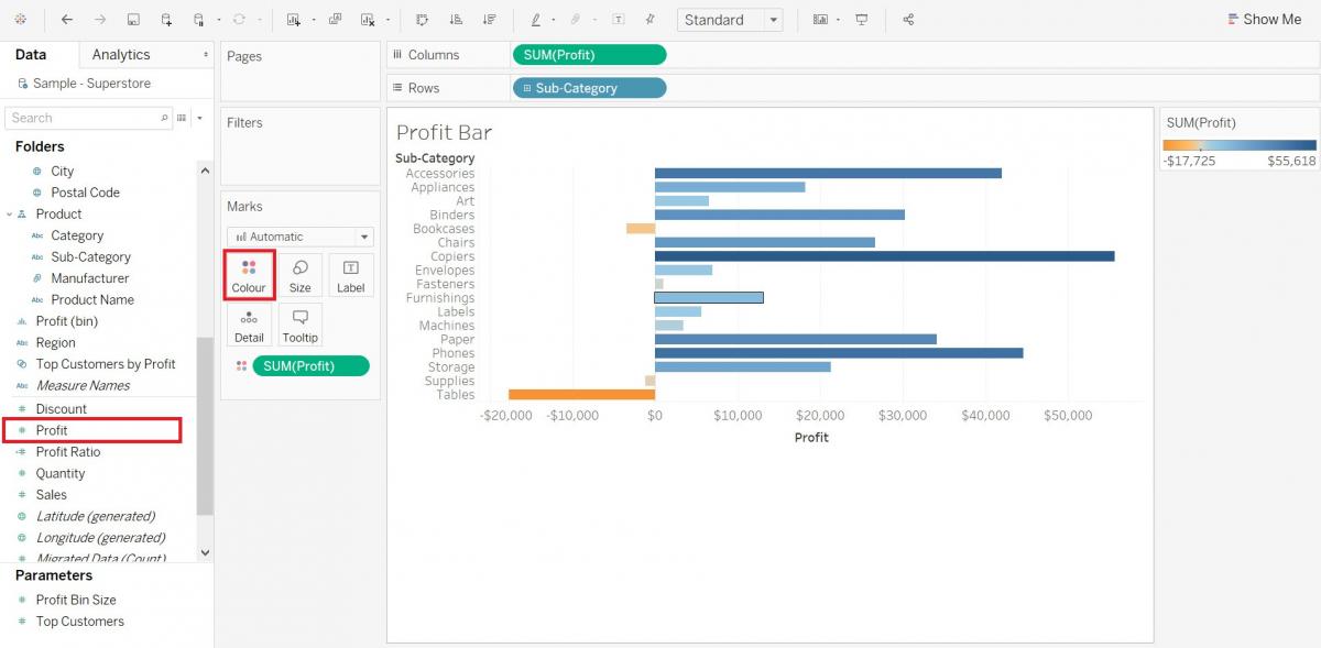
In this case, the meaning of the colours is fairly clear, so we can hide the legend. Hover over the legend until you see a small arrow. Click on it to get the drop-down menu, and then select Hide Card.
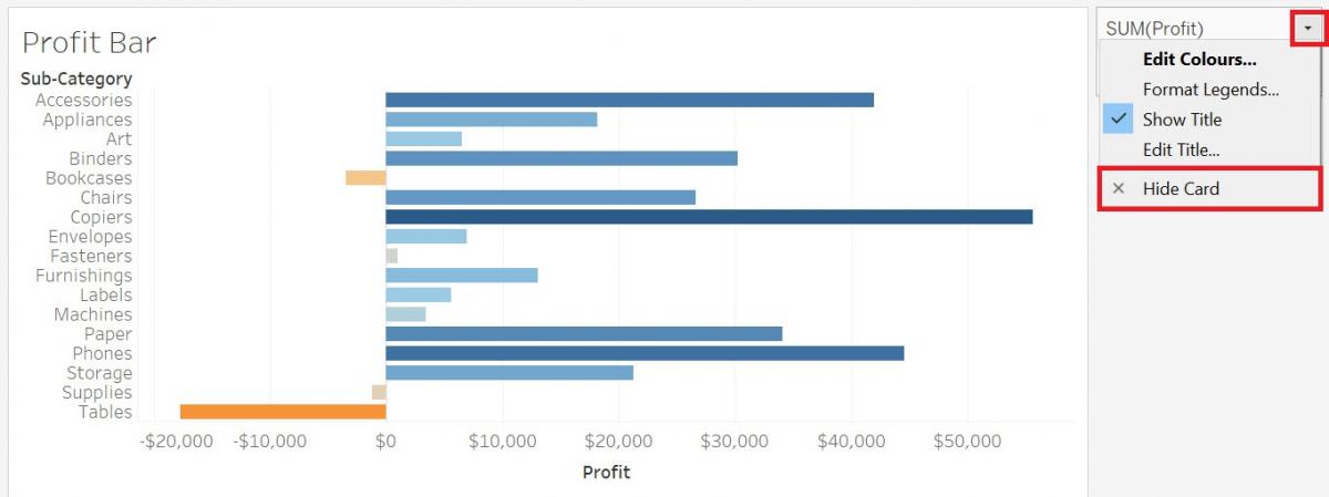
Finally, just simplify the title here by and put “Profit by Sub-Category” instead. You can see that this bar graph highlights the sub-categories that are making a loss or a large gain in profit quite clearly.
Technique: Data Visualization | Tools: Tableau