Creating Dashboards
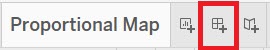
Now so far we have been creating visualizations within worksheets. But you can also create dashboards that combine a number of visualizations together to present a more complex story than a single visualization can show. Click on the create new dashboard icon at the bottom, next to the new worksheet icon.
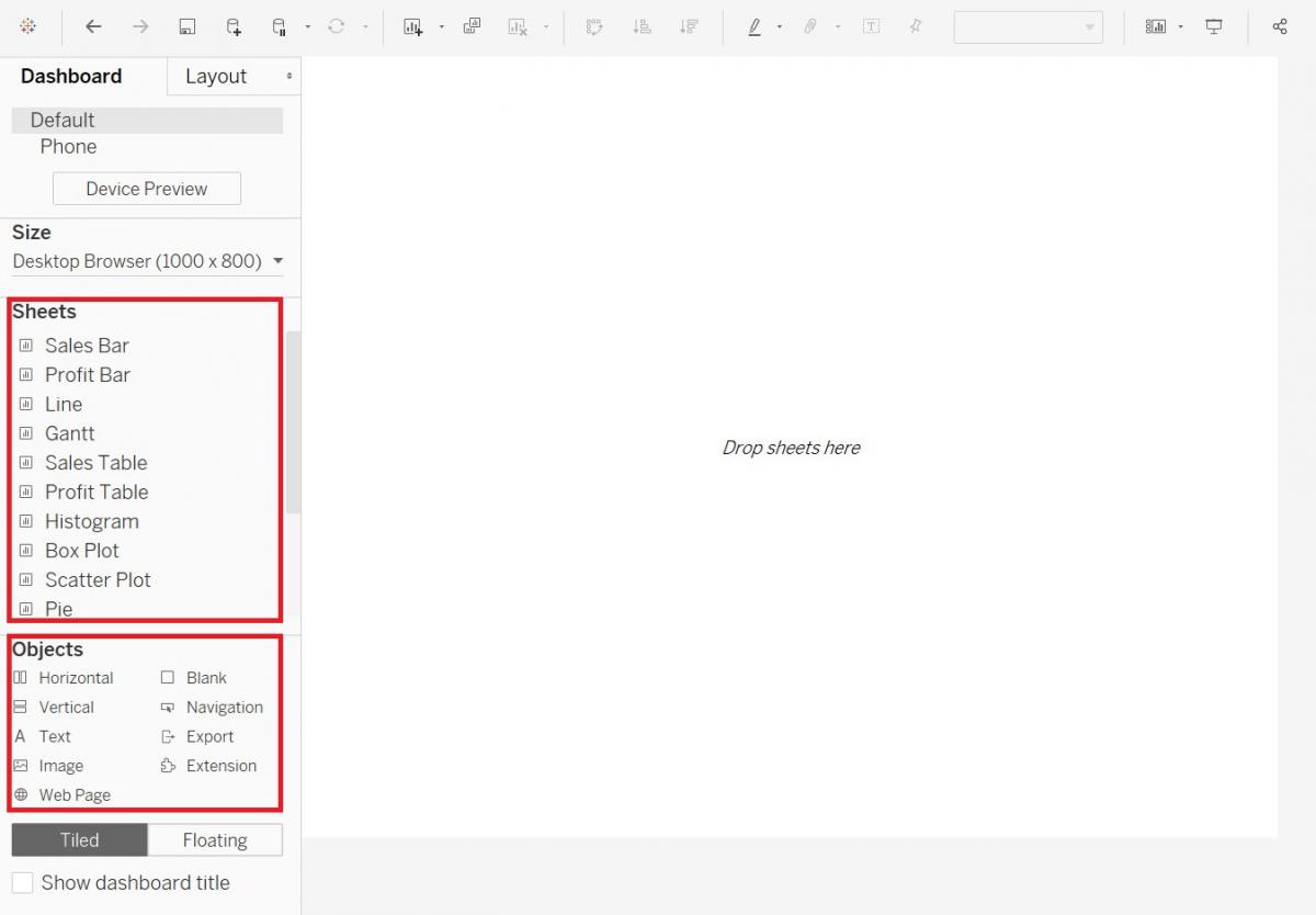
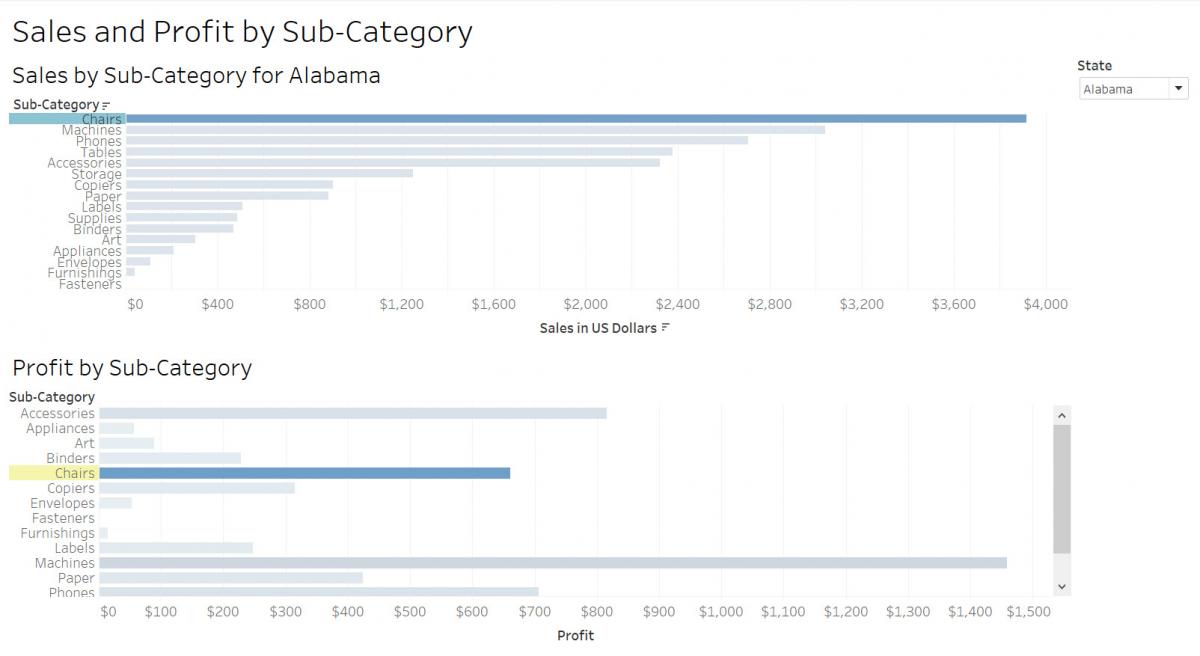
You then can drag and drop various sheets to layout a dashboard. You can see it really helps to label your sheets. You can also drag other objects (bottom left), such as text or images to create your dashboard. So let’s create a dashboard showing sales and profit by sub-category and being able to filter by state.
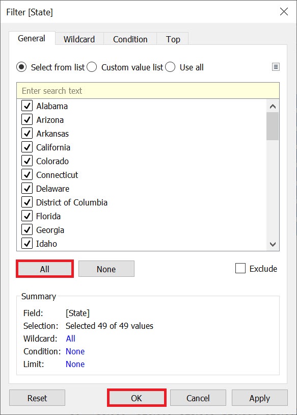
Before we start building our dashboard, I just want to adjust the Sales Bar sheet slightly. Go to the Sales Bar sheet by clicking on its tab at the bottom. Right click on the State pill on the Filters shelf, and select Edit Filter…
Select all and click on OK.
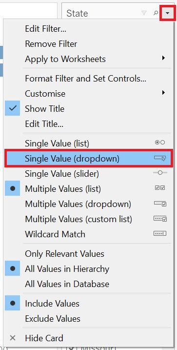
Then right click on the State pill on the Filters shelf again, but this time select Show Filter.
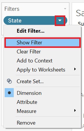
Now you can see the filters show up on the right. Hover over the legend until you see a small arrow. Click on it to get the drop-down menu, and then select Single Value (dropdown).
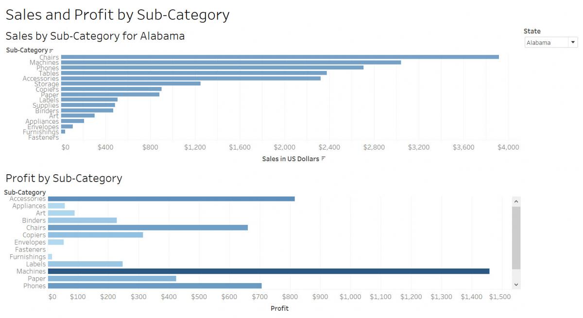
Now we have a State filter that the reader can use to filter the graph. We are going to take this filter and use it in our dashboard to apply to all the graphs we add into the dashboard.
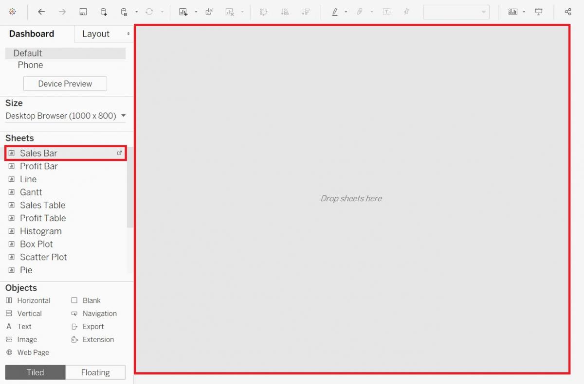
So let’s go back to our dashboard by clicking on the Dashboard 1 tab at the bottom.
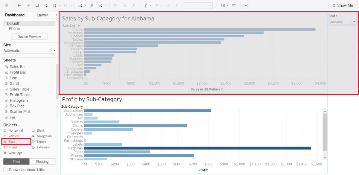
First, let’s drag the Sales Bar sheet into the dashboard.
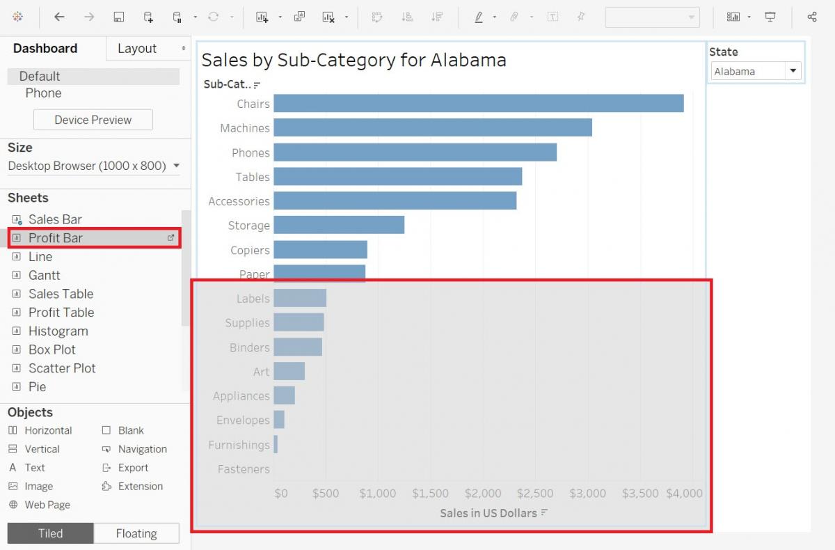
Then drag the Profit Bar sheet underneath.
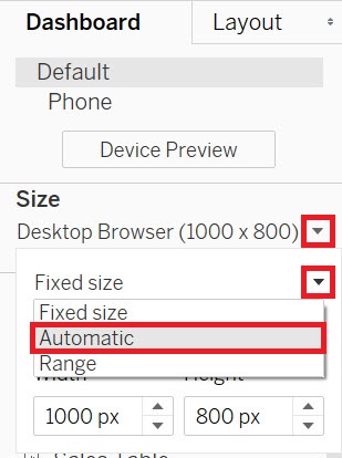
Our dashboard seems a bit squished, to improve how it displays, under Size on the left, change Fixed size to Automatic.
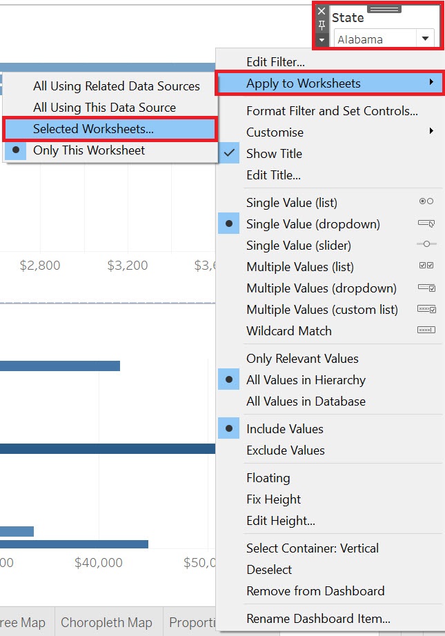
To make the filter for the Sales sheet apply to both, right click on the title of the filter, State, select Apply to Worksheets, and then pick Selected Worksheets…
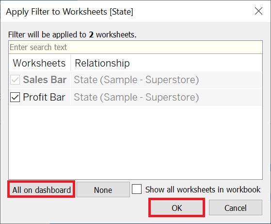
Click on All on dashboard. Now you will see that when you select one state, both graphs refer to that state.
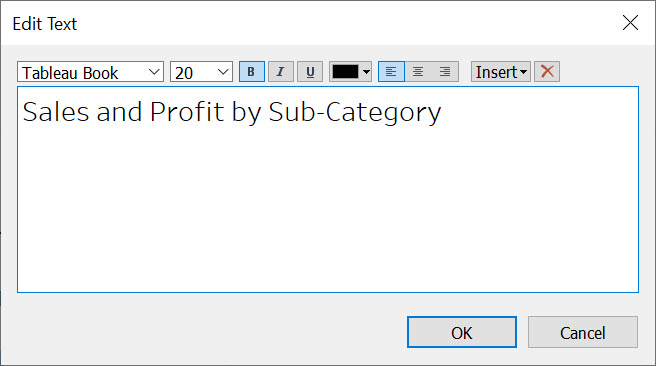
Let’s add a title to our dashboard. Drag Text from under objects to the top of the dashboard. As you drag, make sure the grey rectangle is narrow, spanning the top of the whole dashboard.
Make the title “Sales and Profit by Sub-Category”, set the font size to 20 and make it bold.
Resize the height of the title to finish it off.
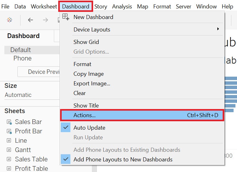
Finally, let’s add a dashboard action, where if you click on a sub-category in one of the graphs, it will highlight it in both to help the reader link the data together visually. From the Dashboard menu at the top, select Actions…
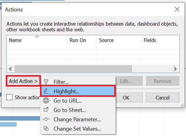
Click on the Add Action > and select Highlight…
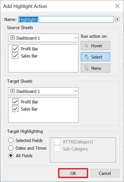
From this window, you could customize the settings if you wish to specify which sheets would be affected, and where to do it on hover or selection, for example. Let’s keep the defaults and click on OK. Then click on OK again to close the Actions window.
Now if you select a Sub-Category in one graph, such as Chairs, it should highlight Chairs in the second graph. Click it again to deselect it.
Technique: Data Visualization | Tools: Tableau