Creating Tree Maps
Let’s try a different dataset for the next few visualizations. We are going to load a built-in dataset again. Go to the top Data menu and select New Data Source. Under Saved Data Sources, select World Indicators.
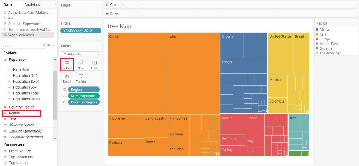
So far, we have looked at pie charts and stacked bar graphs to show parts-to-whole. Another option would be to use a tree map, which not only can be used for composition, but also hierarchies. Let’s create a tree map to illustrate the size of populations by world regions for 2012.
Again, we need a new worksheet. Click on the new worksheet icon at the bottom of the screen. Let’s rename this one to “Tree Map”.
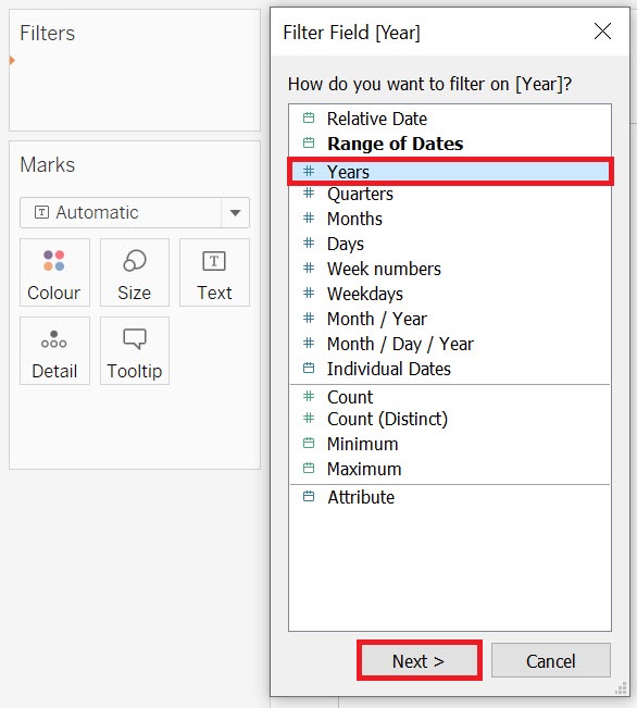
First, let’s filter the data to 2012. Drag the Year variable (Dimensions) to the Filters shelf. Select Years and click on Next.
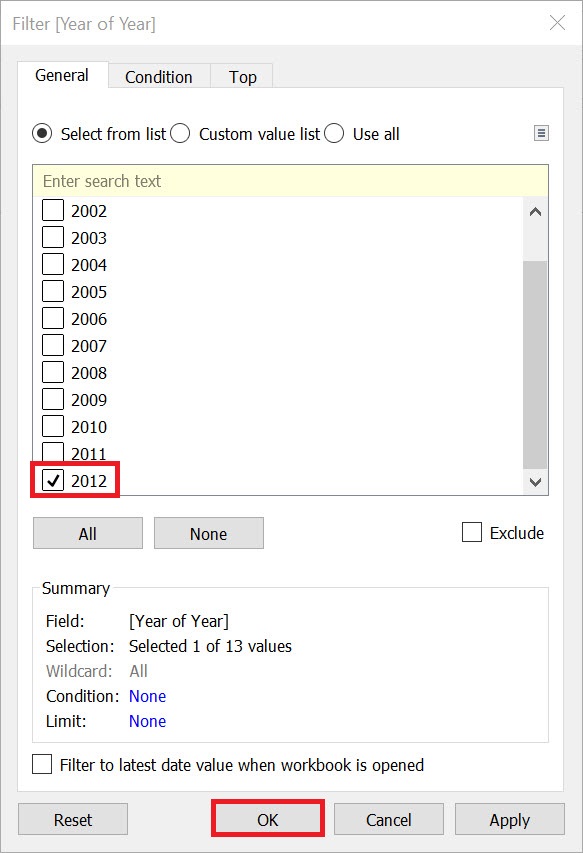
Pick 2012 from the list, and then click on OK.
Next, drag the Country/Region variable (Dimensions) to the Text box on the Marks card, as we are going to separate and label each box with the country name.
Finally, drag the Region variable (Dimensions) on to the Colour box on the Marks card to colour code the blocks by region. Once you have it, you can see that it tells you broad strokes information, such as that Asia is the most populated place, and Oceania regions have the least people. Not only that, but it looks like the population of Asia is roughly equal to the population of the rest of the world. You can hover over the blocks to get more information, or you could even drag the Population Total variable again over the Label box on the Marks card to include that information under the country name.
Technique: Data Visualization | Tools: Tableau