Creating Choropleth Maps
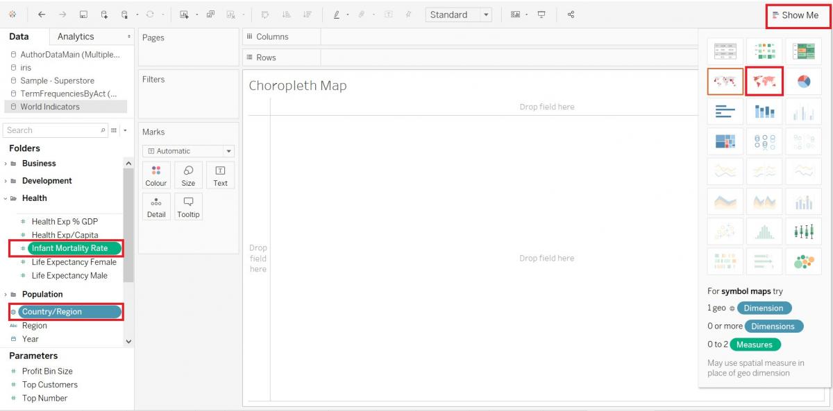
Another type of visualizations we can create with Tableau is maps. Let’s create a couple now to show spatial patterns. First, we will create a choropleth map, where areas are proportionally colour-coded to represent a variable. Let’s create a choropleth map showing infant mortality by country.
Again, we need a new worksheet. Click on the new worksheet icon at the bottom of the screen. Let’s rename this one to “Choropleth Map”.
Using the show me, as we have done before, hold down the Ctrl key and select the Country/Region variable (Dimensions) and the Infant Mortality Rate variable (Measures, under Health), and then click on Show Me. Select the maps option with shaded areas.
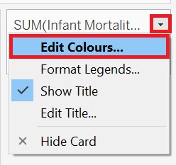
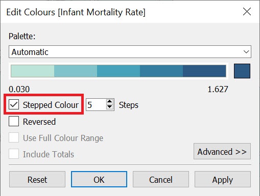
Let’s change the legend from an unclassed map to a simplified classed map, having five different shades of blue corresponding to bin or ranges of values for infant mortality rate. Hover over the legend until you see a small arrow. Click on it to get the drop-down menu, and then select Edit Colours…
Click on Stepped Colour and keep the default of five colours. Then click on OK.
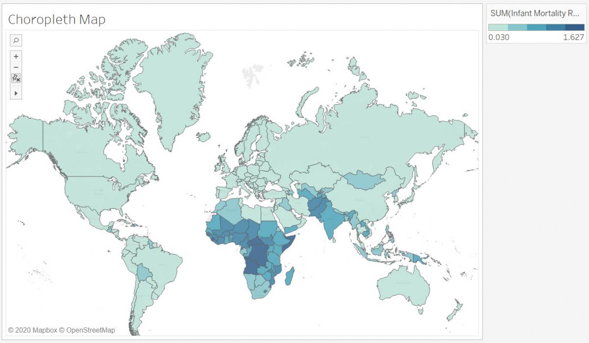
From this map, we can see that infant mortality is higher in Africa and parts of Asia compared to the rest of the world.
Technique: Data Visualization | Tools: Tableau