Creating Highlight Tables
Next, let’s change gears here a bit and look at creating a highlight table. It is a hybrid between a visualization and a table. Tables can be very useful when you need to look up a value and see both precise values and summary stats. To add a visualization piece, you can shade the background of various cells to highlight cells of interest – perhaps the values are too high or low. Let’s create one showing sales by sub-category, broken down by region.
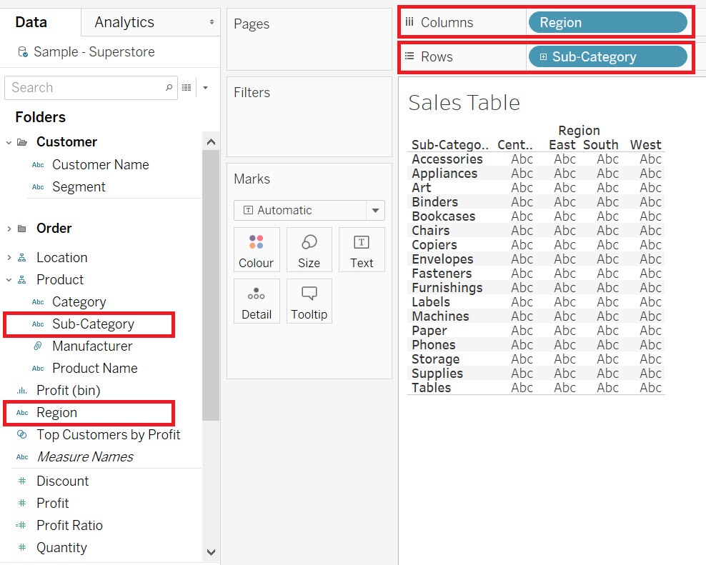
Again, first we need a new worksheet. Click on the new worksheet icon at the bottom of the screen. Let’s rename this one to “Sales Table”.
Drag the Sub-category variable (Dimensions, under Product) next to rows and the Region variable (Dimensions) next to columns.
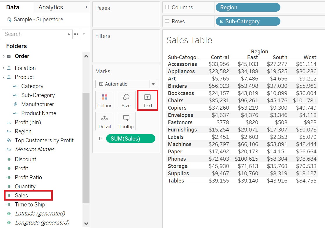
Then drag the Sales variable (Measures) to the Text box on the Marks card.
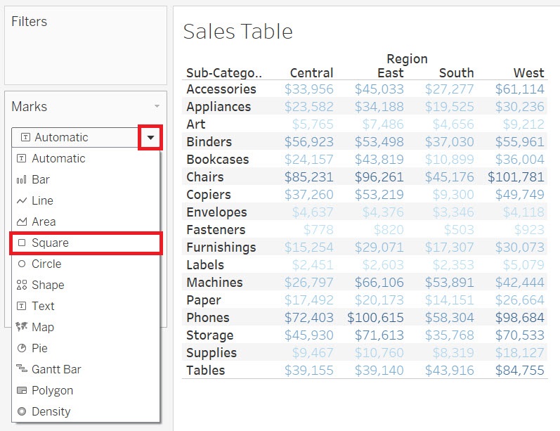
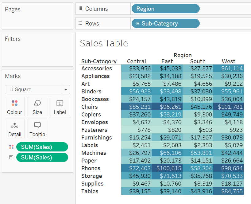
To make it a highlight table, we need to add colour, so drag Sales again, this time to the Colour box on the Marks card. To make the cells shaded, from the Marks card drop-down, select Square.
Now you can easily see for example that Chairs and Phones make a lot of sales in the East and West regions.
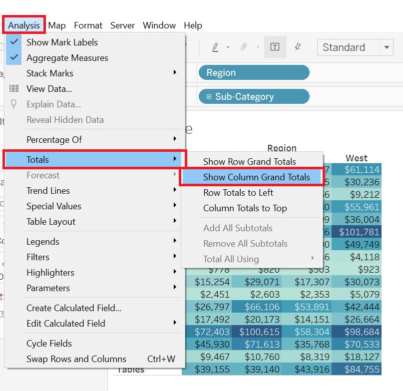
We can also add grand totals by region to add more information to our table. Go to the Analysis menu, and select Totals, and then Show Column Grand Totals.
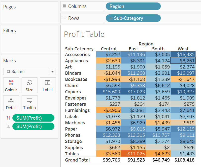
Let’s quickly create one more highlight table, as we will use it later in the activity. But, this time, make a table show profit instead of sales.
Again, we need a new worksheet. Click on the new worksheet icon at the bottom of the screen. Let’s rename this one to “Profit Table”.
Drag the Sub-category variable (Dimensions, under Order) next to rows and the Region variable (Dimensions) next to columns. Then drag the Profit variable (Measures) to the Text box on the Marks card.
Then drag Profit again, this time to Colour box on the Marks card, and from the Marks card drop-down, select Square. From this table, you can easily see for example that Tables are causing a loss in the East. Add Column Grand Totals here as well, by going to the Analysis menu, and selecting Totals, and then Show Column Grand Totals.
Technique: Data Visualization | Tools: Tableau