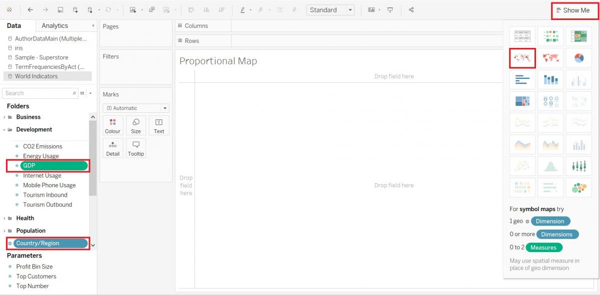
Creating Proportional Symbol Maps
Another type of map we can create using Tableau is a proportional symbol map, where the maps scales the size of simple symbols, like circles, proportionally to the data value found at that location. Let’s create a proportional symbol map showing GDP by country.
Again, we need a new worksheet. Click on the new worksheet icon at the bottom of the screen. Let’s rename this one to “Proportional Map”.
Using the show me, as we have done before, hold down the Ctrl key and select the Country/Region variable (Dimensions) and the GDP variable (Measures, under Development), and then click on Show Me. Select the proportional symbol option (the map with symbols).
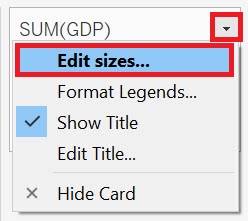
Let’s change the legend to adjust the size of the symbols. Hover over the legend until you see a small arrow. Click on it to get the drop-down menu, and then select Edit Sizes…
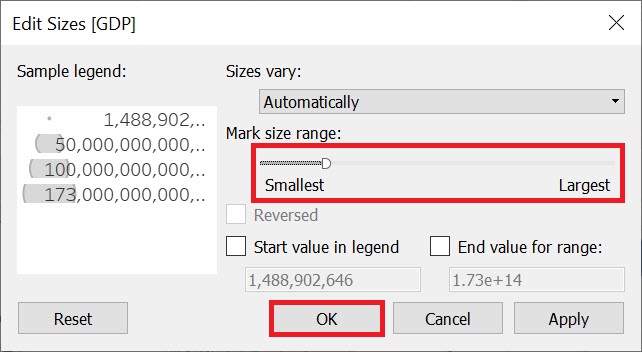
Use the slider to make the symbols a bit larger, so they are more visible (to the end of the word smallest). Then click on OK.
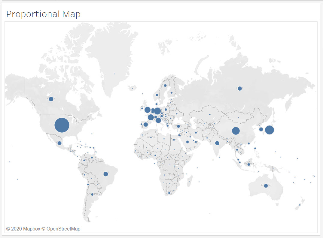
From this map, we can see that there are a number of countries with a significant GDP in Europe.
There are many special design conventions to consider for map making. Check out the Data Visualization guide for cartography tips: https://mdl.library.utoronto.ca/dataviz/specialty-visualization-areas
Technique: Data Visualization | Tools: Tableau