Creating Gantt Charts
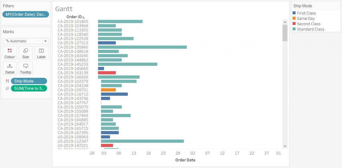
Next, let’s look at time from a project management perspective to compare how long different tasks took using a gantt chart. We will take a look at individual orders in December 2019 and see how long it took to ship individual orders and if many orders coming in at the same time had an impact.
Again, we need a new worksheet. Click on the new worksheet icon at the bottom of the screen. Rename this one to “Gantt”.
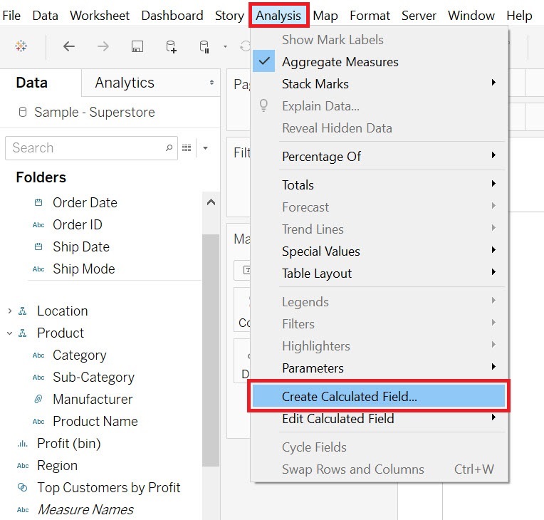
To create a gantt chart, you need to have a variable that represents duration. Currently we only have order dates and ship dates, but we can use Tableau to calculate the difference to create a new variable called Time to Ship. To do this, go to the Analysis menu, and select Create Calculated Field…
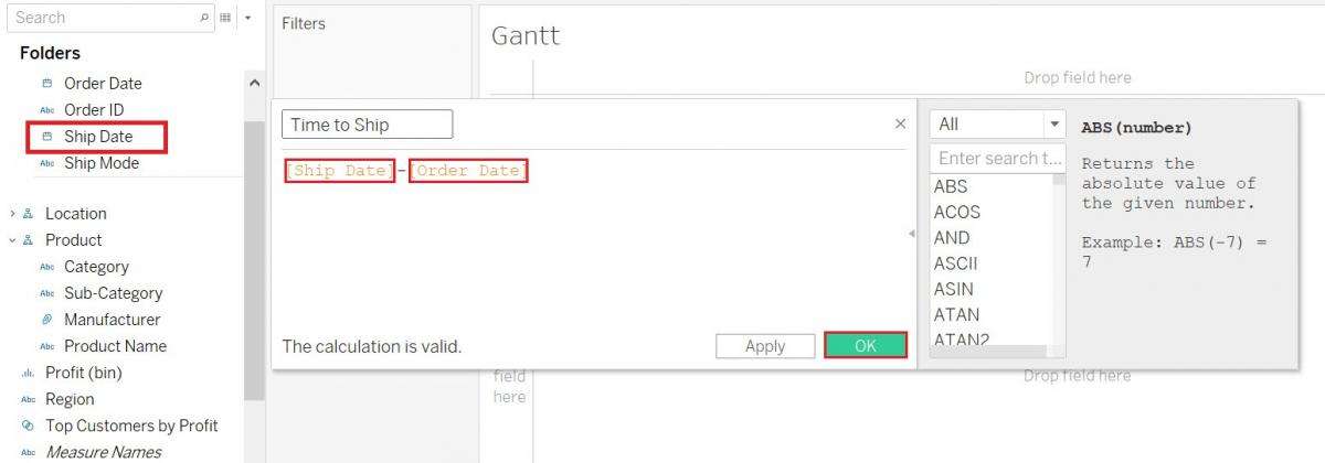
Call it Time to Ship. The formula would be Ship Date minus Order Date, so first drag the Ship Date variable (Dimensions, under Order) into the formula box, type minus, then drag the Order Date variable (Dimensions, under Order) into the formula box. The result is the number of days between the two dates. Finally, click on OK.
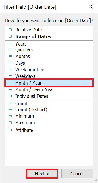
There are many orders in the dataset, so let’s first add a filter for just orders in December 2019. Drag the Order Date variable (Dimensions, under Order) on to the Filters Shelf. Select Month / Year and then click on Next.
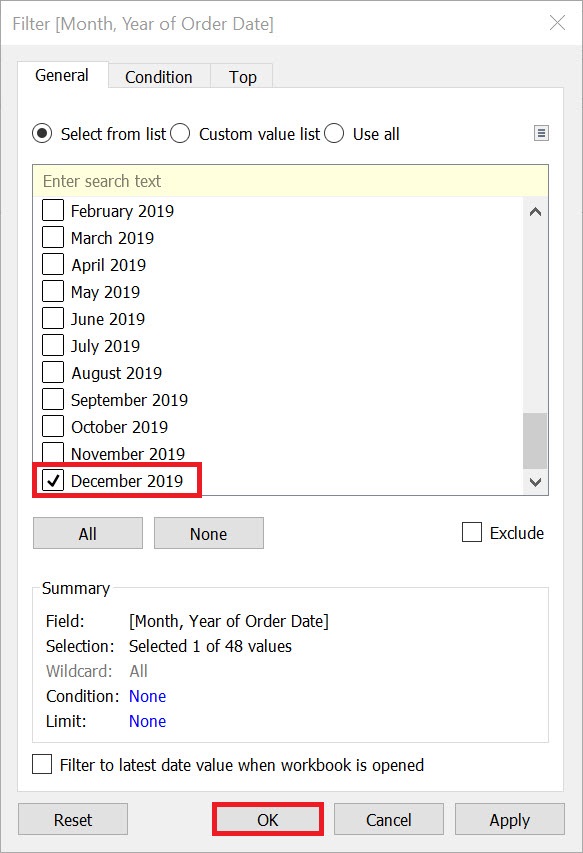
Select December 2019 from the list and click on OK.
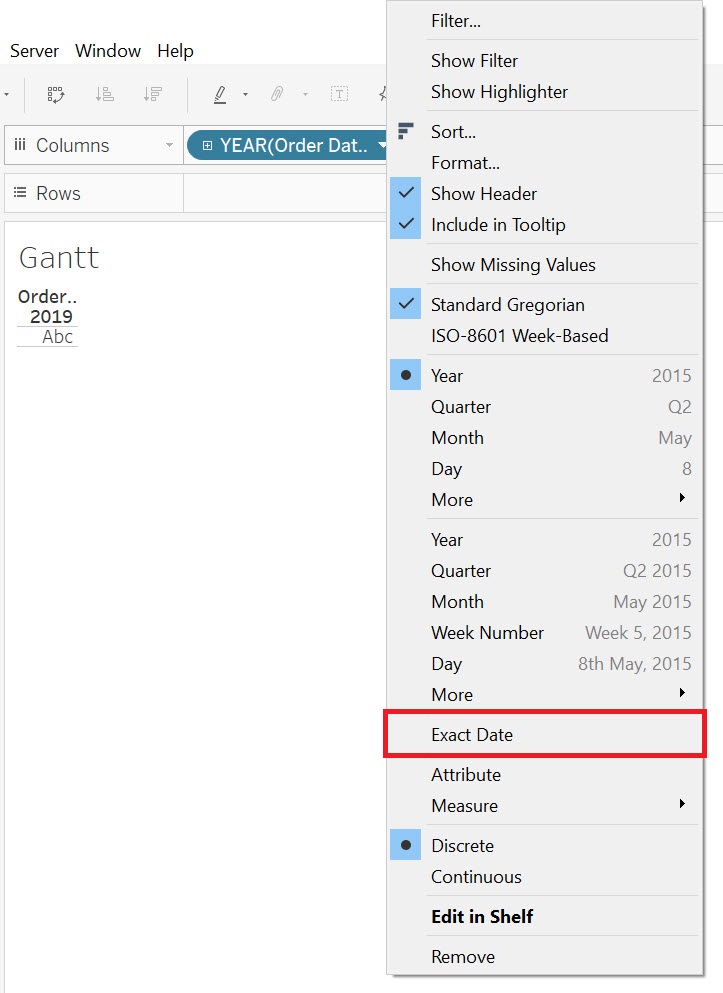
Next, drag the Order Date variable (Dimensions, under Order) next to columns. Right now, it is taking only the year part of the date from the field. Right click on the Order Date pill and select Exact Date to pull the full date.
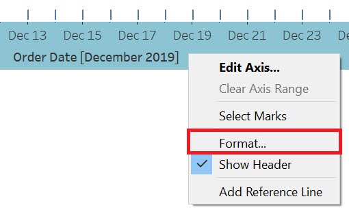
Before we go any further, let’s change the date format on the x-axis from day month to just the day (as we know what month and year we’re looking at from the filter). Right click on any date on the x-axis and select Format...
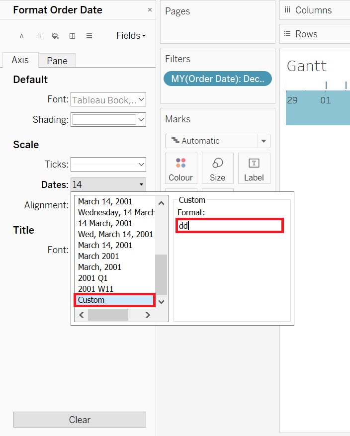
The Format Order Date pane should open up on the left covering the dimensions and measures section. Under Scale, from the drop-down for Dates you should see many options, but not the one we want. So select Custom and type dd to set our own date format to 2-digit dates. Click away to close the pop-up and then close the pane by clicking the ‘x’ at the top of the pane.
For the rows, drag the Order ID variable (Dimensions, under Order) next to rows.
Gantt charts size marks by duration, so drag the Time to Ship variable over to the Size box on the Marks card.
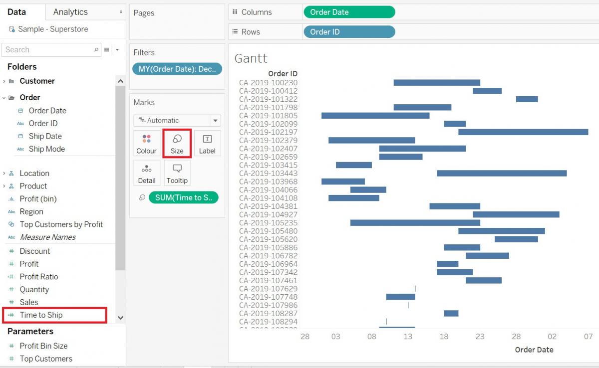
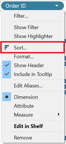
Now it is starting to look like a gantt chart, but let’s change the sorting. Currently, it is sorting by Order ID, but let’s sort by Order Date. To do this, right click on Order ID pill, and select Sort.
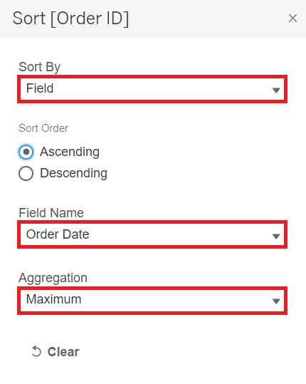
From the Sort By drop-down, select Field, and then pick Order Date from the field name list. Finally, change the aggregation from Count to Maximum (or Minimum works as well) to sort by date. Now you can see which orders came in at the same time and compare how long they took to ship.
To gain further insight into this gantt chart, we could also use colours for categories of shipping class (standard class, same day, etc.) to see how it matched or didn’t match with how long it actually took to ship. Drag the Ship Mode variable (Dimensions, under Order) to the Colour box on the Marks card. You can see that the same day shipping ones stand out, especially if they were longer than expected (perhaps due to many other orders coming in at the same time).
Technique: Data Visualization | Tools: Tableau