Creating Box Plots
Related to a histogram is a box plot, so let’s create one now. Box plots show distribution in quartiles, and have a very compact display so you can compare distributions of multiple groups much easier than you could with side by side histograms. So instead of using colours on our histogram, as we did before we filtered it, let’s create a box plot to compare the distributions of petal width by species.
Again, we need a new worksheet. Click on the new worksheet icon at the bottom of the screen. Let’s rename this one to “Box Plot”.
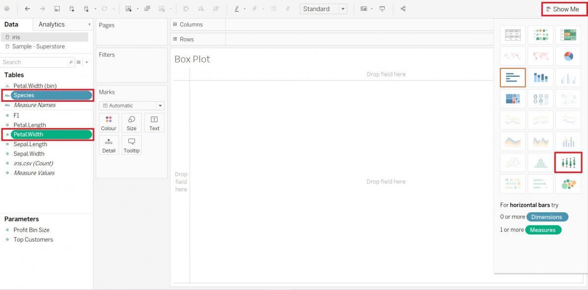
Let’s use the Show Me option again. This time hold down the Ctrl key and select the Petal.Width variable (Measures) and the Species variable (Dimensions), and then click on Show Me to expand the tab. Select the box-and-whisker plots option. Then click on Show Me again to close the tab.
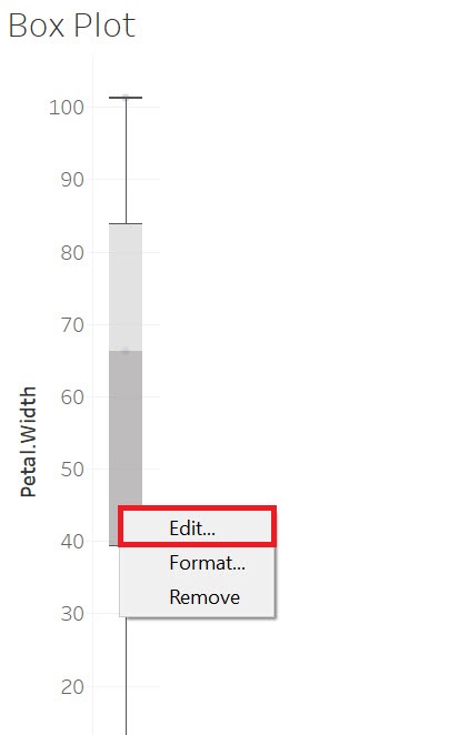
We change some of the settings on the box plot by right clicking on it and selecting Edit…
You can change what the whiskers (those line thin lines extending out from the box) represent. From the drop-down, select Maximum extent of the data. We can also select Hide underlying marks (except outliers) to remove the dots shown underneath the box and whiskers. Then click on OK.
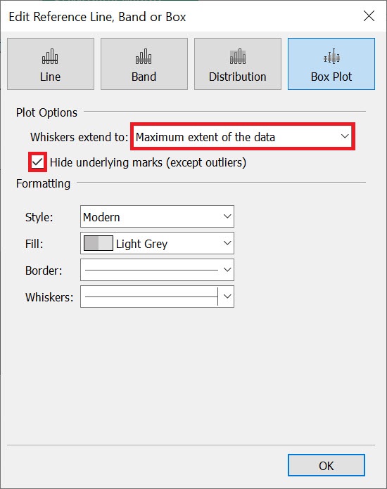
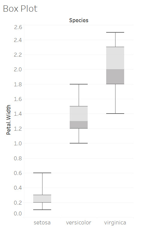
The box plot uses the whiskers to show us the high and low values (and the range of values for Petal width), and the median petal width (which is the middle line in the box). It also shows you that 50% of values in the dataset fall within the box.
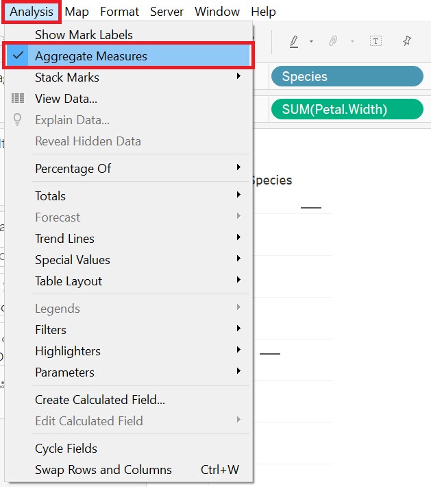
But I mentioned the power of box plots is that you can compare different distributions. So let’s compare distributions of petal width by species. So drag Species (Dimensions) next to columns. You will see that you have split the data into three species, but the boxes are gone because currently it is aggregating the data to the sum for each species. To fix this, go to the Analysis menu at the top and deselect Aggregate Measures.
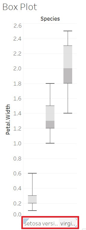
Finally, you can hover near the species labels at the bottom to get an arrow cursor so you can click and expand the graph’s width to be able to read the species labels.
You can see this graph shows us for example that the species Virginica has a largest range of petal widths and that there are some overlap in petal widths between Versicolor and Virginica, but none with Setosa.
Technique: Data Visualization | Tools: Tableau