Creating Histograms
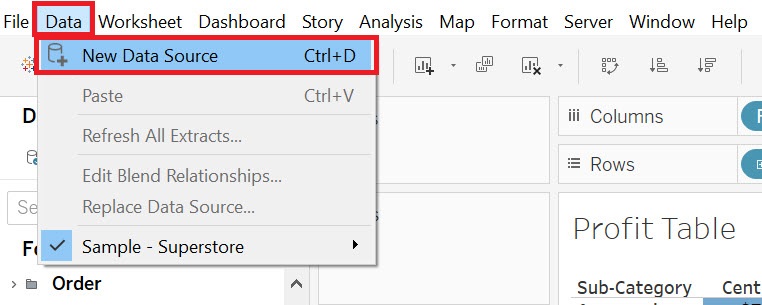
Let’s try a different dataset for the next couple visualizations. We are going to load in external data this time. Go to the top Data menu and select New Data Source.
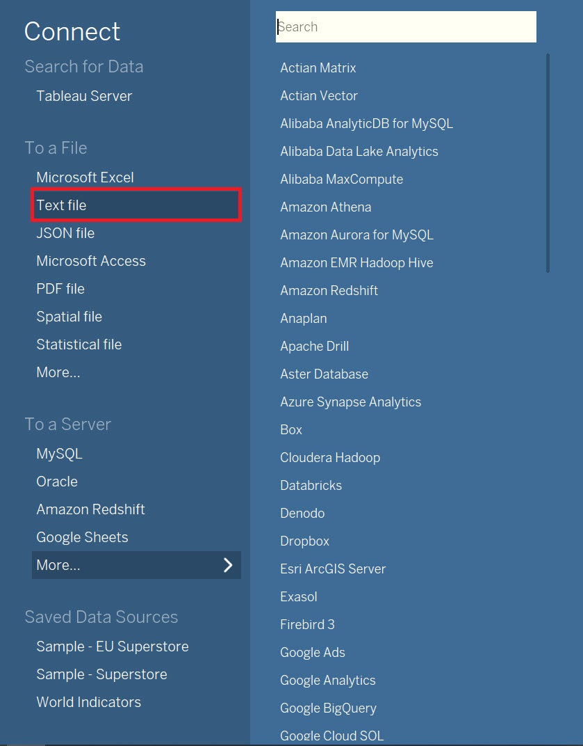
Choose Text, and select iris.csv and click Open.
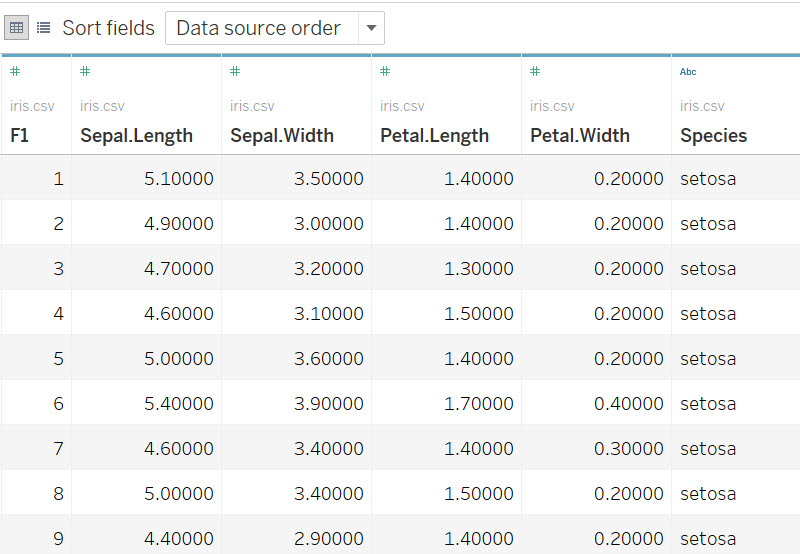
From this screen, you get a preview of the data. This dataset contains measurements for different parts of different species of iris flowers.
The next visualization we are going to make is a histogram, which can show us the distribution of a numeric variable – for example, we could look at the frequency that different petal widths were recorded for different specimens of irises.
Again, we need a new worksheet. Click on the new worksheet icon at the bottom of the screen. Let’s rename this one to “Histogram”.
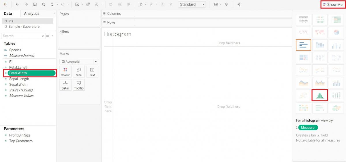
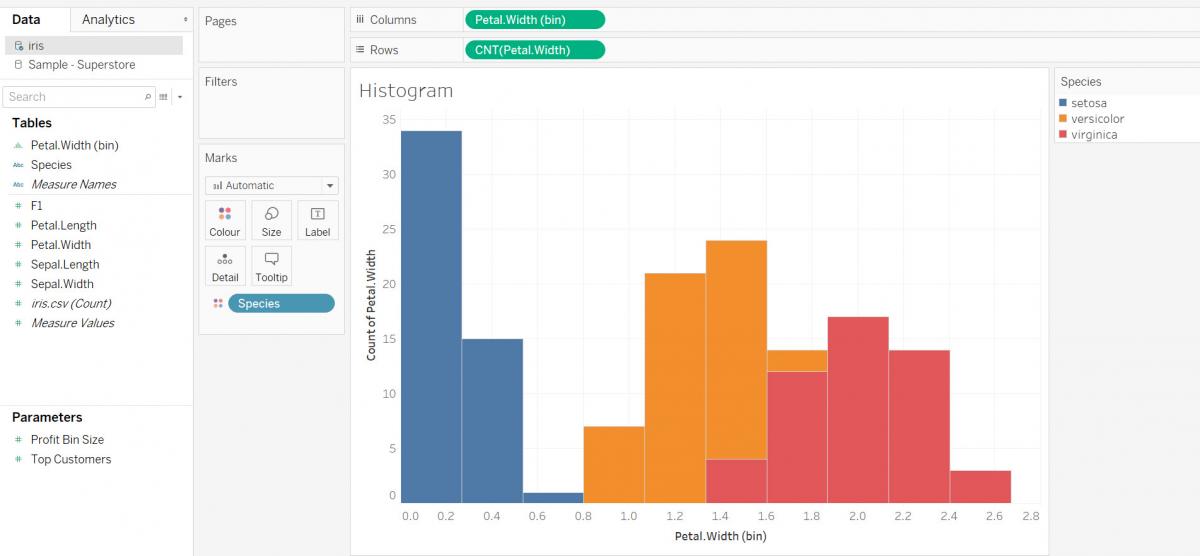
This time, let’s take a look at creating the histogram demonstrating the show me feature. Select the Petal.Width variable (Measures), and then expand Show Me by clicking on it. You will see that there are two options that are not greyed out – a bar graph and a histogram. You can hover over any of the images in the Show Me tab to see what the visualization is called; it will be listed below. Select the histogram. Then click on Show Me again to close the tab.
Let’ s colour by species – drag the Species variable (Dimensions) to the Colour box on the Marks card. You can see that depending on the species, there is a different range of petal widths.
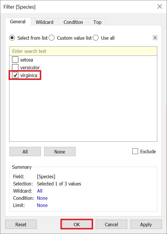
Let’s filter by species so we can see the histogram for each species individually. Drag the Species variable (Dimensions) on to the Filters shelf and make sure only Virginica is selected, and then click OK.
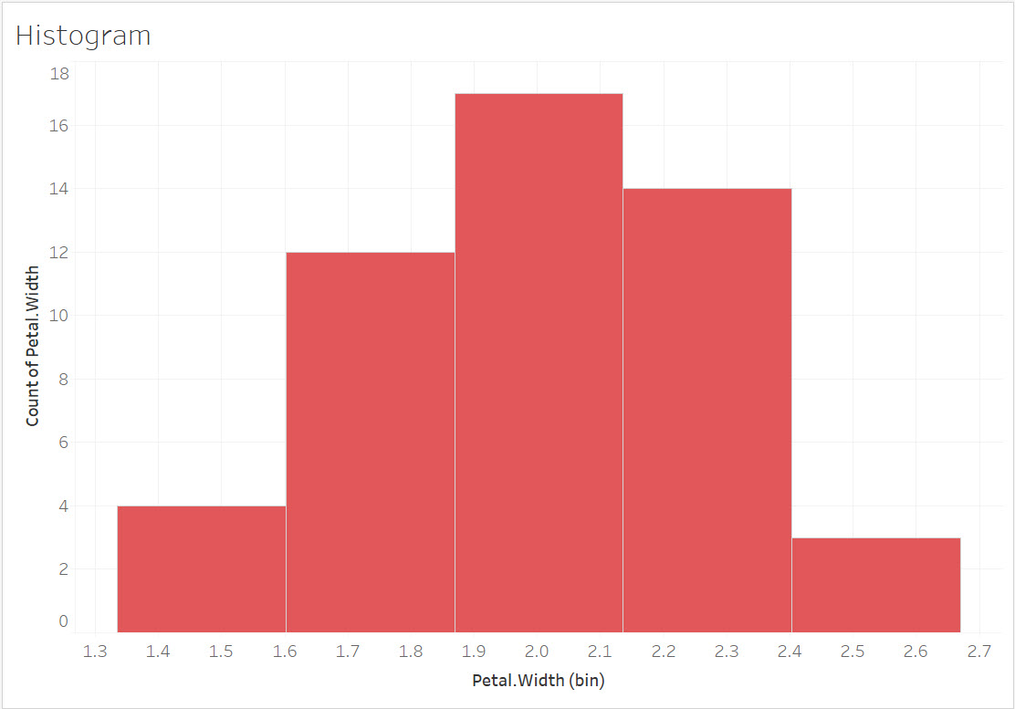
You can see that for Virginica, most of the flower’s petal widths are in the middle of the range of options.
You may have also noticed that Tableau automatically creates a bin size variable under Dimensions to create the graph, where bins are just used to divide the Petal.Width variable into equal parts or ranges that each observation could fall under and their frequency could be calculated. Tableau automatically tries to select an appropriate bin size, but if you wanted, you could right click on Petal.Width (bin) under Dimensions and change the size of the bins. Let’s leave it as is for now.
Technique: Data Visualization | Tools: Tableau