Document Variable Statistics
Another way to use your document variables, is to understand your documents better. For example, you can look at simple descriptive statistics of your variables. Before we do this, let’s deactivate any documents and codes you have active by clicking on the reset activations icon at the top of the Document System Panel and Code System Panel (looks like a purple tag icon with a number).
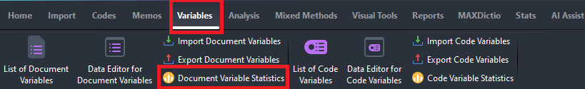
Next, from the Variables menu, select Document Variable Statistics.
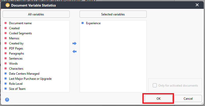
From the list on the left, double click on Experience to select it or use the right arrow button, then click on OK.

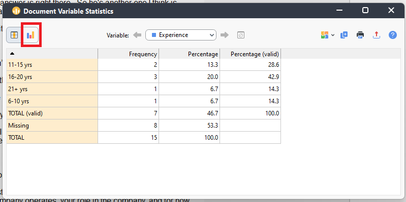
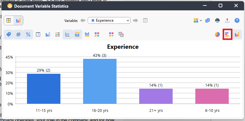
- This table shows you how many documents fall into these categories of experience. Click on the chart icon on the top left to see these results visualized. This can give us a sense of our interview participants experience.
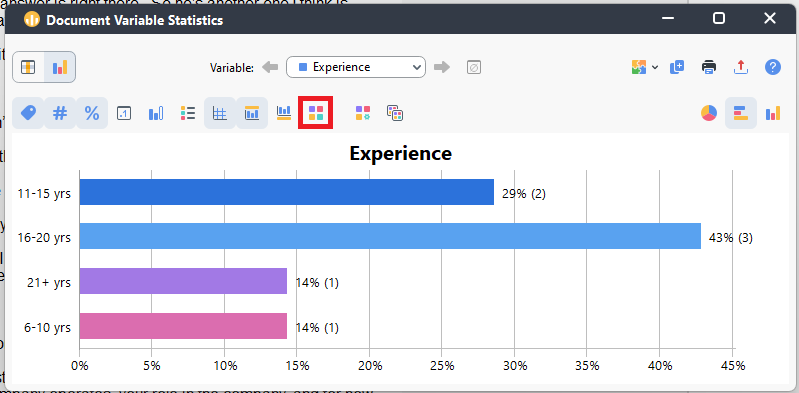
- You can customize this graph. For example, click on the horizontal bar graph icon on the far left to change the display.
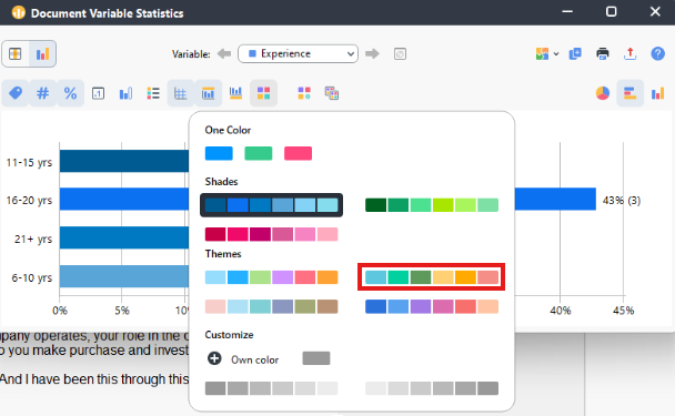
Click on the four square colours icon just above the graph to change the colours of the bar. Select a colour palette of your choice.
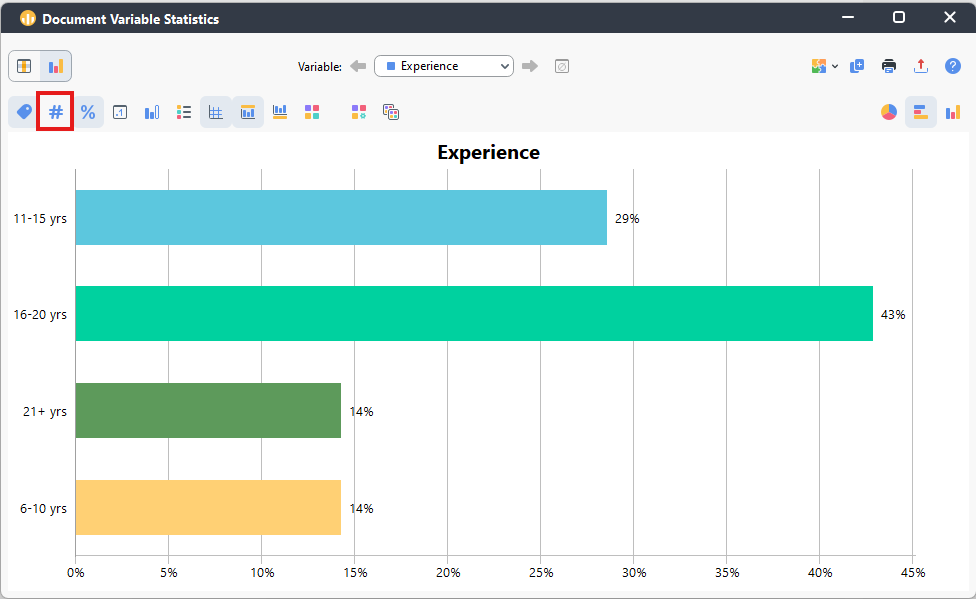
- You can also change the labelling. Click on the number sign icon at the top left to toggle it off, so now the bars are only labelled by their percentages.
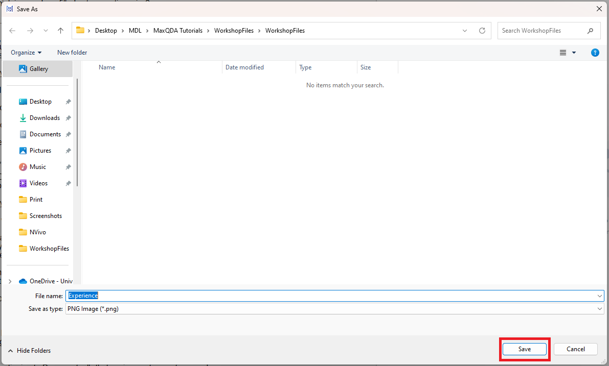
- Finally, we can export this bar graph as an PNG or SVG image file by click on the export icon at the far top right (looks like a red arrow pointing up). Choose where to save your file, leave it as a PNG file, and click on Save. Then close the Document Variable Statistics window.
Note: This export icon option is available in the same location for all the visuals and other outputs discussed in the tutorial.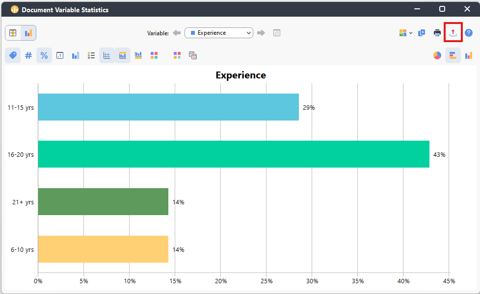
Technique: Qualitative Data Analysis | Tools: MAXQDA